Hello! From my queue.
General:
- There some sort math image in the folder? Don't know what thats about but doesnt need to be in the mapset.
- Also seems like at least my end, .mp4 videos arent played. Switch for avi?
- The map only has one timing point, its all 177bpms, so remove all of the timing points except for the first one, and instead replace them with inherited points (the green lines)
- For this to be ranked you still need to create an Easy and a Normal
Hope it helps!
General:
- There some sort math image in the folder? Don't know what thats about but doesnt need to be in the mapset.
- Also seems like at least my end, .mp4 videos arent played. Switch for avi?
- The map only has one timing point, its all 177bpms, so remove all of the timing points except for the first one, and instead replace them with inherited points (the green lines)
- For this to be ranked you still need to create an Easy and a Normal
Hard
Seems like you chose to use the rare CS3 on a Hard difficulty, which is fine, but also is kinda confusing when its combined with AR8 as circles appear too fast
You use alot of stackings on this map, why not make the map flow more instead of having cursor pauses by mapping more around the screen?
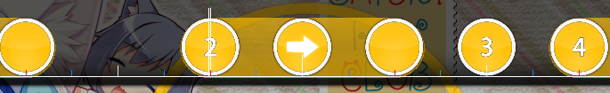
00:03:906 (1,2) - Switch combos on these 2 objects
00:08:652 (6) - Inconsistent spacing
00:06:788 (1,2) - switch combos
00:10:178 (4,7) - This is a bad overlap, avoid doing this and try to fix it
00:11:364 (1,2) - Switch combos
00:17:635 (1,2) - Switch combos, if you havent got the idea yet, its best to start the combos on white ticks instead of red ones, and i mean the larger white ticks and if not possible, the object right after.
00:17:635 (1) - Inconsistent spacing
00:21:195 (2) - Confusing spacing
00:22:211 (3,4) - Same as above
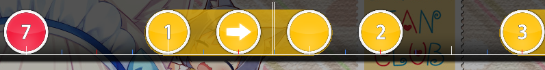
00:28:651 (10,1) - Switch combos
00:34:076 (9) - Try making this slider more visually pleasing?
00:35:092 (1) - Remove NC and place it here 00:35:432 (3) -
00:48:822 (6,7,8) - Wow this is hard to read, the spacings make it look like it would be a 1/2 spacing just like the rest of the map, don't do this and just make them alot closer with the same distance snap as the rest of the map.
01:25:432 (3,4) - Stack these properly
Overall you just need to fix the distancing between objects and not stacking every note and map it more so it moves around the map more often.
You use alot of stackings on this map, why not make the map flow more instead of having cursor pauses by mapping more around the screen?
00:03:906 (1,2) - Switch combos on these 2 objects
00:08:652 (6) - Inconsistent spacing
00:06:788 (1,2) - switch combos
00:10:178 (4,7) - This is a bad overlap, avoid doing this and try to fix it
00:11:364 (1,2) - Switch combos
00:17:635 (1,2) - Switch combos, if you havent got the idea yet, its best to start the combos on white ticks instead of red ones, and i mean the larger white ticks and if not possible, the object right after.
00:17:635 (1) - Inconsistent spacing
00:21:195 (2) - Confusing spacing
00:22:211 (3,4) - Same as above
00:28:651 (10,1) - Switch combos
00:34:076 (9) - Try making this slider more visually pleasing?
00:35:092 (1) - Remove NC and place it here 00:35:432 (3) -
00:48:822 (6,7,8) - Wow this is hard to read, the spacings make it look like it would be a 1/2 spacing just like the rest of the map, don't do this and just make them alot closer with the same distance snap as the rest of the map.
01:25:432 (3,4) - Stack these properly
Overall you just need to fix the distancing between objects and not stacking every note and map it more so it moves around the map more often.
Divine's Insane
Increase OD to 7 or 7.5, 6.5 is really too low for an insane
00:03:737 (3,4) - Hard part to read, make the slider repeat only once and turn the end of the slider to the left instead of right
00:07:974 (4) - Unnecessary repeating slider, just replace with 2 circles or a slider that goes from the white tick to the red one.
00:09:245 (4) - Delete this circle and move the slider to a better spot for spacing consistency
00:10:856 (7,8,1) - I don't hear a sound for it to be represented as a triple, delete circle 8
00:14:839 (4) - Delete this slider, no sound to be represented as that pattern.
00:44:161 (4) - No sound here, delete
00:44:245 (5) - Also this shouldnt be a finish
I didn't mention this before but i noticed quite often now, is that you shouldn't start sliders so much on red ticks like 00:42:042 (1) - White ticks are more appropriate, you have to do this on the rest of the map ofc
00:43:398 (1) - This one in particular is the most troublesome for example
00:46:957 (2,3,4) - replace this pattern with 2 sliders that repeat 2 times each, like:

First best as the stream part should start on where circle 2 is.
00:48:228 (4) - Delete
00:49:415 (4) - Delete, really there are alot of unnecesassary triples so i will stop pointing them out, basically means if there is no clear sound to it, it shouldn't be there.
01:02:720 (1,2,3) - Confusing spacing, at first i thought this was a triple, give it a consistent spacing or move them alooot more closer to each other.
01:03:313 (4) - Starting this one a blue tick is not right, what you should have done here is replace slider 01:03:059 (3) - with a circle, then move slider 01:03:313 (4) - to the white tick and make it repeat once more just like the next slider, that is better for both reading, playability and correct way of following the song.
01:06:110 (3,4) - Same as way before, this pattern is confusing to play like this
01:12:381 (3,4) - You could have made a triple in between these to follow the song better.
01:12:974 (6) - Delete this
01:13:059 (6) - Don't make this slider like this as it has nothing that sounds like a stream, make it 2 circles or one slider for example.
01:26:957 (1) - delete this circle and make the slider end on it's correct position, which is here 01:26:787 -
00:03:737 (3,4) - Hard part to read, make the slider repeat only once and turn the end of the slider to the left instead of right
00:07:974 (4) - Unnecessary repeating slider, just replace with 2 circles or a slider that goes from the white tick to the red one.
00:09:245 (4) - Delete this circle and move the slider to a better spot for spacing consistency
00:10:856 (7,8,1) - I don't hear a sound for it to be represented as a triple, delete circle 8
00:14:839 (4) - Delete this slider, no sound to be represented as that pattern.
00:44:161 (4) - No sound here, delete
00:44:245 (5) - Also this shouldnt be a finish
I didn't mention this before but i noticed quite often now, is that you shouldn't start sliders so much on red ticks like 00:42:042 (1) - White ticks are more appropriate, you have to do this on the rest of the map ofc
00:43:398 (1) - This one in particular is the most troublesome for example
00:46:957 (2,3,4) - replace this pattern with 2 sliders that repeat 2 times each, like:
First best as the stream part should start on where circle 2 is.
00:48:228 (4) - Delete
00:49:415 (4) - Delete, really there are alot of unnecesassary triples so i will stop pointing them out, basically means if there is no clear sound to it, it shouldn't be there.
01:02:720 (1,2,3) - Confusing spacing, at first i thought this was a triple, give it a consistent spacing or move them alooot more closer to each other.
01:03:313 (4) - Starting this one a blue tick is not right, what you should have done here is replace slider 01:03:059 (3) - with a circle, then move slider 01:03:313 (4) - to the white tick and make it repeat once more just like the next slider, that is better for both reading, playability and correct way of following the song.
01:06:110 (3,4) - Same as way before, this pattern is confusing to play like this
01:12:381 (3,4) - You could have made a triple in between these to follow the song better.
01:12:974 (6) - Delete this
01:13:059 (6) - Don't make this slider like this as it has nothing that sounds like a stream, make it 2 circles or one slider for example.
01:26:957 (1) - delete this circle and make the slider end on it's correct position, which is here 01:26:787 -
Insane
Alot of the stuff on this difficulty could be said the same way as on the other insane, on the case of unnecessary triples for example so i won't go into great detail about it, just means that avoid adding circles where there is no clear sound to it.
00:13:737 (3) - this should not be a slider here, instead a circle thats placed on 00:13:906 - to better follow the song
00:18:908 (1,2,3,4,5,6) - Ouch, these spacings are too much... make the objects closer to each other, but then again, this is unnecessairly have blue tick circles, with no clear sound to them so best is just to delete the circles stacked.
00:20:601 - Now here for example when you have a clear drum kick you could have made a triple, but you didn't, so i suggest doing so
00:20:179 (8,2) - Weird overlap, hard to read
00:21:874 (5,7) - This one isnt as hard to read, its just that it doenst look so good
00:32:381 (5,6,7) - Weird overlappings as well
I mean the whole map feels in a certain circular motion with some squares in between, but overall it could be fixed by making patterns cross more with each other, but then again you also have extremely high spacing which makes this look more like an extra, with ar9.2 and all as well
Fix the triples and try to follow better with the song and the map should be better.
Also give sliders less random shapes and maybe try to copy paste some of them and rotate to make them look more well done.
Hope it helps!


