[general]
good choice of cover to switch to!
00:25:574 - ur timing lines have different custom sets!! unrankable!!
ur diffname sucks!! imo! pick a better one!!
make ur od higher or nobody will play it for pp!! also cuz its way too low for the difficulty of the map atm!! imo!
!
[cursed]
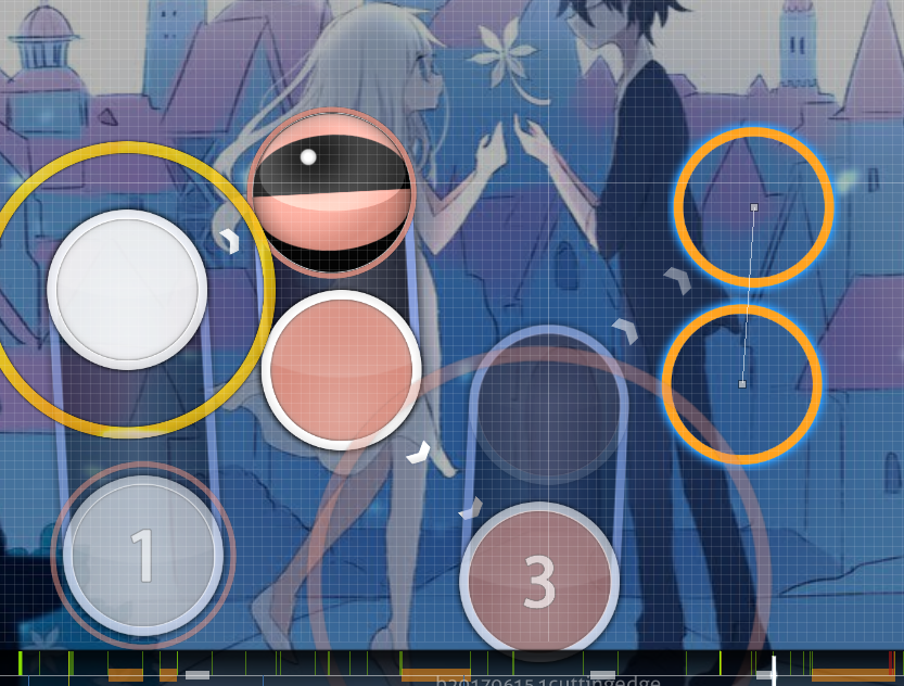
ok all ur blankets in the intro are off by like 5 pixels and its kinda tilting me can u fix them all thx
00:10:912 (2,1) - this jump is huge =( ctrl g on 1 and then 2 after it is fine
00:20:101 (1) - nibba this is the ugliest slider ive ever seen
this isnt even a wub map y u hav wub sliders???
00:25:922 (2) - seems like it would be better as 2 clicks for vocals
also the bell hitsounds are ridiculously loud xd
actually do your hitsound volumes wtf...
00:31:155 (1) - don't like how you have a vocal on the slider end here despite focusing on the vocals in other surrounding areas.
00:37:783 (4) - same here. seems kinda meh
yea so this entire section has this weird issue where its not really clear what you're following. cuz if you're following vocals, you arent doing too good a job of that due to the slider end thing, and if you're following the flute, theres stuff like 00:32:376 - this triple 00:38:655 - this 1/1 slider etc getting ignored.
switching layers, if that's what youre doing, is also suboptimal since it makes it look like you arent following anything properly xd
so basically just decide what to follow and follow that properly
00:49:294 (1) - can u make this thing even
00:58:364 (3) - seems like the hitsounding isnt following the mapping here, or rather, you should put a click here too to match the clap hitsound. or just remove the clap
01:09:701 (4,5) - probably shouldnt be a jump cuz 01:10:050 (6) - is the one you want to emphasize cuz it has a vocal on it
01:11:271 (4) - this is also kinda meh cuz you highlight vocals with the 1/1 sliders but then you put one as unclickable. again, switching layers, kinda lame.
01:14:585 (2,3) - these notes have no emphasis on them, should be different spacing from 4-5 or something
01:17:550 (3,4,5) - this looks like garbage cuz the path of entry is not the same direction as the curve so just ctrl g h j it and itll b ok
01:18:510 - could b nice to follow this thingy
01:20:341 (3) - mute slider end?
01:25:922 (2) - u had jumps for all the other 2, why not here too?
01:33:771 - should b clickable cuz its the same drum as 01:33:946 - imo
01:34:992 (4) - could b nice to make this clicks cuz of vocals
01:40:225 (2,1) - stack mod
01:36:736 (1) - btw putting a 1/3 stream here would be really cute
01:45:806 (3) - would b nice to space this out more cuz its a dfferent clap!
01:49:992 (3,4) - meh wwhat is 4 following... might as well just make 3 a slider to follow the vocals with the holds
01:54:178 (3) - remove clap from repeat plz
01:57:667 - would b more interesting to follow the flute here than just 1/2 spam imo,,,
02:01:068 - circle plz
02:03:422 (2) - slider feels weird af here cuz offbeat and there is something loud on the white tick
02:04:643 (1,2) - i think actually putting doubles here would b a lot easier to read tbh..
02:32:550 (1) - wot whyd u stop mapping after u already started with more dense stuff lol
02:40:922 -
http://puu.sh/wba5s/1a843ea869.jpg nicer rhythm imo!!
02:52:085 (1,2,3) - this pattern is done like you followed the vocals but its 1/2 beat off of following the vocals lol
03:23:480 - this wasnt kiaied over at the other time it happened
03:36:736 (1,2) - can u blnket this better lol
03:39:527 (1,2,3) - this visual spacing looks small af
03:43:713 (1) - again could b cool to follow the flute instead of 1/2 spam
03:55:922 (4,1) - now would have been a nice time to just switch all the way to vocal focus and put a red tick 1/1 slider
04:04:991 (3,4) - slider cuz no vocal on 4?
04:11:532 (9,1) - this is the only time you did this thing until now. all other examples of a 1/4 jump were off of a sliderend so this one is pretty out of place imo.
05:06:387 - this gap is cute but seems a bit drastic. how about mapping these white beats too with circles? that way you get the density lowering effect but it isnt as contrasting to the section
05:17:811 - would b nice to put a note here on the clarinet thing
05:36:648 (5,1) - same issue,,
06:03:618 (1) - the fact that this isnt rotationally symmetrical tilts me
06:11:640 - u could make this a slider so that ppl dont lose acc on it!
06:17:720 (1) - blanket this around the previous circle plz - _ -
lmk when you respond and we can talk further!
 . It's really not necessary to map everything just because you think there's something there.

