forum

Amaryllis - Hiver

posted
Total Posts
19
Topic Starter
donacdum
This beatmap was submitted using in-game submission on October 9, 2017 at 6:03:40 PM

Artist: Amaryllis
Title: Hiver
Tags: liquid dnb drum and bass Surreal Records marathon
BPM: 178
Filesize: 6782kb
Play Time: 05:19
Difficulties Available:
  1. A Feeling Of Euphoria (5.27 stars, 951 notes)
  2. remap (4.92 stars, 108 notes)
Download: Amaryllis - Hiver
Information: Scores/Beatmap Listing
---------------
Music is a moral law. It gives soul to the universe, wings to the mind, flight to the imagination, and charm and gaiety to life and to everything.

Second remap.


Modders
Thanks so much for modding!
#1: lewski
#2: [Soul]
#3: CircleFairy
#4: h4d0uk3n1
#5: Itasha_S13
#6: _sponez
#7: Moku_Hazushi
lewski
mod
00:22:500 (7) - 00:23:849 (7) - 00:25:197 (7) - The song emphasizes the fourth beat of each measure. You've mapped sliderends on those, which doesn't represent the music that well. It's better to have a circle or sliderhead on stronger sounds to emphasize them with the player's clicking. This also happens in both kiai sections like 01:19:129 (5) - and 03:42:027 (7) -
01:18:287 (1) - 01:19:635 (1) - 01:20:983 (1) - There's a sound on the red tick before the sliderend that gets ignored with 3/4 sliders like these
01:39:523 (3) - The stronger fourth beat doesn't stand out in the stream, it could be better to have a 1/4 slider here for emphasis
02:25:028 (1) - 02:38:680 (4) - 02:55:871 (2,3,4) - There don't seem to be sounds here
02:27:725 (1,2,4) - 02:49:298 (1) - 02:54:017 (1) - The stronger sounds are on sliderends
02:34:298 (2) - 04:57:196 (2) - There doesn't seem to be a sound on the sliderhead, the sound gets stronger on the white tick so it could be better to have the slider start there
02:34:804 (3) - 04:57:701 (3) - The sound changes on the large white tick 1/1 after the sliderhead so it could be better to have the slider start there
02:58:231 (6) - You could start a new combo here to indicate the slider velocity change like at 03:04:466 (1) -
03:08:680 (2) - This slider should start 1/2 later because there's a sound there
03:12:893 (5) - This slider should start 1/4 earlier
03:15:253 (6) - This slider should end 1/4 earlier
03:19:719 (1) - This circle should be 1/4 earlier
03:32:444 (1) - This slider should start 1/2 earlier as that's when the sound starts, the emphasis is also on the sliderend
04:19:611 (4,5) - This 1/4 jump is really surprising and the sound on the red tick shouldn't be ignored anyway
04:47:926 (1,4,5) - I don't really know what these are emphasizing
Topic Starter
donacdum

lewski wrote:

mod response
00:22:500 (7) - 00:23:849 (7) - 00:25:197 (7) - The song emphasizes the fourth beat of each measure. You've mapped sliderends on those, which doesn't represent the music that well. It's better to have a circle or sliderhead on stronger sounds to emphasize them with the player's clicking. This also happens in both kiai sections like 01:19:129 (5) - and 03:42:027 (7) - Yeah, I agree. I'll make those 1/2 jumps that emphasize the strong beats.

01:18:287 (1) - 01:19:635 (1) - 01:20:983 (1) - There's a sound on the red tick before the sliderend that gets ignored with 3/4 sliders like these I don't feel like the red tick sound is really loud enough to emphasize. I might change my mind though.

01:39:523 (3) - The stronger fourth beat doesn't stand out in the stream, it could be better to have a 1/4 slider here for emphasis I agree! Added

02:25:028 (1) - 02:38:680 (4) - 02:55:871 (2,3,4) - There don't seem to be sounds here I deleted the circle at 02:25:028 (1) . There is a quite noticeable sound at 02:38:680 (4) , so I left that in. 02:55:871 (2,3,4) I deleted those.

02:27:725 (1,2,4) - 02:49:298 (1) - 02:54:017 (1) - The stronger sounds are on sliderends I agree on the first one, but the other 2 sliders are 3/4 gaps, which would be awkward to play, so I'll keep those.

02:34:298 (2) - 04:57:196 (2) - There doesn't seem to be a sound on the sliderhead, the sound gets stronger on the white tick so it could be better to have the slider start there I didn't do exactly what you said, but I changed up the sliders to be circles because I felt the slidertails didn't actually land on anything.

02:34:804 (3) - 04:57:701 (3) - The sound changes on the large white tick 1/1 after the sliderhead so it could be better to have the slider start there The long slider's head is following the background "bass"(?) so I mapped it to that.

02:58:231 (6) - You could start a new combo here to indicate the slider velocity change like at 03:04:466 (1) - I agree! Fixed

03:08:680 (2) - This slider should start 1/2 later because there's a sound there It seems to start too late 1/2 later, but I moved it 1/4 later and it fits perfectly.

03:12:893 (5) - This slider should start 1/4 earlier I agree! Fixed

03:15:253 (6) - This slider should end 1/4 earlier I agree! Fixed

03:19:719 (1) - This circle should be 1/4 earlier I agree! Fixed

03:32:444 (1) - This slider should start 1/2 earlier as that's when the sound starts, the emphasis is also on the sliderend This link seems to point to a circle, so I'm confused.

04:19:611 (4,5) - This 1/4 jump is really surprising and the sound on the red tick shouldn't be ignored anyway Whoops, that's a placing mistake. Will fix.

04:47:926 (1,4,5) - I don't really know what these are emphasizing I removed the 5, as it didn't make much sense. I feel like the others are noticeable enough.
Thank you very much! :)
lewski

donacdum wrote:

03:32:444 (1) - This link seems to point to a circle, so I'm confused.
Oops, sorry about that. Now that I look at it again, it might actually be correct to move 03:32:191 (4) - and the beginning of 03:32:275 (1) - 1/4 forward.
Topic Starter
donacdum

lewski wrote:

donacdum wrote:

03:32:444 (1) - This link seems to point to a circle, so I'm confused.
Oops, sorry about that. Now that I look at it again, it might actually be correct to move 03:32:191 (4) - and the beginning of 03:32:275 (1) - 1/4 forward.

Fixed.
Gordon
Hey not sure if my mod will help any but here we go :)

Overall a really great alternating map if I could play it. I just find a lot of the patterns repeat a lot of the time so maybe try playing around with different ways to sound out the same thing and different ways of placement.

Really good job :)

Mod
00:24:354 (1,2,3,4,5,6,7,1) - A very small overlap
00:44:579 (1,2,3,4,5,6,7,8,1) - Might add a little over mapping but I'd just stream it out onto the slider. Thus putting a note on the blue tick but make sure it flows to the slider aka 1.
03:19:635 (1,2,3,4,5,6) - Personally I'm picky with my slider placements. That being I hate sliders that dont start on white ticks. But for maps like this I find it fine that some are on reds. I'd just try to see if starting these sliders on the reds could work too. Dont really need to change just something from my observation.
03:41:185 (1,2) - End the slider on the red tick and put a note on the blue. THus making a slider into a close double.
03:42:196 (9,10,11) - I'd probably change this part up note wise. Maybe like a note on the white and a double on the red and blue into the following slider. Play with pattering if you do change it. I just find the space between the original concept to be difficult due to the spacing between the slider from blue to red and then the note on the blue into the slider. There is nothing wrong in doing something like this imo I just find the distance to be a little drastic. But I'm not really an alternating player. Like its fine I'd just it needs a little clafication or something.
03:43:544 (6,7,8) - Same as last input
03:48:937 (8,9,10) - Same as before
03:51:634 (8,9,10) - ^^ Maybe keep some like this and change the patterning and structure on others? Cause this repeats a bit throughout the kiai.

Soul~
Topic Starter
donacdum

[Soul] wrote:

Mod
00:24:354 (1,2,3,4,5,6,7,1) - A very small overlap Fixed

00:44:579 (1,2,3,4,5,6,7,8,1) - Might add a little over mapping but I'd just stream it out onto the slider. Thus putting a note on the blue tick but make sure it flows to the slider aka 1. I tried it and it doesn't really sound good on my end due to no sound on the blue tick.

03:19:635 (1,2,3,4,5,6) - Personally I'm picky with my slider placements. That being I hate sliders that dont start on white ticks. But for maps like this I find it fine that some are on reds. I'd just try to see if starting these sliders on the reds could work too. Dont really need to change just something from my observation. Unfortunately, it sounds off if I move it off the blue tick to either side.

03:41:185 (1,2) - End the slider on the red tick and put a note on the blue. THus making a slider into a close double. Fixed

03:42:196 (9,10,11) - I'd probably change this part up note wise. Maybe like a note on the white and a double on the red and blue into the following slider. Play with pattering if you do change it. I just find the space between the original concept to be difficult due to the spacing between the slider from blue to red and then the note on the blue into the slider. There is nothing wrong in doing something like this imo I just find the distance to be a little drastic. But I'm not really an alternating player. Like its fine I'd just it needs a little clafication or something. Fixed.

03:43:544 (6,7,8) - Same as last input This one needs to stay because it's adding emphasis on the kick.

03:48:937 (8,9,10) - Same as before Fixed.

03:51:634 (8,9,10) - ^^ Maybe keep some like this and change the patterning and structure on others? Cause this repeats a bit throughout the kiai. This one needs to stay because it's adding emphasis on the kick. I'll try to go through my map and find out which one's don't fit and which ones do. Thanks!
Thanks for the mod! :3
CircleFairy
Hi I came from your #modreqs request :3

01:25:871 (5) - I feel like this note can have better placement.
01:28:736 (7) - The slider here looks more neat in the pic below.
01:32:950 (7) - Reverse selection on this slider has better flow.
03:02:107 (3,4,5) - I feel like you can map these sliders better.
03:06:657 (2,3,4) - I don't like this small section it doesn't fit the song.
04:53:993 (4,1) - This doesn't fit with the song either.
04:56:016 (3) - No sound in the song for this note.
05:01:578 (1) - Delete this note and put the heart slider in it's place.

Nice map, hope this helps :-)
Topic Starter
donacdum

CircleFairy wrote:

Hi I came from your #modreqs request :3

01:25:871 (5) - I feel like this note can have better placement. Moved it a bit to make the angle sharper.
01:28:736 (7) - The slider here looks more neat in the pic below.
Sort of fixed. Not a direct stack but an offset stack.
01:32:950 (7) - Reverse selection on this slider has better flow. This makes the jump a really awkward wide angle, so I'll have to deny this.
03:02:107 (3,4,5) - I feel like you can map these sliders better. Fixed.
03:06:657 (2,3,4) - I don't like this small section it doesn't fit the song. This is putting emphasis on the violin, so I need to keep this.
04:53:993 (4,1) - This doesn't fit with the song either. Fixed.
04:56:016 (3) - No sound in the song for this note. I can hear a quite noticeable sound on this beat.
05:01:578 (1) - Delete this note and put the heart slider in it's place. Fixed.

Nice map, hope this helps :-)
Hectic
Hello there! From queue.

A Feeling Of Euphoria
  • Please don't use combo colours #1 and #2 because most of the players play with full background dim and such colours merge with darkness

    Streams look inaccurate, consider using ctrl+shift+f tool to make them smooth and nice

    Try to change direction of flow not randomly, but relatively to the music

    Sometimes distance snapping helps to make map look more polished and smoothier
  1. 00:47:107 (8,9,1) - this kind of movement doesn't support music and doesn't look nice, make this pattern look like a solid bent line
  2. 00:49:214 (3,4) - weird spacing
  3. 01:35:141 (4) - as far as I know, every SV changing should be accompanied by new combo
  4. 01:39:017 (3,4,5,6,1,2,3) - if you decided to make stream like this, make space increase gradually, or it will be misread. Also it should be related to music
  5. 02:34:804 (3) - this slider is quite nice, just move last white dot a little bit to the left and down to make tail not so stuck out
  6. 02:45:590 (3) - make hook roundier
  7. 05:01:578 (1) - can be better
Good luck! Hope you'll find something helpful
Topic Starter
donacdum

h4d0uk3n1 wrote:

Hello there! From queue.

A Feeling Of Euphoria
  • Please don't use combo colours #1 and #2 because most of the players play with full background dim and such colours merge with darkness
    I made both combos a lot brighter, making them easier to see.

    Streams look inaccurate, consider using ctrl+shift+f tool to make them smooth and nice I'll go through the map, trying to look for streams that look off.

    Try to change direction of flow not randomly, but relatively to the music I'm using the direction of flow change to emphasize the start of a new measure (large white tick)

    Sometimes distance snapping helps to make map look more polished and smoothier I'll try this, thanks!
  1. 00:47:107 (8,9,1) - this kind of movement doesn't support music and doesn't look nice, make this pattern look like a solid bent line Fixed
  2. 00:49:214 (3,4) - weird spacing Fixed
  3. 01:35:141 (4) - as far as I know, every SV changing should be accompanied by new combo I will do this, as well as make the slower sliders grey.
  4. 01:39:017 (3,4,5,6,1,2,3) - if you decided to make stream like this, make space increase gradually, or it will be misread. Also it should be related to music It's like this due to the loud hits on each beat when they get larger spacing.
  5. 02:34:804 (3) - this slider is quite nice, just move last white dot a little bit to the left and down to make tail not so stuck out Changed the end of the slider entirely.
  6. 02:45:590 (3) - make hook roundier Fixed
  7. 05:01:578 (1) - can be betterI made this slider before the remap, so I may be scrapping it.
Good luck! Hope you'll find something helpful
Thank you! :)
ItashaS13
hi o//


after le mod, Ill say, I liked the map and hitsounding they're great, but, MORE THAN THAT, I LOVED THE SONG, ITS waaaaaaaaaaaaa now I'm looking for more of Amarillys.. Ahh The song its perfect

  • Le mod
    "A Feeling Of Euphoria" < great diff name lol
    00:21:658 - you don't need a new timing (red) point here, delet this
    00:20:983 (5,1) - http://prntscr.com/f2f4ja you see this? this little overlap? you should try not to make such overlap, because.. ok, playing, you never notice it but, it looks terrible in the editor, and, having a lot of circles overlapped like this makes the map looks ugly, overall, Im not saying you HAVE to change this one but I just point it out, so you don't make the same "mistake" in the future, Im just trying to help, and make your map to look more "clean", because you have tons of circles in the same place of the screen https://osu.ppy.sh/ss/7958987

    00:21:320 (7,1) - 00:21:152 (6,7,1) - the spacing between these objets should be QUITE different, because 6-7 are 1/2 and 7-1 are 1/1, but the spacing it's like.. almost the same

    00:42:725 - until here, the map it's pretty much THE SAME, and it's boring to play over and over and over again the same short stream with the slider at the end with the same spacing and the same flow, try changing some streams to kicksliders or.. making different shapes with the streams or.. delete some sliders at the end of some streams and make them circles, http://prntscr.com/f2f6kf or some kicksliders http://prntscr.com/f2f6qx at the end, it's your decision, if you don't want to change it, dont change it

    00:53:764 (8,6) - this is the kind of overlaps you should avoid, in this case, you can stack the 8 with the 6, this will not change the playability of the map, and it will look cleaner in the editor (and modders/mappers likes this, because if not, the map looks like a mess and theyll ignore it, it's sad I know) Im not saying your map its a total mess, but it's not the most... aesthetic map I've seen (please don't take it bad, Im just tryna help ;-;)

    00:54:017 (1) - See the map from here to here 01:00:169 (4) -
    all of this
    00:54:017 (1,2,3,4,5,6,7,8,1,2,3,4,5,6,7,8,1,2,3,4,5,6,7,8,9,1,2,3,4,5,6,7,8,1,2,3) -
    .. whats "wrong"? imagine someone playing it, the flow it's exactly the SAME, counterclock wise, you make the player go around the screen doing the SAME over and over again, a map should have more variety so the player doesnt get bored, I didnt get bored playing it because I was already in love with the song but.. this is not the case for everyone, and Im sure most of people will say and complain about it

    01:19:635 (1,7) - once again, this is the kind of overlaps you should not make, in this case, move the whole stream to stack the 7 to the 1, and youll see, the map will looks cleaner after that? without changing too much

    01:25:028 (1,7,8,1) - see this bunch of circles in the same place of the screen, they don't looks... nice at all

    01:32:275 (3) - stack the slider head with 01:31:601 (9) - http://prntscr.com/f2f9qr

    01:28:736 (7) - stack its end with the 4

    01:28:062 (2,3,4,5,6,7,8,9) - btw I loved how you mapped this, its soo fun (I wish the beginning had more fun parts... not exactly like this, because this is too much for the beginning, but it means, you can do something BETTER)

    01:33:118 (1) - this slider breaks the flow too hard. is it on porpuse? 01:32:950 (7) - if you move this to the other side of the previous circle, that next slider will play better, something like this maybe ? https://osu.ppy.sh/ss/7959136

    01:34:972 (3,1) - this one kinda breaks the flow too, not as hard as the other but.. but you should try to change it, and make them flow better

    01:37:163 (1) - I don't like this reverse, it's out of nowhere and doesnt really plays well, make it a kickslider and add a triplet after it, with 01:37:416 (2,3) - or something better, it's on you but please, don't keep it :<

    01:39:354 (1) - When I was playing this for first time, and.. even after some plays without seeing this in the editor, I thought the rythm was 1/6 or 1/3 because you add the NC on that circle.. the spacing changes a lot from the previous streams, and the NC makes it looks like it's another time signature. so please, remove the NC so the player knows it's the same 1/4 stream. (apply this to the other streams like this one, there's like 4 streams like this in the whole map)

    01:47:950 (1) - yeah, Im pretty sure if you make this reverse, a kickslider, and add a triplet after it, it would be more fun to play

    03:55:848 (6,3,5,9) - this is the kind of overlaps you should.. try to avoid, stack some circles, here you can stack the kickslider (6) with 03:56:606 (4) -

    03:57:280 (10,1) - btw this.. this is very unconfrtable to play, because the direction of the triplet and the direction of the slider, but more than that, it's because it's in the corner of the screen, you should change it http://prntscr.com/f2fe2h make something like this or idk, you can do something better

    04:07:982 (9,10,1) - same here :thinking:
If you have some .. idk, questions about the mod or... if you need more help, catch me in game, Ill be happy to help more on this map, because the song its 10/10

I hope you find something helpful tho
Topic Starter
donacdum

Itasha_S13 wrote:

hi o//


after le mod, Ill say, I liked the map and hitsounding they're great, but, MORE THAN THAT, I LOVED THE SONG, ITS waaaaaaaaaaaaa now I'm looking for more of Amarillys.. Ahh The song its perfect

  • Le mod
    "A Feeling Of Euphoria" < great diff name lol thx
    00:21:658 - you don't need a new timing (red) point here, delet this fix
    00:20:983 (5,1) - http://prntscr.com/f2f4ja you see this? this little overlap? you should try not to make such overlap, because.. ok, playing, you never notice it but, it looks terrible in the editor, and, having a lot of circles overlapped like this makes the map looks ugly, overall, Im not saying you HAVE to change this one but I just point it out, so you don't make the same "mistake" in the future, Im just trying to help, and make your map to look more "clean", because you have tons of circles in the same place of the screen https://osu.ppy.sh/ss/7958987 fix

    00:21:320 (7,1) - 00:21:152 (6,7,1) - the spacing between these objets should be QUITE different, because 6-7 are 1/2 and 7-1 are 1/1, but the spacing it's like.. almost the same fix

    00:42:725 - until here, the map it's pretty much THE SAME, and it's boring to play over and over and over again the same short stream with the slider at the end with the same spacing and the same flow, try changing some streams to kicksliders or.. making different shapes with the streams or.. delete some sliders at the end of some streams and make them circles, http://prntscr.com/f2f6kf or some kicksliders http://prntscr.com/f2f6qx at the end, it's your decision, if you don't want to change it, dont change it fix

    00:53:764 (8,6) - this is the kind of overlaps you should avoid, in this case, you can stack the 8 with the 6, this will not change the playability of the map, and it will look cleaner in the editor (and modders/mappers likes this, because if not, the map looks like a mess and theyll ignore it, it's sad I know) Im not saying your map its a total mess, but it's not the most... aesthetic map I've seen (please don't take it bad, Im just tryna help ;-;) fix

    00:54:017 (1) - See the map from here to here 01:00:169 (4) -
    all of this
    00:54:017 (1,2,3,4,5,6,7,8,1,2,3,4,5,6,7,8,1,2,3,4,5,6,7,8,9,1,2,3,4,5,6,7,8,1,2,3) -
    .. whats "wrong"? imagine someone playing it, the flow it's exactly the SAME, counterclock wise, you make the player go around the screen doing the SAME over and over again, a map should have more variety so the player doesnt get bored, I didnt get bored playing it because I was already in love with the song but.. this is not the case for everyone, and Im sure most of people will say and complain about it fix, basically redid the entire section

    01:19:635 (1,7) - once again, this is the kind of overlaps you should not make, in this case, move the whole stream to stack the 7 to the 1, and youll see, the map will looks cleaner after that? without changing too much fix

    01:25:028 (1,7,8,1) - see this bunch of circles in the same place of the screen, they don't looks... nice at all fix

    01:32:275 (3) - stack the slider head with 01:31:601 (9) - http://prntscr.com/f2f9qr fix

    01:28:736 (7) - stack its end with the 4 fix

    01:28:062 (2,3,4,5,6,7,8,9) - btw I loved how you mapped this, its soo fun (I wish the beginning had more fun parts... not exactly like this, because this is too much for the beginning, but it means, you can do something BETTER) thx

    01:33:118 (1) - this slider breaks the flow too hard. is it on porpuse? 01:32:950 (7) - if you move this to the other side of the previous circle, that next slider will play better, something like this maybe ? https://osu.ppy.sh/ss/7959136 fix

    01:34:972 (3,1) - this one kinda breaks the flow too, not as hard as the other but.. but you should try to change it, and make them flow better fix

    01:37:163 (1) - I don't like this reverse, it's out of nowhere and doesnt really plays well, make it a kickslider and add a triplet after it, with 01:37:416 (2,3) - or something better, it's on you but please, don't keep it :< fix

    01:39:354 (1) - When I was playing this for first time, and.. even after some plays without seeing this in the editor, I thought the rythm was 1/6 or 1/3 because you add the NC on that circle.. the spacing changes a lot from the previous streams, and the NC makes it looks like it's another time signature. so please, remove the NC so the player knows it's the same 1/4 stream. (apply this to the other streams like this one, there's like 4 streams like this in the whole map) fix

    01:47:950 (1) - yeah, Im pretty sure if you make this reverse, a kickslider, and add a triplet after it, it would be more fun to play fix

    03:55:848 (6,3,5,9) - this is the kind of overlaps you should.. try to avoid, stack some circles, here you can stack the kickslider (6) with 03:56:606 (4) - fix

    03:57:280 (10,1) - btw this.. this is very unconfrtable to play, because the direction of the triplet and the direction of the slider, but more than that, it's because it's in the corner of the screen, you should change it http://prntscr.com/f2fe2h make something like this or idk, you can do something better fix

    04:07:982 (9,10,1) - same here :thinking: fix
If you have some .. idk, questions about the mod or... if you need more help, catch me in game, Ill be happy to help more on this map, because the song its 10/10

I hope you find something helpful tho >I hope you find something helpful

lmao
_sponez
Hello!

  1. 00:23:511 (3,4,5,6,7) - https://osu.ppy.sh/ss/8050273
  2. 00:27:556 (3,4,5,6,7) - ^.
    In these flows straight sliders look bad, as in other similar.
  3. 00:34:298 (2,3,4,5,6) - Few align.
  4. 00:39:691 (3,4,5,6,7) - ^.
  5. 00:52:500 (8,9,1) - better https://osu.ppy.sh/ss/8050310.
  6. 01:00:590 (8,9,1) - ^.
  7. 01:45:759 (3,1) - https://osu.ppy.sh/ss/8050328.
  8. 02:00:590 (3,4,5,6,7) - Crooked.
  9. 03:21:405 (4) - https://osu.ppy.sh/ss/8050363.
  10. 04:40:173 (6,7,8) - - https://osu.ppy.sh/ss/8050372.
  11. 04:18:095 (3,4,5,6,7) - Crooked.
  12. 04:40:173 (6,7,8) - Similary 04:40:173 (6,7,8).
Topic Starter
donacdum

_sponez wrote:

Hello!

  1. 00:23:511 (3,4,5,6,7) - https://osu.ppy.sh/ss/8050273
  2. 00:27:556 (3,4,5,6,7) - ^.
    In these flows straight sliders look bad, as in other similar.
  3. 00:34:298 (2,3,4,5,6) - Few align.
  4. 00:39:691 (3,4,5,6,7) - ^.
  5. 00:52:500 (8,9,1) - better https://osu.ppy.sh/ss/8050310.
  6. 01:00:590 (8,9,1) - ^.
  7. 01:45:759 (3,1) - https://osu.ppy.sh/ss/8050328.
  8. 02:00:590 (3,4,5,6,7) - Crooked.
  9. 03:21:405 (4) - https://osu.ppy.sh/ss/8050363.
  10. 04:40:173 (6,7,8) - - https://osu.ppy.sh/ss/8050372.
  11. 04:18:095 (3,4,5,6,7) - Crooked.
  12. 04:40:173 (6,7,8) - Similary 04:40:173 (6,7,8).
Fixed everything!
Moku_Hazushi
(From my modding queue~)

Hey there, really nice song and the mapping fits it well ;3 I did my best for the mod but the mapping is complex (i mean during the kiai) and this is not my main game mod sooo i hope it will be useful anyway owo)/

A Feeling of Euphoria


00:20:983 (5) - Add a clap here

00:21:152 (6,7) - Maybe stack them i think it goes a bit better with the drum, also this way you can keep spaced note for 1/1 mapping like 00:21:657 (1,2) or 00:23:006 (1,2) during the first section

00:29:747 (1,2) - This spacing is a bit weird, if you look at the similar previous circles you have
00:21:657 (1,2) - 1x
00:23:006 (1,2) - 1x
00:24:354 (1,2) - 1x
00:25:702 (1,2) - Increasing 1.2x
00:27:051 (1,2) - 1.2x
00:28:399 (1,2) - Increasing 1.3x
So i think 00:28:399 (1,2) should also be 1.3x spacing

00:31:096 (1,2) - Same remark

00:33:792 - I think its important the player hit a circle here to stay consistent with the previous patterns

00:39:186 (1,2,3) - Make (2) closer from (3) and farther from (1)

00:41:882 (1,2) - Maybe space them a little, this is the last pattern of the introduction section

00:43:230 - Remove that kiai from the timing section :p

00:45:422 (6,7,8,1,2) - During the test playing i found this rythm a bit confusing, but okay it might be me since 5.2 is just a bit above my current STD level. But maybe you can go for this rythm mapping to get it less confusing if you want


As you can see, the idea is simply to use the second rythm twice, the thing later on in this section you are using this rythm several times at 00:51:320 (1,2) or 00:56:714 (1,2) so i think its better to prioritize it over the first one

00:49:214 (3) -Just a suggestion, i dont really feel its a good moment for a very short slider so maybe switch it for a coming back slider like this :
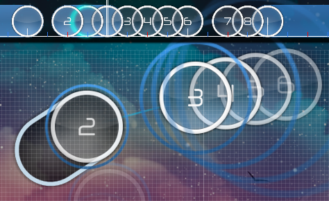

00:59:916 (2,3) - Same suggestion

01:18:792 (3,4) - Maybe make them a bit closer, otherwise it almost seems they have the same spacing as 01:19:129 (5,6,7) while its completly different rythm

01:24:354 (1) - Just an esthetic thing, i think you should make this curvy to emphasize the slider velocity change

01:25:534 (3,4) - Same thing as 01:18:792

01:28:736 (7) - I think you should make them 2 circles connected to 01:28:905 (8,9) as a stream before 01:29:073 (1) The idea is to mark the middle of the kiai

01:40:534 (1,2,3) +
01:41:039 (4,5,1) - I think you should stack them to differentiate from the 4-circle stream you had in different patterns before

01:44:579 (4) - Move it just a bit to the right i think to make it closer from (3) and (5), also for the same idea as 01:18:792

01:45:927 (1) - Same as 01:24:354

01:48:202 (2,3) - Im note sure you should stack them, the drum is not suggesting any stack and the player might loose the tempo with it, i would recommend to make it a jump

02:03:961 (9,10) - I would have seen a slider instead of simple circles here. During the kiai, before those long slider either you use several different patterns either more based on stream or slider or both, and i think you should use the slider approach a bit more

02:13:230 (6,7,1) - What about removing all whistle HS for those, and adding clap at every slider head ? We approach the end of the kiai so i think it could be interesting to emphasize the clap hit sounding a bit more

02:26:377 (4) - I you want to map the small voice in the background you should make it a slider until 02:26:629

03:06:657 (2,3) - I think you should make them a single coming back slider to match better with the violin

03:07:500 (4) - This one really feels like a ghost circle, i'd move it to 03:07:332

03:43:038 (3,4) - Same remark as 01:18:792

03:57:870 (3) - Just esthetic thing, i think you should align the slider with the next one

04:03:432 (1,2,3) +
04:03:938 (4,5,1) - Same remark as the previous kiai, maybe stack them

04:11:100 (2,3) - Well this time you didnt stack them but maybe make it a jump (even small)

04:26:859 (9,10) - Same remark as 02:03:961

Nice map, sorry i cant really evaluate the difficulty spread since this is above my level but it seems alright anyway. The kiais are really intense and the hitsounding is well done. Just maybe find a finish sound to add at every kiai beginning it could be great :3
Topic Starter
donacdum

Moku_Hazushi wrote:

(From my modding queue~)

Hey there, really nice song and the mapping fits it well ;3 I did my best for the mod but the mapping is complex (i mean during the kiai) and this is not my main game mod sooo i hope it will be useful anyway owo)/

A Feeling of Euphoria


00:20:983 (5) - Add a clap here fix

00:21:152 (6,7) - Maybe stack them i think it goes a bit better with the drum, also this way you can keep spaced note for 1/1 mapping like 00:21:657 (1,2) or 00:23:006 (1,2) during the first section fix

00:29:747 (1,2) - This spacing is a bit weird, if you look at the similar previous circles you have fix

So i think 00:28:399 (1,2) should also be 1.3x spacing fix

00:31:096 (1,2) - Same remark fix

00:33:792 - I think its important the player hit a circle here to stay consistent with the previous patterns I think it's more important to emphasize the new sound that came in, it's quite noticeable, and the sliders help that, so doing 2 sliders then cutting off one early seems weird.

00:39:186 (1,2,3) - Make (2) closer from (3) and farther from (1) fix

00:41:882 (1,2) - Maybe space them a little, this is the last pattern of the introduction section fix

00:43:230 - Remove that kiai from the timing section :p adds emphasis to the new section of music

00:45:422 (6,7,8,1,2) - During the test playing i found this rythm a bit confusing, but okay it might be me since 5.2 is just a bit above my current STD level. But maybe you can go for this rythm mapping to get it less confusing if you want

As you can see, the idea is simply to use the second rythm twice, the thing later on in this section you are using this rythm several times at 00:51:320 (1,2) or 00:56:714 (1,2) so i think its better to prioritize it over the first one
there's a quite noticeable sound on the white tick, so I shouldn't go through it

00:49:214 (3) -Just a suggestion, i dont really feel its a good moment for a very short slider so maybe switch it for a coming back slider like this :
fix

00:59:916 (2,3) - Same suggestion fix

01:18:792 (3,4) - Maybe make them a bit closer, otherwise it almost seems they have the same spacing as 01:19:129 (5,6,7) while its completly different rythm you only have to click on the slider heads due to slider leniency, so you play them like normal jumps, it's the 1/4 sliders to add emphasis.

01:24:354 (1) - Just an esthetic thing, i think you should make this curvy to emphasize the slider velocity change I have the grey color combo plus the new combo that already emphasizes it

01:25:534 (3,4) - Same thing as 01:18:792 same response

01:28:736 (7) - I think you should make them 2 circles connected to 01:28:905 (8,9) as a stream before 01:29:073 (1) The idea is to mark the middle of the kiai the 1/4 slider is emphasizing the kick and bass on them

01:40:534 (1,2,3) +
01:41:039 (4,5,1) - I think you should stack them to differentiate from the 4-circle stream you had in different patterns before fix

01:44:579 (4) - Move it just a bit to the right i think to make it closer from (3) and (5), also for the same idea as 01:18:792 fix

01:45:927 (1) - Same as 01:24:354 same response

01:48:202 (2,3) - Im note sure you should stack them, the drum is not suggesting any stack and the player might loose the tempo with it, i would recommend to make it a jump fixed slightly, unstacked it

02:03:961 (9,10) - I would have seen a slider instead of simple circles here. During the kiai, before those long slider either you use several different patterns either more based on stream or slider or both, and i think you should use the slider approach a bit more I usually use the slider to emphasize the kick/bass that sometimes plays, but there's only a quiet stream, so there's no point for the slider there

02:13:230 (6,7,1) - What about removing all whistle HS for those, and adding clap at every slider head ? We approach the end of the kiai so i think it could be interesting to emphasize the clap hit sounding a bit more It sounds really off on my end since the clap is too early

02:26:377 (4) - I you want to map the small voice in the background you should make it a slider until 02:26:629 fix

03:06:657 (2,3) - I think you should make them a single coming back slider to match better with the violin fix

03:07:500 (4) - This one really feels like a ghost circle, i'd move it to 03:07:332 fix

03:43:038 (3,4) - Same remark as 01:18:792 same response

03:57:870 (3) - Just esthetic thing, i think you should align the slider with the next one fix

04:03:432 (1,2,3) +
04:03:938 (4,5,1) - Same remark as the previous kiai, maybe stack them fix

04:11:100 (2,3) - Well this time you didnt stack them but maybe make it a jump (even small) emphasizing the two drum sounds

04:26:859 (9,10) - Same remark as 02:03:961 same response

Nice map, sorry i cant really evaluate the difficulty spread since this is above my level but it seems alright anyway. The kiais are really intense and the hitsounding is well done. Just maybe find a finish sound to add at every kiai beginning it could be great :3 thank you!

Net0
Really late small mod
[ A Feeling Of Euphoria ]
  1. 00:49:129 (2,3,4,5,6) – The emphasis here should be on the 00:49:635 (6) – it stands out way more compared to 00:49:382 (3,4,5) – imo.
  2. 01:34:972 (3,1) – improve the blanket
  3. 01:39:523 (9,1) – the gap here is really off considering the song is progressively increasing its intensity there, especially considering ending it on the kick on the blue tick. Same goes for this 02:22:669 (9,1) – and other similar transitions.
  4. The overlap here 02:11:714 (7,1) – looks really unpolished considering how you did most of your patterns. Move 02:12:556 (2) – to stack with 02:11:714 (7) – sliderhead, and rotate the slider 02:12:219 (1) –
  5. 02:12:725 (3,4,5,6,7) – Here there are 4 kicks, in which 3 of them express the same musical sound 02:12:725 (3,4,6) – and the final one is mapping something entirely different 02:13:399 (7) -. It could work better if 02:13:399 (7) – was a circle instead, for both musical representation as well as spacing possibility.
  6. The NCing here 03:58:039 (1,1,2,3,1) – was a bit confusing to me. What was the point of the NC here 03:58:376 (1) - . I know it repeats itself a lot of times, but this time not having the sv change here made it really off. If you want to keep it for consistency I’m fine with it, just warning you that it felt off.
Map is really consistent and there isn’t that much to mod since I agree with visual and spacing most of the time. Good luck o/
Topic Starter
donacdum
Thanks for the mod, but I'm probably going for a full remap again.
BanchoBot
This modding thread has been migrated to the new "modding discussions" system. Please make sure to re-post any existing (and unresolved) efforts to the new system as required.
Please sign in to reply.

New reply