19:30 Smolboi: i think i'll just do it IRC
19:30 Juiceys: Does your map have hitsounds?
19:30 Smolboi: not yet
19:30 Smolboi: i'm lazy
19:30 Juiceys: Lol do u want me to hitsound it for you?
19:30 Smolboi: fuck it
19:30 Smolboi: if you got some nice hitsounds then sure
19:30 Smolboi: On normal
19:30 Smolboi: 00:26:608 - this should have a note on it
19:31 Juiceys: Eh i'd probably just use normal hitsoudns
19:31 Juiceys: Hm you'd probably want some custom hitsounds
19:31 Smolboi: i don't really care
19:31 Smolboi: whatevery you think sounds nice n chill
19:31 Juiceys: Ya hitsounds are dumb
19:32 Smolboi: 00:31:648 - idk whats up with the kiai here
19:32 Juiceys: Idk a BN told me to do that
19:32 Juiceys: xdd
19:32 Smolboi: lol
19:34 Juiceys: Fixed the 00:26:608 thing
19:35 Juiceys: This is a pretty chill song you picked out
19:35 Juiceys: I like it
19:36 Smolboi: i actually did it because i speedmapped a Gd for a friend without asking him
19:36 Smolboi: he shot it down
19:36 Smolboi: i was like "fuck it, i'll make my own set
19:36 Juiceys: Aw
19:36 Juiceys: Nice
19:36 Juiceys: sounds fun lol
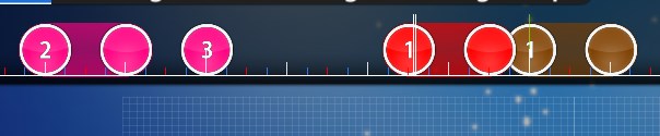
19:36 Smolboi: 00:34:288 - sound nicer like this
http://prnt.sc/ec9ylc19:37 Juiceys: What diff
19:37 Smolboi: lowest
19:37 Juiceys: k
19:37 Smolboi: 00:48:448 - could put a note here at the start of the spinner
19:37 Smolboi: on to the advanced
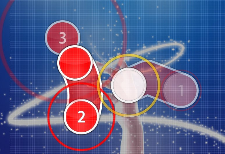
19:40 Smolboi: 00:17:248 (1,2,3) - sounds nicer like this
http://prnt.sc/ec9zng19:41 Smolboi: 00:30:208 (1,2) - this blanket could look nicer
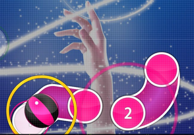
19:41 Smolboi: 00:36:448 (1,2,3,4,5) - not sure what sliders are emphasizing here
19:41 Smolboi: they kinda just happen whenever
19:42 Smolboi: 00:48:448 - same remark about last map
19:42 Smolboi: could put a not on the begining of the spinner
19:42 Smolboi: note*
19:42 Smolboi: on to the hard
19:43 Smolboi: 00:08:608 (1) - this slider ends one tick too late
19:43 Smolboi: it should end on the red tick
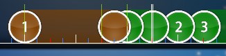
19:43 Smolboi: 00:16:048 (2,3,4) - i'd just stack these, considering that this is only a hard
19:44 Smolboi: 00:33:328 (3,4) - blanket
19:44 Smolboi: 00:44:128 (1,2,3,4,5) - sliders are confusing again
19:45 Smolboi: and thats about it
19:45 Smolboi: i'd go back and look out for blankets, i think i saw a few others that looked funky
19:45 Smolboi: otherwise, pretty nice
19:45 Smolboi: osu needs more meme maps
19:45 Juiceys: Alright cool


