hi m4m from ur queue~
sorry for being late ;w;
okay that's all from me~
well, you have a good choice of songs xd I also like Yuuki no Pendant I modded before
And also I like how you map the chorus with the double bpm mapping. Good job~
Here take some stars o/
Good Luck~
sorry for being late ;w;
A Thousand Fated Connections
- Hitsound "normal-hitclap2.wav" have a long empty sound after the sound (about 1400ms). It was highly recommended to cut it to reduce the file size. I've cut the empty part for you
 here it is ~ normal-hitclap2.wav
 - 00:26:342 (6,7) - Maybe you want to follow the instrument there, but how about using a combination of instrument and vocal ? Simply cut 00:26:450 (7) - into a 1/2 slider and put its start on the white tick and add a circle on the blue tick. This combination also can increase the "player experience" when playing it.
- 00:30:472 (1) - Don't really get the idea about using a 1/4 reverse slider here. I didn't hear any sound on t he 1/4 point that deserve a note. I think a 1/2 slider would fit better here.
- 00:38:081 (1) - I understand that you want to make a sliderart here, but ignoring the vocal doesn't seem a good idea though since the vocal was your main asset on this calm part and I see you didn't ignore it on this calm part except for this one. So I suggest to not ignore it here too.
- 00:46:994 (6) - Good one, but doesn't really fit to this calm part of the song with those sharp angles. 2 circles like 00:50:472 (6,7) - would be good.
- 00:48:515 - The pitch increase on the vocal seems deserve a click instead of just a slider tail. and also I heard a drum sound there, it makes this point deserve more to be clicked. how about using this pattern for 00:47:863 (1,2) - ?
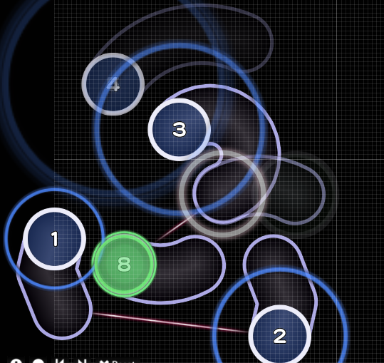
- 00:58:298 (1,2,3) - Without any transition, this 1/4 spacing feels so sudden. Personally, I think it breaks the spread between notes. These notes can be a transition key from the calm part into "a bit hard" part. You can make them play more calmer by reducing their spacing and movement. Like this maybe ?
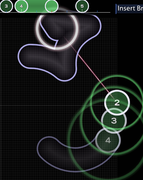
- 01:46:994 (1,2,3) - their spacing is almost similar to each other but they snapped differently. It feels a bit confusing to play. I suggest to increase the spacing between (1) and (2) since their gap was 1/2. Same goes for 01:47:863 (4,5) - .
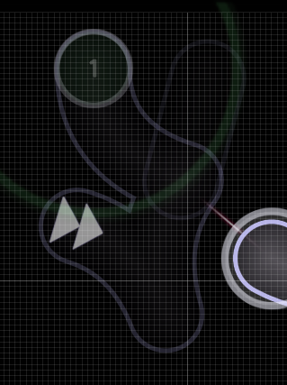
- 01:58:081 (2) - ctrl+g ? I think it flows better.
- 02:20:254 (2) - Did you forgot the whistle here ?
- 02:21:776 (1) - Like I said before on 00:30:472 (1) -
- 02:22:211 (2,3) - This movement stop seems unreasonable. Nothing in the song that indicate it. And also you didn't stop the movement on 00:30:907 (2,3) - . I think we don't need to stop the movement here too.
- 02:35:689 (1,2,3) - Also like I said before on 00:58:298 (1,2,3) -
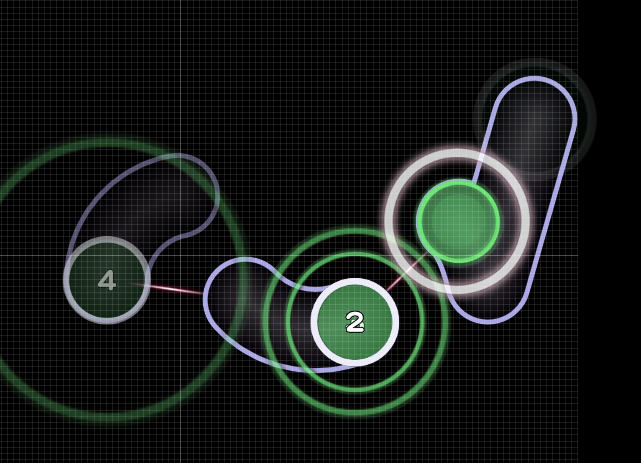
- 02:48:950 (7,1) - This spacing is too low to indicate that it was snapped 1/2. And the spacing is similar to 02:49:167 (1,2) - , a bit confusing if I can say. how about move 02:49:167 (1) - somewhere else ? on 02:49:602 (1) - 's head maybe ?
- 03:13:297 (6) - You can increase the flow and movement here. The current one feels a bit "sharp" if I can say. give a bit curve on the head like this maybe ?
- 03:24:385 (1) - I know it doesn't touch the hp bar. But still, isn't this slider is a bit "too high" ? And if we use 4:3 screen resolution, it touches the score bar. I suggest to move it lower a bit.
- 04:05:906 (8) - Move it further. It's hard to indicate that its gap from the previous slider was 1/2. You're doing good on 04:07:646 (4) - . Maybe you can apply that an this point too.
- 04:40:689 (4,1) - Ugh.. This movement transition doesn't connected to each other. And it feels weird to play. Maybe change the direction of (4) like this ?
okay that's all from me~
well, you have a good choice of songs xd I also like Yuuki no Pendant I modded before
And also I like how you map the chorus with the double bpm mapping. Good job~
Here take some stars o/
Good Luck~

 Instead, since it's a sound that is repeated three times (01:50:472 - , 01:51:341 - , 01:52:211 - ) perhaps repeat 01:50:472 (1,2) - rhythm three times. Also 01:51:341 - is weaker than the other two, it should be emphasized lesser than the other two.