Thanks and thanks again for the star! 
Thanks. Hope you'll read this again.Nao Tomori wrote:
well, sb itself is apparently rankable, lets see the map.
[insane]
i had quite a few issues with different aspects of the map. pointing out every instance of something is a bit idiotic, so i will instead organize this mod into sections with examples for each.
disclaimer: these are entirely my opinion, and are for the most part stylistic or aesthetic issues. none of this is objectively unrankable, but to me, subjectively lowering the quality of the map significantly. Let's see then..issue one visual spacing
basically you have a ton of conflicting and randomly changing visual spacing that makes the map look pretty disorganized and messy (to me.)
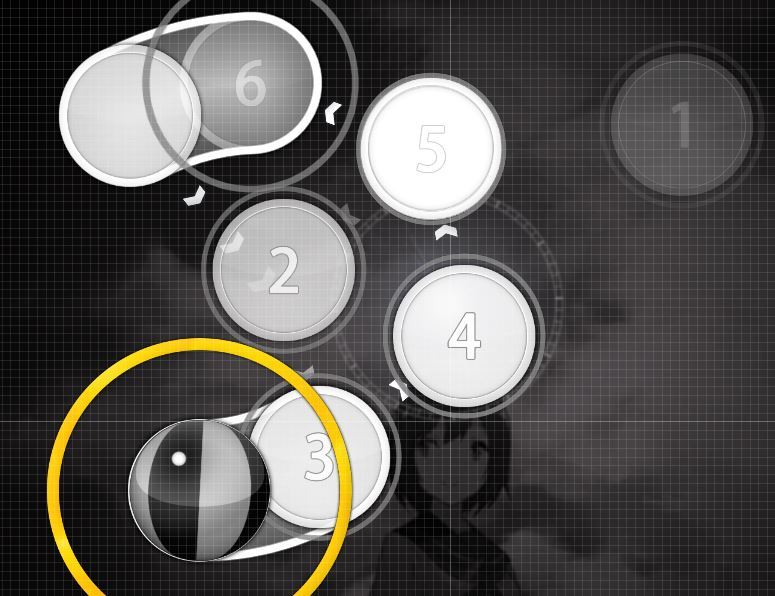
for example, 00:01:961 (4,5,6) - . < (Here the voice has higher tone, so i intentionally made a little jump, imo it's not a spacing fault, this jump has a sense) the spacing between 00:01:628 (3,4) - and 00:02:461 (5,6) - is very different, though the pattern (a slider going into a blanket) is the same. This is based on the voice pitch/tone in general. That should be okay.
assorted other examples
01:29:294 (3,2) - vs 01:29:794 (1,4) - I got it fixed.
01:30:628 (5,7,8) - Fixed too.
02:00:961 (2,1,3) - I guess this one is fine, opinion ?
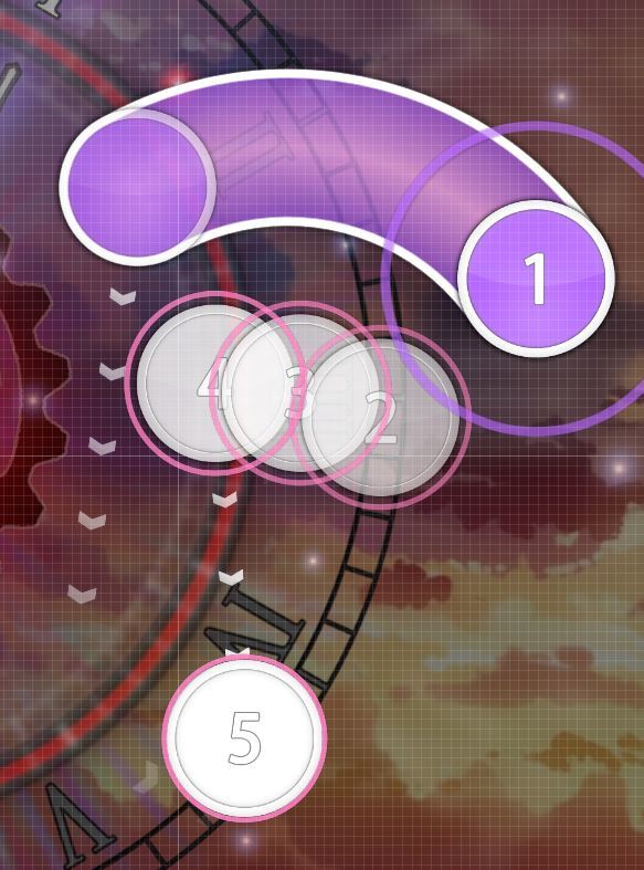
02:51:628 (2,3) - spacing here should be similar to 02:51:794 (3,5) - spacing between these bodies.I don't get it, the spacing here in the whole part is 1,25x constantly 02:51:628 (2,3,4,5,6,7) - What do you want me to do ?
02:57:961 (5,6,7) - Not much i can do about this one. :/ Any idea ?
02:58:628 (7,8,1) - Can't really change this since i must keep this stack 02:58:294 (6,8) - unless you have a better idea ?
in essence i'm complaining that the space between slider bodies is different and it looks bad. it seems like you didn't really use this as an element while mapping this, so this issue appears in a lot of places.issue two patterning and angles
a lot of the patterns to me, do not look like patterns, or play like patterns. this is due to them having inconsistent angles and different visual spacings, as well as being on different "planes."
00:18:794 (7,1) - for example.this is a diagram of the "planes" that i see the sliders on. they are at a wide angle, and one that does not really "harmonize" in my opinion. in other words, i think it looks bad. Arranged the whole pattern, tell me if this is better ?
00:36:961 (3,2) - we can see similar issue here where the plane is not the same and there isn't a larger pattern justifying it (like a triangular pattern, or a square, or something.) Hopefully fixed.
00:43:294 (1,2,3,4,5) - this pattern has vastly different angles. 1>2>3 is a sharp angle, but 3 4 5 is a really wide one. in addition, the pattern itself has inconsistent spacing, so it looks pretty messy. I don't really see anything wrong here, but i'm thinking if it could be changed, but i'm not even sure, so help ?
this issue is even more apparent during kiai time, with patterns like
01:18:628 (3,4,1,2,3) -
changing angles abruptly and seemingly randomly. I think this one is fine, unless you find a better idea wich could fit better ? 01:18:628 (3,4,1) - being a very sharp angle, 01:19:128 (1,2,3) - being a 90 degree one. Everything can't be perfect, i'm not trying to make a perfect map with perfect coordinates, but if you find something better to replace this, just let me see.
01:24:461 (1,2,3,4,5,6,7,8,9) - That one is and will remain fine.
01:40:794 (2,3,4,1,2) - changing from a pentagonal pattern into something with wider angle and spacing I guess that's fine ?
02:09:961 (1,2,3,4,5) - doesn't really make a shape at all, changing spacing and angle. I didn't really wanted to have a particular shape here, but i used to have a spacing related to the drums. wich i just fixed my spacing error at 02:10:294 (3,4,5) -
03:21:794 (1,2,3,4,5,6,7) - I admit that one can be a tiny bit weird, but i don't know how to do better.
it's evident that you mostly used stacking to determine the note placement. this causes my issue, which is the use of incredibly different angles on the same thing. different angles means different cursor movement, which conveys a different feeling of the song to a player. therefore, imo, using similar types of cursor movement for similar parts of the song is the most important part in a map. i think that this is not used here, which is why i think the patterning is an issue in this map.issue three use of rotational flow
well, we already talked about this. however, i think it's an issue worth talking about again. basically, you use flow that goes in the same rotational direction (clockwise or counterclockwise) for extended periods of time. in addition, the changes themselves appear to be somewhat inconsistent.
00:24:294 (5,6,7,8,1) - starting here, you use counterclockwise flow till 00:30:961 - . i don't think 00:30:961 - is a good time to change flow, since imo the change in the song actually occurs at 00:29:961 - where the 2nd half of the first melody in the kiai starts.
anyway, it's then clockwise flow all the way until 00:44:461 - which is a much larger stretch of the same type of flow.
the bigger issue is with 01:17:961 - this kiai. since you use counterclockwise flow all the way until 01:30:211 - . i think that's not a particularly good time to change flow directions, since the new verse starts at 01:28:628 - instead. however, i think that using the same direction from for 11 seconds is also not a particularly good use of flow in the first place. because the next time the flow changes is at 01:33:961 - which is a mere 3 seconds away from the previous one. therefore it seems rather inconsistent.
finally, 03:15:294 - this entire kiai is clockwise. i think you should add in at least one flow change, if not more, since spinning in a circle for 20 seconds is not a particularly enjoyable experience for a player. For this tird issue: Is this a real problem for the gameplay ? That's unrankable ? It MUST be changed ?conclusion
these are the main places i believe this map has room to improve. it's entirely possible you disagree with me completely - our style appears to be rather different, and our thoughts on mapping might be as well. however, i think the points i bring up are worth considering, since they tend to apply throughout the entire map. please pm me if you have questions or want to talk further about the map, or my mod. I have fixed what needed to be fixed, but i'll need your help for the orange quotes i left just above.

Imo you don't have to make perfect shapes (like perfect triangles, squares, pentagons, etc), but using basic patterns help keep the jump angles more consistent and also help the map look more aesthetically pleasing.It's not unrankable, it's just that you're not using rotational flow to its potential. It's highly recommended to change the direction of the flow to emphasize downbeats, or the most intense parts. A good map uses as many techniques as it can to follow the song. Flow is one of the most important ones.
finally, 03:15:294 - this entire kiai is clockwise. i think you should add in at least one flow change, if not more, since spinning in a circle for 20 seconds is not a particularly enjoyable experience for a player. For this tird issue: Is this a real problem for the gameplay ? That's unrankable ? It MUST be changed ?
Thanks!Ohwow wrote:
Hi modding cause i like the song and SB
[Storyboard]
00:21:628 - The growth of the circle/ring is not smooth at this spot, should be a smooth transition (use easing?) Intentionnal.
It would be awesome if the time on the clock stayed consistent throughout the whole song. At 01:39:294 - should continue at 12:40 (or at 1:00 to round it up) and 03:15:294 - should continue at 5:00, 03:36:628 - same, etc etc. Yeah, but i won't do that because of the big downbeats must start with the minute-hand on XII
[General]
Too much kiai, I suggest removing kiai on 00:24:628 and 01:39:294 . Not a big deal though, so it's k if disagree There are just enough.
[Insane]
00:19:961 (3,4,5,6) - Notice the angle of the jumps. It'd be better if you made the angles consistent like this (doesn't have to be exactly like this if you change it): https://i.gyazo.com/dd83cabeffa89acfe8e ... 573c9f.jpg That's fine how i did.
00:21:128 (7,8) - I feel like the slider should start on the red tick to match the vocal. (delete 7) That's just fine like that, i'm not going to change this.
I think the main problem of this diff is that you used a lot of wide angle jumps where sharp angles would be feel better to play. For example, 00:27:294 (1,2,3,4,5,1) - the circular motion here is really slow here (only completing 1 circular rotation). If you change it something like this, now the circular motion is faster (completing 2 circular rotations): https://i.gyazo.com/68dd9989ca0121db3db ... 94aace.jpg That's going to be a rude angle.
00:34:128 (2,3,4,1,2,3,4) - Don't make this back and forth, it somewhat ruins the circular flow in that little jump section. Unchanged.
00:36:961 (3,2) - Why don't u copy 1 of them and then rotate it 120 degrees, it makes it a cleaner triangular pattern. That's already fine like that, i don't need to adjust this again.
01:10:461 (2,3) - delete (3) and if you want you can make (2) into a slider. (to follow the vocal) This must be clicked, as there's a string sound on it.
01:10:961 (4) - delete note? No. There's something on it.
01:30:128 (2,3,4,5,6,7) - change it to something like this so it looks less random: https://i.gyazo.com/7e3fbebbf30242edc39 ... b2c405.jpg I don't appreciate that much, and i'm not a big fan of super perfect patterns with a quarter of a millimeter precision.
01:35:128 (1,3,4) - Looks better: https://i.gyazo.com/9c0263996ff421c2017 ... a991cf.jpg No. The angle with 01:34:628 (4,1) - will be even worst.
01:43:794 (4,1,2) - Another wide angle jump that looks aesthetically unpleasing You don't seem to realize my mapping is mostlyrelated to the drums in the most of the parts. So for this pattern, i'll leave it like that.
01:57:961 - death stream probably too much for its difficulty? maybe add some repeating sliders. That's fine for Insane.
02:06:628 (3,4) - Would look better if these 2 sliders mirrored each other (copy+paste+rotate180) Wich will cause an unwanted overlap > https://puu.sh/uOpLH.png so I'm going to disagree with this.
02:14:794 (4,1) - minor aesthetic improvement?: https://i.gyazo.com/dc9d3fe8bc24b0bd9d4 ... 92a591.jpg I prefered to have it my way, and not to the middle of the other slider, wich is way better.
03:27:628 (2,3,4,5,6,7,8) - bad flow Arranged, and i'm not touching it again.
Okay maybe i could back up Nao's mod
00:02:961 (6) - your argument for spacing is okay, but 6 isn't following the vocal. The vocal starts at the red tick, not at the white tick. Maybe make 5 and 1/2 slider and 6 a 1/1 slider, then it would make more sense It follow the vocal variation between 00:02:794 - and 00:02:961 - it already has a sense.
02:51:794 (3,5) - I think what he means is that 02:51:794 (3,5) - should be spread farther apart like this (I 5 cuz it looks better this way imo xD): https://i.gyazo.com/f801ed5d032bae6a3b3 ... 296925.jpg It wouldn't fit at all with the next hitobjects.
00:43:794 (3,4,5,1,2,3,4,1) - Yeah this pattern may need some revision. maybe redo it and avoid using wide angle jumps No, this was fine and will stay as it is.Imo you don't have to make perfect shapes (like perfect triangles, squares, pentagons, etc), but using basic patterns help keep the jump angles more consistent and also help the map look more aesthetically pleasing.It's not unrankable, it's just that you're not using rotational flow to its potential. It's highly recommended to change the direction of the flow to emphasize downbeats, or the most intense parts. A good map uses as many techniques as it can to follow the song. Flow is one of the most important ones. Noted for my hopefully future maps.
finally, 03:15:294 - this entire kiai is clockwise. i think you should add in at least one flow change, if not more, since spinning in a circle for 20 seconds is not a particularly enjoyable experience for a player. For this tird issue: Is this a real problem for the gameplay ? That's unrankable ? It MUST be changed ?
yah try to avoid wide angle jumps. Unless that's the gimmick you're going for (Which i kinda doubt), then you might want to at least keep angles consistent according to the song.
2017-03-27 03:31 Shurelia: ACTION is watching [https://osu.ppy.sh/b/1086667 Powerless feat. kakichoco - Vanity [Insane]] |Cinema|
2017-03-27 03:31 Shurelia: naah
2017-03-27 03:31 Shurelia: the uuh
2017-03-27 03:31 Shurelia: idk what it's called
2017-03-27 03:31 Shurelia: the clock's tick loop sound
2017-03-27 03:31 Shurelia: are pretty out of place
2017-03-27 03:32 Lumy: clock tick ? I didn't added one
2017-03-27 03:32 Shurelia: also you might want to reduce these flickering
2017-03-27 03:32 Shurelia: i know that you already put the "warning" but
2017-03-27 03:32 Shurelia: it still hurt people's eyes for its sudden high contrast.
2017-03-27 03:32 Shurelia: like
2017-03-27 03:32 Shurelia: you using them
2017-03-27 03:32 Shurelia: to emphasize every drum's sound
2017-03-27 03:32 Lumy: ah, i see
2017-03-27 03:33 Lumy: when it came from black and sudden white ?
2017-03-27 03:33 Shurelia: it's pretty unnecessary and gonna hurt this SB
2017-03-27 03:33 Shurelia: (tbh idk which sound that came from HS or music or from the SB )
2017-03-27 03:33 Lumy: pretty simple metchod to know
2017-03-27 03:33 Lumy: method*
2017-03-27 03:34 Shurelia: how about hmm
2017-03-27 03:34 Shurelia: you use screen shaking instead.
2017-03-27 03:34 Shurelia: light flickering
2017-03-27 03:34 Shurelia: to emphasizing the drum
2017-03-27 03:34 Shurelia: srsly
2017-03-27 03:34 Shurelia: this SB is absolutely amazing
2017-03-27 03:34 Shurelia: but
2017-03-27 03:34 Lumy: https://puu.sh/uZm2o.png
2017-03-27 03:34 Shurelia: the way you use the sudden white flickers
2017-03-27 03:34 Lumy: with this, you'll understand for the audio
2017-03-27 03:35 Shurelia: aight
2017-03-27 03:37 Shurelia: 01:19:295 (2,3,4,5,6) -
2017-03-27 03:37 Shurelia: probably not pretty necessary
2017-03-27 03:37 Lumy: and i'll see for the sudden white thing
2017-03-27 03:37 Shurelia: to spamming the huge bell sound thing
2017-03-27 03:37 Lumy: i will remove the one in the middle
2017-03-27 03:38 Lumy: this one 01:19:961 (5) -
2017-03-27 03:38 Lumy: here
2017-03-27 03:38 Lumy: will be removed, and the same at this spot too
2017-03-27 03:38 Shurelia: that's fair
2017-03-27 03:38 Shurelia: 01:38:794 -  this sudden bright are fine
2017-03-27 03:39 Shurelia: but
2017-03-27 03:39 Shurelia: if you use this not too often
2017-03-27 03:39 Shurelia: I don't have any ecylepsy or something
2017-03-27 03:39 Shurelia: but this still hurt my eyes
2017-03-27 03:39 Shurelia: with 100% screen brightness
2017-03-27 03:39 Lumy: alright, i'll see
2017-03-27 03:40 Lumy: 01:38:794 -
2017-03-27 03:40 Lumy: how about this reversed bell sound ?
2017-03-27 03:40 Shurelia: shouldn't that placed at 01:38:294 - ?
2017-03-27 03:41 Shurelia: the current one like
2017-03-27 03:41 Shurelia: it got duplicated
2017-03-27 03:41 Shurelia: which yeah,
2017-03-27 03:41 Shurelia: gonna confuse the palyer
2017-03-27 03:41 Shurelia: it's actually well implemented
2017-03-27 03:41 Shurelia: if
2017-03-27 03:41 Lumy: will fix it
2017-03-27 03:41 Shurelia: the organ like sound at 01:38:128 - didn't exist
2017-03-27 03:42 Lumy: i see
2017-03-27 03:42 Shurelia: 02:00:961 (2) - for some reason
2017-03-27 03:42 Shurelia: the whislte sound that you used at here
2017-03-27 03:42 Shurelia: are a bit too high pitched
2017-03-27 03:43 Shurelia: the frequency that this sound's produce are a bit too high for normal human's ears it seems.
2017-03-27 03:43 Lumy: this hitsound is at a lot of places of the map haha
2017-03-27 03:43 Shurelia: *normal acceptable for humans
2017-03-27 03:43 Lumy: but it could benefit a fix too, audacity stuff
2017-03-27 03:44 Shurelia: yeah
2017-03-27 03:44 Shurelia: please consider that you're giving this thing away to a mere human.
2017-03-27 03:44 Shurelia: 02:17:961 (1) - probably misused HS
2017-03-27 03:45 Lumy: got it fixed
2017-03-27 03:47 Shurelia: 03:41:294 - a bit too high
2017-03-27 03:47 Shurelia: the volume from the snare
2017-03-27 03:47 Shurelia: 03:46:794 (4) - same
2017-03-27 03:48 Shurelia: 03:57:961 (1) - no bell sound at here?
2017-03-27 03:48 Lumy: Alright, i have fixed them
2017-03-27 03:48 Shurelia: you sometimes missed them tho
2017-03-27 03:48 Shurelia: like
2017-03-27 03:49 Shurelia: 02:24:628 -
2017-03-27 03:49 Lumy: i can add one here, but i need to make a new one with a better fade-out
2017-03-27 03:49 Shurelia: around you can hear a bell's sound
2017-03-27 03:49 Shurelia: coming from the music
2017-03-27 03:49 Lumy: but too quite
2017-03-27 03:49 Shurelia: i see
2017-03-27 03:49 Lumy: for a real bell
2017-03-27 03:49 Shurelia: probably should be all right now
2017-03-27 03:49 Shurelia: the main point is
2017-03-27 03:50 Lumy: 02:37:961 (1) -
2017-03-27 03:50 Lumy: i can add one here maybe
2017-03-27 03:50 Shurelia: you can try
2017-03-27 03:50 Shurelia: the thing is, use less light flickering
2017-03-27 03:51 Shurelia: like
2017-03-27 03:51 Shurelia: 00:45:461 (2,3,4,5,1) -
2017-03-27 03:51 Shurelia: @.@
Blame les BN's qui disent non ou qui font "No, i'm too busy." ou encore "Maybe..." mais rien en retour.Pachiru wrote:
Tu la rank quand cette map Lumy? ;-;
Son userpage :Imakuri wrote:
Ask squichu ? Elle m'a jamais rien refusé en ce concerne le mod tbh
ça veut juste dire qu'ils sont pas intéressés de rank ta map, faut se remettre en question et éviter de tout le temps rejeter la fautes aux BNs.Lumy wrote:
Blame les BN's qui disent non ou qui font "No, i'm too busy." ou encore "Maybe..." mais rien en retour.Pachiru wrote:
Tu la rank quand cette map Lumy? ;-;
Merci beaucoup!Gabe wrote:
coucou
Easy
- 00:00:628 (1,2,1,2,3,1,2,1,1,2,3,1) - À cette section ici, j'ai bien aimé ton usage des 'stacks' pour les deux premiers combos, par contre, ce qui me dérange, c'est le spacing après ceux-ci. Par exemple: 00:08:627 (2,3) - ou 00:13:961 (2,1) - . Dans ce cas, je te suggère de retravailler l'emplacement un petit peu pour y créer quelque chose de plus significatif pour la musique. Yep, c'est corrigé
- 00:19:294 (1) - Il ne manquerait pas un whistle ici? En effet, rajouté
- 01:28:628 (1,2,1,2) - Pour cette partie ici, je te suggère de retourner au rythme que tu avais à 01:17:961 (1,2,3,1,2,3) -. De cette façon, ça te permet de faire un peu de variation. Corrigé
- 01:36:628 (1) - Tu peux facilement polir la courbe de ce slider. Yes
- 03:25:961 (1,2,3,1,2) - Même principe que mentionné à 01:28:628 (1,2,1,2) -, mais dans ce cas-si, tu devrais prendre le rythme de 03:15:294 (1,2,3,1,2,3) - . Arrangé
Normal
- 00:08:628 (1,2) - Si tu veux jouer un peu avec la symétrie, parce que tu le fait avec tes objets précédent, je te suggère de placer le cercle (1) aux coordonnés x:80 y:64 et le cercle (2) tu le place à l'opposé, sois à x:432 y:64
- 00:10:628 (3,1) - Si tu suis la suggestion précédente, tu devrais mettre le cercle (3) en plein milieu et le prochain cercle devrait être stacké avec 00:08:628 (1) - . Par contre, avec les prochains objets jusqu'au prochain spinner, essaie de faire le plus de symétrie possible pour polir cette section.
- 00:43:294 (1,2,3,4,5,6,7) - Honnêtement, je n'aime pas trop ce combo, tous les objets sont placés d'une façon très restreinte et le mouvement n'est pas fameux non plus. Tu pourrais essayer de faire quelque chose d'autre pour améliorer le flow un peu? Yup, c'est fixed
- 00:45:961 (1) - À partir de cet objet, les combos ne sont plus consistent comme au dernier kiai. Pourrais-tu essayer d'en ajouter un peu plus? Par exemple, mettre un nouveau combo sur tes finish pour te servir comme repère. (00:48:628 (4) - ) J'utilise moins de NC quand il s'agit pas d'un kiai time
- 01:20:461 (6,1) - Si je me méfie à l'emplacement de 01:19:794 (4,5) - , ces cercles devrait suivre la même lignée, sois ça:
Et c'est corrigé- 01:27:794 (6) - Ce cercle n'est pas utile et je trouve que ça rend la section trop dure pour la difficulté: Supprime-le. Ok
- 01:36:461 (7) - Comme dit plus tôt, tu devrais bouger ce cercle et le mettre à x:356 y:64 pour suivre la même lignée que les deux derniers objets. Ok, done
- 01:42:961 (3) - Avec ce slider, tu pourrais facilement le décaler un peu à la droite pour pas qu'il soit complètement aligné avec le dernier cercle. Yep
- 01:48:128 (2) - Puisque le son que tu dois faire le plus d'emphase est la fin du slider 01:47:294 (1) - et 01:48:294 (3) -, ce cercle n'est pas nécessaire,
donc supprime-le. Supprimé- 02:08:628 (1) - Je pense que si tu bouges ce slider à x:168 y:216, le flow pourrait être meilleur à cause de ces objets: 02:07:294 (4,5) - C'est fait
- 03:25:128 (6) - Pour les mêmes raisons expliqué plus tôt, supprime ce cercle. Fait aussi
Hard
- 00:00:961 - Il ne manquerait pas un objet ici pour démontrer les vocals? Tu devrais ajouter un slider ici, comme tu as fait à 00:03:628 (2) - Yep, j'ai rajouté quelque chose
Insane
- 00:04:461 (4) - Je ne suis pas sur de comprendre pourquoi le spacing est comme ça, tu voulais faire un petit jump? Si c'est le cas, il faudrait qu'il soit plus déterminé, parce que pour l'instant, on dirait seulement que le spacing n'est pas bien délimité. C'était pour la voix qui devenait plus aigue d'un coup, mais j'ai corrigé ça
- 00:08:961 (2,3,4,5,6) - Un peu de consistance dans le spacing pourrait être mieux, surtout que le début de la musique est très lente, alors je ne vois pas pourquoi le spacing devrait être comme ça. Fixed
Je ne voulais pas trop être objectif pour la Hard et la Insane, donc bon, glhf.
Je suis un naze en structuration (look ma première ranked), je sais faire que simple esthétiquement, mais plus élaboré en terme de rythme, et surtout que ça soit jouable pour que ça plaise à tout le monde et c'est tout, c'est exactement le cas de la map en ce moment : Jouable et pas de prises de têtes, et ça plait, voilà.Cherry Blossom wrote:
cadeau. owoIZI
- 01:01:961 (1,2) - la transition ici peut être amélioré, actuellement tu passe d'un slider droit à un curved slider, et ce type de mouvement peut être facilité si 01:01:961 (1) - est curved dans la même sens que 01:02:628 (2) - , du genre quelque chose qui donne ça Okay
- 01:28:628 (1,2,3) - polarity issue, le problème ici est que le rythme est assez confus car tu switch pas mal entre plusieurs type de tick (du white-white à du white-red) et pour un débutant ça peut être assez vite confus surtout ici.Ton red-white ici 01:29:294 (2,3) - et ton white white là 01:30:628 (4,1) - rend ce combo assez confus et peut être vraiment symplifié en utilisant ce rythme à la place pas trouvé moyen de placer ça correctement pour bien fix alors je laisse comme ça, et je préfère également que 01:29:794 - soit clickable comme c'est un gros son
- 03:15:294 (1,2,3,1,2,3,1) - Cette partie là est un peu trop intense par rapport à ce que tu as fait avant et après au même endroit, essaie un peu de simplifier le rythme et d'utiliser moins de slider à différentes longueur, ça peut être difficile pour un newbie. Arrangé légèrement
Normal
- 00:21:961 (1) - 00:21:961 (1) - c'est pas centré *nazi* Rip, done
- 00:25:628 (2,3,1) - un 1/2 après un gap de 3/4 ça peut tuer le joueur dés le début, et je déconseille un peu ça, essaie une transition plus en douceur genre du 1/1, fin' je veux dire plus intuitif à jouer du genre ça J'ai arrangé un peu, mais pas comme sur le screen, ça passait très mal côté hitsound
- 02:12:794 (3,4) - je suis pas trop fan de ce genre de transition, ton slider (3) pointe le haut, et malgré qu'il soit court, ça reste du 1/2 donc assez rapide pour un joueur de Normal, vaut mieux que tu partes sur une transition classique du type Arrangé
Difficile
- 00:47:294 (5,6,7) - Ce pattern se joue un peut trop serré je trouve, par serré je dis pas assez espacé, aéré. Tu as la possibilité de créer du volume avec ce pattern et actuellement c'est comme si c'était un peu "étouffé", du genre tu peux faire ça Yep
- 01:56:461 (2,3,4,1,2) - je sais que tu vas pas aimer ça mais, quand les cercles sont assez serrés entre eux c'est beaucoup moins confortable à jouer que s'il y avait du volume selon moi, du genre faire un pentagon serait plus agréable je trouve Ok, done
Enfer
- 00:04:628 (5) - En vrai, rien ne justifie un slider qui se termine sur un tick bleu, après je connais pas la meta 2017
shitmapping, de même sur 00:10:961 (8) - où la note sur le red tick est audible, 00:13:628 (15) - etc. Il y à un petit changement dans la voix qui indique du 1/4 ici, et j'ai essentiellement suivi la voix sur tout le début.- 01:32:795 (2,3,4,5,6) - leur placement me gêne un peu, ils sont un peu trop rapproché pour une partie assez intense, le mieux c'est de garder un espace constant à partir de leur espacement 01:32:461 (1,2) - , ça ira beaucoup mieux niveau fluidité.Okay
- 01:40:794 (2,3,4,1) - garde un peu de cohérence par rapport à 01:43:628 (3,4,1,2) - concernant les différence de spacing, les changement de spacing sont pas les mêmes. Corrigé
Bon j'ai juste relevé ce qui me tapais le plus à l'oeil, je suis cramé niveau modding x)
fin', la map globalement dans toutes les diff a besoin d'être mieux structurée, les patterns avec des cercles en général sont plus joué par fluidité de mouvement et pas en "cassage" par angles (du genre triangle, star patterns etc), c'est un style mais sur ta map si c'est mieux structuré ça donne quelque chose de vraiment très bien.
Bonne chance !, nice sb, Pour faire plus réaliste, je te montrerai comment fonctionne une horloge mécanique, le mouvement du balancier est simple à faire je pense (allers-retours), et aussi les roues dentés, c'est tout un art, rien n'est laissé au hasard ^^.
Thanks again.Nozhomi wrote:
The NC:1 whistle sound is kinda killing my ears.
Also the kiai for 02:00:628 - is quite unecessary, the song is not "that" strong to deserve it.
I guess you won't change it anyway, but your SV is so low than spacing for 1/1 looks more like 1/2 imo and that's quite bad.
Combo 3 / 4 are too alike, make 3 a bit darker.[Easy :][Normal :]
- AR3
- 00:10:628 (3,1) - / 00:20:628 (2,3) - No stack on visible object unless you want to kill newbies.
- 00:24:628 (1) - / 01:39:294 (1) - These sliders are super ugly tbh and seems out of the place for that diff.
- 00:24:628 (1,2) - is different from 00:27:294 (3,4) - when beats are same. So do like 00:27:294 (3,4) - or this https://puu.sh/wnJni/613813a7ac.png . Obvioulsy that's not the only place to fix.
- 01:18:628 (2,3) - Brek could you like double blanket or smth ?
- 02:08:628 (3) - Center the red anchor thx
EVERYTHING HAS BEEN APPLIED![Hard :]
- 00:30:961 (2) - This slider shape is so meh and have no purpose or anything just do a simple shape thx, that's not the only one btw so you know what to do.
- 01:29:794 (3,4,5,6,7,1) - Unreadable pattern for a newbie and just too dense overall. Why do you stay on the corner ???
- 03:17:794 (7,1,2,3) - This is the typical type of pattern where a new player won't know which object he have to play, because they're all too close each other. Ofc that's only an exemple, you know what to do. Btw this is an example of how it would be better https://puu.sh/wnLZo/41920cce59.png .
- 03:25:294 (6) - No thx you know why.
- 03:32:794 (3,5) - I wouldn't do that for readability purpose.
- 03:37:961 (1,2) - No sound on these, that's kinda overmapped I would say.
- 03:44:628 (1) - Make it end on 03:46:128 - and remove that circle. The point is the sound is not enough strong and I don't see any reason to make this part more dense when it's supposed to be a calm part.
EVERYTHING HAS BEEN APPLIED![Insane :]
- Imo the intro have a huuuuge lack of structure. Compared to the rest of the map, it just seems you throw objects and yeah that's it. Better doing some restructuration here (everything before 00:23:461 - ).
00:32:628 (1,3) - You better want to click 3 instead of 2 cause if slider direction and they're closer.- 00:37:294 (3) - Not fan of hidding circles behind sliders.
- 03:16:461 (1,3) - Ugly overlap just for the stack is not worth.
- 03:33:128 (3,4) - Nice jump just because you was blocked in the corner, but not justified since there's a lot of places where you didn't used jump for vocal.
EVERYTHING HAS BEEN APPLIED!
- 00:10:461 (6,7,8) - This kind of flow is just bad, smth like this works better ye https://puu.sh/wnObV/99230ac2f1.png .
- 00:16:628 (1,2,3) - Spacing have to be the same for them. Nothing suggest this augmentation.
- 00:33:628 (1) - This kind of sliders is meh tbh and looks weird on the diff, kinda same issue than before (00:51:961 (3) - and more...)
- 01:06:628 (1) - Maybe NC to amphasis the stream?
- 01:15:794 (2,3,4,5) - Other example of bad flow / structure here ->https://puu.sh/wnOpz/e105b840bc.png .
- 01:20:628 (1,3) - These sliders force a movement than create a sort of bad flow / angle to play with 01:21:128 (2) - . Same for 01:23:295 (1) - because a simple curved slider like 01:23:961 (3) - would create a more fluid movement and a nice pattern.
- 01:29:295 (3,2) - meh
- 01:32:961 (3,4,7,8) - nice spacing inconsistency.
- 02:30:628 (3) - Nothing deserve a clickable object here. There's no strong beat at all.
- 02:43:628 (2,3) - Swap them, because 02:44:128 - should be different from 02:44:294 (4,5) - who are drums, and because slider will work better for guitar.
- 03:08:294 (4,5,6) - Do it also with a reverse slider. Will avoid people to go on a single small 1/3 section believing it's 1/4.
- 03:34:294 (1) - CTRL+G. A low angle will play better.
- 03:36:628 - The outro have too big jumps like 03:46:628 (3,4) - / 03:47:128 (5,1) - / 03:49:794 (6,1) - / ect...who shouldn't be used for smth way more calm than kiai.
- Also if your spread is that edgy, it's because you have way too long streams when Hard have only some triplet. So maybe cut some of your streams with reverse sliders (don't touch the Hard ofc that's not the diff with spread issues).
EVERYTHING HAS BEEN APPLIED!
Remember than some of these issues are only example and could have more spots on the map where it could apply.
If you fix ALL of this then it could probably be okay to move forward.
And that's all for me I'm tired of this map zzz
Ah et no kd c'est useless.
Lumy wrote:
Great, now looking for a BN T2.
As Raiden said.Raiden wrote:
When there is no real spread (taiko), Oni may use higher density patterns.
I think that's fixed, hopefully.MrSergio wrote:
Pop reasons
- As mentioned before, rhythm is really poor in some instances. It can be seen at:
- Insane: 02:42:461 - after this point you strangely switch to vocals, although the song is rather calm and would better fit with 1/1 sliders or even slower rhythms This part doesn't only contains vocals, but a lot of small sounds that deserved to be mapped in some way, i reduced the slider's speed and spacing in this area to slow it down a bit, theses sounds shouldn't be skipped, we can hear them with vocals.
- Hard: 00:34:294 (3,4) - not respecting what the song gives you at all This is fixed aswell; 02:00:628 - this section is expressed using a mixture of 1/1 sliders, which fit greatly, and 1/2 ones, which kinda ruin the main rhythm of this part (this happens on Insane too)Should be fixed by now, placed more 1/1, were using somes 1/2 to avoid the feel of boring part because only 1/1 audible rythm ; 03:09:461 (6,7,8,9,10) - kinda intense for being a Hard diff imo Fixed too.
- Normal: 00:04:628 (2) - not sure why the piano note ended up on the slider tail here, nor why 00:09:961 (2,3) - beats like these are even there since they feel overmapped for this type of diff;Both fixed 00:47:294 (2,3,4,5,6,7,8) - this sort of stuff also seems a bit unrelated with the song, which is not good. Fixed too Make sure to follow the song more and not just place filler rhythm; And fixed. 00:57:294 (2,3,4,5,6) - same; Arranged 01:15:628 (1) - what's with this spinner when there is nothing going on in the song; Removed 02:01:961 (3,4,5) - not sure why these 1/2 triplets should be in this part when the song is clearly aiming to emphasize all the 1/1 beats; Fixed and removed somes others to follow 1/1.
- In few parts I could see how you kinda ignored the song and just went with the first thing, which brings down song expression: 00:34:128 (2,3,4,1,2,3,4) - on Insane, 00:34:628 (1,2,3,4) - this combo should be spaced more considering how stronger those beats are; or take 00:45:961 - 01:07:294 - , where you once again took vocals and mixed it with drums to create something more intense than what the song suggests (always Insane) It should be really fixed now.
- Not really a big thing but you kept using the same sort of flow, either ccw or cw, for huge chunks of you map.
This is not bad, but it is hella boring and shows poor song interpretation overall, because the song surely offers more than just that.
I won't really point out those, since it's a really general thing which happens on all diffs.________________
~~ Additional Stuff ~~
- the BG we see from song selection doesn't really match the song's atmosphere imo. You'd need something with more grey or red, considering the sad feeling this song gives Couldn't find a better one for this song imo.
- I mentioned how structure wasn't that great either, and here's an example: 00:08:961 (2,3,4,5,6,7,8) - on Insane.
If I were to ask you why are these objects placed like that you would answer... ? Idk what to answer properly, but yes i did fixed it.- The perpetual cw/ccw flow you use also creates some poor emphasis here and there, which is not that big anyway, but on a large scale I see the map as a stagnant pond, where everything more or less falls under the same spacing/emphasis. This is not objectively bad for sure, but imo it is not great and could be better
I see.
This is my last map, i will have no others.MrSergio wrote:
I suggest you focus on other maps
The composer is well known by its name : Powerless, previously nammed as MuryokuP, and in Japanese : 無力PRanking Criteria wrote:
The sole exception to this is when a composer of a given circle is well-known enough by their own name. In this case, their own composer name may be used instead
Lumy wrote:
That is still a proposal, nothing has been approved or made official into this thread yet.
Refering to what RC says :The composer is well known by its name : Powerless, previously nammed as MuryokuP, and in Japanese : 無力PRanking Criteria wrote:
The sole exception to this is when a composer of a given circle is well-known enough by their own name. In this case, their own composer name may be used instead
The mapper has choosen to do so, that is his choice, not mine.Lama Poluna wrote:
this map used circle name, no "Kikuo feat. Hanatan".
