for a start try to make cut intro from world end, it takes a lot of time and extra weight of the file, try to make it as the beginnings of other songs, the same smooth transition
Its kinda meh to cut that tho D: since it is in the song and would be kinda weird to cut right into a partwoof's hitsounds...nice
00:53:387 (1) - remove nc and also 00:53:892 (4) - put nc
sure00:56:083 (1) - 00:56:589 (4) - ^
^00:56:083 (1,2,3) - seems like too far, maybe move it up?
This is fine tbh00:57:769 (1) - 00:57:937 (2,3,4) - 00:58:274 (5,6,7) - a bit weird flow, move last triple
up, and for example you can make
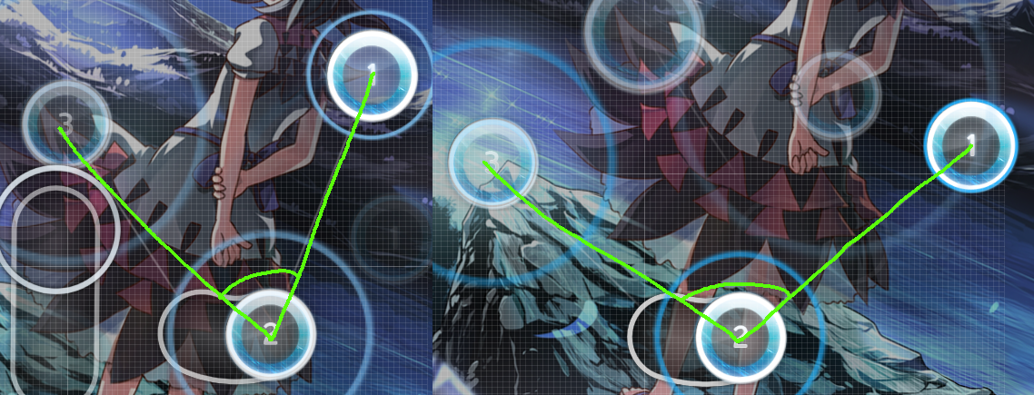
blanket with 00:59:286 (2) -
SeemsGood00:59:623 (3,6) - make here blanket
Nah this is fine as it is, also dont wanna fuck up the ds01:02:319 (6) - nc
dont see the point in that tbh01:04:173 (1,4) - swapped nc
done01:06:196 (2,3) - a bit wrong blanket, move 01:06:870 (1,2,3) - right
I dont see anything wrong with it01:08:218 (6,7,8,9,1) - i understand your idea here, but it looks like curve imo, make it better
dont understand what you mean D:01:10:915 (7) - ctrl+g
Nah, it fits more with a jump here cause of the sound of the cymbals01:13:949 (1) - maybe put this slider
here?
Looks good01:15:465 (2,6) - curve blanket, move note a bit up
aight01:14:791 (2) - maybe nc?
nah 01:19:005 (7,2) - located too close, move note a bit right
true dat01:21:027 (3,1) - same, move note right
sure again01:23:050 (1,3) - swapped nc
nah cause its a triple and its better to have that on the start of the triple rather than the end of it xd01:23:218 (3,6) - stack
View>Stacking01:25:072 (4,6) - located too far (because its kicklsiders), make here something like
this nah I like it more the way I did.01:26:758 (5,1) - curve blanket, move slider a bit down
sure01:28:611 (6,1) - swapped nc
nah01:29:791 (7,1) - make here blanket
done01:31:140 (5,2) - same, and also move 01:31:982 (4) - left to stood somewhere
herenah this part is fine imo01:32:488 (1,3) - swapped nc
as I said above01:33:499 (6) - i dont like that this slider ending on the strong guitar sound, put on the current slider start place (01:33:499 - ) circle, and put on the current slider end (01:33:668 - ) slider and make it as the start of stream 01:33:836 (7,8,9,10,1) -
This is fine tbh01:43:441 (5) - nc
Dont see why01:53:825 (5) - nc
^02:00:748 (5,4) - bad ovelap imo, make it better (
for example), or stack
fixed02:01:408 (2,1) - bad ovelap again, move circle right
this isnt that bad, and it would also fuck over my DS02:03:551 (4,5) - stack
fixed02:08:165 (7,9) - maybe ctrl+g? and also in this case move stream 02:08:660 (1,2,3,4,5,6,1,2,3,4,5,6,1,2,3,4,5) - up to 02:08:660 (1) - was stacked with 02:07:671 (3) -
Nice02:18:549 (1,2,3) - move this to stack 02:18:879 (3) - with end of slider 02:17:725 (3) -
done02:22:010 (6,7) - too far, move kickslider up
did something else02:28:274 (3,1) - fix blanket, move (1) right
Fixed 02:31:983 (6,7,2) - too close, or move stream left, or ctrl+j on stream
Fixed02:41:560 (8) - nc
nah02:43:668 (5,6) - make here blanket
sure02:44:155 (7) - nc
nah02:50:641 (6,7) - too far, move kickslider up
true dat02:49:992 (6,1) - swapped nc
nah02:53:398 (9,1) - i ofc understand your idea but this such a small spacing not contrasted with large spacing between kicklsiders and start of streams (02:50:641 (6,7) - , 02:50:641 (6,7) - , 02:55:668 (7,1) - ). Spread them out
Fixed it slightly03:02:965 (2,8) - maybe stack?
I like it more the way it is. I know its overlapping but meh03:10:425 (8,1) - too far, move 8-th note
there nah, im making bigger jumps here cause of the next part is kiai03:24:046 (4,5,1,2,3,4,5) - ctrl+h, also you can make here
this nah03:24:452 (4,6) - if you dont like previous idea, at least fix wrong stack
fixed03:28:587 (1) - ctrl+j and make blanket with 03:27:695 (2,3) -
nah I like my way more03:31:344 (1,2,3,4,5,6,7,8) - maybe make this stream piece with ds 0.8x?
why?03:34:587 (9,11) - unstack this: i dont think that 11-th note in this place is easy to read, move it up
Fixedit seems to me or in Counter-Attack of the Weak some notes is a bit unsnapped? (AiMod does not swear, strangely)
04:00:904 - i hear here triple, make here it (you can make here something like
this)
did something else but yeah I guess I will do that04:15:905 (4,2) - bad overlap, or make it better, or stack note with start of slider
either way its gonna be overlapped but I like your way more xd04:23:405 (1,2,3) - i dont like that you decided to pass strong solo sound, you can make here kicksliders for example
Good idea04:34:655 (1,1) - too far move it up
nah04:49:166 (1) - ctrl+j, to blanket with 04:49:980 (5,6,1) -
nah I dont like that04:50:470 (5,2) - wrong stack
dat tiny mistake tho lol04:54:220 (9,10,1,2,3,4) - looks like ugly, make on the place 04:54:220 (9,10) - kickslider, for example
did something else05:18:156 (2,1) - i think that this blanket is a bit off, move note a bit down
nah this is okay05:18:314 (3,3) - make here blanket
ye05:23:394 (3,5) - curve blanket, move 5-th slider up
1 frame haha 
05:26:092 (4,6) - too close, move note right
done05:28:949 (2) - move it left to "blanket" with 05:28:473 (1) - (also stack with note 05:28:473 (1,4) - )
y05:29:743 (1) - move end of slider (point on it) a bit left to symmetry with 05:29:267 (3) -
that was small05:31:330 (2,4) - make here overlap (move 4-th note right-down)
uhm it is? o-o05:32:124 (2,5) - wrong blanket, move slider a bit right
done 05:32:283 (3) - ctrl+h, to blanket with 05:31:489 (3) -
I guess05:34:187 (2,3) - wrong blanket again, move 3-rd slider up
Fixed05:41:171 (2,6) - wrong stack
^05:41:806 (5,1) - ^
^ 05:48:314 (8,9) - too far, move 05:48:473 (9,10,11) - up
Im keeping same DS tho06:06:886 (2,1) - wrong blanket, move slider a bit right
fixed06:26:153 (6,7) - stacked star is boring imo, better make overlaps (move (6) right and (7) left accordingly) (anyway, sounds in 06:26:000 (5,6,7) - very different from 06:25:387 (1,2,3,4) - )
Nah id like to keep it this way06:28:143 (2,3,4,5) - bad flow imo, better move last note
up Good idea06:29:367 (2,5) - wrong stack
xd06:29:673 (3,1) - wrong blanket, move note right
fixed 06:31:051 (4,2) - a bit wrong blanket, move note A BIT down
xd06:34:877 (5,2) - ^
cant see anything on this06:50:183 (2) - move it left to blanket with 06:49:571 (3) -
sure06:56:459 (7) - nc
dont see the point in that tbh07:03:194 (1,3) - very bad ovelap, or stack it or make it better
nah its fine this way07:13:449 (2,8) - wrong stack
xd07:35:757 - 07:35:907 - i hear here strong guitar sounds, maybe make here kicksliders to emphasis it?
nah like it more this way07:36:507 (3,1,2,3) - i dont like that you "stacked" note with triple such way, stack it normal, note with slider
View>Stacking07:37:107 (3,5) - wrong stack
xd07:40:557 (3,4,5,6,1) - move this to stack 07:40:857 (1) - with 07:39:507 (10) -
xd07:43:257 (1) - move this slider right to blanket with 07:42:957 (4) -
nah would fuck my ds07:53:457 (2) - too far, move it left and stack with 07:54:957 (5) -
nah this is fine08:07:257 (1) - curve and this slider to blanket with 08:06:807 (7) - and to contrasted with curve slider 08:07:857 (6) - (you just can clone this slider (08:07:857 (6) -) and put it on the direct slider place)
ait08:07:857 (6,1) - a bit curve blanket, move (1) a bit up
think I fixed it08:20:982 (7,1) - wrong stack
xd08:23:157 (3,7) - ^
this is fine08:23:307 (4,1) - stack start of kickslider with end of 1/2 slider (move kickslider for this)
fixed08:24:057 - you can make here kiai time
naahend of mod~

