forum

Why certain patterns look good [explained]

posted
Total Posts
21
Topic Starter
Kibbleru
So after having a good listen to Charles' podcast on mapping theory and stuff (btw check it out if you haven't yet it's on his userpage), I've been doing some thinking of my own.

One of the biggest questions I've wondered was;
Why do some patterns look nice to us, and where did this meta originate from.
That was always one thing that I've never understood. Why whenever I modded a map, and I pointed out whether a pattern looked bad - why did it look bad to me, and why was my suggestion better?

After doing some thinking, I've concluded that it all boiled down to connecting the patterns we see in our maps to some common real life patterns. So, lets give some examples.


Parallelism
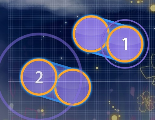
It is very clear that many maps use parallel patterns. Here is one of the most common patterns that utilize this.


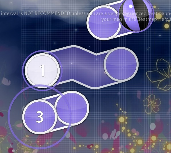
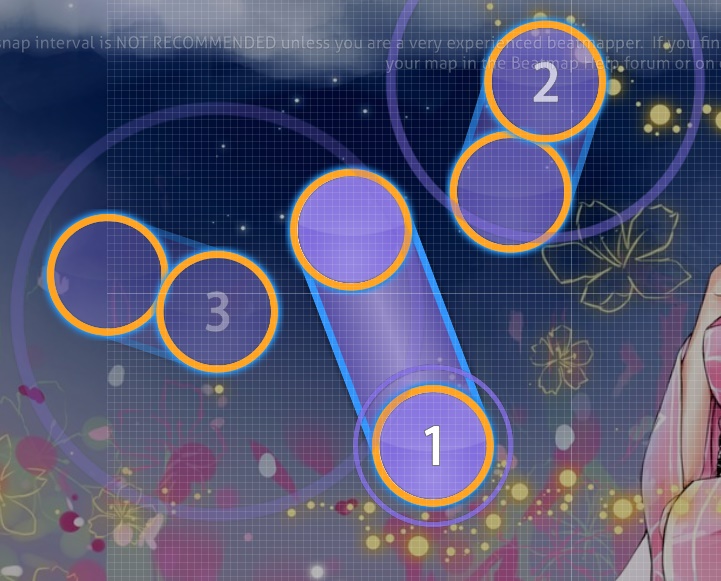
or, if we want to get more complicated, something like this.


Symmetry
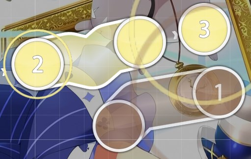
This one is also very self-explanatory. Symmetry plays a big part in the development of the mapping meta, especially in the older times, where there were maps made of purely symmetrical patterns (Andrea is a great example of this). Even though we have moved on, there are still patterns that take from this concept.

Precisely things like this


As time went on, people began to work off that concept and started experimenting. An example is we may have started using different angles for the axis of symmetry.


Shapes
This element has been the key deciding factor for many of the jumps we use; stars, squares, triangles, etc

For example, star jumps are very common
(we all know what this looks like so I won't take an image for this)

But we have worked off that and created interesting things with sliders too.
(admittedly this is a pretty bad pattern, but you get the point lol)


Spacing
This one is a bit of weird one, and I don't think many people use this, however, I believe equal visual distance between various objects make it look much more aesthetically pleasing. The easiest way to explain this is give good/bad examples.

-bad

Notice how circle 4 is very far away from the rest of the circles, which makes it look very out of place.

-good

It looks much better now that the visual distance between the objects look more even.

-bad

This is much more subjective, but there is an uneven density of objects around the right part (with the slider).

-good

Now it looks much better now that the objects are placed evenly around the slider.


Interlocking Placement (Fitting?)
Written by -Mo-

I believe that the reason blankets seem to 'look good' is the same reason why we seem to get satisfaction from things fitting perfectly into eachother, although I guess you could argue that every tangent of a circle in a blanket is parallel to the tangents of the slider. So yeah, a blanket (and other fitting patterns) does seem to be more applied versions of parallelism.

You can do a lot more than just blankets with this 'fitting' concept too:
Or I guess if you wanted to, you could call them advanced blankets.


Petit Rabbit's - No Poi! (nenpulse bootleg remix) (Skystar)


HoneyWorks - Hatsukoi no Ehon feat.Aida Miou(CV:Toyosaki Aki) (Guy)

You could then argue that regular shape patterns are just cases of rotational symmetry, for example your slider thing is just the same slider rotated about the same point 5*72 degrees. Furthermore, you could argue for the parallel case that there is a line of symmetry between the objects exactly inbetween them.

So perhaps all satisfying patterns are just different ways of applying symmetry?


And with these simple elements, people evolved the mapping meta. Kind of like how technology evolves. We start with simple elements, and then build on to that forming other concepts, and then we build off those concepts. Sort of like a flowchart.

Anyways, you are free to agree with me or not, but I just wanted to share my thoughts here.
Nathan

Kibbleru wrote:

This one is a bit of weird one, and I don't think many people use this, however, I believe equal spacing between various objects make it look much more aesthetically pleasing.
I think equal visual distance or something similar is a more fitting name rather than spacing, which actually influences movement

for example


1→2→3 have different motions but to the eyes the pattern looks balanced
Monstrata
"Equality" is basically what most people nowadays consider "structure". It's also the placement technique i use on 99% of my maps haha. When everything appears equidistant, it creates a sense of unity and integration between patterns, like every object is thoughtfully placed.

Chaotic and random patterns throw people off because its hard to predict their location. When you play a map, you aren't actually looking at what you click. At least, well, this is true for anyone who can read over AR 8. You are always looking ahead, at the next object that's coming up. If you were looking at the object you were clicking, you wouldn't be able to move to the next object in time. When you play, you are actually memorizing a location, and clicking on what you saw 600 ms (for AR 9) ago. In a sense, osu! trains your extremely short-term memory. When the timeframe is so small, visual patterns and/or muscle memory become incredibly helpful with aiming. If the map is structured well, you are able to remember the location more easily, as it is naturally more predictable. The same can be said for good flow, (which is basically inertia, or the natural drifting of your mouse after finishing a pattern). The idea here is not so much predictability, but rather, an association between what you saw, and what you clicked. For example, maybe you saw the object at say, 256||192. You click 256||192. The object was actually 246||190 or something. I would argue that better structure, flow, and overall pattern predictability will narrow the margin to something like "You saw 200||200, You clicked 200|200, the object was actually 198||198".

A thing too about muscle memory, back and forth jumps tend to be easier to land than say, triangle or rotational jumps. This is because back/forth jumps (think Fycho's Miraizu) only use movement in two directions (with minor angle changes). When you can just mimic these movements with minor changes (speeding up slightly, shifting angle slightly), its easier to remember the motion, and this ends up improving aim.

Of course, this is just how I see it from a game-design perspective. We have to remember that the object we perceive, and the actual location of an object may be slightly different. We base it on memory / reading / whack-a-mole. However you call it xD.
Ayesha Altugle
gud shit
Topic Starter
Kibbleru

Monstrata wrote:

A thing too about muscle memory, back and forth jumps tend to be easier to land than say, triangle or rotational jumps. This is because back/forth jumps (think Fycho's Miraizu) only use movement in two directions (with minor angle changes). When you can just mimic these movements with minor changes (speeding up slightly, shifting angle slightly), its easier to remember the motion, and this ends up improving aim.
yes this stuff is explained on charles' podcast (on his userpage) https://osu.ppy.sh/u/charles445

and on this video by -Mo- https://www.youtube.com/watch?v=0uGeZzyobSY
chainpullz

Monstrata wrote:

If you were looking at the object you were clicking, you wouldn't be able to move to the next object in time. When you play, you are actually memorizing a location, and clicking on what you saw 600 ms (for AR 9) ago.
This isn't exactly true due to peripheral vision. This is the biggest reason HD vs no-HD aiming plays so much differently. Without HD there is a small margin to correct your aim mid flight. This is even more noticeable when the aim is slower and you actually have opportunities to briefly pause over the circle. With hidden you'll go to a spot and usually won't move from that spot even if you misaim because, aside from your cursor not going to where you wanted it to, you don't have any visual input to adjust to. Without hidden you can clearly see out of your peripherals that you aimed the wrong location and flick your cursor where it needs to go.

I feel this does a decent job of demonstrating what I'm talking about
This picture is basically just 2 frames on top of each other with some transparency. If this play hadn't been with hidden I would have been able to easily discern through my peripherals the location of the 1st circle and wouldn't have aimed at the 2nd circle instead. So I'd say what you've described is only really accurate if we are talking about HD or AR>10 (maybe idk?).
Monstrata
Peripheral vision can play a part in reading yes, but I think mis-aiming is a fault of the player. We're talking about mapping. I would argue that with exception to a player's oversight, its more likely to mis-aim and/or mis-read an object's location if the structure/flow/everything i mentioned doesn't lead the player to a comfortable/predictable location. These readjustments tend to create jerky and unanticipated "reflexive" motions. Sometimes they can be planned, but they do make the map harsher, and more difficult to play. Basically, think of maps with really sharp flow and anti-jumps that force players to focus on reading.

Well, this totally derailed from how certain patterns can be constructed to appear more pleasing.
Yoges
I don't think there was ever a "meta" for this as Charles says. Mappers from years back might have made stuff that looked a lot different to maps now but they were still using the same geometric and structural principles that we use to make our maps look good, it's just that we're better at it. Mapping has developed a lot but some of the same techniques are still used, they're jusy used differently. To say that there's a meta for this would be to say that this shit will go out of fashion, which it won't, chaos will never become fashionable.
J1NX1337
From what I've gathered from my mapping and actual gameplay experience as well, patterns that utilize more even spacing are easier to read and hit, since you don't have to adjust the amount of force you apply to your mouse/pen movements. Therefore, if the pattern is "chaotic" you'll have a higher chance of missing due to an error in your assessment of how much force you should use.

Sometimes it can be quite annoying to miss on one of these "chaotic" patterns because of a misevaluation, especially if the pattern does spacing changes that weren't really predictable or otherwise mislead the player to a major degree. I don't see it primarily as a problem on very complex/quirky maps but if your map otherwise utilizes clean patterns etc. you might wanna reconsider not using unpredictable patterns like this to avoid player frustration.

So yeah I think it ultimately comes down to map playability. Not sure if you could count it as a part of flow or if flow is purely about the comfortability of the changes in movement angles you have to make in order to hit the next note, compared to the direction the previous note was approached from.
Endaris
Generally speaking I'd also say that sticking to a handful of sliders that you copy over and over and just rotate makes your diff look a lot more tidy.

What I always wanted to do some science on but never really got to it was which map settings on easy diff give you the best possibilities to create blankets and other neat looking sliderinteraction.
jawns

Yoges wrote:

I don't think there was ever a "meta" for this as Charles says. Mappers from years back might have made stuff that looked a lot different to maps now but they were still using the same geometric and structural principles that we use to make our maps look good, it's just that we're better at it. Mapping has developed a lot but some of the same techniques are still used, they're jusy used differently. To say that there's a meta for this would be to say that this shit will go out of fashion, which it won't, chaos will never become fashionable.
Saying that mapping hasn't changed since then, and just improved completely ignores the people that dislike modern mapping. As Charles said himself, he believed that mapping became too focused on simply what played well, and that's why he retired (at lest, that's my interpretation).

I don't think there's any way we can say that today's mapping won't fall out of fashion for sure, since good mapping is subjective, and if more people start to prefer different kinds of maps, like the "emotional response" mapping he talked about. Who knows, in 4 years people might look back at the "pp maps of 2016" with disgust.
Shiirn
Having skimmed through the thread, I'm both impressed and disappointed at the breadth of knowledge shown here. It's a shame that this kind of discussion is discouraged as being "thinking too hard" or people being too lazy to put their feelings into words.


Mapping, once you reach a certain point, is a balancing act. The more experienced a mapper gets, the more they realize that, like in many craft skills, the basics you learn as a newbie are much more strict than they need to be to encourage you to understand how mapping works as a big picture. This is why new mappers get so confused when they see people like me, monstrata, or HW basically going "fuck the police" and doing weird shit and pulling it off - because we already know the basics and are intentionally defying them in ways we (generally) know we can succeed at.

This is why I'm such a bitch about "flow" and "consistency" mapping. They're extremely powerful tools and rulesets for new mappers to use. They make maps that play well, look good, and, not-entirely-coincidentally, give 'abnormal' amounts of pp. But when you get right down to it, when you represent a piece of music with the same tools as the last dozens and dozens of musical pieces, you lose sight of the music itself. This can basically be summarized in the simple response "Just because it plays better, doesn't mean it fits the music better."


Experienced mappers know what I'm talking about. The more you map, the more insight you get into how most music is structured. You start seeing the same musical patterns over and over. It's very easy to fall to temptation and just start mapping the same musical patterns across different tracks in the same way. Experience is about knowing how to manipulate the basic patterns and structure that fit pretty much anything to fit this particular musical piece. Of course, for a generic drum'n'bass track, or a generic anime OP, it's borderline impossible to 'leave the rails' of the music, as it were, but people try anyway, and rarely ever succeed.

So basically what I'm trying to say here is "looking good is nice and all but mappers should remember they're making shit for people to play". Mappers tend to get into circlejerks over how pretty and aesthetically perfect their maps can get and lose sight of the fact that hey, we're playing a music game - "music" is literally half of the entire point. I've noticed a major trend in recent years where mappers were mapping for other mappers - this seems so incredibly backward I can barely believe it.


tl;dr Looking good is nice and all, but in many cases a map is fine even if it's not aesthetically perfect, in fact this can cause it to be more iconic with the musical track it comes along with. The handful of decent mappers and modders at present time put far too much stock into the raw mechanics of mapping and lose sight of what it means to play this game. "Mappers" and "Players" have become distanced from one another and that is quite sad. Also I ended up ranting.


tl;dr the tl;dr: generic maps should look generic. weird music should look weird. boring music should look boring. people are making all maps generic regardless of music type. makes shiirn sad.
Yoges

jawns wrote:

Yoges wrote:

I don't think there was ever a "meta" for this as Charles says. Mappers from years back might have made stuff that looked a lot different to maps now but they were still using the same geometric and structural principles that we use to make our maps look good, it's just that we're better at it. Mapping has developed a lot but some of the same techniques are still used, they're jusy used differently. To say that there's a meta for this would be to say that this shit will go out of fashion, which it won't, chaos will never become fashionable.
Saying that mapping hasn't changed since then, and just improved completely ignores the people that dislike modern mapping. As Charles said himself, he believed that mapping became too focused on simply what played well, and that's why he retired (at lest, that's my interpretation).

I don't think there's any way we can say that today's mapping won't fall out of fashion for sure, since good mapping is subjective, and if more people start to prefer different kinds of maps, like the "emotional response" mapping he talked about. Who knows, in 4 years people might look back at the "pp maps of 2016" with disgust.


I haven't listened through all of Charles' podcast. I don't have access to a computer right now so care to enlighten me on what the "emotional response" you're talking about is?
chainpullz

Shiirn wrote:

This is why I'm such a bitch about "flow" and "consistency" mapping. They're extremely powerful tools and rulesets for new mappers to use. They make maps that play well, look good, and, not-entirely-coincidentally, give 'abnormal' amounts of pp. But when you get right down to it, when you represent a piece of music with the same tools as the last dozens and dozens of musical pieces, you lose sight of the music itself. This can basically be summarized in the simple response "Just because it plays better, doesn't mean it fits the music better."
As a player I second this. No offense to monstrata but I'll use his early maps as a good example. I'm pretty sure most informed people have figured out by now that he was essentially just using hexigrids to guarantee both "consistency" and aesthetics (with the occasional pentagon tossed in perhaps). The one complaint about this mapping I always had wasn't the pp it gave or how easy it is to fc. Rather, my complaint was more about how much of the music itself was ignored with this style. Some of monstrata's newer maps that have strayed away from this style more are a lot more bearable for me.

It's kind of the same issue I have with maps like tsubaki. If you constrain your mapping to a single design space then you are essentially trying to chain down a piece of music, which most musicians would argue to be "alive", and squeeze it into a tiny box. If you look at tsubaki he did a pretty damn good job of capturing as much of the music is possible within his constrained design space but without the constraints it could have fit the music even better.

As a player I feel like mappers get so worked up about consistency that they forget the only type of consistency that really matters is that it be consistent with the music. Music that, throughout a section, flatlines in intensity is considered extremely boring. Spacing throughout at section that is merely consistent with itself can often lose sight of this (ie. very constant spacing is very consistent with itself). It makes me sad when mappers like shiirn have to put notes about intentional "inconsistencies" on their maps when they try to push more sophisticated interpretations for ranked.
Topic Starter
Kibbleru
think we're gettinga bit off topic here lol
jawns

Yoges wrote:

I haven't listened through all of Charles' podcast. I don't have access to a computer right now so care to enlighten me on what the "emotional response" you're talking about is?
I think the gist of it was, when a mapper decides to stray away from what "plays well" in order to get an emotional response from the player.

He then used 3 maps as examples:

One used the map and the storyboard to evoke a sense of nostalgia

Another one used the map together with the music to create a feeling of mourning

And the last one was mapped in a way, that was deliberately frustrating to play


Also I'm sorry if this is going too far off topic, and I will stop writing stuff if it is
Pituophis
Useful stuff.
[-CeMAqpOP-]kee
i just wanna shitmap
Grrum
I'd like to see some discussion on two more topics:

Overlapping / Stacking

This is something that newer mappers are sometimes oblivious to, and even when they might want fix it, some guidance / examples of good vs bad overlapping could really help these players out so they can keep the spirit behind their pattern instead of being afraid of overlapping. For instance, how long does an object have to fade before it is acceptable to arbitrarily overlap on it? (The option View → Hit Animations in the editor is particularly helpful for this)

Additionally, patterns might be a little “cramped” in that they don't overlap, but they are a little too close for comfort like: http://puu.sh/prpvw/1dbc93d2d5.jpg

Being Conscious of Angles between objects (especially of a slider)

This is one topic that I struggle with, so I hope I can at least present some issues worth discussing.

Consider this pattern in A r m i n's Light Extra of Reol - Netoge Haijin Sprechchor

I think this pattern has an odd angle between (1) and (2,3). It doesn't look smooth and it's not accomplishing any kind of structure. Having a smoother flow like so I think would help it out visually:
http://puu.sh/proY3/3d741abb7a.jpg

And how about this from the same map:

The tangent line at (1)'s head doesn't connect with the previous pattern making this not only awkward visually but also mechanically. Wouldn't a rotation like so help the pattern out?: http://puu.sh/prpby/eb681484e5.jpg

Consider this pattern in Monstrata's Insomnia of Stonebank – All Night
I think it is successful because (3) is perpendicular to the line made by (2)'s endpoint and (3)'s head; i.e.
rotating it 90 degrees makes it linear: http://puu.sh/prqEz/c22878bd29.jpg

And what about this pattern that I'm currently having trouble with:

Is there a more appropriate position or rotation for these objects such that (1,2,3) makes a better angle or does it have sufficient aesthetics?

As an aside, it also feels like certain mappers have "the correct" curvature on some of their sliders because they look so good, where as my sliders seem to be curved too tightly or in a weird way. Does anyone have any thoughts about relative curvatures of sliders?
-Mo-
I believe that the reason blankets seem to 'look good' is the same reason why we seem to get satisfaction from things fitting perfectly into eachother, although I guess you could argue that every tangent of a circle in a blanket is parallel to the tangents of the slider. So yeah, a blanket (and other fitting patterns) does seem to be more applied versions of parallelism.


You could then argue that regular shape patterns are just cases of rotational symmetry, for example your slider thing is just the same slider rotated about the same point 5*72 degrees. Furthermore, you could argue for the parallel case that there is a line of symmetry between the objects exactly inbetween them.

So perhaps all satisfying patterns are just different ways of applying symmetry?
Topic Starter
Kibbleru

-Mo- wrote:

I believe that the reason blankets seem to 'look good' is the same reason why we seem to get satisfaction from things fitting perfectly into eachother, although I guess you could argue that every tangent of a circle in a blanket is parallel to the tangents of the slider. So yeah, a blanket (and other fitting patterns) does seem to be more applied versions of parallelism.


You could then argue that regular shape patterns are just cases of rotational symmetry, for example your slider thing is just the same slider rotated about the same point 5*72 degrees. Furthermore, you could argue for the parallel case that there is a line of symmetry between the objects exactly inbetween them.

So perhaps all satisfying patterns are just different ways of applying symmetry?
interesting idea! added to the main post
Please sign in to reply.

New reply