One of the things I see really often in maps, are slider speeds that make no sense with the general spacing of the song.
For example:
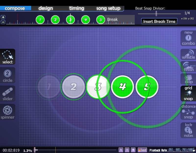
If the spacing is like this:
(What you are looking at: Five notes placed with even spacing)

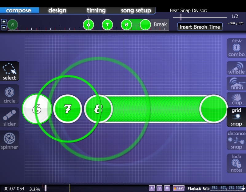
It makes absolutely no sense to make the slider speed like this:
(What you are looking at: Two notes evenly spaced, and a slider, going at the same beat, at a ridiculous slider speed.

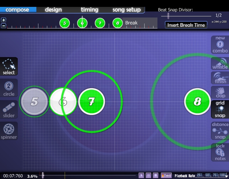
This is how I see it, uhh, how to explain this, basically, the space between the slider should be equivalent to the general spacing of your map. Otherwise it'd look like this (using the slider speed of the above picture):
(WYALA: The way it'd look if you substituted the slider start/endpoings with notes when the slider speed is ridiculously incorrect)

Which is wrong.
It should be more like this:
(WYALA: Two notes placed evenly, and a slider that fits the spacing)

Because then, if it were notes, it'd be:
(WYALA: What it'd look like if the start/endpoints of the above picture were replaced by notes)

Which actually makes sense with the spacing, amirite?
But yes, that's all I'd like to say.
I'm just tired of seeing easy diffs who's sliders are two times the regular spacing.
inb4thereisactuallysomesortofruleaboutslidersbeingeasierthannotesorsomethingandthathavinghighspeedsisokandiamreallywrong...
For example:
If the spacing is like this:
(What you are looking at: Five notes placed with even spacing)
It makes absolutely no sense to make the slider speed like this:
(What you are looking at: Two notes evenly spaced, and a slider, going at the same beat, at a ridiculous slider speed.
This is how I see it, uhh, how to explain this, basically, the space between the slider should be equivalent to the general spacing of your map. Otherwise it'd look like this (using the slider speed of the above picture):
(WYALA: The way it'd look if you substituted the slider start/endpoings with notes when the slider speed is ridiculously incorrect)
Which is wrong.
It should be more like this:
(WYALA: Two notes placed evenly, and a slider that fits the spacing)
Because then, if it were notes, it'd be:
(WYALA: What it'd look like if the start/endpoints of the above picture were replaced by notes)
Which actually makes sense with the spacing, amirite?
But yes, that's all I'd like to say.
I'm just tired of seeing easy diffs who's sliders are two times the regular spacing.
inb4thereisactuallysomesortofruleaboutslidersbeingeasierthannotesorsomethingandthathavinghighspeedsisokandiamreallywrong...
