yea lets write more paragraphs instead of taking 30 mins of ur time and changing these cancerous parts
forum
FELT - After rain
posted
Total Posts
215
after I see this map i must say I really enjoy it. almost every aspect of this map makes logical sense to me and I felt obligated to share this to you because I'm upset this is not currently ranked.
this map is very special to me because its something the ranked section doesn't normally see, its a breath of fresh air from all the generic smog rolling in from these popular uninspired mappers. thank you so much for complimenting such a beautiful song with an outstanding piece of art.
this is one i can enjoy watching in editor and playing in game
thanks so much ~
shot 48 stars but i wish i could shoot so many more
this thread.. just smh
Also UC,good work i didnt expect less from you c:
Also UC,good work i didnt expect less from you c:
gratz on loved when you get 30 favs
A pop for an app map always pops all the existing bubbles no matter it has got one or two
so from what I know about ranking process, there have to be additional BNs participating in the whole renominating procedure.
About map I've got not much to say.
so from what I know about ranking process, there have to be additional BNs participating in the whole renominating procedure.
About map I've got not much to say.
- I don't think the rhythm in intro part being problematic, the mapper has been consistently presenting the strongest notes with highest pitch in the whole part.
- Non-mainstream never directly makes a map bad.
I don't agree with you on a point, the intro rhythm. (let's ignore the map design for this time, because I think that's something pretty personnal)Zero__wind wrote:
- I don't think the rhythm in intro part being problematic, the mapper has been consistently presenting the strongest notes with highest pitch in the whole part.
- Non-mainstream never directly makes a map bad.
You can clearly hear in the beginning that there is the same melody from here 00:00:181 - to here 00:24:171 - but the mapper decided to change the rhythm on 4 measures. I agree the fact that he made that to avoid repetitive beats, and boringness, since the song is similar during the intro, so that's a good choice from him to try different stuff.
But to me, the real problem is that the intro rhythm use is not consistant, compared to the song. Instead of using a new rhythm pattern evertime, then why not using different visual patterns?
For instance, I'll take this pattern: 00:15:600 (3,4,5,1,2,3,4) - there is the same rhythm for this highlighted pattern. But why on the red tick is mapped here: 00:15:600 (3) - but not here: 00:17:743 - maybe there is a reason or else? On this map, it's kinda hard to see mapper's thoughts since in my opinion, the map is confusing.
That's just one of the multiple exemples in the intro, but I think that you got my point of view.
Other than that, I don't want to add anything else, since I don't like the visual of the map, but it's very personal, I can understand that people could like it. There is something that I like in the diff, is on the kiai. I like the way how the mapper got the map intensified during the kiai.
Don't see anything wrong here, I'm not trying to force changes or else, I'm just expressing my point of view.
Have a good day~
Topic Starter
Thank you Pachiru, I have something to work off of now~
So most songs are designed into 8-measure sections. And typically these sections are divided into two halves, with the second half being more or less identical to the first half. The intro to this song is built this way. 00:13:886 - is where the section restarts and matches the pitch of 00:00:172 - . But the 4 measures in each half are clearly distinct, just listen to each downbeat and you can tell there's difference in pitch, and then stuff like 00:06:171 (3,4,1) - only appears in the second measure of each half, etc.
So I designed my rhythms to be consistent between each half, or at least I tried to. But I had also implemented more dense rhythms overall in the second half to transition into the vocals and show how more and more instruments were being introduced. I think this is where the confusion came from. Instead of two repeating instances of 4 different measures, most people saw eight different measures with little connecting them together.
So I've changed the second half to fit closer to the first half. I'm not going to make each measure totally identical, because they aren't. But the differences in each measure should be more apparent now, and the overall rhythm structure should be more coherent between the two halves.
I hope the new rhythms are acceptable.
EDIT: http://puu.sh/vfSSX/e24e0307ac.jpg Pachiru has given the ok to my changes/justifications, I hope others do too ;w;
Diff
- 00:06:171 (3,4) - things like this are super weird, I feels like your rhythm choices are arbitrary made, without much consistency, for example why 00:06:814 (4) - deserves to be mapped, while other similar ones are mapped as slider tails or just ignored? I think you really should be more consistent with your own rhythms and make an agreement with modders, because this is the main issue that people have with your map.
- 00:12:171 (1) - The NC seems unnecessary to me, it doesn't highlight any big change in the music or a new measure
- 00:29:100 (3) - are you really mapping her breath instead of the piano at the white tick? if your argument is that you're following vocals, then why this 00:53:100 (4) - isn't a 1/2 slider
- 00:41:957 (2) - would you consider to use a 1/4 slider and then a circle at the red tick? to represent the vocals better as the other sliders do. If you notice the hold sound of the vocals stops at 00:42:171 - , also in
- 01:25:029 (3) - The finish hitsound doesn't fit the song or your rhythm at all. To be honest I didn't notice the nice change in the music at 01:25:457 (4) - because of the previous unfitting hitsound.
- 01:35:529 (6,7,8,1) - 8 should be stacked and 1 should be the jump, I really don't understand why 6 and 7 are stacked and 8 doesn't (8 is the weaker beat there), just adding that this doesn't represent the song at all.
- 01:56:727 (1,2,3) - The other thing that I really dislike about this map is the spacing being the same for different snaps in the same combos, I get that you want to make a tricky map, but I think your ways aren't the best, 02:07:013 (1,2,3,1,2,3) - 02:09:584 (1,2,1,2,3,1) - 02:53:084 (3,4,5) -
- 02:14:727 (2,3,4) - there are more examples, even at this one 3 is the stronger beat, but somehow you decide to make the jump at 4
- 02:29:941 (5,6,7) - 02:34:013 (1,2,3) - you also should consider mapping the 1/3s in a different way than the 1/8s.
- 04:00:183 (1) - I love slider art, but let's be honest, musically talking this is not justified by anything in the song. This one 05:18:598 (1) - works well
- 04:23:754 (1) - I don't like how this sounds, the change in the music starts at 04:23:968 - not before
- 05:03:384 (3) - I really don't like your hitsounds, mainly because I feel they aren't done according to the map. For example why 05:03:384 (3) - have a super strong cymbal in the repeat? and what make it sounds worst is the fact that these strong hitsounds aren't active beats in your map.
I don't know, I really have this feeling with the hitsounds, map and song, like they don't act like a whole, but as a different things merged into a beatmap
Personally I don't think the hitsounds work well with your rhythms choices (sometimes). - 00:46:243 (3) - why is this 1/4 repeat slider compared to 00:32:529 (2) - (from xexxar's mod) I also think you are being super inconsistent without a logic reason
Topic Starter
I didn't hitsound this map, Naitoshi did (which you can see if you read the map description), so I suppose that's your issue with the hitsounding feeling separate from the beatmap. But that's a common and unavoidable thing among all collaborative efforts, and I've had enough positive opinions about the hitsounding to not be bothered by it. Will edit this post later after I get Naitoshi's comments on your specific hitsound modding.Natsu wrote:
DiffReply to my mod, suggestion by suggestion, btw I'm also online in game if you want to discuss with me there.
- 00:06:171 (3,4) - things like this are super weird, I feels like your rhythm choices are arbitrary made, without much consistency, for example why 00:06:814 (4) - deserves to be mapped, while other similar ones are mapped as slider tails or just ignored? I think you really should be more consistent with your own rhythms and make an agreement with modders, because this is the main issue that people have with your map. your example is clearly a distinct and important highpitched note that only shows up here and 00:20:529 (4) - , please pay closer attention to the song before complaining about rhythm issues
- 00:12:171 (1) - The NC seems unnecessary to me, it doesn't highlight any big change in the music or a new measure dunno how that got there, fixed
- 00:29:100 (3) - are you really mapping her breath instead of the piano at the white tick? if your argument is that you're following vocals, then why this 00:53:100 (4) - isn't a 1/2 slider second timestamp is transitioning into the next section so i dont think extending the weak ending vocal is a good idea there
- 00:41:957 (2) - would you consider to use a 1/4 slider and then a circle at the red tick? to represent the vocals better as the other sliders do. If you notice the hold sound of the vocals stops at 00:42:171 - prefer mine to chain the vocal line together better, your suggested rhythm is too much clicking for me
- 01:35:529 (6,7,8,1) - 8 should be stacked and 1 should be the jump, I really don't understand why 6 and 7 are stacked and 8 doesn't (8 is the weaker beat there), just adding that this doesn't represent the song at all. this is just a special arrange to fit this point of the song that doesn't come up anywhere else, it emphasizes the 01:36:171 (1) - beat in a really nice way for me
- 01:56:727 (1,2,3) - The other thing that I really dislike about this map is the spacing being the same for different snaps in the same combos, I get that you want to make a tricky map, but I think your ways aren't the best, 02:07:013 (1,2,3,1,2,3) - 02:09:584 (1,2,1,2,3,1) - 02:53:084 (3,4,5) - i dont try to make a map tricky or anything like that, i just map to the song and then players with poor reading skill complain ww, the arranges you linked are simple enough to read with approach circles and are needed for cursor pacing for me so i won't be changing them
- 02:14:727 (2,3,4) - there are more examples, even at this one 3 is the stronger beat, but somehow you decide to make the jump at 4 i think the waiting of the cursor to click 3 is enough emphasis, and the snap to 4 fits well with the guitar vocals and drums for me
- 02:29:941 (5,6,7) - 02:34:013 (1,2,3) - you also should consider mapping the 1/3s in a different way than the 1/8s. not necessary, basic rhythm sense makes the 1/3 easy to expect bc it appears in the same parts of the song over and over
- 04:00:183 (1) - I love slider art, but let's be honest, musically talking this is not justified by anything in the song. This one 05:18:598 (1) - works well see p/5815260 and p/5937014 for explanation of that slider, i will never ever change this for any reason ever ;-;
- 04:23:754 (1) - I don't like how this sounds, the change in the music starts at 04:23:968 - not before it clearly starts on the red tick, check at 25% speed if you must
- 00:46:243 (3) - why is this 1/4 repeat slider compared to 00:32:529 (2) - (from xexxar's mod) I also think you are being super inconsistent without a logic reason was originally to lead into the change in vocal rhythming, but either way seems to work well, so i'll change this
We seem to have different understandings of the song and of mapping in general, so most things were denied. I hope my wordings made some form of sense to you, bc I'm really bad at wording things ;; Let me know if I need to explain anything further.
Thanks for the more detailed check either way!
edit: im dumb
You're just trying to find things to point out his alleged incompetence. At least be observant about it...Xexxar wrote:
wait, naotoshi bubbled a map he hitsounded?
"Do not nominate your own map, a collab map you participated in or a map you made a storyboard for. The entire modding process is focused around others ensuring that your map is ready for ranking, so doing this counteracts common sense."
that includes hitsounds lol
natz
Natsu wrote:
DiffReply to my mod, suggestion by suggestion, btw I'm also online in game if you want to discuss with me there.
- 01:25:029 (3) - The finish hitsound doesn't fit the song or your rhythm at all. To be honest I didn't notice the nice change in the music at 01:25:457 (4) - because of the previous unfitting hitsound. I disagree, it's quiet enough so I'm not sure how it correlates at all with the next part.
- 05:03:384 (3) - I really don't like your hitsounds, mainly because I feel they aren't done according to the map. For example why 05:03:384 (3) - have a super strong cymbal in the repeat? because there is a cymbal finish? and what make it sounds worst is the fact that these strong hitsounds aren't active beats in your map.I don't know, I really have this feeling with the hitsounds, map and song, like they don't act like a whole, but as a different things merged into a beatmap
Personally I don't think the hitsounds work well with your rhythms choices (sometimes). I believe it doesn't matter as long as they're consistent with the timestamps given by the rhythms
when will you guys learn that memes are not welcome?
seriously guys,focus on helping the mapperMrSergio wrote:
when will you guys learn that memes are not welcome?
love how the map looks like honestly, we have not enough stuff like that, patterning like this is cool
the only thing that i thought was that i thought there was missed beats around places like 03:01:441 -
still a cool map nonetheless lol good luck
the only thing that i thought was that i thought there was missed beats around places like 03:01:441 -
still a cool map nonetheless lol good luck
^ definitely agreeMazziv wrote:
seriously guys,focus on helping the mapperMrSergio wrote:
when will you guys learn that memes are not welcome?
why i don't think xexxar's veto should be held up basically
anyway
looks like all the discussion is done so rebubbling this...
(assuming natsu doesn't also decide to veto? it's been 2 weeks again)
zero__wind would count against xexxar if he decides to keep his amazing veto despite not supporting it~
#1
anyway
looks like all the discussion is done so rebubbling this...
(assuming natsu doesn't also decide to veto? it's been 2 weeks again)
zero__wind would count against xexxar if he decides to keep his amazing veto despite not supporting it~
#1
Topic Starter
Again, thank you so much Nao <3
And again, thank you Zero__wind for all your help and support <3 shame your bubble didn't get to last :c
And again, thank you Zero__wind for all your help and support <3 shame your bubble didn't get to last :c
I wasn't contacted at all.
@UndeadCapulet you really need to contact the people involved first, you didn't even tried to contact me to discuss about your map.
@Naotoshi I suppose you also contacted Xexxar?
The intro is still randomly mapped and that big slider doesn't fit the song at all, tbh you can copy paste it at any song and it would work the same,
????????????????????????????????????????????????????
yea nice job using an obvious joke as an excuse for breaking bng rules. no thats not reason to void my bubble pop, nor is it reason to ONCE AGAIN go behind my back to try and rank this.

yea nice job using an obvious joke as an excuse for breaking bng rules. no thats not reason to void my bubble pop, nor is it reason to ONCE AGAIN go behind my back to try and rank this.
god forbid i sound like i'm agreeing with natsu here but
the start isn't necessarily random per se, but it's still completely out of place and does not fit the theme or intention of the map as a whole, and that big slider is still one massive pussy copout.
no amount of bullshitting or whining or ranting will change these two facts. why can't you just man up and make these minor changes, UC?
edit: I've modded this map before, can ppl stop pming me
I'm not breaking any BNG rules Xexxar, your veto is equivalent to a bubble from Zero__Wind. It resets it to an unbubbled state ofc, and since it's clear that you disagree fundamentally with the map I'm showing my support for the mapper by bubbling the map with bubble #1. I'm not going behind your back because your back is not relevant here to go behind.
Well, I won't rebubble it again until I talk with Natsu, as I rebubbled on the assumption that he wouldn't veto the map and that he was just modding and providing feedback. Thanks for dropping back in to clear things up!
edit: according to Loctav, Xexxar's veto counters both Zero__Wind and my bubbles.
On a side note, it seems like making a spread and doing the normal ranking procedure is the best bet for this now!
are posts like this really necessary? there's almost nothing constructive here.Shiirn wrote:
that big slider is still one massive pussy copout.
no amount of bullshitting or whining or ranting will change these two facts. why can't you just man up and make these minor changes, UC?
not going to speak much on the rhythms or aesthetics as a whole, but i don't see what's wrong with the slider; UC's mapping is quite obviously sentimental, it's definitely mapped from the perspective of somebody who's listened to the song hundreds, if not thousands of times. i find when someone maps like that, there's overall less pattern and rhythm consistency and more focus on how each part feels to them. while i understand that alone isn't enough of a justification for contentious elements, i'd say the music backs it up too; just after a heavy guitar+drum section, it cuts back to sole piano. even compared to the intro, this is the bottom of the song's rhythm intensity, yet (arguably) the emotional peak - while maika's vocals are relatively steadfast throughout the song, here they start wavering out of control; she literally sounds like she's trying not to cry, breathing and sighing much more, before regaining her stoic composure at the end of the section, i feel like it'd be difficult to map this any other way but still manage to capture that "holding on" feeling. every time i get to this part of the song, my heart sinks a little, so i find it a bit weird to call it a copout - the two anchors in it are linked to particularly strong vocals (with the first one even ending a sentence), so it's not just fluff slider art just for the sake of slider art; the way i see it, you could have a traditional rhythm here instead, but it'd still be pretty uneventful and lose most of the emotional impact as well.
not sure what's going on with the map right now but some short suggestions:
SPOILER
00:16:457 (5) - i like this sound here, but have you tried shortening this slider to the red tick? the spacing to the next note would be a little more uniform, but i'm not sure if it'd play better.
00:32:529 (3) - i like how this plays when ctrl+g'd; it flows into the following sliders a little better imo.
02:56:727 (4) - aaa, please add a note here, it's so strong
00:32:529 (3) - i like how this plays when ctrl+g'd; it flows into the following sliders a little better imo.
02:56:727 (4) - aaa, please add a note here, it's so strong
good luck!
Topic Starter
Thank you for the check!emmy wrote:
00:16:457 (5) - i like this sound here, but have you tried shortening this slider to the red tick? the spacing to the next note would be a little more uniform, but i'm not sure if it'd play better. prefer to map the ending beat here
00:32:529 (3) - i like how this plays when ctrl+g'd; it flows into the following sliders a little better imo. really want the small spacing at 00:32:314 (2,3) - and the direction change at 00:32:529 (3,4) - to separate the lead into the next measure from the previous vocal line
02:56:727 (4) - aaa, please add a note here, it's so strong there used to be note here but a bunch of people convinced me it'd be better to just stick to the strong drumbeats, tho i am going to revise the note placements here and use a trick to show off the cymbal w/out making it clickable
And thank you for all the support, it means a lot ;w;
We did some IRC, added a whistle and changed a pattern that bother me a lot  .
.
About the intro, UC explained it to me beat by beat and I ended understand their idea, even if is not my taste at mapping we should understand that every mapper map in a different way.
The long slider was explained multiple times and the mapper has strong feelings about it, I understand his point of view now.
About the visuals, not every map needs to be mapped with perfect aesthetics.
Anyways the map has been discussed a lot and the opinions about the map are divided, so I think is more about taste instead of real issues, I think is time to bring it another chance, bubbled~
Topic Starter
Thank you so much Natsu! I really appreciate it <3
I followed the thread for a while but at this point it got bit too huge, so I might mention things that were already discussed
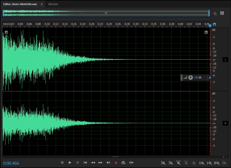
drum-hitwhistle volume is much higher on left, which makes it a bit irritating
http://lasse.s-ul.eu/0hdZ4Zzt.jpg
=> http://puu.sh/vHf7O/030d8abdf3.wav or adjust it yourself
soft-hitfinish3 has lots of silence after the hitsound, making it unnecessarily huge. also has the volume balance issue, although much less noticeable
=> http://puu.sh/vHfcu/c8c451e60d.wav
how about it higher quality bg? just crop http://puu.sh/vHfnh/19a4bf76ec.png however you need it
02:34:441 (1) - even if it transitions into a break, I think having this spaced like you did for similar patterns before would be great as it's so different from 1-2-3 and a very distinct beat
04:23:915 - how about adding some green lines starting from here to make hs volume of the repeats scale with the sound there?
05:25:455 - 5% on this still seemed a bit too audible and sounded a bit off at the end of the map. how about using an actually blank hitnormal for the sliderend?
other stuff has already been discussed or doesn't really matter when looking at the map as a whole
actually found it quite enjoyable to play and the intro seems alright in gameplay too
I want to see how this goes, so let me know when you replied
Topic Starter
Fixed all the hitsound stuff, 05:25:455 - has both a silent hitnormal and is set to 0% vol to hopefully give customsound ignorers the better experience as well. This is rankable .osu editing. Thanks a ton for all those files~
Cropped the bg to 16:9 res and dropped it in, the new sizing looks weird but it's how editor formatted it so it should be rankable as well. Still within the 1200 height limit. Thank you for this file as well~
Didn't change 02:34:441 (1) - because it's a really weakfeeling beat to me, especially compared to the strong 02:17:298 (1) - finishes/kiai resets that I use that snapping arrange for.
Thank you for the check Lasse! This was really unexpected and really helpful <3
2
Topic Starter
<3 Really appreciate the help, Lasse! (starting to sound like a broken record with these posts but i really mean it ;; )
soontm qualified once again UC, good job!!!! :3
Nice map, almost there. Good luck!
proof that as long as you keep gonig back to the same bns you'll eventually be able to sneak something through...maybe
even though he is going to different BNs huh, interesting.Shiirn wrote:
proof that as long as you keep gonig back to the same bns you'll eventually be able to sneak something through...maybe
These are literally two different BNs from the original iconers lolShiirn wrote:
proof that as long as you keep gonig back to the same bns you'll eventually be able to sneak something through...maybe
Not really a fan of the aesthetics, but I respect what you went for and I think it's a cool map. Good luck on rank!
Greetings
dw, not here to discuss visuals, even if I do feel they're unnecessarily unaccounted for. Stuff like 00:51:600 (1) - is really cramped, and in reality slider leniency could give the same effect, for example, but that's not what I'll be discussing.
What I am here to discuss and have concerns about is 04:00:183 (1) - this 22 second long slider. This is the reason for the pop. I have read through the previous discussions about it, including your reply, so no need to repeat yourself.
For the problems it poses, in summary:
The player literally just holds down a button and patiently waits for the sliderball to move while listening to the vocals in the background. While it may be different and unique, it's not really preferable in a game design perspective. This is a rhythm game at it's core, and relevance to the song is important, so to skip out on clear distinctions in the song would seemingly contradict that, even if the point is to lower the density. I am aware of the mapping philosophy where emphasis is more important than coverage, but in this case not covering things will in turn damage the accentuation, thus posing an issue either way, regardless of these perspectives. This is where B comes in to the picture.
For B:
The said distinctions happen at every other measure, aka 04:07:040 - 04:13:897 - 04:20:754 - . This is generally how songs are structured, as you are also aware of, judging from your thoughts on consistency. From what you've written, you feel that the vocals are rather cohesive and connected within this hypermeasure. In regards to song structure, however, they're all divided into different parts. At 04:06:611 - , a new stanza begins and leads into 04:07:040 - . 04:11:325 - starts a 1/1 pattern, but then adds a 1/2 at 04:13:468 - as transition into the next part, 04:13:897 - . Vocals go idle at 04:20:325 - and piano takes priority 04:20:754 - , all indicating some kind of transition from one part into another. Every transition also lifts the tension; the background vocals go quieter and then gain momentum again for each part. At this point there are one of two ways to improve the accentuation of this, leading us to the solutions.
Possible solutions:
One way to solve B alone, is to have the slider change direction on each distinction. Not something I would suggest, though, as A remains for the most part; it would make it slightly more engaging in a way, but it would still be largely monotonous. To solve both points, I would suggest you split it up. Would recommend a separation on red ticks, both for the sake of reflection as well as for making the lengthened vocals stand out more in accordance with your intentions.
In contrast, 05:18:598 (1) - is much more acceptable since it's all the same sound with only one instrument playing, not divided into parts in the song, etc.
Anyway, your background is beyond the acceptable dimensions and is unrankable as per the Ranking Criteria, thus why I'll have to be popping this either way:
Scaled down to 1920x1200
dw, not here to discuss visuals, even if I do feel they're unnecessarily unaccounted for. Stuff like 00:51:600 (1) - is really cramped, and in reality slider leniency could give the same effect, for example, but that's not what I'll be discussing.
What I am here to discuss and have concerns about is 04:00:183 (1) - this 22 second long slider. This is the reason for the pop. I have read through the previous discussions about it, including your reply, so no need to repeat yourself.
For the problems it poses, in summary:
- It is monotonous in gameplay and offers not much more than visuals.
- In terms of reflection of the song, it does reflect the background vocals as a whole, but it misses musical distinctions throughout.
The player literally just holds down a button and patiently waits for the sliderball to move while listening to the vocals in the background. While it may be different and unique, it's not really preferable in a game design perspective. This is a rhythm game at it's core, and relevance to the song is important, so to skip out on clear distinctions in the song would seemingly contradict that, even if the point is to lower the density. I am aware of the mapping philosophy where emphasis is more important than coverage, but in this case not covering things will in turn damage the accentuation, thus posing an issue either way, regardless of these perspectives. This is where B comes in to the picture.
For B:
The said distinctions happen at every other measure, aka 04:07:040 - 04:13:897 - 04:20:754 - . This is generally how songs are structured, as you are also aware of, judging from your thoughts on consistency. From what you've written, you feel that the vocals are rather cohesive and connected within this hypermeasure. In regards to song structure, however, they're all divided into different parts. At 04:06:611 - , a new stanza begins and leads into 04:07:040 - . 04:11:325 - starts a 1/1 pattern, but then adds a 1/2 at 04:13:468 - as transition into the next part, 04:13:897 - . Vocals go idle at 04:20:325 - and piano takes priority 04:20:754 - , all indicating some kind of transition from one part into another. Every transition also lifts the tension; the background vocals go quieter and then gain momentum again for each part. At this point there are one of two ways to improve the accentuation of this, leading us to the solutions.
Possible solutions:
One way to solve B alone, is to have the slider change direction on each distinction. Not something I would suggest, though, as A remains for the most part; it would make it slightly more engaging in a way, but it would still be largely monotonous. To solve both points, I would suggest you split it up. Would recommend a separation on red ticks, both for the sake of reflection as well as for making the lengthened vocals stand out more in accordance with your intentions.
In contrast, 05:18:598 (1) - is much more acceptable since it's all the same sound with only one instrument playing, not divided into parts in the song, etc.
Anyway, your background is beyond the acceptable dimensions and is unrankable as per the Ranking Criteria, thus why I'll have to be popping this either way:
Background images must not exceed a width of 1920 pixels and a height of 1200 pixels. Images with lower vertical or horizontal resolutions than that of the player's will be upscaled to fit the entire screen.
Scaled down to 1920x1200
Topic Starter
Fixed the bg, current should be considered rankable bc why on earth does this 16:9 res game use 16:10 res bgs but whatever
Really don't want to separate that slider into red ticks, it separates the section out too much for me. And I don't want to bounce off of redpoints because that draws too much attention to specific beats when the whole point is for this section to feel connected in one long vocal line w/ the background vocalists. I appreciate your concerns, but if I felt there was any possible alternative that fits my desires for that part I would've done it already after all this discussion.
Thank you for keeping an open mind about the visuals/rhythms/etc., and thank you for trying to find alternatives for that part to your best efforts. I don't know what else to say that hasn't already, but I really want to hold a 22 second slider there. Nothing else will work for me ;w;