Could you clarify?Philosofikal wrote:
This skin has a ton of really strange alignment and proximity issues.
forum
osu!next Skin (Janko's Interpretation) [All Modes || SD/HD]
posted
Total Posts
89
Topic Starter
I won't give you an exhaustive list, but I will point out some of the most obvious errors:
- Skip is not center aligned to the screen - actually, it's impossible to do for more than a single resolution anyways because of the way the skip image alignment is coded (I found this out the hard way)
- Ranking image on song select overlaps text
- Ranking image on score screen is in a bizarre spot (but maybe you wanted it that way for some reason)
- character spacing in "character-n.png" is too large and overlaps with song progress pie
- Spins per minute looks weird being double lined
- Unranked icon causes collision in Taiko and is kinda weirdly positioned anyways
Philosofikal wrote:
I won't give you an exhaustive list, but I will point out some of the most obvious errors:
- Skip is not center aligned to the screen - actually, it's impossible to do for more than a single resolution anyways because of the way the skip image alignment is coded (I found this out the hard way)
- Ranking image on song select overlaps text
- Ranking image on score screen is in a bizarre spot (but maybe you wanted it that way for some reason) What do you mean?
- character spacing in "character-n.png" is too large and overlaps with song progress pie What do you mean?
- Spins per minute looks weird being double lined
- Unranked icon causes collision in Taiko and is kinda weirdly positioned anyways
Both red bars are the same length. Element is clearly not screen centered. If you're playing on anything but 1080p, it will get even more off centered. I would probably just not bother making a center aligned skip image.
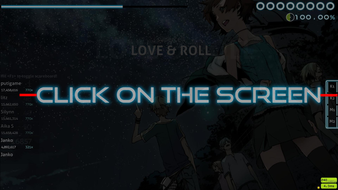
The ranking image is huge for the allotted space. Anything over 50px IMO is too wide, and even that is pushing it.

Why is the ranking image so far over to the left, when nothing else has been moved? It looks odd.

Reduce the width of your "character-comma@2x" and "character-comma@2x" because it's making your accuracy percent text awkwardly close to the song progress pie chart.

The ranking image is huge for the allotted space. Anything over 50px IMO is too wide, and even that is pushing it.
Why is the ranking image so far over to the left, when nothing else has been moved? It looks odd.
Reduce the width of your "character-comma@2x" and "character-comma@2x" because it's making your accuracy percent text awkwardly close to the song progress pie chart.
Topic Starter
wefawefaefgthargrtyhaergartha
I update skin tomorrow. Thx for opinionPhilosofikal wrote:
Both red bars are the same length. Element is clearly not screen centered. If you're playing on anything but 1080p, it will get even more off centered. I would probably just not bother making a center aligned skip image.
The ranking image is huge for the allotted space. Anything over 50px IMO is too wide, and even that is pushing it.
Why is the ranking image so far over to the left, when nothing else has been moved? It looks odd.
Reduce the width of your "character-comma@2x" and "character-comma@2x" because it's making your accuracy percent text awkwardly close to the song progress pie chart.
Unranked icon causes collision in Taiko and is kinda weirdly positioned anyways ok
Very great skin  Thanks
Can you make a 4:3 (and possibly 5:4) version?
Oh and give me the health bar .xcf file plz?
ThanksCan you make a 4:3 (and possibly 5:4) version?
Oh and give me the health bar .xcf file plz?
10/10 m8 would use again <3
Since Janko doesn't really care about editing this skin for 4:3 and 5:4 resolutions, I think i'll do it for him.
For now, I've resized the skip image and health bar for 1280x1024. More resolutions will come soon.
Here's the link:
http://puu.sh/oOTqq/10e1ac1143.zip (1280x1024)
For now, I've resized the skip image and health bar for 1280x1024. More resolutions will come soon.
Here's the link:
http://puu.sh/oOTqq/10e1ac1143.zip (1280x1024)
Topic Starter
Poor effect but thanks for the effort. How do I find the time (I do not know when) I'll make a version for youlongnguyen2004 wrote:
Since Janko doesn't really care about editing this skin for 4:3 and 5:4 resolutions, I think i'll do it for him.
For now, I've resized the skip image and health bar for 1280x1024. More resolutions will come soon.
Here's the link:
http://puu.sh/oOTqq/10e1ac1143.zip (1280x1024)
exelent project!! i love you
Topic Starter
hahah thanksmikutaku wrote:
exelent project!! i love you

It REALLY looks awesome, I'd totally play with it except the mania that I find horrible 
oh, and the CTB ryuuta is not the good one, you should update it (after checking in folder, I saw the new is in a sub folder, you should invert them, though)
I was looking all over osu! for this skin. ;-;
I lost it about a week ago. I MUST REDOWNLOAD....
I love your skin btw.
I lost it about a week ago. I MUST REDOWNLOAD....
I love your skin btw.
The background for the spinner doesn't fit all the way.
And im just stating my opinion. Honestly, for the osu!mania in this skin I think its too lightly coloured.
I think it needs to be a bit brighter...
Maybe neon? Thats just my opinion tho, either way, I love it. Its very well put together.
And im just stating my opinion. Honestly, for the osu!mania in this skin I think its too lightly coloured.
I think it needs to be a bit brighter...
Maybe neon? Thats just my opinion tho, either way, I love it. Its very well put together.
this skin is so goooood <3
youre a great skinner holy damn
youre a great skinner holy damn
Nice skin, but.
STANDARD
· Hitcircles are not simple, transparent and clean, and it's too blue.
· Spinners are the same, too filled in.
I don't like this type of skin in gameplay because I don't play good with this, i get distracted. This is why i always play with clean skins.
Make sure the skin have the simplicity and clean for good plays or something :3
MENU
Well done, I really like that, but i saw the back button has a different font than other options like mods, random, options & mode. I don't like that.
Maybe looks well if you use the same font that other buttons.
SS, S, A, B, C, D ICONS
It looks like better if you apply a simple letter.
You know what avatar would go good with this skin?
Like in replacement of pippi?
Like in replacement of pippi?
Topic Starter
If it weren't that it has a lot of elements associated with the Windows so maybe...TheOperator wrote:
You know what avatar would go good with this skin?
Like in replacement of pippi?
Internet explorer is shit try microsoft edgeTheOperator wrote:
You know what avatar would go good with this skin?
Like in replacement of pippi?
How about that ? Just made itJanko wrote:
If it weren't that it has a lot of elements associated with the Windows so maybe...TheOperator wrote:
You know what avatar would go good with this skin?
Like in replacement of pippi?
HREZSycranet wrote:
a - this would look a lot better if so much of the osu! stuff didn't looked forced. though that's an issue coming from the original image so not much can be done there sadlySycranet wrote:
b - any chance of changing the colours of the 4 squares on her collar? something more based on the 4 world cup colours(i'm being picky ;w;)
this skin is nice....
but i dont like the spin... the center is to big...
the cursortrail and follow point have same color... this is a little bit distracting
could you uplaode your "scorebar-bg.png"-template? I want to change "Player" to My Username
but i dont like the spin... the center is to big...
the cursortrail and follow point have same color... this is a little bit distracting
could you uplaode your "scorebar-bg.png"-template? I want to change "Player" to My Username
GG copyright
Yeah, i know it look overloaded, i think the osu "button" where out of the place, so i changed them too.deadbeat wrote:
a - this would look a lot better if so much of the osu! stuff didn't looked forced. though that's an issue coming from the original image so not much can be done there sadlySycranet wrote:
b - any chance of changing the colours of the 4 squares on her collar? something more based on the 4 world cup colours(i'm being picky ;w;)
For the color i did my best, but it's so tiny the diff is bearly remarquable, even after i took i bigger res than the op.
Topic Starter
?OsuMe65 wrote:
GG copyright
I have something like this http://puu.sh/pI3Qf.xcfLERUfic wrote:
this skin is nice....
but i dont like the spin... the center is to big...
the cursortrail and follow point have same color... this is a little bit distracting
could you uplaode your "scorebar-bg.png"-template? I want to change "Player" to My Username
With the rest yourself unless you can do it
Whoa. I like it. I can add this if this image is in a oryginal resolution (if no send me pm)Sycranet wrote:
Yes It's the original resolutionJanko wrote:
Whoa. I like it. I can add this if this image is in a oryginal resolution (if no send me pm)Sycranet wrote:
If it weren't that it has a lot of elements associated with the Windows so maybe...[/quote]
How about that ? Just made it
Much better
How can I remove the small mini triangles that come out after I hit a note?
wow, it's a like a GG skin
the only thing I've seemed to notice with this skin is that the "a's and s's and b's and so on" are too close to the ranking panel. Other than that there's nothing else wrong I've noticed with the skin.
whoa
is there any way you can disable the "300" ? its annoying af in high speed maps
Pyrozen wrote:
Woah this is really amazing

The future of osu.....
IS NOW!
IS NOW!