Downloads from puush:
puush OSK-file
puush ZIP-file
Downloads from Dropbox:
Dropbox OSK-file
Dropbox ZIP-file
Screenshots
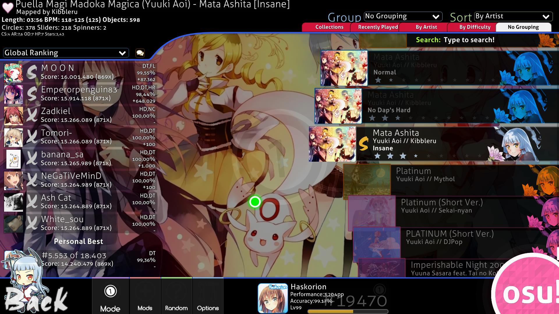
Song Select:
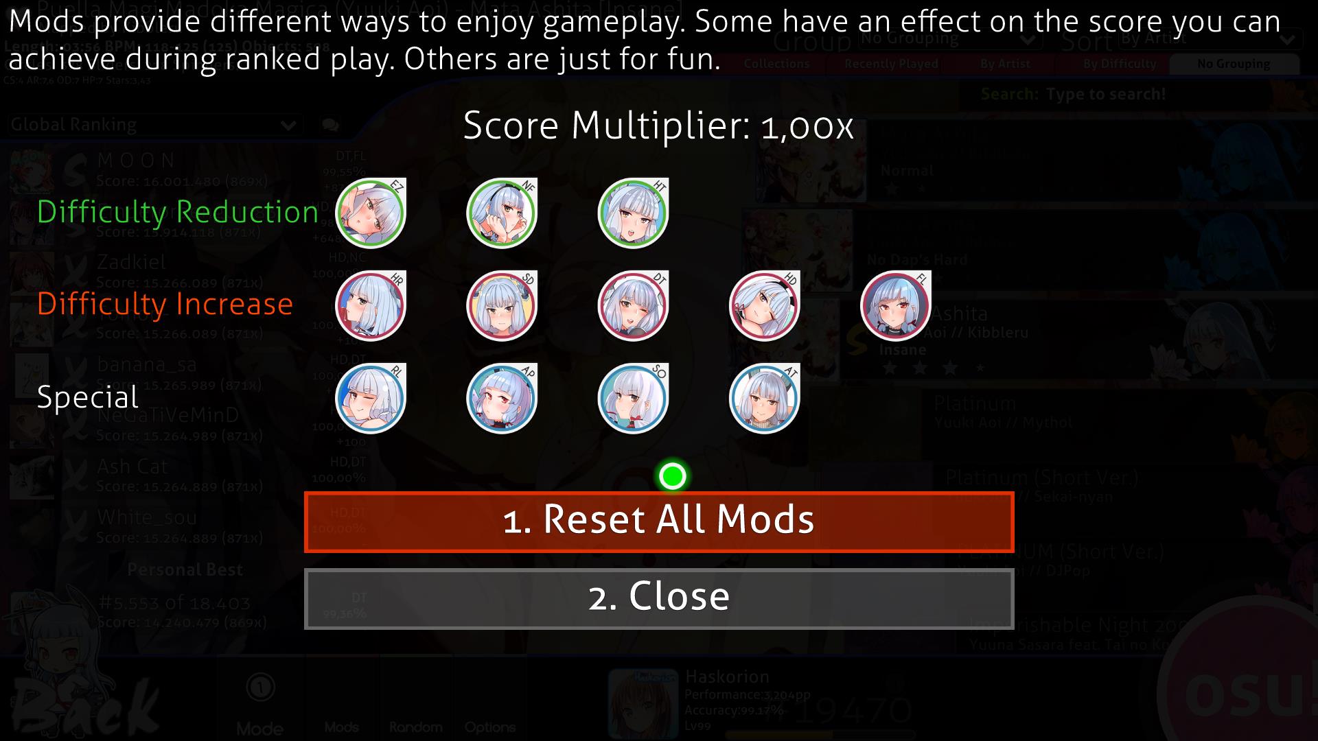
Mod Icons:
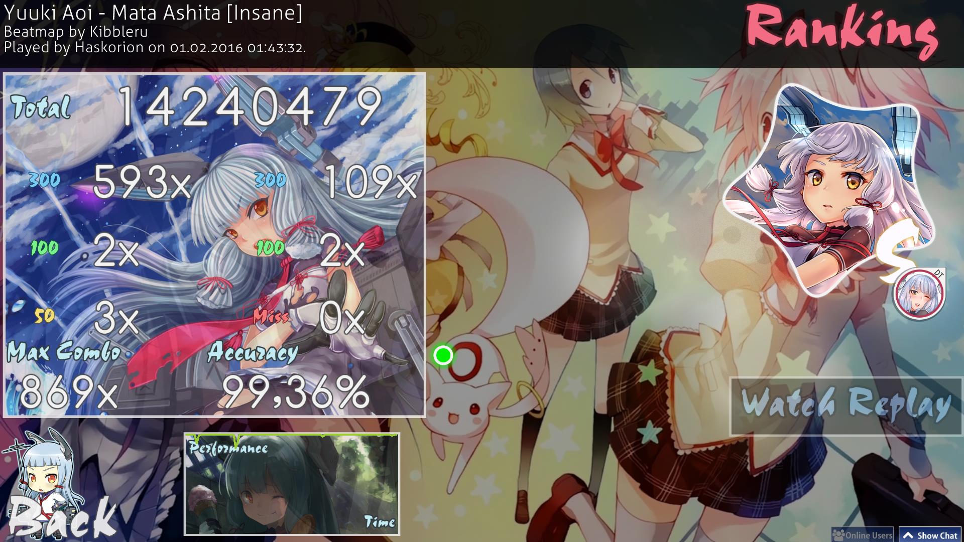
Rankings:
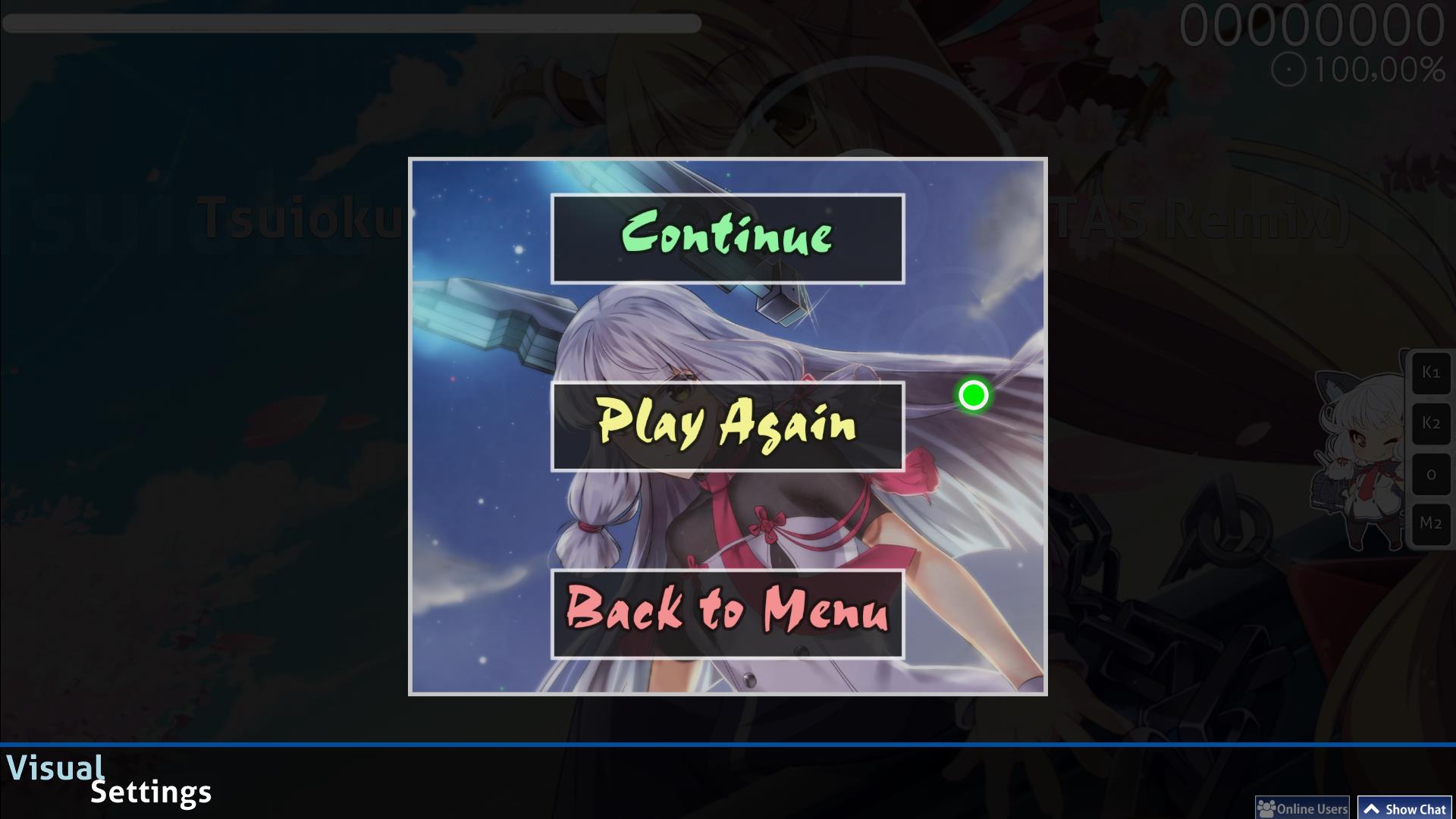
Pause Screen:
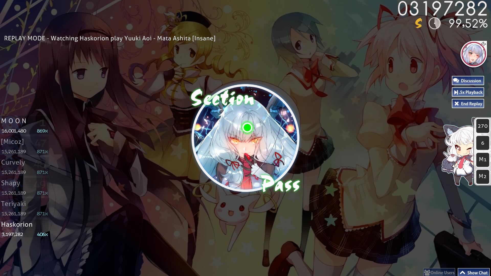
Section Pass:
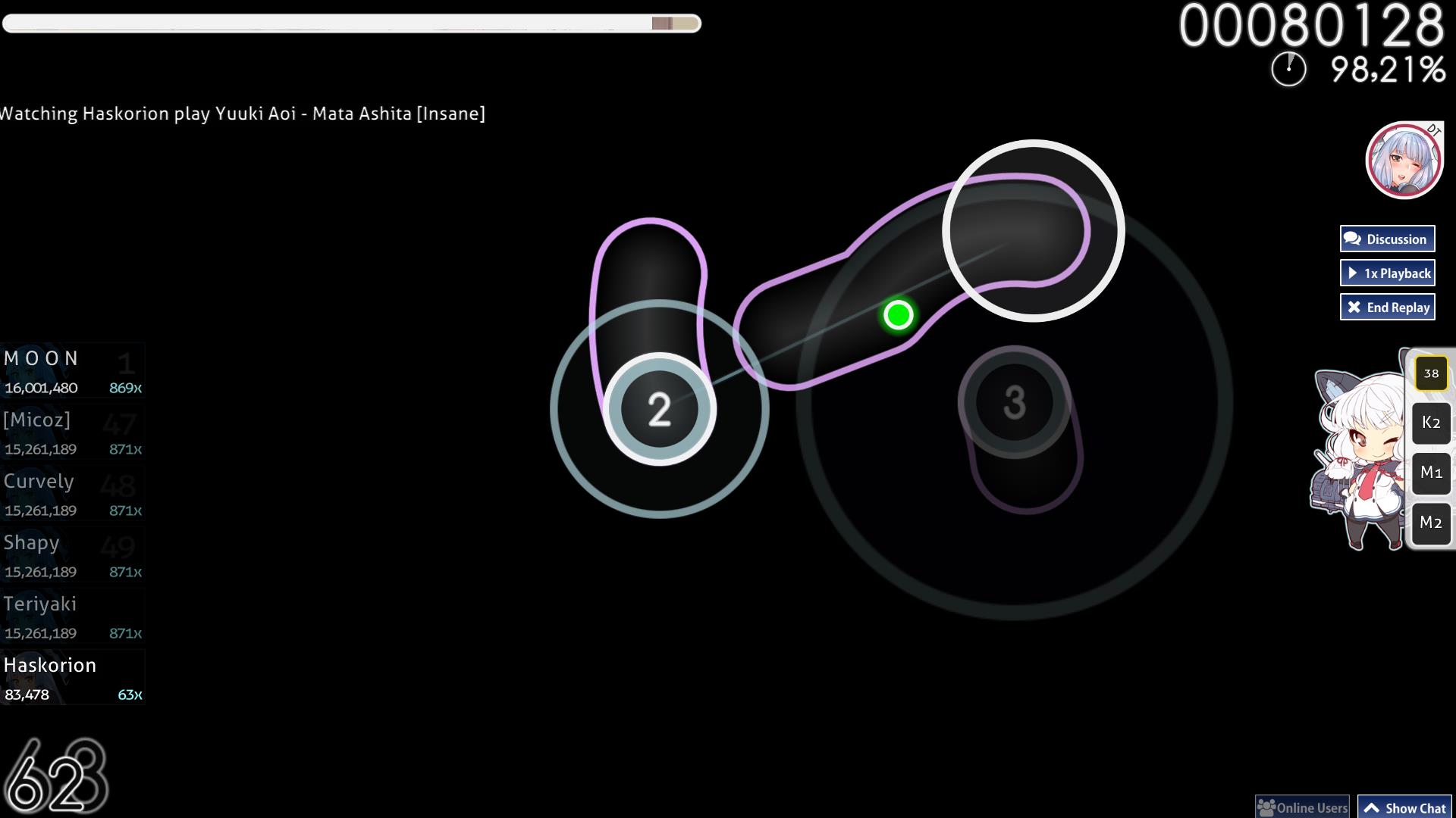
Standard Gameplay:
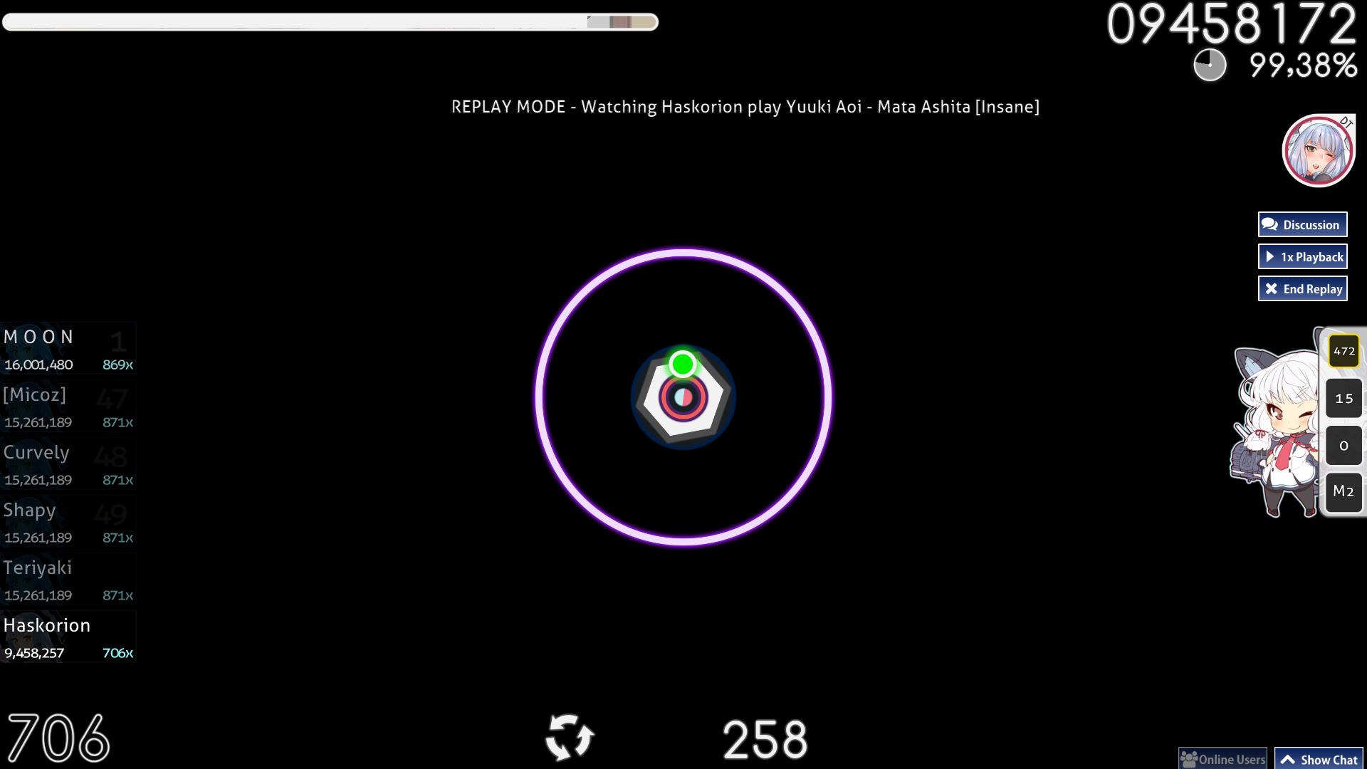
Spinner:
Mod Icons:
Rankings:
Pause Screen:
Section Pass:
Standard Gameplay:
Spinner:
Welcome to the "pre-release" of Comfort, my sixth skin.
This is a skin about Murakumo (叢雲) from KanColle (艦これ) and my first skin to feature art and renders.
I kinda had to make my own since RainAid took a break from his KanColle character skin series.
Also this skin is skinned for Standard gameplay only.
I tried to use no drop shadows (except mod icons where I used full trap to create a shifted border), no gradients (no color shifting ones), and no full white (95% brightness). Due to this design choice full background dim is recommended.
I took some design choices that may look similar to other existing stuff but they fit in general with the theme so no full credits except on my recreations (in question are hitcircle and slider). Also the approachcircle has a low transparent filling which is intended, so don't mark it as a mistake.
I suck at rendering so I mainly used cut masks on forms or simple images to render.
Renders were found on Danbooru and credits go to their respective artists.
Hitsounds are from Redon's Aesthetic HD Skin, which I previously used in two of my skins.
Voice clips are taken from Murakumo's article on the KanColle Wiki.
Fonts used: Comfortaa, ChocD
Click this image to get to the full release of Comfort, skinned for all 4 game modes:
Have fun playing with this skin.
 good job