hi i found this map while hitting random on my songs and decided to mod it. congratulations you got my random mod!

overall it has nice rhythms and you made good decisions as to how to map the many layers of sound in this song using the sliders and circles you have.
sry for no formatting, im lazy
generali think 3723 is a closer offset, please try it and tell me how it sounds
change the dark grey combo color, it blends with the black background dim that many players use
you used some hitsounds, (mostly "clap" sound on sliderticks on [Hard] diff) but there is room to be more creative with it on a song like this.
you might benefit from splitting the [Medium] diff into an [Easy] and a [Normal]. the tempo of the song supports this, and you will be able to make better use of 1/2 rhythms in the [Normal] diff while strengthening the spread.
insaneit's pretty good honestly, mostly aesthetic stuff in this diff.
01:17:453 (6,1) - you can make a better blanket here.
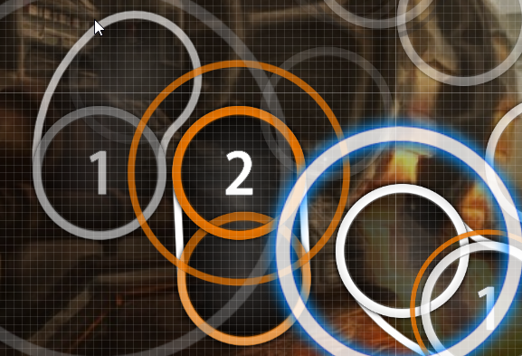
https://imgur-archive.ppy.sh/haJ2sZ7.png01:19:407 (1,2,1) - these are poorly blanketed and 01:20:099 (2,1) - has different spacing than the previous sliders
https://imgur-archive.ppy.sh/4EfKmkX.pngi'm not going to repeat the blanket comment over and over again, but those two issues show up a lot in this mapset.
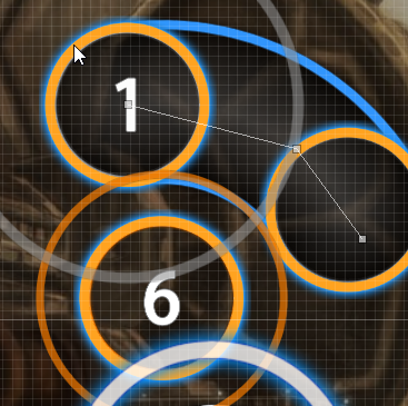
01:20:791 (1,2,3,4,5) - the star isn't symmetrical. you can make good stars using the compose -> create polygon circles tool.
starting here 01:21:714 (1) - the "heartbeat" rhythm on each big white tick is 3/4 beat, not 1/1 like you have it mapped. you would have to rework your rhythms to match it.
01:21:714 (1) - moving the circle around the slider, so it "blankets" (4) looks nicer because the slider is curved.
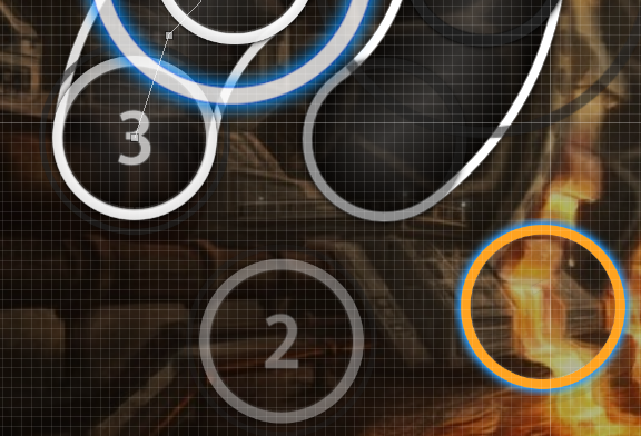
https://imgur-archive.ppy.sh/oGMzPpR.png02:04:637 (4) - it's strange to leave out a note here because its a strong rhythm you've always mapped until now...
hardi think ar 5.5 is not right for this diff. i know it's a slow song, but in playing, i found that it hurt playability, since this song has some "harder" difficulty elements (streams etc)... i personally would put at least ar 7
01:24:945 (1) - i like the way the 3/4 slider maps the echo in this section
00:29:561 (5,6) - not sure why the overlap is off to the left here, it doesn't look good.
mediumyou should probably lower cs to 3 or so for this diff.
01:48:945 (6,7,1,2) - these kind of subtly overlapped patterns are probably not good ideas for a low diff.
01:50:791 (3,4) - these two sliders would look good if they were symmetrical across the y axis
01:54:022 (4,5) - this angle of overlap doesn't look good
if you have any questions, please message me in-game. good luck!

