We call this over-GFXed
forum
Post your GFX!
posted
Total Posts
393
Topic Starter
still beautiful-[Jess]- wrote:
We call this over-GFXed

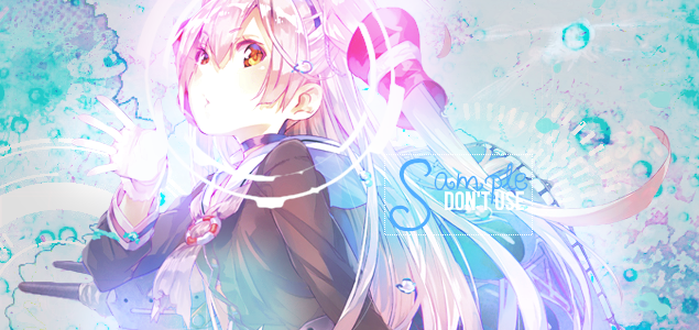
Gosh, I'm tired. But I need to do something with GFX today. wip for another forum.

Overgfxed indeed.-[Jess]- wrote:
We call this over-GFXed
CnC, I'm being sort of general with this and I might gloss over some things
Let's start off with the good. The colors mesh pretty well for the most part and I like your placement of text. Your focals are also placed rather well. Probably the best of this bunch is the first piece since it has all of the things I've listed as good, plus the circle on Amatsukaze's face gives the piece a good focus on the focal.
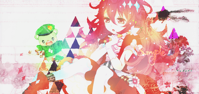
Unfortunately, I have more problems with these pieces that I have more compliments about them. The lighting is messed up to hell and back where it's in places where it's not supposed to be. Last I checked, lights don't go into the folds of clothing or under armpits. I also mentioned earlier that one of the good things in these pieces were the colors? Yeah, it's also a weakness, but more so the coloring than the colors themselves, and combined with the textures that you've used, it makes some of them look like a mess. The worst offender of all of this is probably the last one, where it's just texture spam on top of texture spam with one color all over it (though you probably knew that already). It's just really hard to focus the focal and to be honest, it kind of hurts my eyes a little.
With that said, some advice:
- Limit your light sources to just one part of the canvas
- Rely less on coloring
- Try not to use as many textures spread across the canvas
I love this commentSSShaymin wrote:
Overgfxed indeed.-[Jess]- wrote:
We call this over-GFXedCnC, I'm being sort of general with this and I might gloss over some thingsLet's start off with the good. The colors mesh pretty well for the most part and I like your placement of text. Your focals are also placed rather well. Probably the best of this bunch is the first piece since it has all of the things I've listed as good, plus the circle on Amatsukaze's face gives the piece a good focus on the focal.
Unfortunately, I have more problems with these pieces that I have more compliments about them. The lighting is messed up to hell and back where it's in places where it's not supposed to be. Last I checked, lights don't go into the folds of clothing or under armpits. I also mentioned earlier that one of the good things in these pieces were the colors? Yeah, it's also a weakness, but more so the coloring than the colors themselves, and combined with the textures that you've used, it makes some of them look like a mess. The worst offender of all of this is probably the last one, where it's just texture spam on top of texture spam with one color all over it (though you probably knew that already). It's just really hard to focus the focal and to be honest, it kind of hurts my eyes a little.
With that said, some advice:
- Limit your light sources to just one part of the canvas
- Rely less on coloring
- Try not to use as many textures spread across the canvas
Well,I think pic4 was overspamed with texture and stuff,looking back this remind me overspamed is not good and too messy to look at,I can't find this can catch any of my eyes.i will try to redo it later.really thanks for point out of the mistake
constructive criticism is appreciated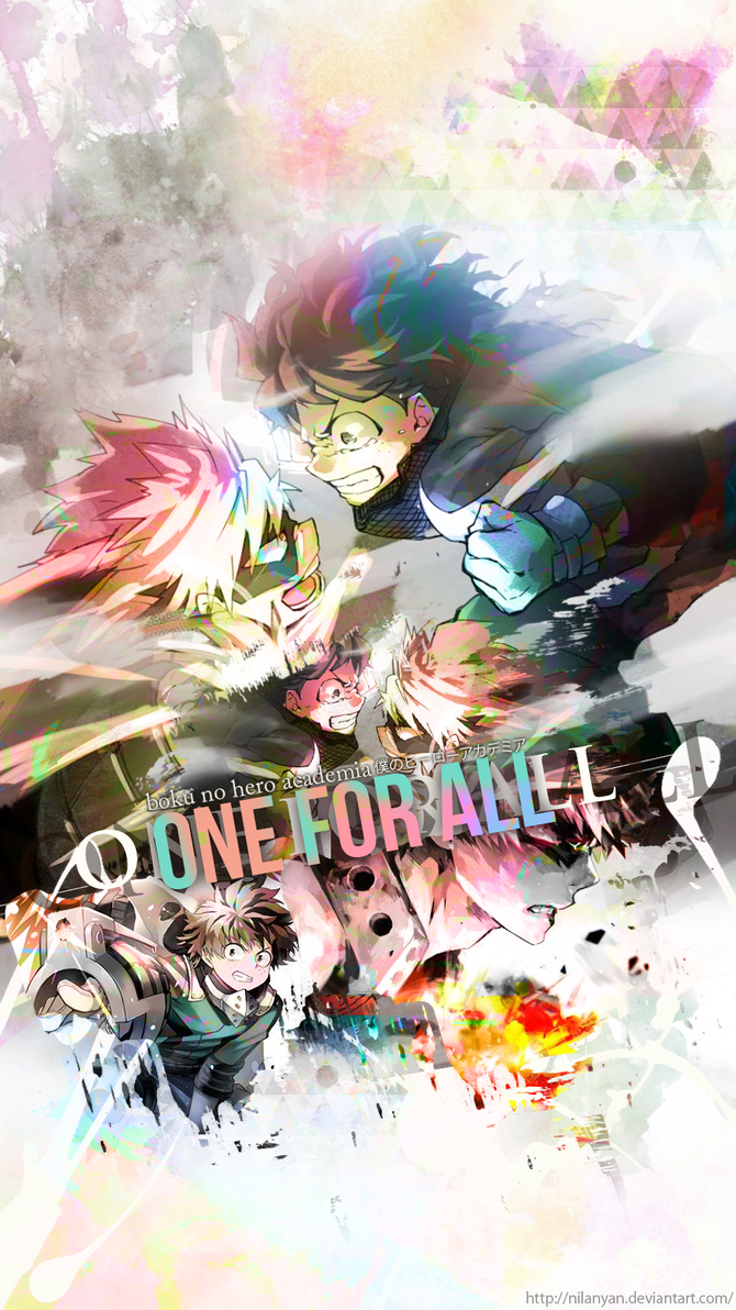
i guess i didnt post this here before xd
i guess i didnt post this here before xd
oops, had to try again
but something is off and idk what :/
(Im not copying Leafy i just like the style f f s)
but something is off and idk what :/
(Im not copying Leafy i just like the style f f s)
My first GFX edit ( i Think ? )
Using link because image not loaded properly xd http://puu.sh/rACN0/53c2c88264.png
Jijou
Everyone has such nice artwork @.@
Ugh, I went dead again. Real life is dumb.
Something I've been working on for the past week.

Something I've been working on for the past week.
AngeLNarancia
t/486618
I need to publish my gfx because nobody is request me anything ;_;
I need to publish my gfx because nobody is request me anything ;_;
Anyone could give me an advice when using text xD and also what colors to choose =w= been editing for almost a year and yet still not good at placing text xD
650x150 is the size I tend to use, but I believe it can go slightly larger than that, but not by much.Shiv wrote:
uhh what is the right size for signature?
it's not GFX related. i'm just curious, how do i make my userpage as big as mr.monstrata's? 

Badges increase the height of the userpage.Shiv wrote:
it's not GFX related. i'm just curious, how do i make my userpage as big as mr.monstrata's?
i'm use size 900x160 for signature no problem

Avatar and coloring practice.


Also a request that I absolutely need to finish.

Also a request that I absolutely need to finish.
that's because it resizes it, which can lower the image quality.LigerZero wrote:
i'm use size 900x160 for signature no problem
Tried experimenting with fractals
sorry for the obvious mistakes here and there ;;
Little something I made while I was at my campus
 Dank UserPage
Now that I'm done with my exams, I've been thinking about working on going outside my comfort zone. Also for the shop. That too.
what font did you use ?Tae wrote:
just created a new GFX, it looks great
Request from another forum. Posting progress before I go to bed. I'm trying out some new brushes and so far I see great potential in the finished product.

Here: http://www.dafont.com/thinking-of-betty.fontjyling wrote:
what font did you use ?Tae wrote:
@Reunilu your work looks really nice, keep it up! May I ask where you source your resources from?
Just deviantart. I can't seem to find the texture pack I've been using for my wip, but if you want exact places, these are the ones I've been using recently.Tae wrote:
@Reunilu your work looks really nice, keep it up! May I ask where you source your resources from?
http://mohaafterdark.deviantart.com/art/MIX12-244363813
http://frozen-roos.deviantart.com/art/8x-Decorative-Scans-189329492
http://akumalovesongs.deviantart.com/art/Pack-19-pngs-430510198
