UPDATE 7/1/'10: By now, I've done a fair amount. Enclosed is almost everything new I've done. WARNING: WALL-O-TEXT THAT YOU PROBABLY DON'T WANNA READ UNLESS YOU'RE AS BIG A NERD AS I AM.
I've edited the cursor yet again, since I thought the small transition meters were dumb against the big CORE array. (By the way, if anyone knows if you can have a different sprite for when you're clicking, not just always, tell me, so I can make it fire the beams at each click, which would just be slick ^_^) I know the cursor is still hidden amidst warm color sliders, kinda, but the progress in both transitions up and down (there's a subtle difference in colors, just look) should help out a little.
I also did the return arrow as--what else?--the BEAT paddle. I'd just had the paddle alone, of course, but then realized it would've been hidden in all colors from orange to yellow. So, I added some of the wavely stair snakes (I guess, dunno the official fanon term) first seen in DESCENT on the side the ball is coming. I'll add the movement blur "pixels" to the paddle to tell that it's moving up (in the way the picture is oriented) for more detail. (I know that the blurs aren't in the real game, but I wanted people to know what those beats are.)
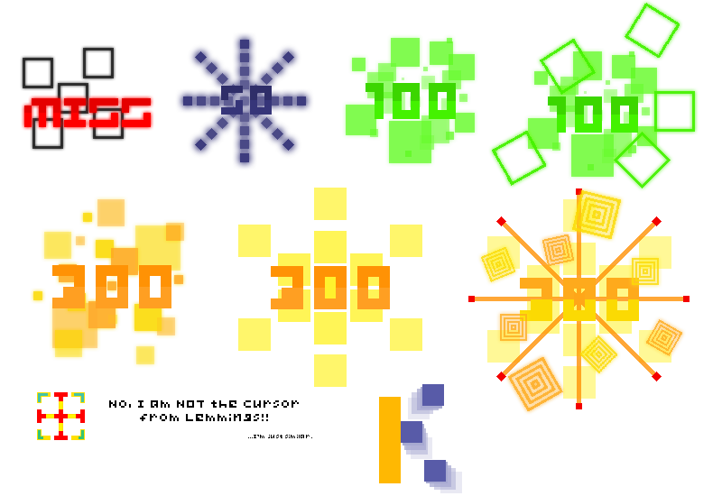
The hit bursts were a LOT harder and took a day or more. Lemme explain what they all are.

First up is the miss. Those five black squares are supposed to be one of the sets that come from the sides when you miss a black Beat in VOID, and the MISS is off-center to both add a bit of style and to show the squares more. The black-and-red combo is pretty striking. (Fact: This one is the only hit burst whose text is given a glow. It has to because it's not really fully backed by anything.)
Next is the 50. This is basically the way a black Beat "bursts" when you hit it with your VOID in VOID, in MEGA mode. I was going to have the way they burst in SUPER and ULTRA be the basis for the 100's and 300s, but I kinda combined them with the first two games. Fairly easy to do, until I realized the diagonals are diagonally-turned, so I had to redo those with PS7's weird way of doing 45-degree rotations. The burst of pixels fades in from the center to show where it "started" and where it's "ended". I'm pretty sure I've got one more "frame" than in VOID, but it goes too fast to really tell.
Third is the 100. It's a mass of randomly-sized green squares of the same color, as seen in MEGA and SUPER of CORE, but different intensities to be cool and bring out the overlap. For that, I just first did them all the same transparency, then did some semi-erasing. To my horror, the overlap areas were much more faded than I'd wanted. So I erased those lighter and apart from the rest of the squares. I put a glow around the squares, which adds their intensity and makes them more solid on the screen (which has the danger of drowning out the "100"; I had to move a square or two to make the "1" more visible), since I didn't want that ugly whitish pseudo-smoothing border stuff I'd found around the MISS squares before I made them glow. Should I not worry? I mean, they're just squares, and thus stationary, so...? PLEASE tell me if you know.
Fourth is the thing that makes people go "Ooooh...!" after a long string of 300's: the 100 Katu. For this one, it's got the little square things that fly from the VOID after shrinking it while in SUPER mode, in VOID. These were a bit of a pain to arrange, since I wanted each to come out a bit farther from the center than the last, yet have it be neither an obvious spiral nor a predictable five-pointed star while not having it look too ugly. The first problem was simple, but the next wasn't. I hope this works for others. (I DEFINITELY needed the glow this time, because I'm SURE the game will put on the pseudo-rotation border around the diagonals.)
Fifth is the thing we want to be seeing after we click or tap, the 300. This is made much like the 100, except it uses different colors and intensities of only four square sizes. I used both yellow and orange (even though they're really never seen bursting from one Beat; I got mixed up when I saw multiple ones being hit at once) because they do different colors per individual Beat's burst when in SUPER mode in CORE, adding to the multi-color theme of that mode. I used the same four sizes because I got lazy. This actually got me in a placement jam, though, not wanting the same sizes too close, or the same colors...I hope it's appealing, still.
Sixth is Mr. Consolation, the 300 Katu. This guy was originally just the Geki's "missiles" over the normal one with the differently-colored number, but I found it too similar to the Geki. So, I just made it the burst that happens when a Beat is repelled by your paddle in BEAT whilst in MEGA. It was too big at first, so I shrunk the squares, then brought them closer after finding it was STILL too big. It's extravagant, but nothing super-special, like the 300 Katu oughtta be.
Finally is everyone's favorite message of "YOU ROCK!!", the Geki. For this one, I mixed together CORE and VOID with a differently-colored number (the colors to emphasize). Those orange lines with the red Beats at the end are "missiles" with "trails" encountered in CORE, most noticeably in EXPLORATION, the second level (where variations with green trails and orange(?) missiles appeared for the boss, which was Missile Command played using the CORE array, the EVILEST boss if you don't know to KEEP AN EYE ON THE BOTTOM OF THE SCREEN...). As said above, they were in the 300 Katu, and I found seeing them burst was REALLY cool! It really looks like they're flying out when the burst is enlarging! I applied it to this one, which had the normal burst in the background, which was, again, too much, so I took it out and replaced it with the same thing as the 300 Katu since the number was too hard to see. Around it are colored and differently-sized (two sizes only for clarity) versions of the cool square things that fly out of the VOID after shrinking within ULTRA mode in VOID. Two are slightly covering the number for extra style. I think it's cool, though I hope it's not too much...
Finally, we have the "stars" that fall from the cursor during breaks and sliding with Kiai and come out in other places. They're just a big square, representing a pixel, which is the fitting motif of the retro-aesthetic BIT.TRIP series. I didn't put it here because it's boring and you can't really understand it until you see it yourself in action. I was using it as a placeholder, thinking of doing the ULTRA line squares instead, but when I saw it was applied to more than just the cursor, I thought, "This fits more." When I saw it burst from hit circles under Kiai, I was sold. X3;
ANYWAY! Blabbing over!
Next: Score fonts and the ranking letters! (I'm thinking putting characters in with the bigger versions.)