forum

An64fan's art topic

posted
Total Posts
28
Topic Starter
An64fan
"What? Why don't you just go to dA or something for stuff like this, Ani?"
Because I already do, but I like getting feedback on my art, even if not from fellow artists. Most people on deviantART are there because they themselves are artists, anyways. Plus, I wouldn't doubt that there may even be a few people here who go to dA but don't see my stuff either.

As said, I like showing and getting feedback on my artwork, and the people here are pretty attentive. I figure I'll post something here every now and again when I come up with something which I feel is worth people seeing. So feel free to let me know what you guys think of the stuff I draw. You can make suggestions of all sorts if you'd like as well, even though I don't actively take requests (you could mention something and hope though, I guess).

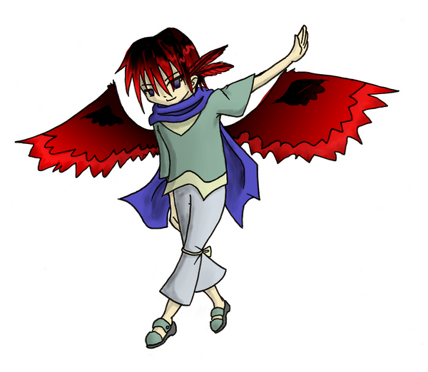
So anyways, first up is something drawn just today:

Lybydose
I've never really understood this: why does the hair on anime-ish characters always go BEHIND the eyebrows? It doesn't make any sense, and yet I see it all the time.
Guy-kun
I'll add you to the endless list of deviants I watch but don't pay attention to if you like.

[edit]
@lybydose laziness and drawing of hair coming first
awp
Any reason why the sleeves are different lengths?
Pokebis
The feet are different sizes.
Where are the wings coming from? They're in an awkward position.
Where is his nose?
It looks like his legs are tied together.
Is he wearing a bandanna or a cape or something? I can't quite tell.
Wait, is it even a he?
Also, eyes and mouths don't work like that. I suggest you pay a bit closer attention to a real life reference on your next drawing.
awp
This map has been deleted on the request of its creator. It is no longer available.
Pokebis

awp wrote:

Pokebis wrote:

Where is his nose?
Above his lips~
I thought that was a blemish or something. Is he supposed to be able to breath out of that?
Cuddlebun
I'll agree with Pokebis on the legs and the wings. The wings are too low; generally wings are right around the shoulderbones, and the legs are too awkward. Also I can't really tell where his neck is, even with the scarf taken into consideration.

The other stuff I'll ignore due to the animeish style (I think that's a scarf?) but it always is a good idea to look at real life references for better anatomy.
Topic Starter
An64fan
Lybydose: Stylizing, I guess. It's more interesting to be able to see them clearly anyways. If I drew thicker brows, they probably would be hidden, though.

awp: Because I wasn't paying much attention and then just went "Meh, whatever" when it came to inking. I could have fixed issues with the left sleeve if I had really wanted.

Pokebis: As awp said, perspective.
From his back.
As awp said, above his mouth.
You have a point. I didn't notice that.
It's a scarf. I love scarves. <3
Yes he is.
Stylizing. My main style is a little more serious (although still animeish), but this is my new style I'm working on so I can draw in a little more peace.

Todesengal: Ever since I read a tutorial about drawing angels, I always draw wings closer to the mid-back. The tutorial said that there's not actually room on the shoulders for functional wings, and really, that's true (the space is already occupied by our arms). Shoulder wings look weird to me now.
And yeah it's a scarf.

Also, I do refer to real life for some stuff, although more for general design ideas rather than style. I don't draw realism very often.
Cuddlebun
See, the wings part is hard to argue, seeing as how the human body is not meant to have wings in the first place, you can't really determine where they would be. The way I've been taught is that they originate mainly ABOVE the shoulderblade, with the actual bone coming out somewhere above, and the more shallow muscles originating closer to the shoulderblade. Your way could be correct, but it'd be really weird. Not to mention those wings are tiny and don't seem to have the support they need to lift something as heavy as a human.

But it's hard to argue since I can't prove anything.
Pokebis
I was just saying the way the scarf flows it looks like the wings would be floating behind him rather than being attached to his body. They're also slanted kind of funny for what his angle is and the one on the left looks dramatically different from the one on the right (from my perspective, not his). I know people aren't symmetrical, but it looks like the bone structure of the wings are different on each side.
Daru
Always keep in mind that anime is derived from realism.

As such, you are typically looking to accomplish many of the goals set forth in drawing realism. There are too many to simply list here, but one of the major goals is to achieve the illusion of solidity. In your drawing there are too many things that contradict what one would perceive as "real", and it therefore looks very flat. These things range from a single boring line weight to odd perspective and a seemingly uncomfortable pose. It's a general rule not to let things in an image get too repetitive. Vary your line weight and change where his "bangs" begin, and keep in mind that your ultimate goal is stylized realism. Think of it this way: If you bake a cake starting at step two, you won't get as good a result had you started at step one. As such, you shouldn't be focusing so much on anime as much as you should be focusing on realism; take concepts common to the fine arts studio and apply them to anime; rather then looking for mistakes in the final product, look for mistakes in your underlying structure, that being your understanding of things like composition, light, color, and so forth.

tl;dr - To get better at anime, stop drawing anime.
Topic Starter
An64fan
Thanks for the feedback, Daru. Actually, I do vary my line thicknesses a lot, but this was just a simple inking so that's not really what I focused on. In fact, I love playing around with line weight, enough so that it's not unusual for it to get out of hand in my hands. :P This was also a rather small drawing, so I probably wouldn't have done much variation anyways...I'm more inclined to do so with a large drawing with lots of space to spare.

Also I suck at perspective. I've done a couple of practices and should probably do more... I'd honestly like to be able to draw some extreme differences due to perspective, but I just don't have the practice to do so effectively. I'll try to improve on that though.
Daru
Well people who are good at something are just people who have endured sucking for long enough to stop sucking.

So, to get better at perspective, draw perspective. :) It doesn't matter if it sucks or even how your practice it, just practice it. I have tons of "will never see the light of day" drawings practicing something that I didn't quite get or wanted to improve on.
LuigiHann

Lybydose wrote:

I've never really understood this: why does the hair on anime-ish characters always go BEHIND the eyebrows? It doesn't make any sense, and yet I see it all the time.
When real people have bangs in front of their eyebrows or eyes, you can usually still see their eyebrows and eyes, because real hair isn't one solid chunk. When hair is drawn in cartoons as one solid chunk, it makes some sense to make that chunk somewhat conceptually translucent, and to have certain details show through... That's what I've always assumed was the reason
Topic Starter
An64fan
There's colour now. Discuss.

That or just criticize me. I'm not confident with my colouring skills to begin with, so that'll just make me more insecure. :P
Cuddlebun
The clothes I really like. The colors are nice and faded, though the shading looks...smudgey, I guess you would say? Not sure about the wings, still forming an opinion on that. The skin color looks...off somehow. Can't put my finger on it.

Still better than anything I can do :P
awp
Gradients make me sad =( especially when they're that obvious and out of place

First thing I noticed other than gradients was that you're mixing shading styles between flat (the shirt) and for lack of a better word, "rendered" (the pants, scarf, hair). I'd say, stick to one or another.

Perspective/depth is still missing from the back leg, which is something colouring should have handled !!!

The blending of the hair on the left side of the head looks pretty good, but on the right side there's a squiggly red line that is probably not serving the purpose it has intended to serve, because it looks odd to me.

Faux-protip: when colouring hair, try setting aside a few shades of colour (in this case various shades between red and black) and then do like a thousand brush strokes in the direction the hair flows, varying your colours in "layers" (layers of hair, I mean) to see if you can get a cleaner, more realistic effect.

picky picky picky picky but that's what this thread is for right

because constructive criticism will help you right right
Randy96
No pupils?
Topic Starter
An64fan
No pupils~

And I'll keep all that in mind, awp. The only thing with the strokes is that I have...let's put it at weak angles. I should really be rotating my work constantly by 90 degrees at a time when I work to overcome that...wait can I even do that in GIMP? Ahah, I don't remember.

I also have a jittery hand sometimes, though this is a greater problem with digital than traditional work (that said, it can be fatal on paper). The good news is that I reinstalled PSP though, and I love PSP's pen tool, which works COMPLETELY differently to GIMP's pen tool. No pressure sensitivity, but it has tracking to smooth out lines, and I can do beziers when I need to with it. Fun fun~

But yeah, I'll see what I can do. I've been playing with different styles of colouring in recent months.
I've got a new drawing I've been working on, but it needs a little bit of cleanup and I still need to colour it. What's more, I'm going to see about writing a tutorial about how I drew it. I'll see about posting the drawing a little later.
Daru


A few things in the coloring that I noticed (and feet, which are bothering me).
Topic Starter
An64fan
This map has been deleted on the request of its creator. It is no longer available.
Daru
You're still shading with black. ._.

But, yes, good job making the shading less messy on this one.
Topic Starter
An64fan
Yeah I know that, but if there's one thing I have more trouble with than shading, it's picking out the colours themselves. I do want to try working with some more colours though. I've seen tutorials on various colouring styles, there's lots of stuff I'd like to try out. I'm just not very comfortable with handling colouring yet. I'll be sure to try some new stuff when I get a little more comfortable.

Maybe I'll post up something in monotone next. :P That much I'm relatively comfortable with, and I simply adore my pens. Been a bit jittery these past few days though.
Ephemeral
Pillow shading blaaaarrrg

Why doesn't anybody use equidistant shading anymore? It was all the rage before this web 2.0 bollocks.
awp
oh I like the patterns on the ring/staff there
Topic Starter
An64fan
This map has been deleted on the request of its creator. It is no longer available.
Lilac
I'd say the jacket on top doesn't have depth in it. Makes it look flimsy.

Is it me, or does the left eye seem out of place?

But on whole, it's great. Definitely above average with your other drawings you find on DA.
Please sign in to reply.

New reply