forum

Osu! Site redesign ^^

posted
Total Posts
49
show more
Topic Starter
WindFleuret
@Senritsu、im sad to dissapoint you, but this is only "fan-made" so to say :) There is nothing here that is in some sort of consideration from osu! devs. I guess they even dont know of the excisting of this thread, so i want to make this clear:

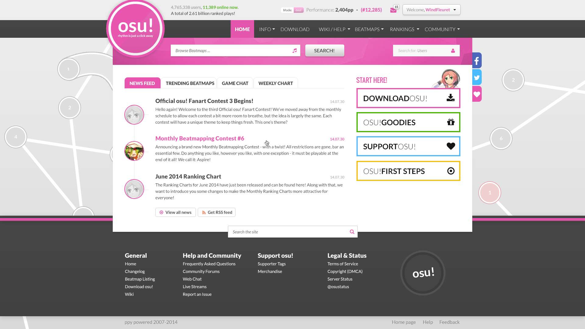
This is NOT future site update! This is only fan-made and its nothing more than that.

And sorry if i missunderstood you :) I am saying this for all other who might read these posts.

Now about what you said hmmm ... a site is to be used from the users, and since all want envelope icon then i will change it :) But know that then it will only be for messages and all other possible notification functionalty is gone.

About home page, yes, i could make one, but i prefer doing the big screen ones first ^^

and imo it shouldn't be latest beatmaps, but mostly played beatmaps, as showed on current homepage?
Yes, you are right about that. I noticed it after i published it here ^^ Will be changed next time.

Also about the video.. mm ... i am not sure its all that great of thing to be there. Sure, it fills empty space, but if it was something more useful then it would be better. For now i might add it, but i am really not sure about that specialy.

The slider - it is in the background, but the footer hide it :P Didnt notice that too lol
ALTKID

WindFleuret wrote:

EDIT: Here is the updated home page:
http://imageshack.com/a/img539/2514/77QBPW.jpg (still not all functionality is presented, if you give me some ideas i would love to add more there ^^)
wow that's better,

imo, the osu!words should be a bit larger than that.
and is that for notification?

please add messages icon. (or something for messages)
sorry for bad english :c

SPOILER
also, i don't think using too much white color will be good, because when you see too long at shiny/bright colour your eyes will become tired. maybe you can use some soft colour like white-pink colour for background will be better. like #faecf4

just in my opinion.
Topic Starter
WindFleuret
@AllRiseSilver, as i said i will be changing it to message icon on the next update. I am doing this in my free time, so when i get some i will update it! Dont worry, i am really having fun with it, so i wont be delaying it at all!

imo, the osu!words should be a bit larger than that
What exactly you mean with this?
ALTKID


i think that's a bit too small.
just in my opinion
Topic Starter
WindFleuret
ok, i will test it and see if bigger one fits better. Just to add a little more weight up there :)
KinkiN
oh God even though it's fanmade i'd actually want for this to get implemented

well i believe peppy will change the template himself in the near future
Senritsu

Yuzuru wrote:

oh God even though it's fanmade i'd actually want for this to get implemented

well i believe peppy will change the template himself in the near future
this haha
yes the word seems like a bit small... and the color seems flat too. try making it gradient like the current one? ww
Perfection
Wonderful, I like it
NotEvenDoomMusic

WindFleuret wrote:

EDIT: Here is the updated home page:
http://imageshack.com/a/img539/2514/77QBPW.jpg (still not all functionality is presented, if you give me some ideas i would love to add more there ^^)
eyegasm

Really well done on the updated version of the design, now everything is settle and works splendid together.
I'm sure there's still plenty of user friendly measurements in terms of hotlinking the right thing and even enable more options for the user to customize the top-layer to their likings.
But as of right now, i give it easily a 10/10.

Oh, also you mispelled "osu!first steps" as "osu!fisrt steps".
Just a typo i almost immediatelly caught haha.

Also, i think you already know this, but if this were to be a real thing that is live right now, the news feed box would have some considerable spacing inbetween each post or do you intend to have them a bit stuffed up like this?
Or would the design allow the user to click on, as an example, one of the news and it would expand it to it's original content size on your current page without leaving the homepage? and by clicking on the title of the news, would open the dedicated thread for that specific news?
Because if that's not the case, i would increase the spacing inbetween each article by a small bit so that it doesn't look pressed together.

I'm just curious if you don't mind, because i'm vaguely interested in how this would look as a live website in its end revision.

AllRiseSilver wrote:


i think that's a bit too small.
just in my opinion
The size is just fine,
you don't want your logo to fill up the entire upper screen.
Besides it would cut off too much of the logo if WindFleuret increases the size.

Also to put it up in a perspective, the current osu! logo is smaller than the one that OP did.
So he already increased it by an approximate 10%.
troke
nice, but forum design?
Senritsu
Omggg why ppl (and me, too) don't realize this
Where's 'rhythm is just a click away' wwwwww
Kouya-
I really like the design, it's fresh and clean .

It looks really nice ^~^

I'm looking forward to seeing the other pages ~
Ayesha Altugle
Simplicity is the best!

I already Got the Idea of forum pages redesign
Topic Starter
WindFleuret
Ok guys, here comes the next update on the home page with your suggestions:
http://imageshack.com/a/img633/7435/weaWhb.jpg

What is changed:
1. A little more space for the news area as suggested
2. added "rhythm is just a click away" in the logo (i hope its not a problem ^^)
3. Another rather bigger change is the pink area under the menu. I think it make the whole design look a little more solid.
4. Small paddings changes in the footer
5. Now we have the envelope for messages :yay: :P

And here comes the new page - Profile:
http://imageshack.com/a/img661/4436/myKu4C.jpg

I had quite a lot of fun doing this one ^^ I hope you like my idea for organizing it.
*note - keep in mind that i still havent added quite a lof of content there, but i hope you get the idea how its going !

Updates will be comming!
Senritsu
i love you <3 [2]
PLEASE APPLY THIS KTHX
but where are http://puu.sh/aMnje.png
there's one thing i want to know about : that button at 'welcome, *user*'. if it's pressed, what will it show?
because this seems missing settings and log out button CAN'T LOG OUT SAO OMG
Topic Starter
WindFleuret
Ahahaha :D

Well, see.

As i said, those that you say that are missing ( http://puu.sh/aMnje.png ) are not yet added as i allready said. This is still WIP, so i will be adding them later on. meanwhile im sharing this, just in case some come with awesome idea that i can add ^^

that button at 'welcome, *user*'. if it's pressed, what will it show?
What will show from that button will be dropdown menu with many cool links :) I will show it in the next preview!
Dont worry, you can logout from my VRMMORPG :D

Btw, i am currently thinking on adding the customized user page content (the one everyone can add for himself) between the performance points line and the performance graph, as the main important thing is above the graph. The rest is just more and more information that is basicly said in the upper area.
Ayesha Altugle
may I know what font did you use in the page redesign? It looks cool (and it's very different from aller)
Topic Starter
WindFleuret
Lato - https://www.google.com/fonts/specimen/Lato - used for 99.99% of the time
Oswald - https://www.google.com/fonts/specimen/Oswald - used only for the 2 headings in the home page
Ayesha Altugle
thanks a lot! (though I'm not that good as a graphic artist, I think I can help)
Topic Starter
WindFleuret
Hmm, i would love to get some help on that from other people too ! Its fan made by me, but i dont mind cooperating with all that want to help ;)
What i would ask you to do is image for the footer. (background). Something that will blend with it and not stay in the way, but still not make it that empty. Also it has to be related to the whole site tematic (we know what it is :D).

1920x400px will be good start. Do whatever you want to, i will test it on the design and see if it fits ;)
Kunieda
Love the profile design! It looks good *^*
Edit: where's the userpage? ;w;
Senritsu
For footer, how about adding mascots from all modes?
Idk tho, just suggestion of what suddenly comes to my mind
Topic Starter
WindFleuret
Hmm ... thats rather cool idea :) from both sides to put total of 4 to 6 images. Still, i am not sure if that will look good. Usually i would stay for the current footer, but if any cool graphics come up i would try them right away.

If you have any sugestions for which images of the mascots to add paste them here, i will try and if it looks good i will share :)
- Marco -
*throws invisible stars*
Kouya-
I'm to hyped for this ~

It's honestly looking great, I like the profile page so far ^^"

I'm thinking, for the characters, they could either be all together, or should be on different parts of the site .

Like for ex. Pippi will be on the homepage and then Yuzu (Wanna be Ryuuta =~= ) could be like on the forums part of the osu website ~

Though, this is only my opinion xD
troke
and forum design ?? :O
Topic Starter
WindFleuret
Yes, forum will be here too, just wait a little more :) Im really bussy with other projects. I hope today i will be making some more !
deadbeat
currently not liking the profile page that much right now. i'll offer more feedback when it's finished. but it does need work :(
edy
First of all I love you for doing this, and holy crap what a good job done.

Some feedback from a nitpicky narrb, these are just my personal opinion.
a click away
General
  1. Colour scheme feels too dark imo, perhaps go for lighter gradient ends? Remember it's a site that people will spend quite a fair bit of time on, you don't want the colour to contrast too much except for important things.
  2. What width are you going for? Browsing on a regular 1024x768 window, there is actually barely space for anything and it's quite huge. How would you collapse items when width goes below your designed width?
  3. Facebook side-button's background isn't well hidden, unless it's intended.
  4. Site search looks really, really awkward. Either move it all the way down like the current one, or slightly below(so it sits in the footer), or bring it up beside the other search options.
  5. Tagline looks weird, and off-place in the logo. Kinda like.... squashed in there. Perhaps near pippi or a sideways text downward here? (sorry for that really sloppy paint edit)
  6. Super huge search button exclusive for beatmaps is biased and I feel is unneeded.
  7. pp on every page might strain the server depending on what's used.
Home page
  1. We have an RSS option? Idk really :P
  2. Date of news are all the same (doesn't matter but I just notice small details like these)
  3. Honestly, honestly if I have to have that top left section, I would never ever see the top beatmaps and the other tabs. There's just too much to do after entering osu.ppy.sh and I could honestly barely bother about those before navigating to do what I want.
  4. In my opinion, on the home page people want information at a glance. As of your 3rd edit it's slightly too cramped for my liking with not much scrolling room. Everything feels cramped but too huge in a wide way (if I make sense)
Profile
  1. Keep avatar size to 128x128 or smaller. Personally I feel this is a must do unless the avatar limits are removed/higher. Upscaled avatars would be the last thing anyone wants.
  2. It's a combination of all three of these, but EXP bar looks too long and out of place below the four modes, or the four modes selection look really off and pushed to the left. That whole bunch of stats feels too squashed. Perhaps consider a grid instead of a straight line. A cool idea which I really only know how to comment and can't get around to doing is those stats in a grid, and upon clicking a grid it kinda expands to fill the grid with more detailed stats I don't make sense again :lol:
  3. A lot of things missing for now so I'll just leave it be until it's complete.
Some ideas~
For your footer, taking Senritsu's idea, but instead of the mascots themselves fully-coloured, how about silhouettes of osu! mascots/symbols? Simple grey outline of their silhouette, not too distracting and would blend in well with your background. Grey on black silhouettes are also nice.

And here's some questions that came to mind..
  1. Would the header and navbar be frozen as the user scrolls down throughout the site?
  2. Little support thingy floating at the left for non-supporters?
  3. Any plans for a guest's point of view?
  4. Btw, i am currently thinking on adding the customized user page content (the one everyone can add for himself) between the performance points line and the performance graph, as the main important thing is above the graph. The rest is just more and more information that is basicly said in the upper area.
    Hmm? Where is this point, exactly? I'd find it weird if my pp/ranks are separated from the graph. I might be interpreting your sentence wrongly though so don't mind it.
  5. What about the video playlist at home page? That would greatly help people who have no idea what osu! is to let them know what osu! is.
Okay, just some random suggestions from random passerby. Hope they help in any way! If I have the time I'd do up the footer I have in mind maybe~

Once again good job for doing this up!
/goes back to hide in my hole
Topic Starter
WindFleuret
@-Iz, what you have wrote amaze me! Yeah, you do look at the details and i appreciate this very much. I will take into consideration most of what you wrote, but still there are a few thins i would love to leave as they are. And one of them is the darker menu line, because it gives more contrast to the page. More contrast means less problems navigating (simply visually speaking)

"What width are you going for?"
Its currently a design for 1920x1080px monitors, but its not problem to make it responsive if its being developed. For 2 years now, all my designs are responsive, so this is not an exception. Its just my workflow to do the fullsized desktop one first, so i know all elements there can be.

Facebook side-button's background isn't well hidden, unless it's intended
Thanks for bringing it to my attention. Acrually the button is placed ok, but as i see it it doenst add much contrast with the pink area on the left. I will probably swap them with twitter.

Site search looks really, really awkward
Hahaha, probably yes :) Well, the best solution i think of is one mixed search field, which is rather harder for implementation. If you have used spotify, there is exactly one like that. It searches Authors, Songs, Playlists all at once and presents them pretty neat. I wanted to make it simpler and leave more inoput fields The other solution is to make one only field and have a dropdown on the right side of it where the user can select what to search for.

Tagline looks weird, and off-place in the logo.
hmm ... i dont see it all that awkward. I will agree that this is NOT the logo of osu!, so its a problem, but i do like how it fits. What you sugested will only make it look like its glued there and its not quite readavle when its vertical.

pp on every page might strain the server depending on what's used.
Every piece of information is requrested every time from the server. So this one is not an exception and wont impact on it, dont worry about that :)

------------

Date of news are all the same
yes they are, i am lazy from time to time :D they are not important in any functional way, so i dont have to write diferent ones.

Honestly, honestly if I have to have that top left section, I would never ever see the top beatmaps and the other tabs.
AS you said it, its your personal way of browsing, nothing i can do here :) As long as its not making your browsing harder its not an issue.

In my opinion, on the home page people want information at a glance. As of your 3rd edit it's slightly too cramped for my liking with not much scrolling room
This is the problem im mostly focused on and not doing much about it. What i feel from inside is to flush it all and do it again, but i blieve its possible to fix it somehow. I should think more on it.

------------

Keep avatar size to 128x128 or smaller
Good idea, will try it out.

About the rest you wrote .. um ... yeah, i didnt get much :D:D

Would the header and navbar be frozen as the user scrolls down throughout the site?
It can be, it can be not. I will have to decide. When i add more content and i can test it i will post you screenshot to see for yourself ^^

For your footer, taking Senritsu's idea, but instead of the mascots themselves fully-coloured, how about silhouettes of osu! mascots/symbols? Simple grey outline of their silhouette, not too distracting and would blend in well with your background. Grey on black silhouettes are also nice.
Well, if they are only silluets new users will have no idea what they are. Even i could have hard time getting them ;/ I will say its not worth trying.

Little support thingy floating at the left for non-supporters?
Define left please ^^ (and not just "left, dont you know directions") :D What page, what region?

I'd find it weird if my pp/ranks are separated from the graph. I might be interpreting your sentence wrongly though so don't mind it.
yes, its weird, and just a suggestion. When i try things out i will know.

What about the video playlist at home page? That would greatly help people who have no idea what osu! is to let them know what osu! is.
Ahh that lovley playlist :P Ok, i will make a few more thoughts on it ^^


------------


Thanks for the long post, its really helpful. Please have a little patience for the next update, because im actually quite full of stuff to work on, and as i said im doing this in my spare time while relaxing the day ^^
edy
For that support thingy on the left, I'm going with the "left is left" way. A picture speaks a thousand words so I'll let it do the job :p It appears on every single page as long as you are not logged in or are not a supporter(I think?)


I think it used to link to /p/support, I can't remember, but currently it brings up a small popup for Zendesk support. Nothing important actually, would just like to see it with the layout. And yeah was just dropping my 2 cents in here :D
Topic Starter
WindFleuret
I see :) Well, i am not fan of those sticky things, but if i can do one screenshot of it next time. :)
WingSilent
Uhm.. not bad.

I'll look more into this when i can get on my computer.
Senritsu
Ahh nice idea.. Shillouetes -> if cursor move to one of them, show the real pict and the name, with a little explanation of who are they? it would be nice if there's a page for themselves
deadbeat

Senritsu wrote:

Ahh nice idea.. Shillouetes -> if cursor move to one of them, show the real pict and the name, with a little explanation of who are they? it would be nice if there's a page for themselves
implying one doesn't exist
Senritsu
implying i know it and still wrote it there. k lols
Xiaolin
I hope they add this and add pippi everywhere and Yuzu too
CaramelChoco_old
Love this! i'm really amazed ♥
Please sign in to reply.

New reply