forum

Skin2 v2.0.1

posted
Total Posts
39
Topic Starter
Megatron

Hello everyone, this is my first publicly available skin! I've chosen to name it Skin2 because it is technically the second skin I have made (just first public), also I think the name fits with the way I modified the osu!standard logo.
This is an osu!standard only skin as I don't really play the other modes but if this skin goes over well I may expand my horizons.
To craft this skin I have taken inspiration from Aesthetic HD, as well as design cues from Google. Redon was extremely nice and encouraging to me as I was working on this and as it stands I have stolen the hit circle select element (which appears in the song editor) from him, everything is my own creation (minus the hit sounds).

EDIT: Today marks the release of v2.0. This update is bigger and better than all the other updates combined as I decided to remake the ENTIRE skin. There are 2 big reasons behind this choice, they are as follows:
With Google's release of a material design .psd I was able to directly use actual material elements and not approximate recreations.
Compression. This one is big. As osu! is a game I feel performance is one thing that should never be compromised. I don't think the previous versions accomplished this. As someone already stated: "It is somehow laggy though. Weird." there is a reason for this; it was poorly optimized and that is my fault. After figuring this out, while I was remaking every single element in an updated .psd I also partnered with lower bit depth (don't worry, 32 bits is still more than your monitor can display), the .pngs that only have black and white elements were even converted to grayscale. Upon completion of this the final size was less than half of the original. After this I used a lossless .png compression algorithm to further reduce the size. After that I used a metadata scrubber to even further reduce the file size. The result is an incredibly total file size with no loss in quality. The blank .pngs were also compressed to the minimum amount I could get. Then for sound I was able to produce 0 byte .wavs for the blank audio. I didn't want to compress any other sound files as I think their quality is pretty important. You'll see what I mean when you download it, the .osk is only 2.7 megabytes!

As always I'm interested in your feedback. If you noticed something that doesn't look good, or you feel something should be changed please let me know.

IMPORTANT:
I want to point out another thing. If you are using this skin and it still feels weirdly laggy go into the skin folder and delete approachcircle@2x.png and approachcircle.png. I use a thin approach circle with a considerable black outline so that when it passes over similar colors it is still visible. Unfortunately this is an incredibly difficult image for monitors to display, but I never noticed as I use a very fast 144Hz monitor. If you use an extremely common 60Hz monitor and the approach circle looks laggy please remove it.

Changelog
1.0:
-initial release
1.1:
-modified the results screen and attempted to tweak the 100 hit burst color
-removed shadow from score numbers
1.1.1:
-adjusted padding between 2 digit hit circle numbers
-fix 2 misnamed "@2x" elements
1.1.2:
-further adjusted padding between 2 digit hit circle numbers
-adjusted color and shading for hit circle numbers
-added inner shadow on hit circle
-adjusted color and shading for hit bursts
-adjusted cursor size(1.3x used to be what I used, now 1.0x is the equivalent)
-added cursor smoke
1.2:
-hit0 updated
-reversearrow updated
-sectionfail sound effect changed
-sectionpass sound effect changed
-section-fail updated
-section-pass updated
-selection-mod-perfect updated
-selection-mod-suddendeath updated
-spinner-clear updated
1.3:
-selection-mod-cinema updated
-selection-mod-doubletime updated
-selection-mod-easy updated
-selection-mod-flashlight updated
-selection-mod-halftime updated
-selection-mod-hardrock updated
-selection-mod-nofail updated
-selection-mod-relax2 updated
-selection-mod-spunout updated
-selection-mod-target added
-selection-mods(-over) updated
-selection-options(-over) updated
-selection-random(-over) updated
2.0:
-literally everything was remade/changed except sound files.
2.0.1:
-added Gaussian blur as per Quanteck's recommendation (This give a sort of manual pseudo-anti-aliasing reducing jagged edges on round stuff)
-menu-back.png was missing
-replaced selection-mode@2x.png with selection-mode.png

Screenshots (Please forgive imgur's compression, it looks a lot better in person)
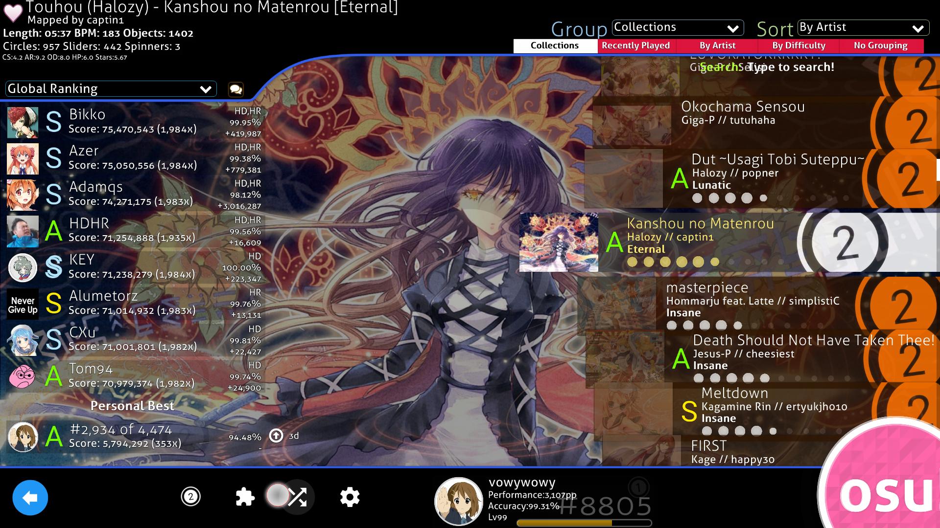
Song Select


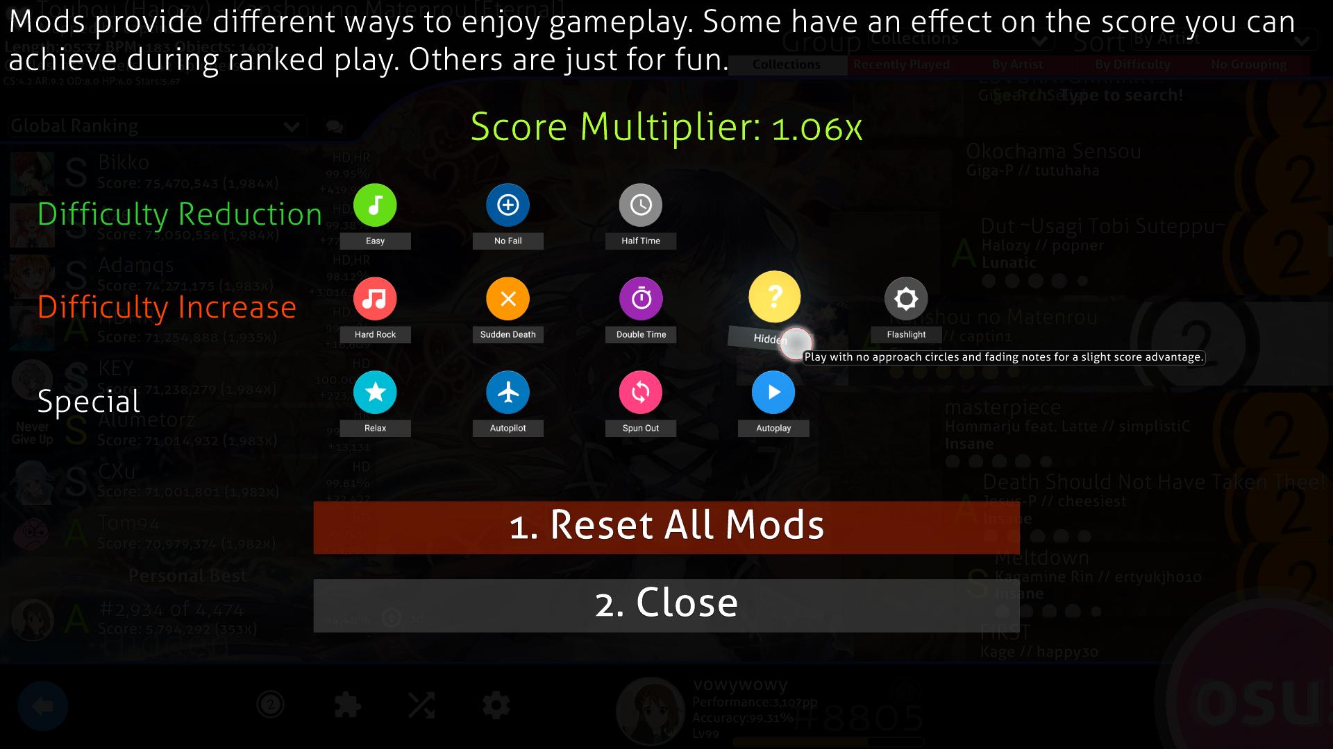
Mod Select


Gameplay Skip Button
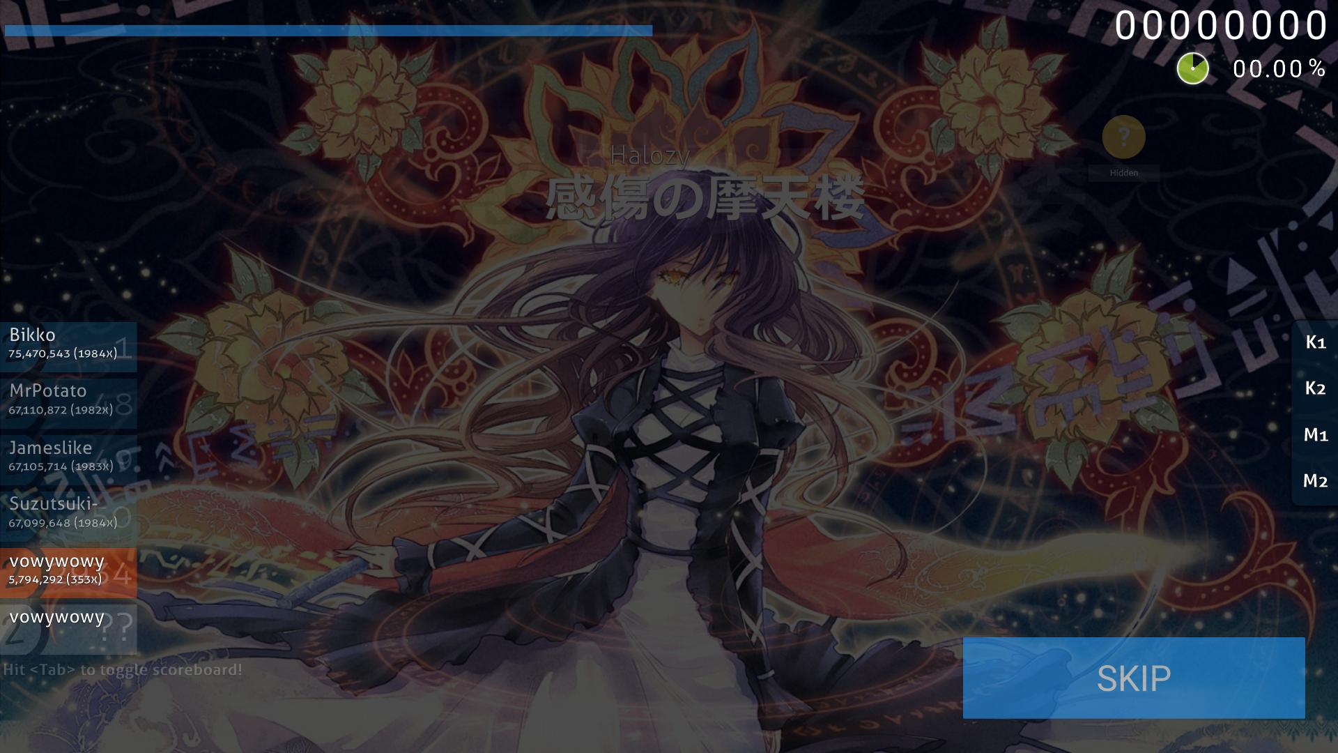

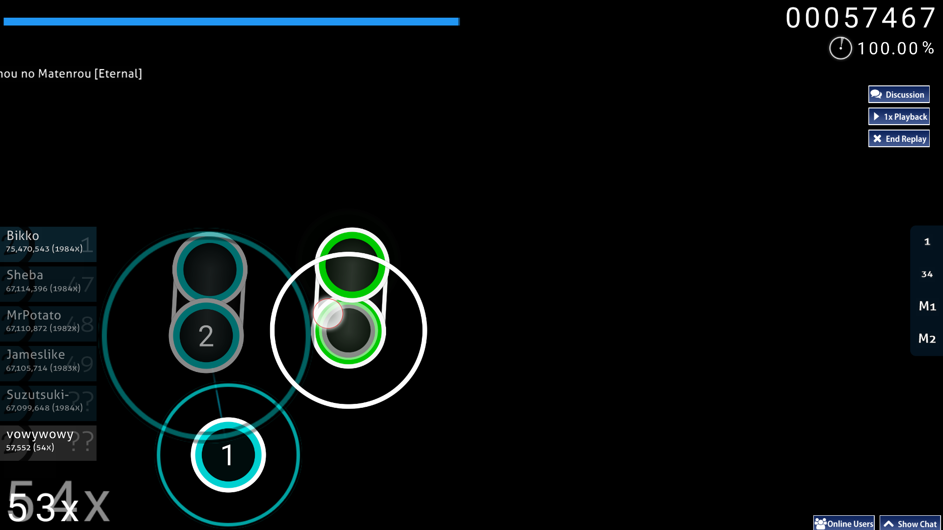
Gameplay

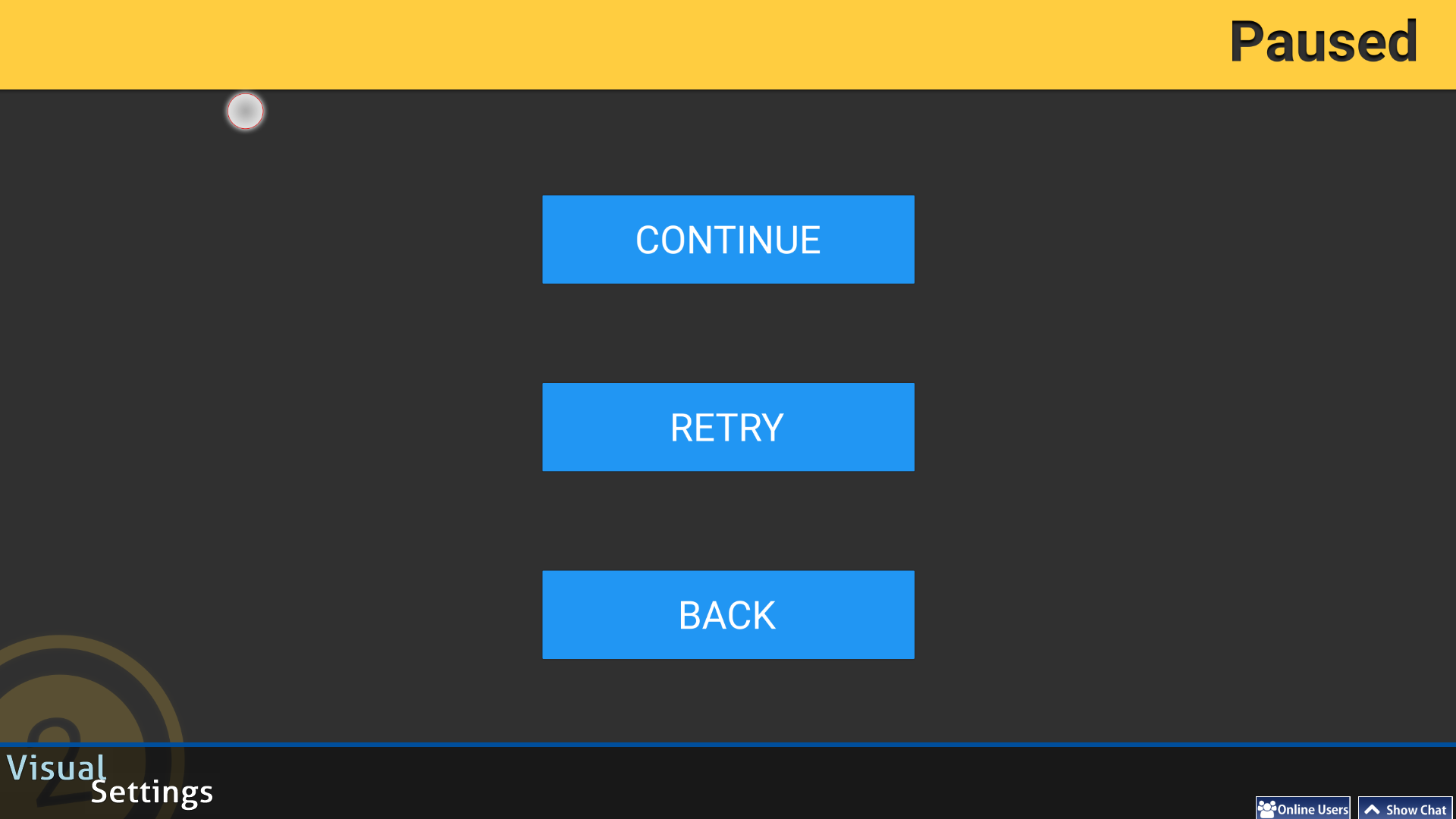
Pause Screen

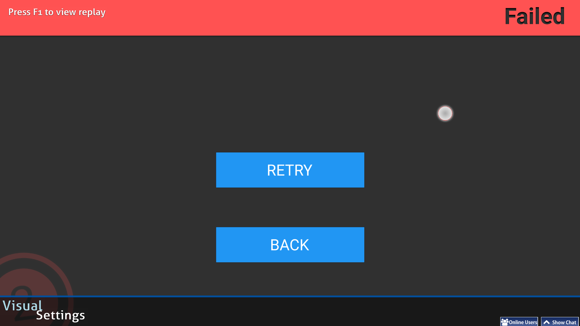
Fail Screen

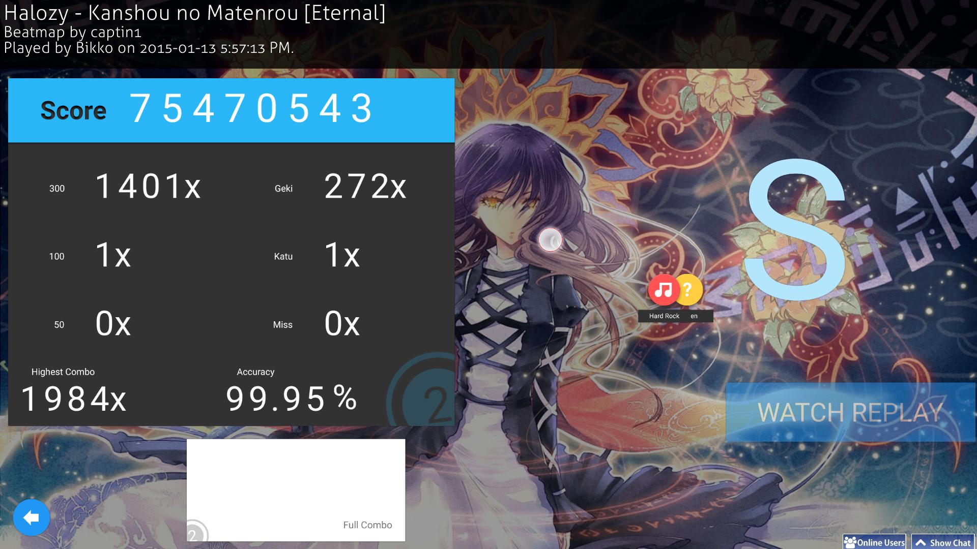
Results Screen

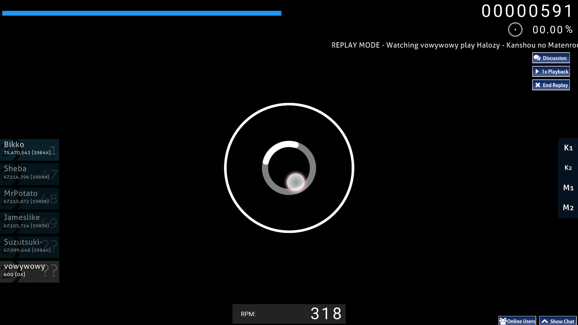
Spinner
[ Zan ]
Dunno if it's just me but the download link seems to not be working properly?
Topic Starter
Megatron

[ Zan ] wrote:

Dunno if it's just me but the download link seems to not be working properly?
Try this one http://puu.sh/aAUrd.osk
Or this one: https://drive.google.com/file/d/0B2d47e ... sp=sharing
Will update the OP
Ayesha Altugle
awesome
n0ah
nice
EcksDee
This shit is pretty fuckin amaze if you ask me
main skin go


It is somehow laggy though. Weird.
sasakura
I really like the skin :) very clean and clear. The icons are pretty cool :P
[-Choa-]
I enjoy it. However, I did tweak the cursor, reverse arrows, hit scores, and ranking panel. For the first three, I swapped them for the elements from Hard Rock Optimized v1.0. For me, the small red cursor is more visible in comparison to the default. Likewise, I felt the numbers/colors of the hitscores didn't match the overall theme (ex. the odd green 100). So instead of numbers, they're now colored dots. As for the reverse arrow that's now a blue aura, that was a personal preference. I'm planning on changing it from blue to red in the future. The blue tends to blend in too much. Lastly, the ranking panel was taken from Black 2014 as I didn't like the plain white you had.

Here's my custom version if you want to look
Topic Starter
Megatron
I have released a pretty big update today so I'm going to shamelessly bump.
Yangu
Great job with the update! I think you meant 2.7 megabytes though :P

Also the cursor and mod icons look a bit rough around the edges? Not sure if this is just me (tried at 1920x1080 and 1600x900)
Topic Starter
Megatron

Yangumasuta wrote:

Great job with the update! I think you meant 2.7 megabytes though :P

Also the cursor and mod icons look a bit rough around the edges? Not sure if this is just me (tried at 1920x1080 and 1600x900)
You are correct, I did mean megabytes. And I see what you mean about the roughness. I think it's to osu's resizing methods. If you look at the source files they are pretty clean. I'll see what I can do to subvert this.
[Kole]
Nice skin!
Xial
Wow thats a really nice ! Thats so clean ! I love it ! Waw ! :o
Makan1
unfortunately the skin doesn't work on 4:3 resolutions lol. another
Axiaan
It's very simplistic but I like !
Just a question : have you planned to do the "fruits" in Osu!CatchTheBeat ? I think, if fruits are made in the same style of your skin, it will very pretty ! :)
It's just a question, not a request. ^^
Topic Starter
Megatron

Makan1 wrote:

unfortunately the skin doesn't work on 4:3 resolutions lol. another
Peppy has said that 4:3 will be deprecated soon. Just use the widescreen equivalent res, the play area size wont change so you will still be used to it. There is no reason to use a 4:3 resolution unless you have an extremely low res 4:3 monitor.
teasp00n
Nice skin! Could you make one with higher resolution? Everything feels very pixelated.
Xerxes Break
Awesome, but you realy need higher resolution.
Storb
Great skin. What font did you use (e.g. for pause / fail menu, for 50s and 100s)?

Is there a possibility of you releasing the raw .psds at one point as well?
Topic Starter
Megatron

Storb wrote:

Great skin. What font did you use (e.g. for pause / fail menu, for 50s and 100s)?

Is there a possibility of you releasing the raw .psds at one point as well?
The font used skin-wide is the newest version of Roboto from here, just with variances like medium/bold/regular/etc.

I absolutely can release the .psds I made, though you might need to excuse my naming conventions. Keep in mind some of the skin elements that only contain black and white elements have been changed so that the .pngs they produce are smaller in size. If you run into one that isn't giving you color just go to image>mode>rgb in Photoshop. Also I may have taken some shortcuts on things for example, the circle with the 2 in the middle. I never actually got around to remaking that when I remade the skin and my original version has been lost in the void so sometimes it isn't a resizable vector but mode-osu@2x.psd should be large enough for all your needs. As a final note, these .psds DO NOT contain the Gaussian blur. It is extremely tedious to apply the blur to every single layer so remember to flatten then blur when you output .pngs.

Here is the download.
iwantapm
Really nice skin!

Do you have dl links to older versions?
Topic Starter
Megatron

iwantapm wrote:

Really nice skin!

Do you have dl links to older versions?
I actually removed them all since no one was downloading them and there were a few silly mistakes/things i didn't like. What part of the older ones were you looking for?
nat2011
will there b more modes
Topic Starter
Megatron

nat2011 wrote:

will there b more modes
You know what? I strongly considered it. I also have/had another skin in the works(and actually almost done) which is inspired by style of Super Mario 3D world just because that game's design blew me away. But I digress, the reason that skin isn't fully completed is the same reason that I haven't done other modes for this skin and that reason is the imminent osu! redesign. Osu!next as well as peppy's various comments have scared me away from skinning anything until that redesign launches. There seems to be way too many changes for me to work hard on something for a long time and then have it be useless in a short amount of time.

When the redesign launches I will first try to port this skin/make the other modes and then finish the other skin, but until then don't expect anything from me unless the are emergency small changes.

All of the above is not set in stone either.
Yangu
Will you be updating this to work with the new skinning changes? Right now, the text in the in-song rank bar looks a bit asymmetrical. Also, the key counter has black text, making it hard to read. I really like using this skin so it'd be nice if these things could be fixed. Thanks again for all your hard work!
fumiga
By any chance do you have the old mod-selection icons?
I just updated my skin from 1.3 to 2.0.1, but I didn't like the icons with the written under it.
AGRX
Please can you release hitcircleoverlay without 3d overlay whiteness in middle ? and hitcircle overlay without texture ? ;3
Wish i could have that for my personal skin.
Also wondering why is approach circle in standard resolution
Rosalinda0
Good Job!
The skin is but really,really good,clean and simple.
Unavailable
Good guy Canadian, making skins for the community! :)
Midas Gold
Nice skin! I loved how simple it is and yet looks nice! The only thing that i think that could be better is the Life bar, as it is a bit hard to know if you have good health or if you are going to fail.
FlyingNeko
Smooth.
Stickman92
This is the smoothest and cleanest skin i have. I have been searching for a skin that is as good as my main in nomod but can be also used for EZ mod and this skin is fits every criteria.
Aycalate
Is there any way to disable the black screen?
Haruko-KGRM
I REALLY LOVE YOUR SKIN! IS PART OF MY LIFE. THANK YOU SO MUCH. THIS SKIN MAKES ME VERY HAPPY. <3 <3 <3 <3 <3 <3 <3 <3 <3 <3 <3 <3 <3 <3 <3 <3 <3 <3 <3 <3 <3 <3 <3 <3 <3 <3 <3 <3 <3 <3 <3 <3 <3 <3 <3 <3 <3 <3 <3 <3 <3 <3 <3 <3 <3 <3 <3 <3 <3 <3 <3 <3 <3 <3 <3 <3 <3 <3 <3 <3 <3 <3 <3 <3 <3 <3 <3 <3 <3 <3 <3 <3 <3 <3 <3 <3 <3 <3 <3 <3 <3 <3 <3 <3 <3 <3 <3 <3 <3 <3 <3 <3 <3 <3 <3 <3 <3 <3 <3 <3 <3 <3 <3 <3 <3 <3 <3 <3 <3 <3 <3 <3 <3 <3 <3 <3 <3 <3 <3 <3 <3 <3 <3 <3 <3 <3 <3 <3 <3 <3 <3 <3 <3 <3 <3 <3 <3 <3 <3 <3 <3 <3 <3 <3 <3 <3 <3 <3 <3 <3 <3 <3 <3 <3 <3 <3 <3 <3 <3 <3 <3 <3 <3 <3 <3 <3 <3 <3 <3 <3 <3 <3 <3 <3 <3 <3 <3 <3 <3 <3 <3 <3 <3 <3 <3 <3 <3 <3 <3 <3 <3 <3 <3 <3 <3 <3 <3 <3 <3 <3 <3 <3 <3 <3 <3 <3 <3 <3 <3 <3 <3 <3 <3 <3 <3 <3 <3 <3 <3 <3 <3 <3 <3 <3 <3 <3 <3 <3 <3 <3 <3<3
Biro-biru
Hello, sorry for question, but can you give or send me file with resona material v2.0?
Henlo
I love it
[centre]
[/centre]
xKozumo
whats the file to boost the fps? i can add it to my skin pack
DeeDK4_TV
how do i download it???
PodsXD
can someone please help me my osu downloads for all skins and songs keep going to the 2014 version does anyone know how to fix this?
Please sign in to reply.

New reply