Awesome skin man! I watched you make the blank circles and couldn't wait to try them >.>!!
forum
[osu!] SlickCircles by Pannari
posted
Total Posts
74
Topic Starter
Thanks for all of the nice feedback <3 I'll try to add mania during the following days.
Topic Starter
I can try, once I've solved the problems with this mode first.OMGPingu wrote:
Can you add Taiko too? <3


Good Job Pannari!
I Will Use This For A Very Good Time!
I Will Use This For A Very Good Time!
Really love the skin! Thank you very much!!!

Topic Starter
1.3:
-Changed song panel
-Made completely new mod icons
-Minor improvements
https://www.mediafire.com/?8zfn9lgfpsr2lzm
-Changed song panel
-Made completely new mod icons
-Minor improvements
https://www.mediafire.com/?8zfn9lgfpsr2lzm
Awesome skin, will be my default skin from now on.
Especially love the hit sounds and clearness of the skin.
Especially love the hit sounds and clearness of the skin.
Topic Starter
Redon wrote:
As promised, some feedback for your skin! Obviously, this post will be focusing on the things that I think can be improved, so don't take it the wrong way
I assume you're using a 16:10 screen, since the default background you provide is 1920x1200. Your idea to include panels on it behind the user info, music player and osu!Direct tab is interesting, but it doesn't work so well in practice because people use different resolutions and screen dimensions, and depending on that, the background is cropped and resized. This is what the panels look like in a 1920x1080 (16:9) resolution. 4:3 users get their background cropped horizontally. I can't think of a simple way to make that idea work across different resolutions, so I would remove these panels. Alternatively, provide the panel versions as an extra, instead of assuming 16:10 as a default.
The background seems very bright to me, and it makes it kind of hard to read the playerlist in multiplayer. Have you tried adjusting the brightness and contrast in an image editing program?
This part is... messy. I'm not sure what happened here, but this is probably not intended behaviour? You have to bear in mind that osu sticks the mode icon on top of that button (unless it's replaceable in a way that I'm not aware of), and the overlap doesn't look so nice.
I recommend you redo the text size and alignment for all four buttons to the right. With different sizes and offsets, it looks kind of nasty as it is now.
Good job on the mod icons! I like them a lot more than the old ones.
About the followpoints, is there a certain reason they are pink? I think it usually conflicts with the with the color scheme of hitcircle combos. If it is to fit the cursor color, then I recommend you provide followpoints that match the alternative cursor colors in your skin. Otherwise, I'd personally go for white/gray (transparent) followpoints.
Apparently the position of the progress circle is dependent on the size of score numbers, because there is no way my own score numbers would fit in there if that was its default position. The overlap is not pretty - you should add some transparent space around your score numbers to make it feel a bit less cramped and shift the progress circle!
Next, about the ranking panel. I recommend you get put the 'Acc' and 'Combo' images you currently use directly on the ranking panel background, and get rid of those two files. Looks the same, and makes it a lot easier to align!
I can't help but think the ranking panel background should be a bit lower. Right now, there's a lot of spare room at the top, to the point where it disappears under the black bar, and on the bottom, it doesn't completely cover the accuracy/combo numbers. Unless that's intentional, try adding some transparent space to the top of the ranking panel!
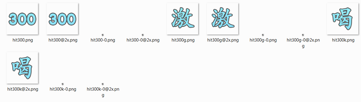
Lastly, there's a nice little trick you can use to have an icon for 300s and gekis on the ranking panel, but not during gameplay. For example, hit300.png is the icon displayed on the ranking panel, since it doesn't support animation of hitbursts. If you add an empty pixel file as hit300-0.png, the game will treat that as a one-frame animation and display the empty pixel instead during gameplay. This is how I made use of that in my own skin.
I think that's all, I hope this was helpful in some way, and keep it up!
Wow, that is a great contribution! I'll see into these issues after I've finished doing avatars on tuesday. I'm having a pretty busy week!
edit: also I love your skin.
I liked the menu-background nice one tho


Your Skin is awesome! 

EDIT: I found!
1.3 : http://www.mediafire.com/download/8zfn9 ... es+1.3.zip
Annette wrote:
Nice skin !
But we can only download old versions?
Me tooyuanzongli wrote:
I can't seem to find a download link for the latest version
EDIT: I found!
1.3 : http://www.mediafire.com/download/8zfn9 ... es+1.3.zip
Topic Starter
I had the image messed up, fixed now.Wolfy3D wrote:
Your Skin is awesome!Annette wrote:
Nice skin !
But we can only download old versions?Me tooyuanzongli wrote:
I can't seem to find a download link for the latest version
EDIT: I found!
1.3 : http://www.mediafire.com/download/8zfn9 ... es+1.3.zip
selection-mod-target and selection-mod-cinema are missing
also there are a lot of @2x elements, but some are missing. such as followpoint-0,-1,-2,-3,-8 and -9. just quickly go through and add in the missing @2x elements please
also there are a lot of @2x elements, but some are missing. such as followpoint-0,-1,-2,-3,-8 and -9. just quickly go through and add in the missing @2x elements please
like the skin but the score number is not that good because it is too close, the selection-mode is not that good, but i like your skin.
but can you still fix it?
but can you still fix it?