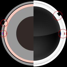
So on the edge of the hit circles there are little white texture mistakes ( http://postimg.org/image/7zfo1p473/ ). And maybe you could make the little circle in the middle of the spin a bit smaller, just my opinion.
forum
[11.30.14] Luminance
posted
Total Posts
433
Topic Starter
1st problem. That is an issue with osu. The element is completely red. Both HD and SD.TheNoobseeker wrote:
So on the edge of the hit circles there are little white texture mistakes ( http://postimg.org/image/7zfo1p473/ ). And maybe you could make the little circle in the middle of the spin a bit smaller, just my opinion.
Which circle? The whole thing? They are combined on top of each other.
I can do both or the pink one which is the outline.
The circle is no problem, I just thought that it should be smaller but its ok at the moment.
When does the update come out for Fluorescence
i gotta say im impressed by the amount off work you have put into this skin.. in my honest opinion this is one off the best skins made from scratch.. everything in the skin itself fits perfectly and it's an easy skin to play with overall. keep up the good work and keep the updates coming!
regarding the score numbers.
maybe you can replace them with colored dots or something similar? (I've seen a video of someone using a different skin which uses this method)
maybe you can replace them with colored dots or something similar? (I've seen a video of someone using a different skin which uses this method)
Topic Starter
Minor update is out.
I'll think about adding it to extras.techbot wrote:
regarding the score numbers.
maybe you can replace them with colored dots or something similar? (I've seen a video of someone using a different skin which uses this method)
I personally like the theory behind the skin ;3 and read it all Uruoki.
But it could be hidden by default into spoiler boxes, because the update spoiler boxes already take so much space D:
Its easy to get lost there, When i browse all of it.
Also could be better to add more clarity. So newcomers wont get lost.
Example of Main Page
But it could be hidden by default into spoiler boxes, because the update spoiler boxes already take so much space D:
Its easy to get lost there, When i browse all of it.
Also could be better to add more clarity. So newcomers wont get lost.
Example of Main Page
Topic Starter
I plan on rewriting the main post sometime. So when I do that, I will make things easier to read.
Syrus wrote:
Wow, this is very interesting, I never thought that a colour of a skin actually even mattered. Keep up the good work.
The reason I'm not doing that well with Standard right now is because a lot of things distract me, I have a small attention span. The bright colors in this skin help me focus and actually helped me improve slightly!
I love this skin so far, and I loved the other one too. Hope this turns out great! ^^
I love this skin so far, and I loved the other one too. Hope this turns out great! ^^
Wanna say that I started playing with Fluorescence a bit more and seeing a slight improvement on my reading.
The mod icon redesign made them clearly readable. Sadly you forgot to change selection-mod-suddendeath.png (SD and HD), and selection-mod-spunout.png (also SD and HD)
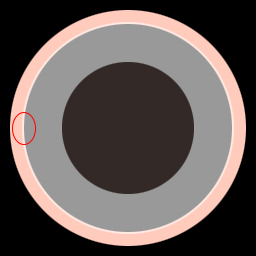
While playing I saw that the hitcircleoverlay has small white particles at the edges that aren't visible in GIMP when checking on black background.
If you allow it I made a small fix for the hitcircleoverlay and the forgotten mod icons that you can apply if you want to save some time eventually (simple recolour from the updated mod icons from Locus, you didn't forget them there).
Small Fix + Suggestion on Hitcircleoverlay
I also included a hitcircleoverlay that has a marginal thicker edge on the inner side. This was my suggestion regarding the slidertracks being visible by a small margin.
The mod icon redesign made them clearly readable. Sadly you forgot to change selection-mod-suddendeath.png (SD and HD), and selection-mod-spunout.png (also SD and HD)
While playing I saw that the hitcircleoverlay has small white particles at the edges that aren't visible in GIMP when checking on black background.
If you allow it I made a small fix for the hitcircleoverlay and the forgotten mod icons that you can apply if you want to save some time eventually (simple recolour from the updated mod icons from Locus, you didn't forget them there).
I also included a hitcircleoverlay that has a marginal thicker edge on the inner side. This was my suggestion regarding the slidertracks being visible by a small margin.
Topic Starter
Mod icons was skin, just forgot to upload. They are uploaded now.
Hitcircles (16x) still show the white on them.
Hitcircles (16x) still show the white on them.
On my end it didn't show any white particles, SD and HD.
http://puu.sh/++.zip (look at the new one)
Maybe better? Included the XCF-file (GIMP project) using a different method (layer masks).
Maybe better? Included the XCF-file (GIMP project) using a different method (layer masks).
[ Pingu ] wrote:
Wow, this is a skin that actually works for me, THANKS! <3
Topic Starter
I don't use GIMP and refuse to download it. I'll mess with it later. This week I am on call at work, so I don't want to get too involved into anything, then get called it.ReddScorn wrote:
Included the XCF-file (GIMP project).
Love it so far. Have been using the night version and it feels really soft on the eyes in a similar way that f.lux works. The spinner sound is dreadful though.
First skin I've ever used
First skin I've ever used
Just a suggestion for CTB.
I think it will be better to make bananas look different than other fruits because its hard to distinguish normal fruits from bananas.
The thing is when you play a map with circles or sliders that have really fast spinners going after/before them, you don't know what are normal fruits and what are bananas. That can mess up and break combo.
Beside that CTB catcher could be more "organic looking to please eyes" but i dont think this is necessary.
I will really like to make one, if they will be good i will sent you them so you can use them.
Don't bother with this thing, just suggestion.
- to hutbursts. They look very similar to default numbers when you hit 100s or 50s its hard to read normal numbers. I think the old ones was better because of their were more compart and were different
I think it will be better to make bananas look different than other fruits because its hard to distinguish normal fruits from bananas.
The thing is when you play a map with circles or sliders that have really fast spinners going after/before them, you don't know what are normal fruits and what are bananas. That can mess up and break combo.
Beside that CTB catcher could be more "organic looking to please eyes" but i dont think this is necessary.
I will really like to make one, if they will be good i will sent you them so you can use them.
Don't bother with this thing, just suggestion.
yeah the spinner spin sound is tearing so much the ears but you can replace it with one extra folder.MrLolrus wrote:
Love it so far. Have been using the night version and it feels really soft on the eyes in a similar way that f.lux works. The spinner sound is dreadful though.
First skin I've ever used
- to hutbursts. They look very similar to default numbers when you hit 100s or 50s its hard to read normal numbers. I think the old ones was better because of their were more compart and were different
Topic Starter
Spinner sound is getting changed.MrLolrus wrote:
Love it so far. Have been using the night version and it feels really soft on the eyes in a similar way that f.lux works. The spinner sound is dreadful though.
First skin I've ever used
Bananas is changed in the next update. If that doesn't work, let me know. I have another idea. As for the catcher, what is considered "organic"? Hitburts should be transparent. I think you meant hitscore though, I noticed that too and still working on it.Agrrox wrote:
Just a suggestion for CTB.
I think it will be better to make bananas look different than other fruits because its hard to distinguish normal fruits from bananas.
The thing is when you play a map with circles or sliders that have really fast spinners going after/before them, you don't know what are normal fruits and what are bananas. That can mess up and break combo.
Beside that CTB catcher could be more "organic looking to please eyes" but i dont think this is necessary.
I will really like to make one, if they will be good i will sent you them so you can use them.
Don't bother with this thing, just suggestion.
- to hutbursts. They look very similar to default numbers when you hit 100s or 50s its hard to read normal numbers. I think the old ones was better because of their were more compart and were different
- Hitbursts
Hitbursts should look different than default1-9.pngs It is really hard to read very fast anti-jumps/difficult patterns when you get few inaccurate hits.
They look almost the same as default numbers with difference they use serif and are italic.
And when they are kinda similar and reading is so heavy dependant on numbers, THIS IS REALLY BAD.
I liked more the old ones because they dont take much attention and not making noise when they appeared over the default pngs.
And most important i NEVER confuse them with numbers.
And because numbers don't use any kind of outlining or don't have shadow drop the new hitburst just blends with numbers LOL.
But i think outlining as Aestetic skin has should be a good experiment, maybe it will improve reading who knows..
And yeah hitburst have file name with hit0 hit50 hit100 hit100k hit300 hit300g hit300k prefix.
As you can read here: https://osu.ppy.sh/wiki/Skinning
- particlex.png trick
Also a trick you can try to do. If you put a transparent particle50.png particle100.png particle100k.png, Hitburst will appear under the circle instead of top of it. But certain players actually like to see hitburst above circle so better put that into Extra folder.
- Ctb
Also I have made experiment with Ctb. This skin is suppose to show more accurate hitbox of elements. I made test to show their real hitbox which is 1x1 pixel also the ryuuta has much smaller collision box than seen on original files. I did test with 2x2 fruits and adjusted the ryuuta catcher plate for perfect collision size. Not only that but also fruit plate is in same height as the fruits hits the end of hitbox.
skin: http://puu.sh/aDoP8.zip
- Ryuuta
And to organic ryuuta. Im still working on it. The actual pretty good, looks like something Gothic or Renaissance style. But kinda sharp IMO.
- Spinner
Also idk why but with this skin its hard to keep spining because there is no good visual indicator how fast you are spining. The inside circle is kinda too small.
When i spin i kinda more focus on sound.
Mania and Taiko seems to be in good state. I will figure it out by playing more.
Damn, I've been using Luminance for a while now but I skipped the PL update because you know, kawaii skins are better and stuff but damn, downloaded it a day ago and I feel rested. I mean, like I didn't realize how my eyes suffered from this game until you provided us with this skin.
So yeah, basically just wanted to pop up and thank you for this :q.
So yeah, basically just wanted to pop up and thank you for this :q.
Also I always felt that approach circles are going a bit over hitcircles no matter how i hit..
I mean this:
I can see the approach circle is kinda a bit getting over hitcircle. Default skin approach circle is touching hitcircle.
I heard you talking about how is the plankian locus hitcircle producing new hues into hitcircleoverlay when expanded.
I think its because the actual hitcircle is a bit overlaping with hitcircleoverlay.
NOTE: I intentionally placed hitcircle on top of hitcircle overlay.
Not sure if this is part of design thou.
Also thx for Fluorescence , A best skin when your eyes are well rested and aiming for good rank ^^.
Fluorescence Hitcircle element remakeUruoki wrote:
I don't use GIMP and refuse to download it. I'll mess with it later. This week I am on call at work, so I don't want to get too involved into anything, then get called it.
Got some fancy PSDs this time after comparing my GIMP exports and PS exports (PS much smoother edges). I also made sure that I don't see any particles on them in both resolutions. It maybe has to do with the compression when exporting it to png-format. I chose the lossless option.
I also remade the approachcircle to fit 256px and the hitcircle to have the set complete.
As a claim I don't force you to change them, they are just suggestions or extras depending on your view.
@Aggrox: If you check the dimensions of the approachcircle it gets more obvious. The normal size should be like the 256x256 where as the luminace one is 250x250. If you like you can check my remake and how it plays in comparison.
yeah 250x250 i didnt noticed
EDIT: Whats better 16x or 14x ? Its just Antialiasing ?
EDIT: Whats better 16x or 14x ? Its just Antialiasing ?
Topic Starter
16x.
Check the bold parts.Agrrox wrote:
- Hitbursts
Hitbursts should look different than default1-9.pngs It is really hard to read very fast anti-jumps/difficult patterns when you get few inaccurate hits.
They look almost the same as default numbers with difference they use serif and are italic.
And when they are kinda similar and reading is so heavy dependant on numbers, THIS IS REALLY BAD.
I liked more the old ones because they dont take much attention and not making noise when they appeared over the default pngs.
And most important i NEVER confuse them with numbers.
And because numbers don't use any kind of outlining or don't have shadow drop the new hitburst just blends with numbers LOL.
But i think outlining as Aestetic skin has should be a good experiment, maybe it will improve reading who knows..
And yeah hitburst have file name with hit0 hit50 hit100 hit100k hit300 hit300g hit300k prefix.
As you can read here: https://osu.ppy.sh/wiki/Skinning
Think you misread what I said. Anyway, I am going to rework on these.
- particlex.png trick
Also a trick you can try to do. If you put a transparent particle50.png particle100.png particle100k.png, Hitburst will appear under the circle instead of top of it. But certain players actually like to see hitburst above circle so better put that into Extra folder.
Will add later.
- Ctb
Also I have made experiment with Ctb. This skin is suppose to show more accurate hitbox of elements. I made test to show their real hitbox which is 1x1 pixel also the ryuuta has much smaller collision box than seen on original files. I did test with 2x2 fruits and adjusted the ryuuta catcher plate for perfect collision size. Not only that but also fruit plate is in same height as the fruits hits the end of hitbox.
skin: http://puu.sh/aDoP8.zip
Haven't check, but will check in a later time.
- Ryuuta
And to organic ryuuta. Im still working on it. The actual pretty good, looks like something Gothic or Renaissance style. But kinda sharp IMO.
So something more rounded?
- Spinner
Also idk why but with this skin its hard to keep spining because there is no good visual indicator how fast you are spining. The inside circle is kinda too small.
When i spin i kinda more focus on sound.
Working on redesigning. It is off a bit, but no one knows because I hidden it. Still working on a new sound, but it will come later.
Mania and Taiko seems to be in good state. I will figure it out by playing more.
Redesigning this actually.Agrrox wrote:
Also I always felt that approach circles are going a bit over hitcircles no matter how i hit..
I mean this:
-snip-
I can see the approach circle is kinda a bit getting over hitcircle. Default skin approach circle is touching hitcircle.
-snip-
I heard you talking about how is the plankian locus hitcircle producing new hues into hitcircleoverlay when expanded.
I think its because the actual hitcircle is a bit overlaping with hitcircleoverlay.
NOTE: I intentionally placed hitcircle on top of hitcircle overlay.
Not sure if this is part of design thou.
Also thx for Fluorescence , A best skin when your eyes are well rested and aiming for good rank ^^.
Will look into in a bit.ReddScorn wrote:
Fluorescence Hitcircle element remakeUruoki wrote:
I don't use GIMP and refuse to download it. I'll mess with it later. This week I am on call at work, so I don't want to get too involved into anything, then get called it.
Got some fancy PSDs this time after comparing my GIMP exports and PS exports (PS much smoother edges). I also made sure that I don't see any particles on them in both resolutions. It maybe has to do with the compression when exporting it to png-format. I chose the lossless option.
I also remade the approachcircle to fit 256px and the hitcircle to have the set complete.
As a claim I don't force you to change them, they are just suggestions or extras depending on your view.
@Aggrox: If you check the dimensions of the approachcircle it gets more obvious. The normal size should be like the 256x256 where as the luminace one is 250x250. If you like you can check my remake and how it plays in comparison.
 just curious
After around 1 week of using the FL skin, I can offer some quality feedback
I really like the *tick* sound the hit circles make. Also, the pass/fail visual and sounds after breaks in a song are satisfying.
(I replaced the spinner sound with the default one as a temporary fix)
The lifebar gets harder to see as it empties, fading from bright red to black. I personally like this feature. It gives more immersion to it.
The mod icons aren't very noob-friendly since they don't have any visual indicator as to what the mod does. They also look confusing when stacked, such as in a multiplayer lobby.
The cursor when clicked looks like it has jaggies.
It's hard to tell the difference between a silver and gold S rating.
Some dark colored hit circles are hard to see on dark/black backgrounds. Specifically dark blue and purple.
There are no hit circle chains, which can be a downer for people using the hidden mod.
Something that'd be pretty neat is having osu! auto-switch between FL and PL depending on the time of day, like f.lux. It'd save the trouble of switching to PL during those night gaming sessions.
Keep up the great work Uruoki!
Topic Starter
Mod icons: I noticed that too and I am still trying to think of a good solution.
Cursor: I'll look into it.
Rating: I may redesign those anyway.
Dark Hitcircles: Not sure why. Can you post a screenshot?
Hitcircle chain: I am assuming you mean the followpoints. I am going to add those to the extra folder.
Cursor: I'll look into it.
Rating: I may redesign those anyway.
Dark Hitcircles: Not sure why. Can you post a screenshot?
Hitcircle chain: I am assuming you mean the followpoints. I am going to add those to the extra folder.
Followpoints might be the correct term, I'm still new to osu! terminology.Uruoki wrote:
Mod icons: I noticed that too and I am still trying to think of a good solution.
Cursor: I'll look into it.
Rating: I may redesign those anyway.
Dark Hitcircles: Not sure why. Can you post a screenshot?
Hitcircle chain: I am assuming you mean the followpoints. I am going to add those to the extra folder.
Dark Hitcircles can be found on certain maps with a dark color choice, such as on this map http://puu.sh/aKV7c/11eed4e8ab.png (song is Yousei Teikoku - Kuusou Mesorogiwi with background 100% dimmed)
MrLolrus wrote:
After around 1 week of using the FL skin, I can offer some quality feedback
I really like the *tick* sound the hit circles make. Also, the pass/fail visual and sounds after breaks in a song are satisfying.
(I replaced the spinner sound with the default one as a temporary fix)
*Default one seems to be the best, but im working to find some alternatives from my MASIVE skin collection, maybe Uruoki will use them
The lifebar gets harder to see as it empties, fading from bright red to black. I personally like this feature. It gives more immersion to it.
*Agree, but will be better to get at least that "peripheral feel" how much hp do you have before break starts.
The mod icons aren't very noob-friendly since they don't have any visual indicator as to what the mod does. They also look confusing when stacked, such as in a multiplayer lobby.
*Im working on vertical alignment icons so you will read mods from top to bottom.
like this:
D/H/F
T/D/L
Maybe Uruoki will like them, or he will make his own using this idea. Anyway I will use it for my own skin, if it will be ever released.
The cursor when clicked looks like it has jaggies.
It's hard to tell the difference between a silver and gold S rating.
*Agree, A new players may not notice there is difference
Some dark colored hit circles are hard to see on dark/black backgrounds. Specifically dark blue and purple.
*Best solution to achieve visibility is to use default Luminance skin's colors by either disabling globally "ignore beatmap skin" or you can do it by moving cursor at bottom of screen before song starts and tick "ignore beatmap skin". Unlike Plankian Locus, Fluorescence is using white approach circles so if color is too dark then its problem of beatmap colors, not skin.
There are no hit circle chains, which can be a downer for people using the hidden mod.
*Totally disagree, I know a lot of good HD players that dont use Followpoints. I think they are more important for FL mod. Ofc with longer animation.
I think that line/animated follow points are more for bad than good. They make some maps hard to read when you switch to different AR.
Also not sure if 5 frame followpoints that are included are accurate, i see a lot of people to switch to 9-frame followpoints lately.
Something that'd be pretty neat is having osu! auto-switch between FL and PL depending on the time of day, like f.lux. It'd save the trouble of switching to PL during those night gaming sessions.
* This is wrong thread to ask for skin auto-switching feature, you will have more success in Features Request here: 4
Also i don't see any trouble to just go to options and switch to different skin? It isn't that difficult.
Also make sure you are having breaks during "endless" night session, a little break to switch to different skin may help
Keep up the great work Uruoki!]
Topic Starter
Do you have "Ignore all beatmap skins" enable in settings? If not, enable that and see if that works.MrLolrus wrote:
Followpoints might be the correct term, I'm still new to osu! terminology.Uruoki wrote:
Mod icons: I noticed that too and I am still trying to think of a good solution.
Cursor: I'll look into it.
Rating: I may redesign those anyway.
Dark Hitcircles: Not sure why. Can you post a screenshot?
Hitcircle chain: I am assuming you mean the followpoints. I am going to add those to the extra folder.
Dark Hitcircles can be found on certain maps with a dark color choice, such as on this map http://puu.sh/aKV7c/11eed4e8ab.png (song is Yousei Teikoku - Kuusou Mesorogiwi with background 100% dimmed)
here are alternative spinner sounds i found useful
http://puu.sh/aO9Er.zip
http://puu.sh/aO9Er.zip
Topic Starter
Agrrox wrote:
Uruoki what kind of font is Luminance using ?
Uruoki wrote:
Here is a list of fonts that Luminance has used in case you want to change anything.
Caviar Dreams
Champagne & Limousines
Elegant Light
Origin
I believe right now I have reduced the fonts to the first two.
Question: if I am running a software such as f.lux that already adjusts my computer display's color temperature according to location and time of day, will using the Planckian Locus skin overcompensate and disrupt the effects of the color temperature because of the two conflicting things? Thank you