orz...Garven wrote:
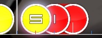
Just an illustration of the concept since I don't think you're quite understanding what I'm saying.
http://puu.sh/6gKfW/5ebb2f1d1d.osu
I stopped applying at 01:00:018 - , but I think you'll get what I talking about. uh... is any issue here after 445's mod? 0.0
Also why did you add a break at 01:33:351 - ? It's such an awkward place to stop. D: uhhh?? why? i think the break here is appreciate, for in the song this is a repeat part next and i just do break to separate the map into two parts here, that's all D:
And for me, the best kiai spot would be during the part at 01:00:018 - and stopping where you start it again. ha... well, the kiai part is more like a special part different from others, and as u see, in the kiai like the 1st one i also used lower sv to do this. and imo, the song's part which had set kiai now is more like a main part in this song, and the song's part in ur opinion should be kiai is more like a refrain to the next heat part which obviously is kiai. so i think the kiai set is just ok 0.0
Just a couple of observations on the Extra map itself: The circles feel way too huge for the general slow pace of the map. hmm, this is just what i want to express. and also, if this is a cs4 map, the map's composing will be worse in looking and don't work well in some of the patterns in it, cs3 is good.
The kiai feels especially slow-paced which is kind of disappointing since I'd expect that to be the super-awesome part, not the kinda of mellow less distance-snap-breaking compared to the part right before it. haha sry for disappointing u... maybe this can be more awesome, but i think this is my best result which i don't want to ruin :3
forum
Akiyama Uni - Chi no Iro wa Kiiro
posted
Total Posts
239
Topic Starter
I really liked Garven's idea, I used a similiar concept on Smoke Tower where I had an 8 color scheme and each section got 2 colors, the stronger and brighter colors went to the kiais while the dull ones went to the quiet parts (There are no section repeats in that song so I didn't need to reuse any combination)
But meh, I guess your epileptic colors are a much cooler and better concept, right?
But meh, I guess your epileptic colors are a much cooler and better concept, right?
I really don't get what's so bad about the combo colors. Please explain.
They match the background and the song fine.
They match the background and the song fine.
this map is orgasmic
that's a compliment
that's a compliment
Not fond of the contrast in Garven's suggestion, pure black and pure white is risky to do because it can break on so many skins. It's also controversial because as far as I can tell most people despise grayscale combo colors.
The muted red and... green? Colors are a bit too washed out and muddy.
While I agree the bright red and bright yellow are very sharp and blinding, I'm honestly not sure what it would be replaced with.
At least they're easy to see during gameplay.
Maybe somebody can come up with a better solution for the colors?
[Normal]
00:58:559 (1) - This spinner is too short for a Normal difficulty. I recommend removing it and adding two circles at 00:59:184 - and 00:59:601.
01:20:018 (2) - Try to move the endpoint so it's easier to see the path at the end. -> http://puu.sh/6lbSn.jpg
02:25:226 (1) - This spinner is too short for a Normal difficulty. I recommend removing it and adding two circles at 02:25:851 - and 02:26:268 -
02:40:018 (1) - I'd rearrange the end of this slider so its path is clearer. -> http://puu.sh/6lc5f.jpg
02:43:351 (2) - The end might need to be moved up and to the left so it's a clearer path. -> http://puu.sh/6lc7j.jpg
[Hard]
00:55:018 (1,2,3) - The spacing here is weird and hard to read.
00:58:351 (7) - It looks like this was originally at x 463 y 281, but was moved because of slider overlap. It's hard to read the antijump, but rearranging the 7 while there might fix it. Try moving the 7 to here http://osu.ppy.sh/ss/1248910
02:35:851 (1,2,3,4) - Move this to the right a little bit, right now the automatic stacking is making it touch 02:35:434 (2) -
[Lunatic]
00:57:413 (2,3) - Reverse these two circles, this is too hard to read otherwise.
02:24:080 (2,3) - Reverse these two circles, this is too hard to read otherwise.
Not going to bubble immediately after changes, need to make sure Garven and others have time to give feedback if they want or if any issues weren't resolved.
The colors were just an illustration for the concept. Even I wouldn't advocate that color scheme, haha. Using more loud colors such as orange and turquoise might work well.
Feel free to move this without me though - I have no idea when I'd be able to sit down and give this a full check.
As for a quick scan, in Normal 00:58:559 (1) - and 02:25:226 (1) - are super-short for this level of difficulty.
Normal's star rating is pretty damned high for the easiest of the set too. This would benefit greatly if you added an Easy to fill in that beginner gap.
In the difficulty settings, I don't recommend having OD 2 lower than AR. It can lead to confusion when you get really off beat, but still land 300s in-game. This sadly applies to all difficulties in the set. Lunatic is pretty ridiculous at AR 9 OD 6.
Lunatic would be good at OD 7 I think.
p/2771273Charles445 wrote:
Not fond of the contrast in Garven's suggestion, pure black and pure white is risky to do because it can break on so many skins. It's also controversial because as far as I can tell most people despise grayscale combo colors.
The muted red and... green? Colors are a bit too washed out and muddy.
While I agree the bright red and bright yellow are very sharp and blinding, I'm honestly not sure what it would be replaced with.
At least they're easy to see during gameplay.
Maybe somebody can come up with a better solution for the colors?
Could be toyed around with a bit and have a bit stronger colors, but overall most people found it fitting and it played well for them.
Topic Starter
Charles445 wrote:
Not fond of the contrast in Garven's suggestion, pure black and pure white is risky to do because it can break on so many skins. It's also controversial because as far as I can tell most people despise grayscale combo colors.
The muted red and... green? Colors are a bit too washed out and muddy.
While I agree the bright red and bright yellow are very sharp and blinding, I'm honestly not sure what it would be replaced with.
At least they're easy to see during gameplay.
Maybe somebody can come up with a better solution for the colors? i really can't understand why these combo colors have issues.
[Normal]
00:58:559 (1) - This spinner is too short for a Normal difficulty. I recommend removing it and adding two circles at 00:59:184 - and 00:59:601. fixed, but i used slider here instead 0.0
01:20:018 (2) - Try to move the endpoint so it's easier to see the path at the end. -> http://puu.sh/6lbSn.jpg fixed
02:25:226 (1) - This spinner is too short for a Normal difficulty. I recommend removing it and adding two circles at 02:25:851 - and 02:26:268 - fixed as well.
02:40:018 (1) - I'd rearrange the end of this slider so its path is clearer. -> http://puu.sh/6lc5f.jpg fixed
02:43:351 (2) - The end might need to be moved up and to the left so it's a clearer path. -> http://puu.sh/6lc7j.jpg fixed
[Hard]
00:55:018 (1,2,3) - The spacing here is weird and hard to read. fixed, changed to another pattern.
00:58:351 (7) - It looks like this was originally at x 463 y 281, but was moved because of slider overlap. It's hard to read the antijump, but rearranging the 7 while there might fix it. Try moving the 7 to here http://osu.ppy.sh/ss/1248910 ok, fixed, and pattern like this at 02:25:017 (7) - as well.
02:35:851 (1,2,3,4) - Move this to the right a little bit, right now the automatic stacking is making it touch 02:35:434 (2) - ok, fixed
[Lunatic]
00:57:413 (2,3) - Reverse these two circles, this is too hard to read otherwise. ah... no... this is just a pattern and i think this is not that much hard to players playing this diff readding this pattern 0.0
02:24:080 (2,3) - Reverse these two circles, this is too hard to read otherwise. as above, i think this can be kept 0.0
Not going to bubble immediately after changes, need to make sure Garven and others have time to give feedback if they want or if any issues weren't resolved.
Garven wrote:
The colors were just an illustration for the concept. Even I wouldn't advocate that color scheme, haha. Using more loud colors such as orange and turquoise might work well.
Feel free to move this without me though - I have no idea when I'd be able to sit down and give this a full check.
As for a quick scan, in Normal 00:58:559 (1) - and 02:25:226 (1) - are super-short for this level of difficulty. already fixed in 445's mod
Normal's star rating is pretty damned high for the easiest of the set too. This would benefit greatly if you added an Easy to fill in that beginner gap. hmm, thou the star rating is high, a really easy map the normal diff is, right? i think it's easy enough to be a lowest diff in mapset...
In the difficulty settings, I don't recommend having OD 2 lower than AR. It can lead to confusion when you get really off beat, but still land 300s in-game. This sadly applies to all difficulties in the set. Lunatic is pretty ridiculous at AR 9 OD 6.
Charles445 wrote:
Lunatic would be good at OD 7 I think. ok, OD7 in Lunatic diff is fine to me as well
sry for late check, i just have my final exam finished.
thx for modding and hope this can be better now, and ready for being re-ranked 0.0
Last attempt, I tried to take your original idea and just make it a bit nicer and more appealing.

[Colours]You could try to get more opinions from a varied type of players like you guys did with Terminal, since after all, we are trying to make this as good as possible for the players
Combo1 : 248,204,31
Combo2 : 216,56,56
Combo 2 is still too bright, try a bit more pastel :^)
Topic Starter
The combo color previews are awkward tbh, these look more pastelish and rustic ingame.Lust wrote:
Combo 2 is still too bright, try a bit more pastel :^)
@HW: You kinda said the same about the AR but due to the obvious choice of the players, it was changed.
Again, you should understand, this is about giving the players the best playing experience, not raising your ego by making your ideas ranked.
Priti asked me to comment on the combo colours. While I don't have a huge problem with them, I do think that they'd look nicer if they looked warmer. Plus, they'd make the hitcircles' glass effect more visible. It would also be a good idea to not combospam--having a new combo for every measure will work fine, or at least better than having random NCs for one or two objects.
I don't want to mod this map in-depth, but I strongly recommend using tick rate 2. The entire track has a steady 1/2 pulse, which would make TR2 fit. Using TR2 would also make the SV changes easier to read, since there's nothing to indicate them otherwise.
I don't want to mod this map in-depth, but I strongly recommend using tick rate 2. The entire track has a steady 1/2 pulse, which would make TR2 fit. Using TR2 would also make the SV changes easier to read, since there's nothing to indicate them otherwise.
Kodora
Two current combo-colours fits pretty nicely here imo - yes, making them a bit more "warm" can be good idea but there is nothing fatal with leaving them as they now - don't forget, Hollow Wings isn't only mapper, he draw this bg by himself and i guess as original creator of this bg he have full rights to decide which colours fits and which don't. Thus, if you don't like this combo-colours you always have feature to disable them - just giving my opinion.
Same with me. Anyways, the combo colors are relatively fine imo. Maybe the mapper was thinking the color Red symbolizes "Reimu" considering this is Reimu's Theme in Scarlet Weather Rhapsody (yes, I do play this game lol) since the clothes she wears is red. The color "Yellow" represents the "Ground" since the music is basically a remix of "The Ground's color is Yellow"D33d wrote:
Priti asked me to comment on the combo colours.
Personally, I just think it's just the difficulty spread tbh. I recommended an Easier difficulty for the most part.
Also, Extra is more or less overmapped imo. For example, this huge jump at 00:02:309 (4,1) is overdoing it considering the notes are only a blue tick apart.
I don't think so considering his first Akiyama Uni map (which is ranked) uses the same exact combo colors.BeatofIke wrote:
Same with me. Anyways, the combo colors are relatively fine imo. Maybe the mapper was thinking the color Red symbolizes "Reimu" considering this is Reimu's Theme in Scarlet Weather Rhapsody (yes, I do play this game lol) since the clothes she wears is red. The color "Yellow" represents the "Ground" since the music is basically a remix of "The Ground's color is Yellow"
[General]
I double checked all of the map's metadata and found a problem.
In the artist, あきやまうに should be あきやま うに
The space is important to denote first and last name, also the other ranked versions do that.
That's all.
I double checked all of the map's metadata and found a problem.
In the artist, あきやまうに should be あきやま うに
The space is important to denote first and last name, also the other ranked versions do that.
That's all.
Topic Starter
ok, change "あきやまうに" to "あきやま うに"Charles445 wrote:
[General]
I double checked all of the map's metadata and found a problem.
In the artist, あきやまうに should be あきやま うに
The space is important to denote first and last name, also the other ranked versions do that.
That's all.
hmm, i changed this as sco said just coz in the real touhou game this is actually "あきやまうに" without that space, but as u said, other ranked maps do have that space, so i think this is acceptable and just make sence to keep them same.
change extra's od to 8
btw, i asked someone good at timing and playing, they suggested me to change the extra's od to 8 for giving a higher hitting require to players, and this can be helped to players controlling and catching their own rhythm in playing, even this is ar9 and only bpm144 for all those patterns in this diff. and also, lunatic is ar9 and od7 as well, change extra's od to 8 can make a better mapset to the map itself.
hope this is ready for re-rank now, thx for all's suggestions!
Verified that nothing within the maps got changed (except for the OD 8 change of course).
Metadata is fixed, therefore, rebubbling.
Note to ranking BAT:
If you were involved with the original ranking of the map, don't rank it again. In order to make sure the set is ready to go we need fresh eyes looking at the set.
I spent a lot of time working to get the sliders in rankable order, but there might still be some questionable ones in the Extra. If you perceive a rankability problem with a slider go ahead and point it out, it's best to avoid questionable sliders.
I playtested Extra and Lunatic a ton and they are both quite playable. The jittery movement might not be for everyone though.
delete scores for changing game-play elements~
加油
As you requested~
[General]
Tick rate 2 fits this song best
The custom normal-hitnormal.wav is incredibly annoying. It sounds like a mistake when you first come across it until you realize that it's hitting on every single note.
I changed the pitch down a fifth and increased the volume a little bit to compensate. This sounds a little better to me - at least it's not incredibly annoying.
http://puu.sh/6x1xB/08d4b1ce5c.wav
I still suggest you find a better normalhitnormal or hitsound the parts that use it better.
[Normal]
I'd do OD +1 to fit more with the AR.
00:33:351 (1) - I wouldn't recommend stacking underneath a sliderend for the easiest of the set. Also having a different rhythm like this is generally frowned upon for a Normal. There are quite a few throughout the map. See if you can fix the ones where the rhythm isn't constant going into the next note (so something like 01:12:726 (3,1) - is okay)
01:00:018 (1,2) - I guess these giant gaps are to corral the star rating in? It's a bit awkward to hit the 2 without the preceding offbeats to establish the rhythm.
01:46:684 (1) - Try this so it doesn't look so crumpled. Generally a 5-point slider's curve will look best (counting the beginning and the red anchor)
02:40:018 (1) - ^
02:46:684 (2) - Run out of slider ideas? q: It doesn't really match the rest of the sliders for this part of the song and is more fitting for use at 02:53:350 (1) -
This is pretty borderline difficulty-wise for the easiest of the set. Even the star rating is to the point where I am wary. The back and forth style that you use is not quite as intuitive than having a more smooth flow style, which also makes me worry.
[Hard]
I found this plays nicely at AR7.
00:13:143 (5,1) - I see why you did this, but it plays really weird and doesn't read so well. This Hard difficulty is already up there since you're using a ton of 1/4 rhythms. Using the 5 as a circle and the 1 as the slider afterward plays and reads a lot better.
01:53:142 (5,1) - ^
00:13:976 (3,4,5) - Going from this spacing to 00:14:601 (5,1) - doesn't really make much sense musically.
01:53:768 (2,3,4,5) - The spacing changes here aren't nearly as bad, but it still has the same issue.^
00:26:476 (5,1) - Same thing as at 0:13
00:55:851 (3,1,2) - Again, this spacing change isn't very intuitive.
02:23:350 (1,2) - ^
01:09:601 (4,1) - This jump was okay, but that you don't follow up with more jumps with that same strong strike in the song makes me kind of sad.
01:25:226 (2,3) - This looks like you ran out of room and ended up with bad spacing. :/
01:30:018 (1,2,3) - These play sooo much better spread out to fit the speedup.
02:00:017 (1) - The first half of this kiai feels empty of extra hitsounds
[Lunatic]
00:10:434 (3,4,5,6,7,8,9,10,11) - You know, I had the hardest time with these. They're simple, and I know I can play them, but just the way they're presented and the direction they change with the slider I think is the culprit. Do you think you could make them a little more similar to how you made this rhythm at 00:23:768 (3,4,5,6,7,8,9,10,11) - so that the direction of movement is with the jump instead of going against it?
01:13:351 - This speed up is... well, it doesn't make that much sense. It's just a repeat of what you just played. I'd keep both of these sections identical (I prefer the faster one ;D ) Same applies to the next iteration when this repeats.
[Extra]
00:56:684 (1,2,3) - Playing these as all circles feels a lot more visceral.
01:27:518 (1) - ctrl g and 01:27:726 (2,3) - ctrl g these two at the same time
Flows with the back and forth motion muuuch better this way.
02:16:684 (1,1) - This spacing change is really strange to me. You might be trying to signify that there is a spacing change with your different new combos here, but all it's doing is leaving me frustrated since I think there's going to be a rhythm change, not a slight spacing change since all your other circle slider 1/4 pairs are the same color in this section. See 02:13:768 (2,3,1,2) - for what I mean
02:28:768 (1,2,1,2,1,2) - Do you think you could map this so that there isn't so much overlapping going on? It's really messy right now.
01:26:684 (1) - These sections are the best part of the map once you apply the ctrl g's.
Topic Starter
thx for modding and checking! Garven~ and thx for supportting me all the time ~Garven wrote:
As you requested~
[General]
Tick rate 2 fits this song best ok, changed tr to 2 in every diff, thou idk if it'll increase much more difficulty of the higher diffs 0.0
The custom normal-hitnormal.wav is incredibly annoying. It sounds like a mistake when you first come across it until you realize that it's hitting on every single note.
I changed the pitch down a fifth and increased the volume a little bit to compensate. This sounds a little better to me - at least it's not incredibly annoying.
http://puu.sh/6x1xB/08d4b1ce5c.wav
I still suggest you find a better normalhitnormal or hitsound the parts that use it better. uhhhhh...... hmmmmmm...... the hormalhitnormal now is just what i really need in this map now and just what i wanna express in hitsounds, and it gives me a strong impression that i actually made all of patterns following this hitsound. i know what u mean "annoying" and i've checked ur provided hitsound, but it's just... not what i really think fit the song. as the song's beat in violin and brass's beat r so strong in every part of this song, the hitsound i've set is just keeping them in a same level in maybe melody, or feeling, or even volume. i really think the normalhitnormal feels good, thou some bat reminds me the volume of normalhitnormal is annoying before i changed lots of hitsound setting, and it's better for them right now. if u just listen to the hitsound it maybe annoying enough to most of people, but i do think it works well in this map. i really hope this can be kept.
[Normal]
I'd do OD +1 to fit more with the AR. hmm??? i think od=ar-2 is the most appreciate set in every diff thou... (not for lunatic+ diffs coz the od requires more from pros q:
00:33:351 (1) - I wouldn't recommend stacking underneath a sliderend for the easiest of the set. Also having a different rhythm like this is generally frowned upon for a Normal. There are quite a few throughout the map. See if you can fix the ones where the rhythm isn't constant going into the next note (so something like 01:12:726 (3,1) - is okay) u r right, i changed this pattern, and overlook the map to see if there're patterns like this, i hope the map is fine to this now
01:00:018 (1,2) - I guess these giant gaps are to corral the star rating in? It's a bit awkward to hit the 2 without the preceding offbeats to establish the rhythm. i have to acknowledge that the gaps do corraled the star rating, but what i really want is the rhythm expressed now here. u can see other parts in this diff and u'll always find that i usually skip those white lines' beat to make the rhythm more vivid, rather than just follow the drum which is really boring to me. i know the easiest diff don't need a diffcult rhythm for noobs to catch, but i think the rhythm now is still a piece of cake to them, with more fun. so i think this can be kept 0.0
01:46:684 (1) - Try this so it doesn't look so crumpled. Generally a 5-point slider's curve will look best (counting the beginning and the red anchor) ok fixed, maybe it's my bad habit to use lots of control points when i make a curve slider which is not an arc lol
02:40:018 (1) - ^ fixed as well
02:46:684 (2) - Run out of slider ideas? q: It doesn't really match the rest of the sliders for this part of the song and is more fitting for use at 02:53:350 (1) - haha alright, i changed this to another shape (i just wanna use the arc once at this part, thou it's not that good to u... q:
This is pretty borderline difficulty-wise for the easiest of the set. Even the star rating is to the point where I am wary. The back and forth style that you use is not quite as intuitive than having a more smooth flow style, which also makes me worry. yeah... the diff is the easiest diff in the mapset and people always think it should be really easy to noobs. what i thought before making this diff is just doing some maybe "normal diff's patterns" and at last the star rating is just corralled. so whatever i think the map is fine itself, but i'll watch out this really carefully next time i make the easiest diff to fit the mapset more.
[Hard]
I found this plays nicely at AR7. yeah it's made for ar7, i change it to ar8 just to fit the mapset. well, i fixed it back yeah.
00:13:143 (5,1) - I see why you did this, but it plays really weird and doesn't read so well. This Hard difficulty is already up there since you're using a ton of 1/4 rhythms. Using the 5 as a circle and the 1 as the slider afterward plays and reads a lot better. i agree with u, haven't thought of this, fixed
01:53:142 (5,1) - ^ fixed, and 00:26:476 (5,1) - as well.
00:13:976 (3,4,5) - Going from this spacing to 00:14:601 (5,1) - doesn't really make much sense musically. i see, changed this pattern.
01:53:768 (2,3,4,5) - The spacing changes here aren't nearly as bad, but it still has the same issue.^ yeah, i changed the pattern to a same one as above
00:26:476 (5,1) - Same thing as at 0:13 ^
00:55:851 (3,1,2) - Again, this spacing change isn't very intuitive. oh here i think this is just a same pattern to 00:53:768 (2,3) - yeah u r right, arranged ds
02:23:350 (1,2) - ^ ^
01:09:601 (4,1) - This jump was okay, but that you don't follow up with more jumps with that same strong strike in the song makes me kind of sad. so poor my mapping skill is... i even don't know what is good or bad... i'll watch out this next time ;w;
01:25:226 (2,3) - This looks like you ran out of room and ended up with bad spacing. :/ still have some way to fix this, here i changed this pattern and arraged ds better now.
01:30:018 (1,2,3) - These play sooo much better spread out to fit the speedup. ok~!
02:00:017 (1) - The first half of this kiai feels empty of extra hitsounds hmm, orz... this kiai's rhythm is just same to the 1st one's. uhh, maybe for this is just a hard diff, i didn't set so much objs, that makes u feeling empty in this part maybe 0.0
[Lunatic]
00:10:434 (3,4,5,6,7,8,9,10,11) - You know, I had the hardest time with these. They're simple, and I know I can play them, but just the way they're presented and the direction they change with the slider I think is the culprit. Do you think you could make them a little more similar to how you made this rhythm at 00:23:768 (3,4,5,6,7,8,9,10,11) - so that the direction of movement is with the jump instead of going against it? yeah~ really easy work and ur mod just remind me of this, i do can make a better composing, u can check it now and see if it's more acceptable to u :3
01:13:351 - This speed up is... well, it doesn't make that much sense. It's just a repeat of what you just played. I'd keep both of these sections identical (I prefer the faster one ;D ) Same applies to the next iteration when this repeats. hmm, the same part they r indeed, but the speed up is just for what i felt from the song. if u force this as an issue i can't say much of things, of course same sections use same sv make sense. thou at same time, same sections have different sv is also a way express the map's spirit, maybe the map it self is odd to some players, i think this changing is same to u like i said. still keep this part, hope it can be acceptable 0.0
[Extra]
00:56:684 (1,2,3) - Playing these as all circles feels a lot more visceral. uh... that means too hard? sry for my bad english knowledge in word "visceral" ;w;... if u mean the sliders start from blue lines felt strange, i can't say much of things, but for there're lots of sliders start from blue lines, i think maybe we can just regard this as a kind of pattern q:
01:27:518 (1) - ctrl g and 01:27:726 (2,3) - ctrl g these two at the same time
Flows with the back and forth motion muuuch better this way.
ahhhh...... i really don't think this is a good idea... ;w; let me explain:
1. now this map is diffcult enough, if i reverse 01:27:726 (2) - this can become a extremely hard pattern to be played to nearly all of players, for the overlap from 01:27:309 (4) - in a short time and really confuse players aimming at the correct place of the slider's head. trust me, even pros will hate me if i changed like this... ;w;
2. the flow after changed will give another feeling, it's fine to u with this jump, but after this, 01:27:934 (3,4,1) - will be a really hard work to do with their pattern's flow: after a really big jump at 01:27:518 (1,2,3) - , no matter how 4 placed and composed, it still will be a weird flow to play. what's more, it will give a larger jump while the map is already very diffcult here...
3. what i wanna express is "big jump, and small jump " in the very high tention kiai here. u can see big jump with yellow sliders and small ones with red sliders in this kiai. what's more, all of them can be read easily, still hard patterns for their big jumps thou. and it's what i felt from the song as well, the violin's melody is just telling me this q:
so... maybe i'll just keep this pattern be like this 0.0
02:16:684 (1,1) - This spacing change is really strange to me. You might be trying to signify that there is a spacing change with your different new combos here, but all it's doing is leaving me frustrated since I think there's going to be a rhythm change, not a slight spacing change since all your other circle slider 1/4 pairs are the same color in this section. See 02:13:768 (2,3,1,2) - for what I mean i know what u mean here. the pattern i set here is just to show some differences between the same rhythm patterns. the ds changing is just what the reason i set nc here actually, like how can i make the 1/4 jump more acceptable if i give a sudden ds changing. and in testing by others these patterns just work well, so i decide to keep this 0.0
02:28:768 (1,2,1,2,1,2) - Do you think you could map this so that there isn't so much overlapping going on? It's really messy right now. hmm, ok~ of course overlap is just like a mess... thou the overlap do is what i want at first. but yeah i think u r right, i'll fix all patterns like this. (except 02:48:767 (1,2,1,2,1) - this one, the overlap is just what the pattern need 0.0
01:26:684 (1) - These sections are the best part of the map once you apply the ctrl g's.
update now and hope this can be re-ranked soon ;w;
We had some additional IRC modding sessions. Normal's star rating is more fitting now, along with it playing better and visually more appealing and clarification on previous mods.
We're good to go here. Rebubbled!
We're good to go here. Rebubbled!
Just a reminder that I will mod/re-rank this evening (approximately 4-5 hours)
Sorry if it takes your time a bit.
Sorry if it takes your time a bit.
Topic Starter
i just can't get online in game coz my bad network here ;w;Garven wrote:
We had some additional IRC modding sessions. Normal's star rating is more fitting now, along with it playing better and visually more appealing and clarification on previous mods.
We're good to go here. Rebubbled!
thank u very much for all works!
thx frost~ that's ok, thou it's dinner time 4-5 hours later here orzzz, but i'll still waiting ;w;Frostmourne wrote:
Just a reminder that I will mod/re-rank this evening (approximately 4-5 hours)
Sorry if it takes your time a bit.
i'll be appreciate u can check this map, and hope it can be re-ranked eventully ;w;
:DFrostmourne wrote:
Just a reminder that I will mod/re-rank this evening (approximately 4-5 hours)
Sorry if it takes your time a bit.
It is never a good attitude to force/bother mapper(s) to follow your idea when they refuse.Priti wrote:
The combo color previews are awkward tbh, these look more pastelish and rustic ingame.Lust wrote:
Combo 2 is still too bright, try a bit more pastel :^)
@HW: You kinda said the same about the AR but due to the obvious choice of the players, it was changed.
Again, you should understand, this is about giving the players the best playing experience, not raising your ego by making your ideas ranked.
Changing combo colours to warmer ones would give players better gameplay experience is ONLY your own SUBJECTIVE STATMENT which should not be forced to mappers.
Also,you can see the Hollow Wings turned a deaf ear to you,bothering him WILL NOT change his mind.
Plus,all FRIENDS you found to bother hollow wings are all fine with the current combo colours.
Thus,DO NOT put your own idea into OTHERS' map(s).
You are ANNOYING enough.
Everything seems to be ready I think.
Re-ranked~
Re-ranked~
nice 
gratz
NICE SHIT RERANK
gratz
gratz
TAT
nold_1702 wrote:
Also,you can see the Hollow Wings turned a deaf ear to you,bothering him will not change his mind.
can't you please stop talking in a rude way?DenoisoGoiso wrote:
NICE SHIT RERANK
gratz

leave me alone pleaseDecipher wrote:
can't you just stop talking in a rude way?DenoisoGoiso wrote:
NICE SHIT RERANK
gratz
don't reply my post again
i probably just posting any funny shitpost
then u
leave me alone thanks
A lot better than before, gratz!
Gratzz!! again!! Holllow Wings!!^^
Can i add you a friend?
Can i add you a friend?
神图!!!!!!!!!!!!!!!!!!!!!!!!!!!!!!!!!!!!!!!!!!!!!!!!!!!!!!!!!!!!!!!!!!!
You are genius!!!!!!!!!!!!!!!!1111111111
You are genius!!!!!!!!!!!!!!!!1111111111