Update v1.1 - spinner-rpm and play-skip fixed.
Update v1.2 - Changed Game Mode Selection.
Update v1.3 - Changed pause-reply
Update v1.4 - Changed Ranking-Panel + Pause-Fail Screen
Almost as if they made it before the contestMcEndu wrote:
This is submitted quick
Thanks for the feedback! I'll try my best to fix those things! [for now I have exams sorryB U R R wrote:
It's a very nice skin — something I really like in fact as I'm a huge space junkie — but there are some elements I can't help but notice that take away from the skin as a whole.
The first thing that I noticed was how small cut out area for you stats as player for the selection-mode screen was as the little icon that displays over your rank is cut off, as well as the last digit or two of your rank. I fixed this however by making the area at least 478 x 152 pixels and the turnout is quite nice from what I see. (1)
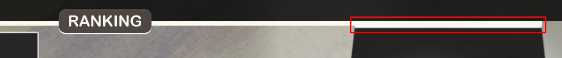
Looking more into the selection-mode panel though, I noticed that the line before the list of player set leaderboards does this weird thing where it doesn't necessarily overlap this blue line here (2) and that the "Quick web access for this beatmap" button looks out of place with the white background surrounding it and the cutoff at the top. I don't use a lot of skins with custom selection-mode panels, so I'm not sure what's creating these issues amidst the layout you've created it, but I'm sure it's able to be fixed.
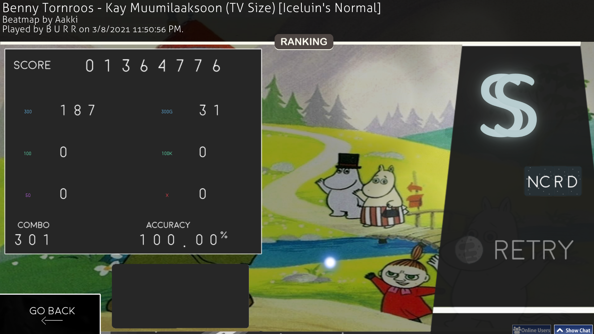
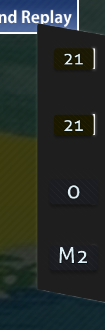
There are a couple of others things I don't particularly like such as how the text of the numbers gets distorted as they have to enlarge to show final scores on personal bests, current combos, or leaderboard shown plays as there's only one size for each of the numbers (3) and how the bottom portion of the "ranking-panel" cuts into the top portion of the results screen, but this is another simple issue that can be fixed by moving the bottom half down some. The same thing can be said with the white line that is supposed overlay or hide behind the line from "ranking-title". (4)
As for the gameplay, I love the sleek design of the skin and how simplistic everything looks. I do have a couple of gripes with some of the elements off to the side like the edges that surround the glow of "inputoverlay-background" being a little too rigid (5) and how the inside of the scorebar is empty as it scares me into thinking I failed, but it's actually the bar itself that dissipates as the map drags along.
Overall, this skin is really nice and a great first submission to the skinning forum and I'm looking forward to seeing the skin in it's complete development as I'm totally down to use to play maps that I find lazily browsing around the beatmaps page. I hope my feedback helps you along the way into creating more custom skins like this one as I'm sure many people like me enjoy the aesthetic you're going for in making these skins.
Keep up the great work, NotConsistent. I'm rooting for you 🍺
 ]
]No worries, don't sweat it! I'll be around when exams are over, still playing new released maps.NotConsistent wrote:
Thanks for the feedback! I'll try my best to fix those things! [for now I have exams sorryB U R R wrote:
It's a very nice skin — something I really like in fact as I'm a huge space junkie — but there are some elements I can't help but notice that take away from the skin as a whole.
The first thing that I noticed was how small cut out area for you stats as player for the selection-mode screen was as the little icon that displays over your rank is cut off, as well as the last digit or two of your rank. I fixed this however by making the area at least 478 x 152 pixels and the turnout is quite nice from what I see. (1)
Looking more into the selection-mode panel though, I noticed that the line before the list of player set leaderboards does this weird thing where it doesn't necessarily overlap this blue line here (2) and that the "Quick web access for this beatmap" button looks out of place with the white background surrounding it and the cutoff at the top. I don't use a lot of skins with custom selection-mode panels, so I'm not sure what's creating these issues amidst the layout you've created it, but I'm sure it's able to be fixed.
There are a couple of others things I don't particularly like such as how the text of the numbers gets distorted as they have to enlarge to show final scores on personal bests, current combos, or leaderboard shown plays as there's only one size for each of the numbers (3) and how the bottom portion of the "ranking-panel" cuts into the top portion of the results screen, but this is another simple issue that can be fixed by moving the bottom half down some. The same thing can be said with the white line that is supposed overlay or hide behind the line from "ranking-title". (4)
As for the gameplay, I love the sleek design of the skin and how simplistic everything looks. I do have a couple of gripes with some of the elements off to the side like the edges that surround the glow of "inputoverlay-background" being a little too rigid (5) and how the inside of the scorebar is empty as it scares me into thinking I failed, but it's actually the bar itself that dissipates as the map drags along.
Overall, this skin is really nice and a great first submission to the skinning forum and I'm looking forward to seeing the skin in it's complete development as I'm totally down to use to play maps that I find lazily browsing around the beatmaps page. I hope my feedback helps you along the way into creating more custom skins like this one as I'm sure many people like me enjoy the aesthetic you're going for in making these skins.
Keep up the great work, NotConsistent. I'm rooting for you 🍺
 . Keep up the good work man.
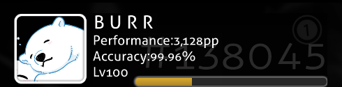