forum
Post your Artwork!
posted
Total Posts
2,353
tried to draw pokemon other than eevee or vulpix hum
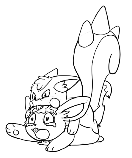
I'm not sure they're even recognizable
I'm not sure they're even recognizable
Pachirisu and... a rabbit ?Shiro wrote:
tried to draw pokemon other than eevee or vulpix hum
I'm not sure they're even recognizable
No, wait... Minccino, perhaps ? Not sure about this one.
It's cute though, as always.
Now, here is my second try of drawing a character. I have hardly drawn anything before this, so even though it doesn't look that great (even bad and ugly, maybe
 ), I'm pretty proud of the result. I used some random image found on google to help me out, but I did modifysome parts of the original artwork (weapons, the face, the ring around the neck, the arms).
This drawing is based on S4 League.
This is only the beginning, I'm pretty sure I'll become better soon.
a lot of things are off but im very tired
Pachirisu and...Shiro wrote:
tried to draw pokemon other than eevee or vulpix hum
I'm not sure they're even recognizable
How do you get your linework and shading to be so clean and smooth?
I obviously need to work on my blending, shading and line work.
six years spent drawingMareownz wrote:
How do you get your linework and shading to be so clean and smooth?
Oh, and I got a blending stump. Yeah, can't get those in third world countries. They smooth out the shades pretty well.
Just keep drawing, try making lines with less strokes.Professor Prinny wrote:
I obviously need to work on my blending, shading and line work.
I like how the link has "why" in itIdeolo wrote:
Drew outlines. Dang this looks horrifying.
Your lines are good and your anatomy isn't ridiculously off (for a loli) so that's good. That'll improve later on. Hands are pretty bad though; might want to brush up on that. I'm also getting the impression you didn't visualize her skirt/apron thing very well. Her waist seems defined properly, for example, but the apron running down from it seems like its adhering to flat space. Contrast this with the skirt below it and it looks weird. Legs seem out of place, too.
she has no hands/ and i dont think i could have got the general glasses area any more wrong
shit yeah she's got like a snake neck wow
i'm so blind to anatomy mistakes
i'm so blind to anatomy mistakes
It's just a matter of getting a good understanding of it.
If you want some in-depth reference (general or specific parts of the body) try this: http://www.scribd.com/doc/9561347/Burne-Hogarth-Dynamic-Anatomy-in-English or hit up some tutorials around the net. Try making some anatomy studies for different body parts as well as the body as a whole.
If you want some in-depth reference (general or specific parts of the body) try this: http://www.scribd.com/doc/9561347/Burne-Hogarth-Dynamic-Anatomy-in-English or hit up some tutorials around the net. Try making some anatomy studies for different body parts as well as the body as a whole.
not just once butBrian OA wrote:
I like how the link has "why" in it
http://wendy-the-creeper.deviantart.com ... -410125280
I'm finally done with this. Now I can play osu! more.
I'm finally done with this. Now I can play osu! more.
so many talented artists here wow
im trying to draw a potato bye
im trying to draw a potato bye
I don't really fit in here but what the heck.
http://pinkster7.deviantart.com/art/Lui ... -401344895
http://pinkster7.deviantart.com/art/Lui ... -404040913
http://pinkster7.deviantart.com/art/Lui ... -401344895
http://pinkster7.deviantart.com/art/Lui ... -404040913
Draw Asuka too...if you don't mind of coursetyrael6192 wrote:
she has no hands/ and i dont think i could have got the general glasses area any more wrong

I don't understand your line weighting, nor the clashing of traditional painting with vectoring.
Step up your game brainman. Don't be lazy, you can do better.
Step up your game brainman. Don't be lazy, you can do better.
What do you mean I'm being lazy? I'm trying my hardest sdsadfboat wrote:
I don't understand your line weighting, nor the clashing of traditional painting with vectoring.
Step up your game brainman. Don't be lazy, you can do better.
The clashing was a result of experimentation. It had been a month since I had painted with Photoshop and I wanted to change my approach since I wasn't happy with my older color works. The vector coloring (I hope that's what you mean by vector) in the hair was where I started coloring. As I went down with the skin, the shirt, and the background, I ended up switching styles.
I don't really get what you mean by line weighting though; I hardly gave that any thought. There shouldn't be anything to understand out of it, though I'll definitely use it as an element next time.
That's the issue right there, put thought into it. The lines on your pencilwork are lovely and clearly you understand how to blend it in with values, so why don't you do it digitally? Drop the silly psuedo line weighting and cellshading/vectoring all together and paint instead, I'm sure that way your work will be more satisfactory to both yourself and to your audience. Learning and experimenting is fine, but there's no reason to drop what you're already good at.
If anything, if you insist on painting more traditionally with digital tools, lose the thick lines or contrast the main focus more. Without any depth, at least imo, it doesn't work.
If anything, if you insist on painting more traditionally with digital tools, lose the thick lines or contrast the main focus more. Without any depth, at least imo, it doesn't work.
decided to actually use my tablet for drawing instead of just an alternative of a mouse u w u i've just been practising with shading skin and faces but i'll get to clothing and proper anatomy eventually. it's just a shame i can never finish anything cough.
Not mine, but it's something a friend of mine made (with permission to put on here, of course). I can see some mistakes, but I'd like to see some critique from more experienced artists.
You should probably tell then to practice their writing for Japanese more. :VSSShaymin wrote:
I can see some mistakes, but I'd like to see some critique from more experienced artists.
Nice face, boy looks like a fag, weird anatomy, linework is blargh, girl's head orientation doesn't mach face's orientation, why are blush values so dark, squished wrting up there, why are soft brushes used everywhere, and nice face.SSShaymin wrote:
Not mine, but it's something a friend of mine made (with permission to put on here, of course). I can see some mistakes, but I'd like to see some critique from more experienced artists.
This friend of yours has plenty of potential. He/She should keep drawing.
Maybe pick up an artbook.
My Hindu colleague wouldn't stop calling me naughty every time he saw me drawing this.