This map has been deleted on the request of its creator. It is no longer available.
forum
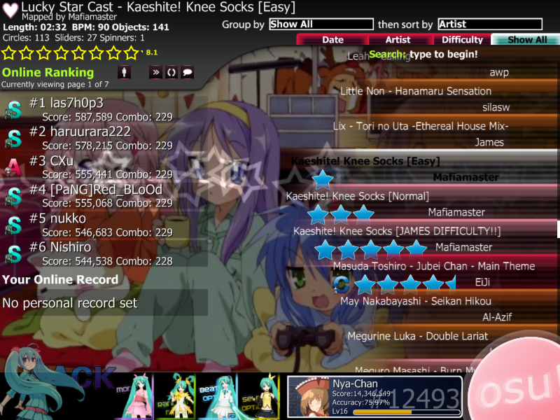
Hatsune Miku -Project Osu!- [Ver. 1.31]
posted
Total Posts
103
Topic Starter
Been taking a break from Osu! due to school and stuff, finally found some time to play again. So back to work I go on this theme.
...
Now that I'm thinking about it, I'm going to turn this theme into a Project Diva thing, since the game's finally out. Going to work on revamping the sucker and turning it into "Project Osu!" I suppose. ;D I'll keep some elements, but once again this theme's going under a huge revamp.
I agree with you, the problem being I have no idea what to use for the bar. >_<;Harris73 wrote:
The HP bar is especially weird. Can't we get something else there?
...
Now that I'm thinking about it, I'm going to turn this theme into a Project Diva thing, since the game's finally out. Going to work on revamping the sucker and turning it into "Project Osu!" I suppose. ;D I'll keep some elements, but once again this theme's going under a huge revamp.
Topic Starter
Sorry for double post, but just making sure that people note it's updated. :3 Screenshots in the top post.
And I'll repeat my question here so to make sure it's not lost in the mass of images:
What's the file name for "Auto Pilot"? I have an image ready for it, but it's obviously not the correct filename since it doesn't show up.
edit: oh and any ideas for the spinner are appreciated. The only thing I can think to link it to PJD-wise is Chance Time, but it doesn't really work well.
Also, CtB will be skinned, I'm just too lazeh right now. It'll be falling PSP button thingys and Miku will catch them. =3=
double edit: whoops, realized I forgot to record something for "Are you ready?" Eh, I'll do it before the next update.
For "auto-pilot" give file name "selection-mod-relax2". ^^
Wow what a total change. Did you have overdo the entire theme of it? And the name too? It's like you dumped the old skin and created this one out of nowhere.
yes yes yes yes yes!!!!!!!!!!!!!!!!!!!!!!!!!!!!!!!!!!!!! 
FIRST of all, i dont really understand the countdown. I dont really like it either. The Slider ball sucks. Im sorry, it just looks really bland. The combo bursts are good but i hate the health meter and the spinner is still the osu! default one. Overall, I think its great i support this new skin.
It's not complete yet, it's version 0.5. That's probably why the spinner hasn't been changed yet.kideddie1501 wrote:
FIRST of all, i dont really understand the countdown. I dont really like it either. The Slider ball sucks. Im sorry, it just looks really bland. The combo bursts are good but i hate the health meter and the spinner is still the osu! default one. Overall, I think its great i support this new skin.
The slider ball...I wouldn't really expect it being an 'X', looking at the screenshots. It would distract me indefinitely. I can always suggest some leek or another object a Vocaloid has (Tuna? :3) but I don't know...
Perhaps a cool techno-all around can work too. >w< Perhaps though, my opinion sucks.
I think the life icon (the kianger.png etc.) might need a little more perfection though.
Everything looks promising, I expected no less from you though.

Topic Starter
I kept a teeny tiny bit of Osu!loid, but I realized half of it sucked or wouldn't fit the idea of a PJD theme.Harris73 wrote:
Wow what a total change. Did you have overdo the entire theme of it? And the name too? It's like you dumped the old skin and created this one out of nowhere.
I had the slider ball being a spinning leek before, but it didn't work out too well because I had crunched it all up to fit better. I had made it an X because I just had felt using the O again would be kinda lame.Starrodkirby86 wrote:
It's not complete yet, it's version 0.5. That's probably why the spinner hasn't been changed yet.kideddie1501 wrote:
FIRST of all, i dont really understand the countdown. I dont really like it either. The Slider ball sucks. Im sorry, it just looks really bland. The combo bursts are good but i hate the health meter and the spinner is still the osu! default one. Overall, I think its great i support this new skin.
The slider ball...I wouldn't really expect it being an 'X', looking at the screenshots. It would distract me indefinitely. I can always suggest some leek or another object a Vocaloid has (Tuna? :3) but I don't know...
Perhaps a cool techno-all around can work too. >w< Perhaps though, my opinion sucks.
I think the life icon (the kianger.png etc.) might need a little more perfection though.
 Maybe an O would work better? X and O are the usual buttons for Normal Rank songs on Project Diva, which is why I used them.
The countdown is a joke off one of Miku's songs "melody.exe". It's one of the old "version"'s remnants, but I couldn't think of anything to change it to, so I left it as is. I'll try to figure out something better.
The health bar is an imitation of the Project Diva "Song Energy Bar". I'll try to fiddle around with the shape and design of it to make it look better. :3
As for the spinner, I haven't thought of anything yet for it. Any suggestions are welcome for it.
Thanks for the comments so far though everyone. ^w^
Heres an idea for the spinner, you know how in the Haruhi skin, the spin-o-meter gauge is a Haruhi Silouette? Makybe a Blue Haruhi Silouette would be awsome with the actual spinner itself being like the Re:package CD.
yes, i rather like the unformed cd.
Topic Starter
That CD image for "unformed" must be the DVD+CD or the LE one right? *has unformed, but her CD doesn't have that design*
Anyways, I finished vectoring it over and altering it slightly to remove the track list and copyright info for the CD. xD; Also added the selection things (in beatmap selection), as well as fixing the filename for Auto Pilot. I haven't started playing around with the slider ball and health bar yet, so this update is really just additions. Also, CtB is partially skinned. Just missing Ryuuta being changed to Miku now. I don't have screenshots of CtB yet, since it's not finished/I forgot. xD;
Updated Selection screen.
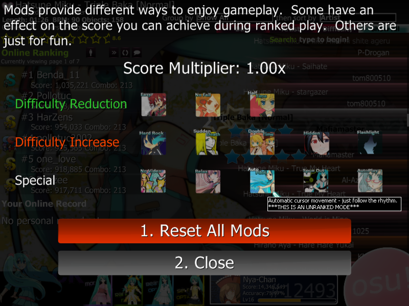
Updated Mods image.
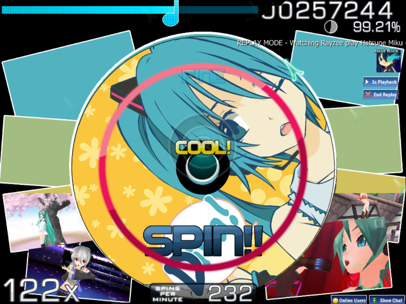
The spinner.
edit: Alignment issues will be fixed before the next update. Dx;
New download link will be in the top post in a few~
Also, on a side note: SuzumiyaKyon, can you change the images to link for me? they stretch the page a lot. (I don't exactly have a huge monitor =3=)
edit: and another side note: I will not be doing hitsounds for this theme. A: Because I suck at audio edited and such, and B: Project Diva's sounds are practically already in there, so there's no point anyways. xD;
Anyways, I finished vectoring it over and altering it slightly to remove the track list and copyright info for the CD. xD; Also added the selection things (in beatmap selection), as well as fixing the filename for Auto Pilot. I haven't started playing around with the slider ball and health bar yet, so this update is really just additions. Also, CtB is partially skinned. Just missing Ryuuta being changed to Miku now. I don't have screenshots of CtB yet, since it's not finished/I forgot. xD;
Updated Selection screen.
Updated Mods image.
The spinner.
edit: Alignment issues will be fixed before the next update. Dx;
New download link will be in the top post in a few~
Also, on a side note: SuzumiyaKyon, can you change the images to link for me? they stretch the page a lot. (I don't exactly have a huge monitor =3=)
edit: and another side note: I will not be doing hitsounds for this theme. A: Because I suck at audio edited and such, and B: Project Diva's sounds are practically already in there, so there's no point anyways. xD;
Topic Starter
I fixed the spinner and made the Health Bar better, but I still have to finish fixing up the markers for the bar. Gotta record the "are you ready" line and play around with the ready and go images. Also finished CtB.
So uhm, I'm almost done? Next update will prolly finish off just about everything I planned to skin, unless I'm impatient and update sooner.
So uhm, I'm almost done? Next update will prolly finish off just about everything I planned to skin, unless I'm impatient and update sooner.
This map has been deleted on the request of its creator. It is no longer available.
Topic Starter
This map has been deleted on the request of its creator. It is no longer available.
-_- Pretty... xD
|
|
The pointer kinda screws up other songs that have custom skins, the pointer will be outside the curser which throws off a lot. The tip of the leek will show up out side the circle. I have this skin as my default so when i went to this song and started playing, i didn't notice the tip of the leek, but then i noticed that a lot of the notes weren't hitting for some reason. You can see what I'm talking about if you put the skin on and go to a song with it's own custom cursor and put it on autoplay. it's more noticeable there
Not really skin related but is that gray haired lady with black pants from the spinner gauge a real vocaloid? If so, whats her name?
Topic Starter
oh, as in the pointer's hot spot is in the top left rather than the center like most cursors figure the hot spot is in the center. I''ll try to get a way to make this work better, though I may have to make a new cursor.Metruzero wrote:
The pointer kinda screws up other songs that have custom skins, the pointer will be outside the curser which throws off a lot. The tip of the leek will show up out side the circle. I have this skin as my default so when i went to this song and started playing, i didn't notice the tip of the leek, but then i noticed that a lot of the notes weren't hitting for some reason. You can see what I'm talking about if you put the skin on and go to a song with it's own custom cursor and put it on autoplay. it's more noticeable there
@kideddie1501: The gray haired girl is Yowane haku, a spin off vocaloid based off miku. She personifies a new user of Vocaloid, and has a more robotic and off-key sound.
Very nice
A couple things I noticed though were:
1) The top left of the leek cursor's glow is cut off. I don't think if this was intentional or not. (probably since you said the hot spot IS the top left to click with)
2) You used the same icon for both Relax and Auto Pilot. Maybe you could make a different one for Relax?
Great job either way xD
EDIT:
3) The cursor-follow-point looks kinda weird since it's smaller than the cursor and sticks out o.o;
4) The hitcircles aren't gray-scaled (intentional?) so it makes maps look weird playing with only approach-circle colors ._.;;;;
This map has been deleted on the request of its creator. It is no longer available.
Topic Starter
1: I'll probably change the cursor (once I get all this pesky college work out of the way xD), but yeah, I noticed it.Derekku Chan wrote:
Very nice
A couple things I noticed though were:
1) The top left of the leek cursor's glow is cut off. I don't think if this was intentional or not. (probably since you said the hot spot IS the top left to click with)
2) You used the same icon for both Relax and Auto Pilot. Maybe you could make a different one for Relax?
Great job either way xD
EDIT:
3) The cursor-follow-point looks kinda weird since it's smaller than the cursor and sticks out o.o;
4) The hitcircles aren't gray-scaled (intentional?) so it makes maps look weird playing with only approach-circle colors ._.;;;;
2: Uh, no I didn't. Relax should have Luka on it, while Auto Pilot should have Miku on it. see screenshots towards the top of this page (2, incase this shoots to a page 3). it shows properly on my computer, I'll check the files, but they ARE different.
3: I'll take that into account int making the new cursor. :3
4: Yeah, it was intentional, But I can alter it to have some recolor-able areas to it. it's based off the 'shadow' version of the button symbols that show in Project Diva, which were, of course, all black with an outline. Though I do agree, it's a little weird, I just wasn't really sure if i should change it.
Possibly? Iunno, at 800x600 on my pc they look fine, and the same goes for my screen dimension at full screen, 1366x768. Even making it bigger than my screen should have it at (thus cutting half the screen off), none of the difficulty stars look pixelated... Can you show me a screencap where the look pixelated, because to be honest, I don't see it happening with my settings.vytalibus wrote:
In addition to what Derekku said, I think the difficulty stars look quite pixellized, especially by its border. Dimension issues, perhaps?
Oops, I see the problem now for the mods. You left "selection-mod-autopilot" in the folder
Uh, I guess it's your pick on the hit circles. I prefer color, but if Project Diva DID have just black, uhhhhh I dunno x3
Uh, I guess it's your pick on the hit circles. I prefer color, but if Project Diva DID have just black, uhhhhh I dunno x3
Sorry, but I'm only basing this on the screenshot you gave me. I think it has something to do with that godawesomely thin border lines, or some eyefucking on my part.Nya-Chan wrote:
Possibly? Iunno, at 800x600 on my pc they look fine, and the same goes for my screen dimension at full screen, 1366x768. Even making it bigger than my screen should have it at (thus cutting half the screen off), none of the difficulty stars look pixelated... Can you show me a screencap where the look pixelated, because to be honest, I don't see it happening with my settings.vytalibus wrote:
In addition to what Derekku said, I think the difficulty stars look quite pixellized, especially by its border. Dimension issues, perhaps?
I do fancy your skin from the screenshots already, so do ignore me if you want.
Topic Starter
Alright, I have changed the cursor, as well as making the hot spot the center, so now all maps with specific cursors designed to work with center-hot-spot-skins now shouldn't be a problem. I have also added some lighter shades into the hit circles, so now, while still rather dark, will show the combo's color. Also removed the pointless wrong-named auto pilot icon from the skin folder.
Here's a screencap showing all the changes:
rar file will be updated into the top post in a few moments.
Any other suggestions and comments are appreciated. :3
Here's a screencap showing all the changes:
rar file will be updated into the top post in a few moments.
Any other suggestions and comments are appreciated. :3
ooooh, I really like the hit circles now xD *sets as default skin* :3
EDIT: A few problems I see.
1) HP Performance line falls off ranking-graph (make it bigger?)
2) Safe/Combo/x from numbers 100+ on the right fall off the background. Could you make the darker parts of the ranking-panel extend out more?
3) SCORE looks weird under the numbers ._.;
---
4) You left followpoint.psd in your folder
5) scorebar-bg could be a little taller on the right side. The score numbers don't really fit and the opacity is kinda high so the numbers/acc/pie are really dark under it.
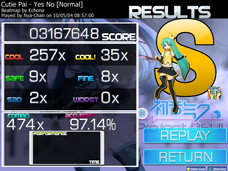
Topic Starter
Alrighty~! Did some fiddling and fixing of the images, mostly score-related. All the things pointed out in Derekku Chan's post above should be fixed now. :3
Fixed Results Screen:
Fixed HP Bar BG:
Score-related numbers also overlap a little more now, so that when 100.00% accuracy is shown that doesn't overlap the edge as well as allowing me to add a little bit more details into the HP bar BG. Will be putting up an updated file in a few moments.
Fixed Results Screen:
Fixed HP Bar BG:
Score-related numbers also overlap a little more now, so that when 100.00% accuracy is shown that doesn't overlap the edge as well as allowing me to add a little bit more details into the HP bar BG. Will be putting up an updated file in a few moments.
Thanks and nice job (again) :3
I love it and thank you so much! Although, I think I preferred the old countdown voice(the voice matched the girls XD), but that's just me. And again, thank you so much!
Although, I think I preferred the old countdown voice(the voice matched the girls XD), but that's just me. And again, thank you so much! i want to know ....how can i download it....
E.....i think i find the way...
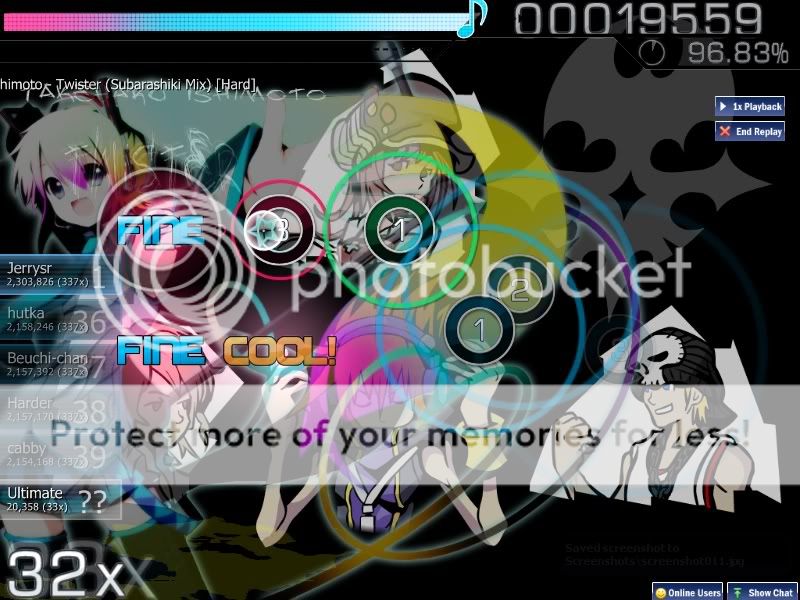
I like, thanks very much... except that there's 2 "FINE"'s and its confusing when im going for accuracy
Topic Starter
okay, so since I recently found out the filenames to make the bg things for pause/fail screens, I added in something for the pause screen. More game-imitating~! Also wasn't really fond of the artwork I used for the rankings and redid them with the pictures of the modules Sega put up tp Piapro. I'll update them again with the other Vocaloids when their module pictures for PJD2nd pop up on Piapro. :3 Also, since someone commented on my weird two fines (which were stupidly not even that different in color), I went and fixed that. 100k is a regular "Fine", 300 is a red-orange "Cool" with no exclamation point. The rest are left alone. Also, changed the combo bursts and now there's multiples. :3
Screencaaaaps~♪!
*goes off to update the top post*
Screencaaaaps~♪!
SPOILER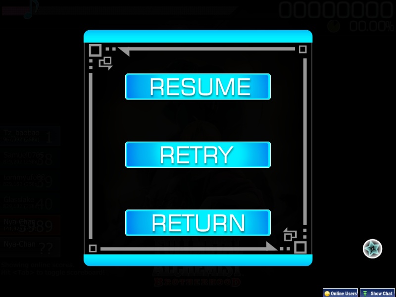
Pause Screen
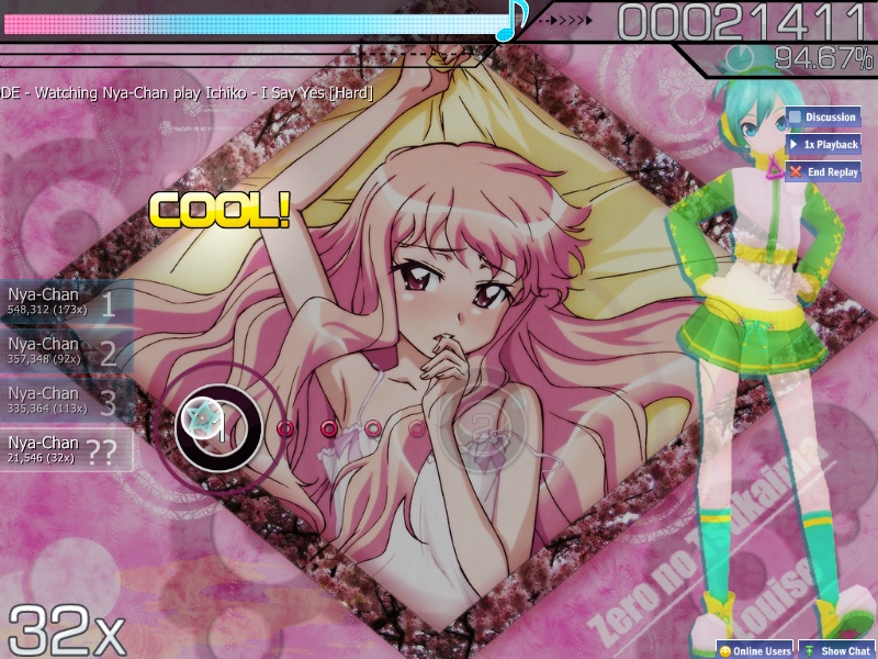
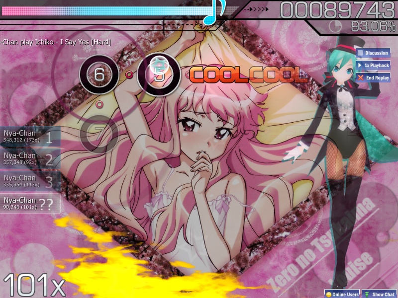
Combo Bursts
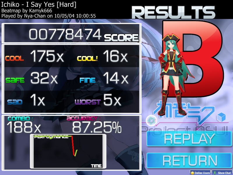
Updated Rankings
Pause Screen
Combo Bursts
Updated Rankings
*goes off to update the top post*
aaaa too damn cool AAaAAAAAaa 
great update Nya!
EDIT : too bad it doesn't work well on widescreen
great update Nya!
EDIT : too bad it doesn't work well on widescreen
Topic Starter
o_o whoa I hadn't realized the score things were spaced to fit the whole screen on widescreen mode. I can totally fix that. :3 It'll be put in a separate folder/zip/rar within the folder for those running widescreen to go and get.Arusha Shuna wrote:
EDIT : too bad it doesn't work well on widescreen
Great job on the skin. This will forever be my favorite skin...:3
Topic Starter
Alrighty, added an alternate scorebar for those running widescreen resolutions. You just gotta go in and un-rar the rar file. :3
Awesome skin...But spinner is too bright for me D: Sometimes it's hard to find the cursor D: