forum

a_hisa - Vindarfr

posted
Total Posts
46
Topic Starter
Diancis
This beatmap was submitted using in-game submission on 2017年10月21日 at 23:30:28

Artist: a_hisa
Title: Vindarfr
Tags: SingleCollection
BPM: 130
Filesize: 3895kb
Play Time: 02:00
Difficulties Available:
  1. Insane (3.84 stars, 375 notes)
  2. Light Insane (3.55 stars, 319 notes)
  3. NikitaErmakov's Normal (1.82 stars, 135 notes)
  4. Xoul's Insane (4.88 stars, 588 notes)
Download: a_hisa - Vindarfr
Information: Scores/Beatmap Listing
---------------
Beautiful Music~
Hope you enjoy~
Mithia
Hi Hi!! Here From My Mod Queue
  1. Well mainly I imagine that the map is not ready, since I do not think that it must depend on a single dificultad (I imagine that I already read the ranking criteria)
Hard
S.v (Slider velocity) should go to 1.3
you should put a color for the combo
00:15:266 (1) - this spinner is of short duration, should be longer
00:16:881 - rest should last until here, you can do more
00:29:804 (1) - this spinner is of short duration, should be longer x2
00:31:881 (2) - looks very ugly and does not have much flow,Improve it
00:34:650 (8) - Blanket with 00:33:727 (6) -
00:34:419 (7,8,9,10) - this jump does not look very well, you can improve it
00:37:419 (7) - ugly and no flow, Improve it
00:38:573 (10) - change the shape of the slider, example
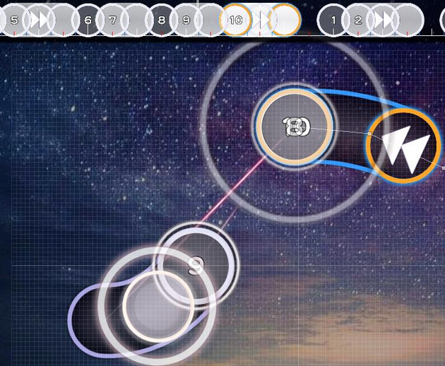
00:39:496 (1) - stack it with 00:37:881 (8) -
00:40:419 - a hitcircle here
00:42:958 (3) - there is sound lost here( 00:43:189 - ), I think this part can be better represented, example
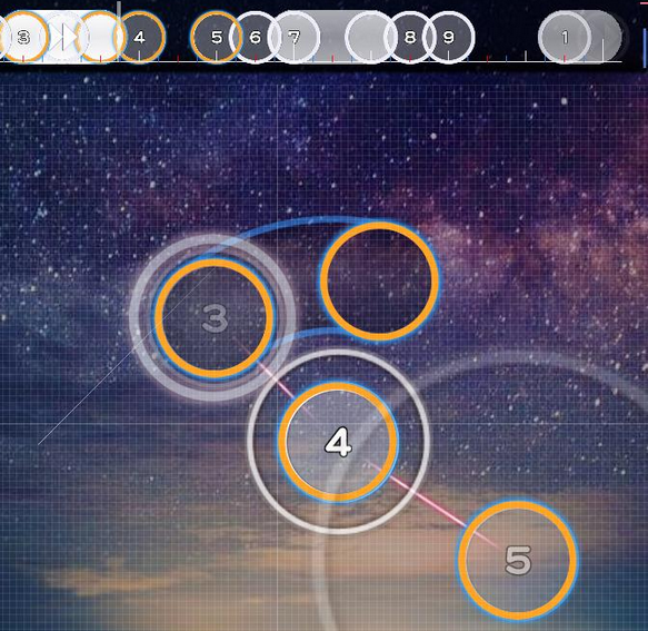
00:46:189 (1,2) - there is a great distance between these notes for a hard
00:46:881 (2,3) - same
00:48:035 (4,5,6,7,8) - mmm, that way it will not look better?
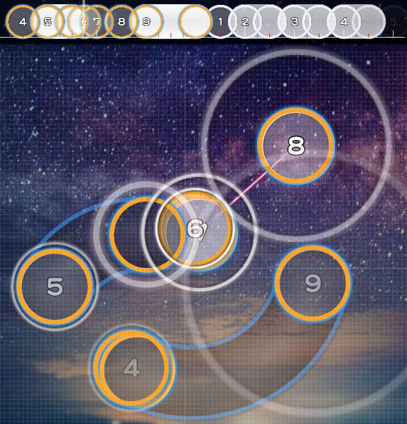
00:50:112 (2) - this doesn't look very good that we say -
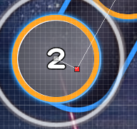
00:50:112 (2,3) - Much distance for a hard, and uncomfortable
00:51:035 (4) - Ctrl+G?
00:51:727 (6) - there is sound lost here( 00:51:958 - ), I think this part can be better represented x2
00:52:419 (7) - same
00:53:342 (8,1) - Much distance, try to reduce it
00:56:573 (8,9,10,1) - I do not feel the rhythm here very well, something like that would be better
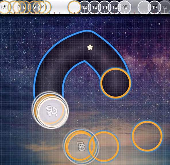
00:57:266 (1,2,3,4,5,6,7) - same, remap that part
00:59:342 (6,7,8) - a lot of distance for a hard
01:02:804 (7,8) - it feels uncomfortable, you can make it better
01:04:419 (1,2) - Very long distance :x
01:04:419 (1) - I do not think here go this hitcircle
01:06:035 (6) - stack it with 01:05:342 (4) -
01:06:496 (8) - there is much rhythm lost here by that slider
01:08:573 (5) - Ctrl+G?
01:09:381 - should go a note
01:09:727 (8) - the slider looks very ugly there and that way xd
01:11:342 (12) - there should be 01:11:573 (1) -
mmmmm
  1. First, I do not know if you have read the ranking criteria but I'll leave it here: https://osu.ppy.sh/help/wiki/Ranking_Criteria .
  2. Second, I think you know about Pishifat or not, Idk, but I still leave his channel, he makes videos about mapping and you can learn a lot like me Pishifat Channel
  3. And thirdly, your map is not bad and not good at all, it has some things that can improve, there are several places where it loses its rhythm and it does not seem like a hard one, I think you can remap it if you want, generally I would do it but it's your decision. I know you can do better, GL
    I'm sorry if it does not help much :(
Topic Starter
Diancis

OsuDans wrote:

Hi Hi!! Here From My Mod Queue
  1. Well mainly I imagine that the map is not ready, since I do not think that it must depend on a single dificultad (I imagine that I already read the ranking criteria)
Hard
S.v (Slider velocity) should go to 1.3
you should put a color for the combo
00:15:266 (1) - this spinner is of short duration, should be longer
00:16:881 - rest should last until here, you can do more
00:29:804 (1) - this spinner is of short duration, should be longer x2
00:31:881 (2) - looks very ugly and does not have much flow,Improve it
00:34:650 (8) - Blanket with 00:33:727 (6) -
00:34:419 (7,8,9,10) - this jump does not look very well, you can improve it
00:37:419 (7) - ugly and no flow, Improve it
00:38:573 (10) - change the shape of the slider, example

00:39:496 (1) - stack it with 00:37:881 (8) -
00:40:419 - a hitcircle here
00:42:958 (3) - there is sound lost here( 00:43:189 - ), I think this part can be better represented, example

00:46:189 (1,2) - there is a great distance between these notes for a hard
00:46:881 (2,3) - same
00:48:035 (4,5,6,7,8) - mmm, that way it will not look better?

00:50:112 (2) - this doesn't look very good that we say -

00:50:112 (2,3) - Much distance for a hard, and uncomfortable
00:51:035 (4) - Ctrl+G?
00:51:727 (6) - there is sound lost here( 00:51:958 - ), I think this part can be better represented x2
00:52:419 (7) - same
00:53:342 (8,1) - Much distance, try to reduce it
00:56:573 (8,9,10,1) - I do not feel the rhythm here very well, something like that would be better

00:57:266 (1,2,3,4,5,6,7) - same, remap that part
00:59:342 (6,7,8) - a lot of distance for a hard
01:02:804 (7,8) - it feels uncomfortable, you can make it better
01:04:419 (1,2) - Very long distance :x
01:04:419 (1) - I do not think here go this hitcircle
01:06:035 (6) - stack it with 01:05:342 (4) -
01:06:496 (8) - there is much rhythm lost here by that slider
01:08:573 (5) - Ctrl+G?
01:09:381 - should go a note
01:09:727 (8) - the slider looks very ugly there and that way xd
01:11:342 (12) - there should be 01:11:573 (1) -
mmmmm
  1. First, I do not know if you have read the ranking criteria but I'll leave it here: https://osu.ppy.sh/help/wiki/Ranking_Criteria .
  2. Second, I think you know about Pishifat or not, Idk, but I still leave his channel, he makes videos about mapping and you can learn a lot like me Pishifat Channel
  3. And thirdly, your map is not bad and not good at all, it has some things that can improve, there are several places where it loses its rhythm and it does not seem like a hard one, I think you can remap it if you want, generally I would do it but it's your decision. I know you can do better, GL
    I'm sorry if it does not help much :(
Thank you very much for your mod!

Hmmm it's true that I' haven't finished the map,and I'm preparing to get it ready.
I've always been trying to make my map feel smooth and comfortable,but sometimes just can't figure out a suitable arrangement.
In several places you really helped!
And thx for sharing the channel~

Excuse me for one more question XD: Is there any difference between editing SV in Timing and in Inherited Points?
Mithia
Thank you very much for your mod!

Hmmm it's true that I' haven't finished the map,and I'm preparing to get it ready.
I've always been trying to make my map feel smooth and comfortable,but sometimes just can't figure out a suitable arrangement.
In several places you really helped!
And thx for sharing the channel~

Excuse me for one more question XD: Is there any difference between editing SV in Timing and in Inherited Points?
Of course, in the timing for example, you put 2.0 at a fast speed depending on the timing, and if with the Inherited Points you put 2.0 that slider will go much faster, in conclusion, the timing is like the default speed of the slider :)
Topic Starter
Diancis

OsuDans wrote:

Thank you very much for your mod!

Hmmm it's true that I' haven't finished the map,and I'm preparing to get it ready.
I've always been trying to make my map feel smooth and comfortable,but sometimes just can't figure out a suitable arrangement.
In several places you really helped!
And thx for sharing the channel~

Excuse me for one more question XD: Is there any difference between editing SV in Timing and in Inherited Points?
Of course, in the timing for example, you put 2.0 at a fast speed depending on the timing, and if with the Inherited Points you put 2.0 that slider will go much faster, in conclusion, the timing is like the default speed of the slider :)
I see...If I set 1.2 in timing and 1.5 in inherited,it will become 1.8 normal?
Mithia
Well no xD, just go up a little more speed c:
N0thingSpecial
give me the kds plz
23:46 Diancis: hi
23:46 Diancis: Nm request plz
23:49 N0thingSpecial: sure
23:49 N0thingSpecial: link map
23:49 *Diancis is listening to [https://osu.ppy.sh/b/1425244 a_hisa - Vindrfr]
23:49 Diancis: thx!
23:49 N0thingSpecial: I'm doing in game chat so you need to reply
23:50 Diancis: ok
23:50 N0thingSpecial: 1) the offset feels late
23:51 N0thingSpecial: I think 248 is better
23:51 Diancis: hmmm let me see
23:52 N0thingSpecial: 00:11:342 (1,2) - these shape look random, try to make them look "related"
23:53 Diancis: 248 is really comfortable...found out why it sometimes feel wired
23:53 N0thingSpecial: [https://osu.ppy.sh/ss/9194454 also the "S" shape could be done better like this]
23:53 N0thingSpecial: unless you want to be like hollow wings or 09kami I guess you can keep it
23:54 Diancis: get it
23:54 N0thingSpecial: 00:16:881 - to 00:29:804 - there is a lot of things to map here why skip it?
23:55 Diancis: hmm I'm still thinking about it,not sure about what to put
23:55 Diancis: i'll fill it
23:57 N0thingSpecial: 00:39:035 (1,2,3) - the spacing is confusing, they all have same distance, but 00:39:034 (1,2) - is 1/1 in timing and 00:39:496 (2,3) - is 1/2 in timing
23:58 N0thingSpecial: It's good to think about symmetry but sometimes it doesn't play well
23:58 N0thingSpecial: 00:40:881 (6,7,8) - ^ same logic
00:00 Diancis: get it
00:00 N0thingSpecial: 00:44:342 - you're missing a beat here, cause you map the same sound here 00:43:419 -
00:01 N0thingSpecial: 00:46:189 (1,2,3) - same thing as the confusing spacing
00:01 N0thingSpecial: but I would like ot add
00:01 N0thingSpecial: if you want to introduce confusing spacing
00:01 N0thingSpecial: do it consistently
00:03 N0thingSpecial: take 00:39:034 (1,2,3) - as an example again, the first is 1/1, and the second is 1/2 in timing, dont switch when it is the same sound like 00:46:189 (1,2,3) -
00:03 N0thingSpecial: in 00:46:189 (1,2,3) - you switch the order from 1/2 to 1/1
00:03 N0thingSpecial: makes things too confusing
00:03 N0thingSpecial: if you want confusing spacing
00:04 N0thingSpecial: do it consistently
00:05 N0thingSpecial: Next point:
00:07 N0thingSpecial: 00:54:035 (3) - you didn't map this beat in the first part why did you map it here?
00:08 Diancis: Oh,didn't notice it
00:09 N0thingSpecial: yea so either change the start
00:09 N0thingSpecial: or change here
00:10 N0thingSpecial: 00:55:650 - you missed a really strong beat here
00:10 N0thingSpecial: the bass and the flute can be heard and it feels weird not clicking it
00:10 N0thingSpecial: 00:56:573 - same here
00:11 N0thingSpecial: 00:59:342 - same here
00:11 N0thingSpecial: 00:57:496 - same here
00:11 N0thingSpecial: feels weird
00:13 N0thingSpecial: moving on
00:14 N0thingSpecial: 01:15:496 - you really undermap here
00:14 N0thingSpecial: you followed the flute 01:08:112 - , but why not here?
00:16 N0thingSpecial: you very often like to map important sounds with slider end and slider body
00:17 N0thingSpecial: usually important sounds appear every 4 strong beat
00:17 N0thingSpecial: and this song fits that
00:17 N0thingSpecial: like 01:23:342 - this is the start of a new section of the song, and you mapped it with a slider end
00:19 N0thingSpecial: 01:56:804 (2,3,4) - this is not recommended, cause this is sudden, the song is slow but you never introduced to players that there are going to be spaced stream
00:19 N0thingSpecial: introducing completely new ideas to players in the middle of the song is not very good
00:20 N0thingSpecial: and I think I modded enough
00:22 Diancis: I think I've known about the problems 0.0
00:22 Diancis: Thanks a lot!
00:22 N0thingSpecial: work on your timing choices, you have weak aesthetic concepts but better than most new mappers
00:22 N0thingSpecial: working on your timing
00:22 N0thingSpecial: come back and maybe I can mod on aesthetics
Lian-_old
[box=[b:1337:1337]Mod!!!]
1) 00:16:863 (1,2,3,4,5) - Should create a more comfortable pattern here, equally visual

2)00:18:248 (1) - NC!
-same: 00:22:401 (1) -
-same: 00:25:171 (8) -
-same: 00:27:940 (7) -
-same: 00:34:401 (7) - quit NC: 00:35:324 (5) -
-same: 00:36:248 (7) -
-same: 00:40:401 (5) -
-same: 00:47:786 (6) -
-same: 01:02:555 (6) -
-same: 01:06:709 (7) -
-same 01:10:401 (10) -

3) 00:21:248 (7) - What if this slider is a copy of this 00:21:017 (6) -

4) 00:27:017 (6,7) - Overlap
-same: 00:36:248 (1,2) -
-same: 00:38:094 (5,1,2) -
-same: 00:46:401 (2,5) -
-same: 00:47:324 (5,8) -
- S A M E: 00:50:094 (2,4,6) - I hate this :)
-same: 01:00:248 (8,2) -
-same: 01:06:248 (6,9) -
-same: 01:10:632 (11,13) -

5) 00:28:863 (1) - You should map in instead of a spinner, since that's not the case!

6) 00:30:709 (1,2,1,2) - You should put more emphasis on background music, there are beats you did not set up!.... Here it feels quite simple, while the song has stronger rhythms that need to be clickable

7) 00:37:171 (3,4) - I really do not feel comfortable doing that

8) 00:39:478 (3,4) - Stack it here!
-same: 00:45:940 (10,2) -
-same: 00:48:594 (9,10) -
Chanyah
From Queue
Note: I will suggest ya take a look at other rank map since I can see ya need a lot more work to improve ur mapping in general

I know I won't be much of help but I will try with this mod below


  1. 00:16:863 (1,2,3,4,5) - for an hard diff - this is looks oddly uncomfortable for anyone of this level and the pattern itself is arrange in a way that doesn't quite make sense rhythm wise
    00:17:555 (4) - goes to the opposite direction from the next note and while this may be fine as an insane difficulty - but this difficulty, a player wouldn't be prepare to hit 00:17:786 (5) - and it just plain too hard
    I have this pic of an example of what ya can do to make it more comfortable and you can suggest to whatever ya feel will work with your map
    https://imgur.com/a/gu4Pb
  2. ok having 1/1 sliders is fine but for this is ignoring too much than just a simple 1/2 slider like you have here 00:18:248 (6) -
    another about this slider is that it end on a strong note here 00:18:709 - which loses a lot of emphais
    the best solution to this problem is to shorten this slider 00:18:248 (6) - to here 00:18:478 - and add a note here 00:18:709 -
    This isn't the only slider like this so I suggest paying attention to that
  3. 00:16:863 (1,2,3,4,5,6,7,8,9,10,11,12,13,14,15,16,17,18,19,20,21,22,23,24,25,26,27,28,29,30) -
    ok I assume ya just didn't do yet but I am say it anyways - please add some ncs into this since it is way too long as of this moment
  4. 00:28:863 (1) - this spinner isn't really needed here or have a reason to be here - you should just map this part instead since it plenty of stuff to map to not do so
k this is all I am gonna mod - This may or may not have grammar issues -

GL :)
Topic Starter
Diancis

Lian- wrote:

[box=[b:1337:1337]Mod!!!]
1) 00:16:863 (1,2,3,4,5) - Should create a more comfortable pattern here, equally visual

2)00:18:248 (1) - NC!
-same: 00:22:401 (1) -
-same: 00:25:171 (8) -
-same: 00:27:940 (7) -
-same: 00:34:401 (7) - quit NC: 00:35:324 (5) -
-same: 00:36:248 (7) -
-same: 00:40:401 (5) -
-same: 00:47:786 (6) -
-same: 01:02:555 (6) -
-same: 01:06:709 (7) -
-same 01:10:401 (10) -

3) 00:21:248 (7) - What if this slider is a copy of this 00:21:017 (6) -

4) 00:27:017 (6,7) - Overlap
-same: 00:36:248 (1,2) -
-same: 00:38:094 (5,1,2) -
-same: 00:46:401 (2,5) -
-same: 00:47:324 (5,8) -
- S A M E: 00:50:094 (2,4,6) - I hate this :)
-same: 01:00:248 (8,2) -
-same: 01:06:248 (6,9) -
-same: 01:10:632 (11,13) -

5) 00:28:863 (1) - You should map in instead of a spinner, since that's not the case!

6) 00:30:709 (1,2,1,2) - You should put more emphasis on background music, there are beats you did not set up!.... Here it feels quite simple, while the song has stronger rhythms that need to be clickable

7) 00:37:171 (3,4) - I really do not feel comfortable doing that

8) 00:39:478 (3,4) - Stack it here!
-same: 00:45:940 (10,2) -
-same: 00:48:594 (9,10) -
Thank you for your mod!
Topic Starter
Diancis

DJ Lucky wrote:

From Queue
Note: I will suggest ya take a look at other rank map since I can see ya need a lot more work to improve ur mapping in general

I know I won't be much of help but I will try with this mod below


  1. 00:16:863 (1,2,3,4,5) - for an hard diff - this is looks oddly uncomfortable for anyone of this level and the pattern itself is arrange in a way that doesn't quite make sense rhythm wise
    00:17:555 (4) - goes to the opposite direction from the next note and while this may be fine as an insane difficulty - but this difficulty, a player wouldn't be prepare to hit 00:17:786 (5) - and it just plain too hard
    I have this pic of an example of what ya can do to make it more comfortable and you can suggest to whatever ya feel will work with your map
    https://imgur.com/a/gu4Pb
  2. ok having 1/1 sliders is fine but for this is ignoring too much than just a simple 1/2 slider like you have here 00:18:248 (6) -
    another about this slider is that it end on a strong note here 00:18:709 - which loses a lot of emphais
    the best solution to this problem is to shorten this slider 00:18:248 (6) - to here 00:18:478 - and add a note here 00:18:709 -
    This isn't the only slider like this so I suggest paying attention to that
  3. 00:16:863 (1,2,3,4,5,6,7,8,9,10,11,12,13,14,15,16,17,18,19,20,21,22,23,24,25,26,27,28,29,30) -
    ok I assume ya just didn't do yet but I am say it anyways - please add some ncs into this since it is way too long as of this moment
  4. 00:28:863 (1) - this spinner isn't really needed here or have a reason to be here - you should just map this part instead since it plenty of stuff to map to not do so
k this is all I am gonna mod - This may or may not have grammar issues -

GL :)
Thank you for ur mod!
I'll try to improve:D
Peter
Mod
Change combo colours to match background
Disable countdown in design section
00:15:248 (1) - too short. it shouldn't be spinner
00:13:171 (2,3) - https://osu.ppy.sh/ss/9206946
00:39:709 (4) - looks bad do this http://osu.ppy.sh/ss/9206955
00:51:709 (6) - looks bad aswell
01:50:786 (7) - ^
Topic Starter
Diancis

PeterEU wrote:

Mod
Change combo colours to match background
Disable countdown in design section
00:15:248 (1) - too short. it shouldn't be spinner
00:13:171 (2,3) - https://osu.ppy.sh/ss/9206946
00:39:709 (4) - looks bad do this http://osu.ppy.sh/ss/9206955
00:51:709 (6) - looks bad aswell
01:50:786 (7) - ^
Thank you for modding!
Hmmm I can't figure out what colors fit that...would you please give a suggestion?:)
wasupandceacar
00:13:171 (2,3) - maybe a star jump will be better?
Topic Starter
Diancis

wasupandceacar wrote:

00:13:171 (2,3) - maybe a star jump will be better?
hmmm....I'm not sure which too choose.
A slider may fit the current rhythm,while a star can connect two parts better...
All the way thank you for ur mod~
coke bottle
hi skrub comming through

kiai time where?
00:15:248 (1) - too short, unrankable
00:20:786 (6) - NC
01:08:094 (1,2,3,4) - try not to have streams more than 3 beats in hard. change 01:08:324 (3,4) - to slider so that it fits for a hard and also represents the musid properly as well
01:15:478 (1,2,3,4,5) - ^
also, 01:07:863 (4,1) - has same distance gap as 01:08:094 (1,2,3,4) - when 01:07:863 (4,1) - is a 1/2 gap and the rest is 1/2. this may confuse players so change that. yee


so i've listed out some things up there that u can apply to other parts of your map. I fell like finding them yourself would help you to improve better
Topic Starter
Diancis

Reynolduh wrote:

hi skrub comming through

kiai time where?
00:15:248 (1) - too short, unrankable
00:20:786 (6) - NC
01:08:094 (1,2,3,4) - try not to have streams more than 3 beats in hard. change 01:08:324 (3,4) - to slider so that it fits for a hard and also represents the musid properly as well
01:15:478 (1,2,3,4,5) - ^
also, 01:07:863 (4,1) - has same distance gap as 01:08:094 (1,2,3,4) - when 01:07:863 (4,1) - is a 1/2 gap and the rest is 1/2. this may confuse players so change that. yee


so i've listed out some things up there that u can apply to other parts of your map. I fell like finding them yourself would help you to improve better
Thank you for ur mod!
I'll try to improve:]
Lavender
鸽了会儿
[General]
虽然群里随便求,但是一般最好还是先做完再求mod,算是community里不成文的规定
  1. 图并没有做完,请阅读
    https://osu.ppy.sh/help/wiki/Ranking_Criteria
    https://osu.ppy.sh/help/wiki/Ranking_Criteria/osu!
    如果要rank的话,最低难度要在2.0以下并且spread要合理
  2. 这个mp3 96kbps... 应该能找到更好的资源吧
  3. Found unused .wav files:
    - normal-hitnormal.wav
    - normal-sliderslide.wav

    Ranking Criteria wrote:

    There must not be any unused files in the map's folder except for the map's .osb file (since they sometimes get added even if the map doesn't have a storyboard) and storyboard .thumb files (since they are automatically created in image directories). Unused files add extra file size which is unnecessary.
[Hard]
  1. Tag里的a_hisa可以去掉,因为Artist已经有了
  2. 节奏:
    1. 跟轨乱,节奏也不均衡,比如00:16:863 (1,2,3,4,5) - 00:21:017 (7,8) - 这里你跟了1/4,但是其他地方你却没有跟,而音乐这里是全程1/4的,这两个地方的音乐和其他地方也没有什么不同,这样就感觉节奏很乱。(也不是一定要跟1/4,但是最好避免一会跟这个轨一会又跳到另一个轨上,这样就很奇怪)
    2. 图里忽略掉了很多节奏,实际上这首歌的节奏是很丰富的,但是图里就没有表现出来,并且,比如00:41:094 (4,5,6) - 这里,其实后面也有一个1/4三连,为什么要用折返掩盖掉呢?又比如00:35:901 - 这里甚至有1/12,(用25%速度听一下),而图直接用1/1带过去了(中间还有一堆1/4),实在有点浪费歌
    3. 没有突出好主要节奏,打图的话,玩家一般会注意自己点击的时间点,所以最好让主旋律是clickable的。比如00:39:017 (1,2,3,4) - 这里,主旋律是在1,3,4(的三个点)上的。所以试试改成这样,打起来是不是好一些了。又比如00:57:017 (1,2,3,4) - 这里,主旋律在,其中一下是滑条尾,一个是折返箭头都不用click,实际上只剩下了中间的三个,改成这样应该会好一些
  3. 美观:
    基本没有美观可言,美观一般是通过物件的放置和物件之间的联系来表现的,如对称
    ,你可以试试Ctrl+H or Ctrl+J来尝试。又如blanket
    ,这些是最基本的
  4. 音效:
    原曲中没有传统的clap,(intro后)每个白线都是地鼓,所以直接在白线上加此音效即可,01:24:248 (4) - 这个normal clap就很奇怪,后面Normal下得太奇怪了完全是乱的,跟原曲的话只要加在白线上即可(加soft-finish2,这个音效和原曲中的地鼓比较契合)
  5. 其他:
    1. 关于New Combo,有两种方式来使用。一种是固定时间NC,一种是看梗NC。你这里好像两种都不是,既然没梗的话,就固定一小节或者两小节NC比较好
    2. 关于间距,不知道你有没有用过Distance Snap,虽然这个算是Hard,不是必须使用的,但是有些地方会很奇怪。比如00:30:709 (1,2,1,2) - 这里两个12,间距一样,时间间隔却差了两倍,同样的地方还有00:45:248 (8,9,10) - 01:15:940 (5,6,7) - 这些都很影响读图
总之,这张图作为1st已经不错了(我的1st还没有删,你可以看看,获得一点自信),但是要rank的话质量肯定还是不行的(其实也没有谁第一张图就能够上rank标准),可以先看看教程
中文教程合集: https://osu.ppy.sh/forum/t/57913
如果你有能力翻墙的话也可以看看pishifat的youtube videos: https://osu.ppy.sh/forum/t/187587
当然最重要的还是自己多打图多做图多mod别人的图,这样提升会比单纯闷头做图快。
也可以加入Q群 537090608
好像就这些了,为啥九乡河麻婆这么多呢
有问题随时ingame找我
Topic Starter
Diancis

Lavender wrote:

鸽了会儿
[General]
虽然群里随便求,但是一般最好还是先做完再求mod,算是community里不成文的规定
  1. 图并没有做完,请阅读
    https://osu.ppy.sh/help/wiki/Ranking_Criteria
    https://osu.ppy.sh/help/wiki/Ranking_Criteria/osu!
    如果要rank的话,最低难度要在2.0以下并且spread要合理
  2. 这个mp3 96kbps... 应该能找到更好的资源吧
  3. Found unused .wav files:
    - normal-hitnormal.wav
    - normal-sliderslide.wav

    Ranking Criteria wrote:

    There must not be any unused files in the map's folder except for the map's .osb file (since they sometimes get added even if the map doesn't have a storyboard) and storyboard .thumb files (since they are automatically created in image directories). Unused files add extra file size which is unnecessary.
[Hard]
  1. Tag里的a_hisa可以去掉,因为Artist已经有了
  2. 节奏:
    1. 跟轨乱,节奏也不均衡,比如00:16:863 (1,2,3,4,5) - 00:21:017 (7,8) - 这里你跟了1/4,但是其他地方你却没有跟,而音乐这里是全程1/4的,这两个地方的音乐和其他地方也没有什么不同,这样就感觉节奏很乱。(也不是一定要跟1/4,但是最好避免一会跟这个轨一会又跳到另一个轨上,这样就很奇怪)
    2. 图里忽略掉了很多节奏,实际上这首歌的节奏是很丰富的,但是图里就没有表现出来,并且,比如00:41:094 (4,5,6) - 这里,其实后面也有一个1/4三连,为什么要用折返掩盖掉呢?又比如00:35:901 - 这里甚至有1/12,(用25%速度听一下),而图直接用1/1带过去了(中间还有一堆1/4),实在有点浪费歌
    3. 没有突出好主要节奏,打图的话,玩家一般会注意自己点击的时间点,所以最好让主旋律是clickable的。比如00:39:017 (1,2,3,4) - 这里,主旋律是在1,3,4(的三个点)上的。所以试试改成这样,打起来是不是好一些了。又比如00:57:017 (1,2,3,4) - 这里,主旋律在,其中一下是滑条尾,一个是折返箭头都不用click,实际上只剩下了中间的三个,改成这样应该会好一些
  3. 美观:
    基本没有美观可言,美观一般是通过物件的放置和物件之间的联系来表现的,如对称
    ,你可以试试Ctrl+H or Ctrl+J来尝试。又如blanket
    ,这些是最基本的
  4. 音效:
    原曲中没有传统的clap,(intro后)每个白线都是地鼓,所以直接在白线上加此音效即可,01:24:248 (4) - 这个normal clap就很奇怪,后面Normal下得太奇怪了完全是乱的,跟原曲的话只要加在白线上即可(加soft-finish2,这个音效和原曲中的地鼓比较契合)
  5. 其他:
    1. 关于New Combo,有两种方式来使用。一种是固定时间NC,一种是看梗NC。你这里好像两种都不是,既然没梗的话,就固定一小节或者两小节NC比较好
    2. 关于间距,不知道你有没有用过Distance Snap,虽然这个算是Hard,不是必须使用的,但是有些地方会很奇怪。比如00:30:709 (1,2,1,2) - 这里两个12,间距一样,时间间隔却差了两倍,同样的地方还有00:45:248 (8,9,10) - 01:15:940 (5,6,7) - 这些都很影响读图
总之,这张图作为1st已经不错了(我的1st还没有删,你可以看看,获得一点自信),但是要rank的话质量肯定还是不行的(其实也没有谁第一张图就能够上rank标准),可以先看看教程
中文教程合集: https://osu.ppy.sh/forum/t/57913
如果你有能力翻墙的话也可以看看pishifat的youtube videos: https://osu.ppy.sh/forum/t/187587
当然最重要的还是自己多打图多做图多mod别人的图,这样提升会比单纯闷头做图快。
也可以加入Q群 537090608
好像就这些了,为啥九乡河麻婆这么多呢
有问题随时ingame找我
感谢!!
Nostalgic_old
hi nm from my q!

  1. stack leniency 3 would look better
  2. disable widescreen support
  3. 00:15:248 (1) - spinner too short
  4. 00:16:863 (1,2,3,4) - these kicks seem a bit out of the place. As u may notice, there are constant 1/4 (flute?) sounds in the background. So why skip others but only map these?
  5. 00:44:094 (5) - nc
  6. 01:21:017 (5) - asymmetrical
  7. In general, the rhythm choice/arrangement is weird (flute or drum?). Its a hard diff so focus on one instead of trying to do both. Aesthetics-wise, its certainly not the best-looking map. Slider shapes and patterns still need quite a lot of polishing. Sorry for the mod being that short xd

GL :)
Topic Starter
Diancis

Nostalgic wrote:

hi nm from my q!

  1. stack leniency 3 would look better
  2. disable widescreen support
  3. 00:15:248 (1) - spinner too short
  4. 00:16:863 (1,2,3,4) - these kicks seem a bit out of the place. As u may notice, there are constant 1/4 (flute?) sounds in the background. So why skip others but only map these?
  5. 00:44:094 (5) - nc
  6. 01:21:017 (5) - asymmetrical
  7. In general, the rhythm choice/arrangement is weird (flute or drum?). Its a hard diff so focus on one instead of trying to do both. Aesthetics-wise, its certainly not the best-looking map. Slider shapes and patterns still need quite a lot of polishing. Sorry for the mod being that short xd

GL :)
Thank you for ur mod!
TheKingHenry
Hello mod from my queue~
Hard
  1. I think Vindárfr should be romanized as Vindarfr instead of Vindrfr
  2. 00:15:248 (1) - not exactly sure how it would feel to the players of the targeted skill level, but I think this is too fast spinner (even auto gets only 2000 bonus points)
  3. 00:24:248 (6) - NC this instead of 00:25:171 (1) - since the music is the same as with 00:16:863 (1) - and then also NC 00:26:094 (4) - cuz otherwise the combo gets kinda long (and it's the next 1st white tick anyways)
  4. 00:28:401 (3,5) - fix stack, similarly 00:28:171 (2,4,6) - looks ugly with the overlaps, but it's more difficult to fix due the automatic stack of 00:28:171 (2,4) -
  5. 00:33:478 (5,5) - NCs to these instead of the current ones. Since it seems like these have a lot to be done, as more overall tip, most of the time NCing the 1st white tick of the measure is going to be good option for structuring, so go along that.
  6. 00:45:248 (8,10,2) - similarly to above, stack fucked up
  7. 00:55:171 (6,7,8,9) - don't use so small spacing between 00:55:171 (6,7) - it's more like they'd continue straight from the slider with this spacing
  8. 00:57:017 (1,5) - both sliders having the stronger sounds not clickable under the tails, change that?
  9. 01:07:863 (4,1,2,3,4) - doesn't work either, 01:07:863 (4,1) - is having the same spacing as the 1/4 even though it's 1/2, pretty damn confusing to read
  10. 01:34:171 (1) - here the most important sound is inside the slider instead, fix that as well? Same with 01:43:401 (5) - (and prob with some others too)
  11. Apply this stuff to more than what I mentioned, lot of it is repeated a lot. After you've tuned the NCs to structure it more, it is probably easier to see the rhythmical problems with some of the sliders emphasising "wrong" stuff and whatnot, like these few examples I noted here. Visuals are going to need some work too, but that can wait for later.
Good luck!
Topic Starter
Diancis

TheKingHenry wrote:

Hello mod from my queue~
Hard
  1. I think Vindárfr should be romanized as Vindarfr instead of Vindrfr
  2. 00:15:248 (1) - not exactly sure how it would feel to the players of the targeted skill level, but I think this is too fast spinner (even auto gets only 2000 bonus points)
  3. 00:24:248 (6) - NC this instead of 00:25:171 (1) - since the music is the same as with 00:16:863 (1) - and then also NC 00:26:094 (4) - cuz otherwise the combo gets kinda long (and it's the next 1st white tick anyways)
  4. 00:28:401 (3,5) - fix stack, similarly 00:28:171 (2,4,6) - looks ugly with the overlaps, but it's more difficult to fix due the automatic stack of 00:28:171 (2,4) -
  5. 00:33:478 (5,5) - NCs to these instead of the current ones. Since it seems like these have a lot to be done, as more overall tip, most of the time NCing the 1st white tick of the measure is going to be good option for structuring, so go along that.
  6. 00:45:248 (8,10,2) - similarly to above, stack fucked up
  7. 00:55:171 (6,7,8,9) - don't use so small spacing between 00:55:171 (6,7) - it's more like they'd continue straight from the slider with this spacing
  8. 00:57:017 (1,5) - both sliders having the stronger sounds not clickable under the tails, change that?
  9. 01:07:863 (4,1,2,3,4) - doesn't work either, 01:07:863 (4,1) - is having the same spacing as the 1/4 even though it's 1/2, pretty damn confusing to read
  10. 01:34:171 (1) - here the most important sound is inside the slider instead, fix that as well? Same with 01:43:401 (5) - (and prob with some others too)
  11. Apply this stuff to more than what I mentioned, lot of it is repeated a lot. After you've tuned the NCs to structure it more, it is probably easier to see the rhythmical problems with some of the sliders emphasising "wrong" stuff and whatnot, like these few examples I noted here. Visuals are going to need some work too, but that can wait for later.
Good luck!
Thank you for ur mod!
Faputa
來自我的 Queue,

STD NM
期待更多難度。

[Hard]
⏩加kiai部分。

⏩00:06:709 (3) - 可以讓slider的方向直綫的滑到(3)。
⏩00:07:632 (1,2) - 用左上角的複製跟翻轉功能讓它們的形狀一摸一樣。
⏩00:09:478 (3) - 圓形還沒有完整,嘗試讓它完全的形成一個圓形。
⏩00:18:248 (1,2,3,4,5,6,7,8,9) - NC有點奇怪。
從這裏開始的NC都好像有點奇怪:/
⏩00:29:324 (6) - 讓它的尾巴跟00:28:171 (2,4) - 重叠。
⏩00:34:401 (1,2,3,4,5,6) - 做一個正五角星,用Ctrl+Shift+D。
⏩00:48:594 (4,5) - 移下它們讓slider的方向直綫的滑到這裏。
⏩00:55:171 (6,7,8,9) - 把(6)跟(7,8,9)分開或者把(6)跟(7)重叠,因爲現在會製作一個它們只有¼拍的距離,影響游玩。
⏩01:07:863 (4,1,2,3,4) - 同樣。
⏩01:24:940 (5,6,7,8,9) - 做一個正五角星。
⏩01:27:248 (2,3) - 做blanket。
⏩01:28:863 (5) - 做一個好一點的蛇形,像這樣:
⏩01:30:478 (2) - 忽略的 01:30:709 - 的重要聲音。
⏩01:34:171 (1) - 同樣。
⏩01:36:709 (7) - 同樣,做一個好一點的蛇形。
⏩01:46:632 (6) - 同樣,做一個好一點的蛇形。
⏩01:57:017 (4) - 同樣,做一個好一點的蛇形。


這是你的第一個map,説真的很不錯,很多mapping常識跟嘗試都具備。如果還有什麽問題的話,歡迎找我哈 :)
加油!感謝request。
祝你好運。
Topic Starter
Diancis

Faputa wrote:

來自我的 Queue,

STD NM
期待更多難度。

[Hard]
⏩加kiai部分。

⏩00:06:709 (3) - 可以讓slider的方向直綫的滑到(3)。
⏩00:07:632 (1,2) - 用左上角的複製跟翻轉功能讓它們的形狀一摸一樣。
⏩00:09:478 (3) - 圓形還沒有完整,嘗試讓它完全的形成一個圓形。
⏩00:18:248 (1,2,3,4,5,6,7,8,9) - NC有點奇怪。
從這裏開始的NC都好像有點奇怪:/
⏩00:29:324 (6) - 讓它的尾巴跟00:28:171 (2,4) - 重叠。
⏩00:34:401 (1,2,3,4,5,6) - 做一個正五角星,用Ctrl+Shift+D。
⏩00:48:594 (4,5) - 移下它們讓slider的方向直綫的滑到這裏。
⏩00:55:171 (6,7,8,9) - 把(6)跟(7,8,9)分開或者把(6)跟(7)重叠,因爲現在會製作一個它們只有¼拍的距離,影響游玩。
⏩01:07:863 (4,1,2,3,4) - 同樣。
⏩01:24:940 (5,6,7,8,9) - 做一個正五角星。
⏩01:27:248 (2,3) - 做blanket。
⏩01:28:863 (5) - 做一個好一點的蛇形,像這樣:
⏩01:30:478 (2) - 忽略的 01:30:709 - 的重要聲音。
⏩01:34:171 (1) - 同樣。
⏩01:36:709 (7) - 同樣,做一個好一點的蛇形。
⏩01:46:632 (6) - 同樣,做一個好一點的蛇形。
⏩01:57:017 (4) - 同樣,做一個好一點的蛇形。


這是你的第一個map,説真的很不錯,很多mapping常識跟嘗試都具備。如果還有什麽問題的話,歡迎找我哈 :)
加油!感謝request。
祝你好運。
谢谢你!我会加油的!
Fia
提一嘴啊 其实吧你回复其他人的mod的话 稍微给点反馈比如哪几条你改了哪几条因为什么原因没有改 对双方都有好处……
Topic Starter
Diancis

PinkHeart wrote:

提一嘴啊 其实吧你回复其他人的mod的话 稍微给点反馈比如哪几条你改了哪几条因为什么原因没有改 对双方都有好处……
哦哦好的,其实我基本都改了(
ShinodaYuu
Hi, from my queue

[Hard]
00:20:094 (6) - Sliderend here is stronger than head
00:24:017 - Strong sound, fill
00:24:248 (6) - Nc
00:26:094 (13) - ^
00:30:478 - and 00:30:594 - Fill, best just stack with 00:30:709 (1) -
00:30:940 - and 00:31:401 - Fill
00:33:709 (8) - This slider represents nothing
00:35:555 (6,7,8) - Too different from previous stuff
00:33:478 (7) - Add nc here and remove from 00:34:401 (1) -
00:35:324 (5) - NC
00:37:171 (12) - ^
00:37:401 (13) - This slider represents nothing
00:41:786 (8,9) - Make a slider
00:43:863 - Fill
00:44:555 (5,6) - Make a slider
00:45:478 (8,9) - ^
00:48:594 (4,5) - Fix https://osu.ppy.sh/ss/9307793
00:50:094 (9) - Nc
00:55:401 - Fill
00:57:248 (13) - Nc
01:07:401 - and 01:07:517 - Fill
01:13:055 - ^
01:15:940 (5,6) - Make a slider
01:16:748 - Fill
01:16:863 - Fill by slider
01:18:132 - Fill
01:20:324 - ^
01:21:478 (1) - This sv change is so unexpected here and is doesn't represent the song
01:30:709 (11) - Nc
01:34:401 (21) - ^
01:35:555 - and 01:35:671 - Fill
01:41:671 - ^
01:51:248 (8,9) - This sv change is so unexpected here and is doesn't represent the song

Well, map isn't awful, but it need big changes. Firstly for same music patterns make same map patterns. Try fill places where you fill there's sounds. Make more ncs, as map with 20-something combos is unrankable

Good luck :)
Gordon
Mod my map loll...
Topic Starter
Diancis

Milar001 wrote:

Hi, from my queue

[Hard]
00:20:094 (6) - Sliderend here is stronger than head
00:24:017 - Strong sound, fill
00:24:248 (6) - Nc
00:26:094 (13) - ^
00:30:478 - and 00:30:594 - Fill, best just stack with 00:30:709 (1) -
00:30:940 - and 00:31:401 - Fill
00:33:709 (8) - This slider represents nothing
00:35:555 (6,7,8) - Too different from previous stuff
00:33:478 (7) - Add nc here and remove from 00:34:401 (1) -
00:35:324 (5) - NC
00:37:171 (12) - ^
00:37:401 (13) - This slider represents nothing
00:41:786 (8,9) - Make a slider
00:43:863 - Fill
00:44:555 (5,6) - Make a slider
00:45:478 (8,9) - ^
00:48:594 (4,5) - Fix https://osu.ppy.sh/ss/9307793
00:50:094 (9) - Nc
00:55:401 - Fill
00:57:248 (13) - Nc
01:07:401 - and 01:07:517 - Fill
01:13:055 - ^
01:15:940 (5,6) - Make a slider
01:16:748 - Fill
01:16:863 - Fill by slider
01:18:132 - Fill
01:20:324 - ^
01:21:478 (1) - This sv change is so unexpected here and is doesn't represent the song
01:30:709 (11) - Nc
01:34:401 (21) - ^
01:35:555 - and 01:35:671 - Fill
01:41:671 - ^
01:51:248 (8,9) - This sv change is so unexpected here and is doesn't represent the song

Well, map isn't awful, but it need big changes. Firstly for same music patterns make same map patterns. Try fill places where you fill there's sounds. Make more ncs, as map with 20-something combos is unrankable

Good luck :)
"01:21:478 (1) - This sv change is so unexpected here and is doesn't represent the song" Hmm about this I would think twice,because I feel that the note can connect parts of the song well(Idk whether it truly is XD)
Others accepted~
Thank you for your mod!
Naidaaka
Hi, from my Mod Queue.


-
General:


- You'll probably need to add on tags "Single Collection" since this track is in the a_hisa's "Single Collection".

- I'd suggest to add more custom colors overall, just a personal aestethic suggestion tho.

- If you're going for rank on this one try to make the mapset more complete by doing a little bit more diffs or gd's.


NikitaErmakov's Normal:


00:39:017 (6) - Maybe the pause here is a bit too long, i would probably keep mapping or, if you have to make a break, try restarting from points like this one 00:46:401 - .

01:00:709 (7,8) - Here, consider to lower the spacing from these two, and make the spacing in this overall section a little bit more consistent. (here aswell 01:04:632 (12,13) -).

01:01:171 (1) - Seems like from here to the end of map you forgot to manage the NCs lol, need to fix this one.


Hard:


I've nothing particular to say about this one, the map is coherent with itself and isn't an extremely challenging difficulty. Although i can't find any major issues that should be fixed, i would like to tell that the rhythm choice is not optimal to me, but is good overall.


Xoul's Insane:


http://puu.sh/y1g6k/bd0bd7be6f.png Next time, i would suggest to try to use more the entire playfield, in most cases it'll result in a more well structured map.

Consider adding Kiais to the map aswell, it'll be more enjoyable.

01:07:286 (5) - I'd suggest to make this reverse slider at 1/8 since the song allows you to do so, and make something like this: https://puu.sh/y1goE/98377841da.png

01:11:324 (7) - Make this slider end to the red tick, it'll be more fluid. 01:10:401 (1,2,3,4,5,6,7) - Not sure about this whole pattern tho, it seems too much "basic", try to make one that is more active rhythm wise.

01:48:247 (7) - Same here, make the slider end to the red tick, and same consideration that has been done before goes for this whole pattern aswell 01:47:324 (1,2,3,4,5,6,7) - .

I really do like this kind of style, although the structure on this one is really basic, i'd suggest you to try sperimenting more spacing variation, be more careful on how a pattern plays and meanwhile put attention on mantaining a good structure, for example here: 01:16:401 (4,5,6,7,8,9,10) - you probably tried to make a well structured pattern but, you neglected a little bit the entire flow of the pattern, and this will result in a really "weird" pattern to play.

Let's take this particular pattern in analysis, here you have 2 option, keep it simple, mantain a good flow, structure and make something like this: https://puu.sh/y1hoS/72135889ee.png or, you can try to make a more tricky one but still keeping a good amount of attention on how the pattern flows, like this: https://puu.sh/y1hwy/d6d37ec1d6.png .

Overall there are really good basis to work on, keep going and i'm sure you'll make some very very good maps.


That's all, good luck with the mapset!
Gordon

Naidaaka wrote:

Hi, from my Mod Queue.

Xoul's Insane:


http://puu.sh/y1g6k/bd0bd7be6f.png Next time, i would suggest to try to use more the entire playfield, in most cases it'll result in a more well structured map. - I find the corners distracting and like to keep things more centered. But I get where you are coming from. But its usually very consistent that I dont use corners in most of my maps. If you care to do more research how I do things. But then again it's still rankable to a degree. You don't always have to use the full playfield.

Consider adding Kiais to the map aswell, it'll be more enjoyable. - Will do. just don't know where yet.

01:07:286 (5) - I'd suggest to make this reverse slider at 1/8 since the song allows you to do so, and make something like this: https://puu.sh/y1goE/98377841da.png - Fixed.

01:11:324 (7) - Make this slider end to the red tick, it'll be more fluid. 01:10:401 (1,2,3,4,5,6,7) - Fixed. - Not sure about this whole pattern tho, it seems too much "basic", try to make one that is more active rhythm wise. - Just thought it could be a little breather for what has been going on. I'll change it if anyone else brings it up.

01:48:247 (7) - Same here, make the slider end to the red tick, and same consideration that has been done before goes for this whole pattern aswell 01:47:324 (1,2,3,4,5,6,7) - . -Fixed. Same as above though

I really do like this kind of style, although the structure on this one is really basic, i'd suggest you to try sperimenting more spacing variation, be more careful on how a pattern plays and meanwhile put attention on mantaining a good structure, for example here: 01:16:401 (4,5,6,7,8,9,10) - you probably tried to make a well structured pattern but, you neglected a little bit the entire flow of the pattern, and this will result in a really "weird" pattern to play. Though I agree with you that its weird to play its kind of the point of the messy pattern. I'll review it at the later time but not everything is meant to keep a combo. But more spacing could be added to increase difficulty of the map and whatever. I just don't want to pull a full on 'Shukusa ino Elementalia' type of spike. But when I look at it sure the flow of the pattern is bad but its still playable. Though I'm not one to alternate I'm sure others could pull it off.

Let's take this particular pattern in analysis, here you have 2 option, keep it simple, mantain a good flow, structure and make something like this: https://puu.sh/y1hoS/72135889ee.png or, you can try to make a more tricky one but still keeping a good amount of attention on how the pattern flows, like this: https://puu.sh/y1hwy/d6d37ec1d6.png . - I'll look in to the patterning stuff but the map is at an early stage and I'm sure there will be some patterning mods coming my way for sure.

Overall there are really good basis to work on, keep going and i'm sure you'll make some very very good maps. - I just enjoy experimenting and pushing minimal playstyle. Thanks though :). Thanks for the mod and everything.
[/box]


That's all, good luck with the mapset!
Topic Starter
Diancis

Naidaaka wrote:

Hi, from my Mod Queue.


-
General:


- You'll probably need to add on tags "Single Collection" since this track is in the a_hisa's "Single Collection".

- I'd suggest to add more custom colors overall, just a personal aestethic suggestion tho.

- If you're going for rank on this one try to make the mapset more complete by doing a little bit more diffs or gd's.


NikitaErmakov's Normal:


00:39:017 (6) - Maybe the pause here is a bit too long, i would probably keep mapping or, if you have to make a break, try restarting from points like this one 00:46:401 - .

01:00:709 (7,8) - Here, consider to lower the spacing from these two, and make the spacing in this overall section a little bit more consistent. (here aswell 01:04:632 (12,13) -).

01:01:171 (1) - Seems like from here to the end of map you forgot to manage the NCs lol, need to fix this one.


Hard:


I've nothing particular to say about this one, the map is coherent with itself and isn't an extremely challenging difficulty. Although i can't find any major issues that should be fixed, i would like to tell that the rhythm choice is not optimal to me, but is good overall.


Xoul's Insane:


http://puu.sh/y1g6k/bd0bd7be6f.png Next time, i would suggest to try to use more the entire playfield, in most cases it'll result in a more well structured map.

Consider adding Kiais to the map aswell, it'll be more enjoyable.

01:07:286 (5) - I'd suggest to make this reverse slider at 1/8 since the song allows you to do so, and make something like this: https://puu.sh/y1goE/98377841da.png

01:11:324 (7) - Make this slider end to the red tick, it'll be more fluid. 01:10:401 (1,2,3,4,5,6,7) - Not sure about this whole pattern tho, it seems too much "basic", try to make one that is more active rhythm wise.

01:48:247 (7) - Same here, make the slider end to the red tick, and same consideration that has been done before goes for this whole pattern aswell 01:47:324 (1,2,3,4,5,6,7) - .

I really do like this kind of style, although the structure on this one is really basic, i'd suggest you to try sperimenting more spacing variation, be more careful on how a pattern plays and meanwhile put attention on mantaining a good structure, for example here: 01:16:401 (4,5,6,7,8,9,10) - you probably tried to make a well structured pattern but, you neglected a little bit the entire flow of the pattern, and this will result in a really "weird" pattern to play.

Let's take this particular pattern in analysis, here you have 2 option, keep it simple, mantain a good flow, structure and make something like this: https://puu.sh/y1hoS/72135889ee.png or, you can try to make a more tricky one but still keeping a good amount of attention on how the pattern flows, like this: https://puu.sh/y1hwy/d6d37ec1d6.png .

Overall there are really good basis to work on, keep going and i'm sure you'll make some very very good maps.


That's all, good luck with the mapset!

All Accepted!
Thank you for ur mod!
timemon
MA stuff

make NikitaErmakov's Normal preview time the same as other diffs

Unused hitsounds:
normal-sliderslide.wav
normal-slidertick.wav
normal-sliderwhistle.wav
normal-sliderwhistle2.wav
soft-sliderslide2.wav
soft-slidertick2.wav
soft-sliderwhistle.wav
spinner-osu.wav

[insane]
00:10:632 (2,3,4,5,6,7) - inconsistent spacing on the stream and you can polish it to make it look better, try using shift+ctrl+F
00:12:248 (2,3,4) - would look cooler if (2) slider line up properly with the 00:11:324 (1) - sliderend
00:15:017 - I suggest adding a circle here (and NC it) and move the spinner to the blue tick instead

00:36:709 (6) - just stack it
00:39:017 (1) - could blanket it better

00:43:171 (2) - no reason to ignore the sound on red tick, just map this as 1/2 slider and a circle or 2 1/2 sliders

00:46:401 (1) - stack

01:15:940 (5) - NC?

01:21:478 - this section just doesn't make sense, why sudden SV change to such a slow speed? I think it would be better to just map this as just 1/1 circles to emphasize the white tick build up lol

01:26:094 (3,4) - hitsound missing

02:00:248 (9) - NC for final object

01:46:401 (4) - off screen

just a really quick glance through the map
GL
Lunala
t
Topic Starter
Diancis

timemon wrote:

MA stuff

make NikitaErmakov's Normal preview time the same as other diffs

Unused hitsounds:
normal-sliderslide.wav
normal-slidertick.wav
normal-sliderwhistle.wav
normal-sliderwhistle2.wav
soft-sliderslide2.wav
soft-slidertick2.wav
soft-sliderwhistle.wav
spinner-osu.wav

[insane]
00:10:632 (2,3,4,5,6,7) - inconsistent spacing on the stream and you can polish it to make it look better, try using shift+ctrl+F
00:12:248 (2,3,4) - would look cooler if (2) slider line up properly with the 00:11:324 (1) - sliderend
00:15:017 - I suggest adding a circle here (and NC it) and move the spinner to the blue tick instead

00:36:709 (6) - just stack it
00:39:017 (1) - could blanket it better

00:43:171 (2) - no reason to ignore the sound on red tick, just map this as 1/2 slider and a circle or 2 1/2 sliders

00:46:401 (1) - stack

01:15:940 (5) - NC?

01:21:478 - this section just doesn't make sense, why sudden SV change to such a slow speed? I think it would be better to just map this as just 1/1 circles to emphasize the white tick build up lol

01:26:094 (3,4) - hitsound missing

02:00:248 (9) - NC for final object

01:46:401 (4) - off screen

just a really quick glance through the map
GL
All accepted and edited!
Thank you for ur mod!
milr_
Hello, from WM's std queue

[General]

Why don't you use pretty combo color? ;)

"NikitaErmakov's Normal" diff doesn't have preview point.

BTW This song is good ;)

[NikitaErmakov's Normal]

Set preview point as remaining diff preview point.

How about AR4~5?

  • 00:01:171 (2) - Blanket

    00:03:017 (4) - ^

    00:11:324 (1) - Set from 00:11:324 to 00:15:017.

    00:24:248 (3) - The slider shape is strange.

    00:35:324 (1) - Overlaps might be difficult to read.

    00:50:094 (1,2,3,4) - They are widely spaced from each other.

    01:00:709 (6,7,1) - ^

    01:03:017 (3,4) - Close distance.

    01:06:709 (8,9,10) - 01:14:094 (7,8,9,10) - 01:21:478 (7,8,9,1) - 01:22:863 (1,2,3) - 01:32:555 (5,6,7) - They are widely spaced from each other.
I'm sorry, This diff needs to remap all. :(

[Hard]

Mmm Looks like Insane diff

  • 00:16:863 (1,2,3,4) - They are difficult reading.

    00:20:786 (2,3,4) - ^

    00:31:863 (2,3,4,5) - ^

    01:21:940 (2,3) - ^

    01:51:248 (6,7) - ^

    02:01:171 (1) - Delete only New Combo
How about Rename Like this "Light Insane"? This diff is more difficult than General "Hard" diff.

Mmm There are a lot of things to fix But, Hitsounds are good ;)

I hope this beatmap be ranked. Good Luck
Topic Starter
Diancis

[ White Music ] wrote:

Hello, from WM's std queue

[General]

Why don't you use pretty combo color? ;)

"NikitaErmakov's Normal" diff doesn't have preview point.

BTW This song is good ;)

[NikitaErmakov's Normal]

Set preview point as remaining diff preview point.

How about AR4~5?

  • 00:01:171 (2) - Blanket

    00:03:017 (4) - ^

    00:11:324 (1) - Set from 00:11:324 to 00:15:017.

    00:24:248 (3) - The slider shape is strange.

    00:35:324 (1) - Overlaps might be difficult to read.

    00:50:094 (1,2,3,4) - They are widely spaced from each other.

    01:00:709 (6,7,1) - ^

    01:03:017 (3,4) - Close distance.

    01:06:709 (8,9,10) - 01:14:094 (7,8,9,10) - 01:21:478 (7,8,9,1) - 01:22:863 (1,2,3) - 01:32:555 (5,6,7) - They are widely spaced from each other.
I'm sorry, This diff needs to remap all. :(

[Hard]

Mmm Looks like Insane diff

  • 00:16:863 (1,2,3,4) - They are difficult reading.

    00:20:786 (2,3,4) - ^

    00:31:863 (2,3,4,5) - ^

    01:21:940 (2,3) - ^

    01:51:248 (6,7) - ^

    02:01:171 (1) - Delete only New Combo
How about Rename Like this "Light Insane"? This diff is more difficult than General "Hard" diff.

Mmm There are a lot of things to fix But, Hitsounds are good ;)

I hope this beatmap be ranked. Good Luck
Hmm I'm not really familiar with hard-lower diff mapping lol
Will edit all
Thank you for your mod!
coco
from q
[xoul]
General: aesthetics can be lot better
check AIMod
anything that i pointed out in the beginning section u can probably find again in the copypasted end section. speaking of which you should really remap the second section since it's more intense and they don't even play the same melody (also it's the kiai time that ur missing rn)
if u ctrl a ure missing the corners

00:03:940 (1) - how come here u start ignoring background claps
00:00:478 (2,3) - 00:02:324 (2,3) - less important but y dont these look the same
00:03:478 (8) - undermapped
00:08:094 - where did everything go
00:12:478 (6,7) - too spaced
00:33:017 (9,10) - 00:35:324 (1,2) - hard to read when these look the same
01:00:709 (8) - sliderend on down beat WutFace
01:21:478 (1) - make longer so easier to play
[Insane]
General: ur undermapping in a lot of places idk y. i stopped pointing them out after the last thing i said cuz honestly if i pointed everything out i would be sitting here for quite a while. sometimes the rhythm u map is incorrect too. (i point out examples of this in the mod)
also can u not clap/finish every note cuz it gets annoying

00:03:248 (2) - should make this 2 circles then 1 repeat slider
00:09:478 (1,2,3,4) - this rhythm more correctly represents the song
00:11:324 (1,1,1,1) - should keep the same as the previous parts since the rhythm for both r literally the same
00:19:632 (5) - 00:19:632 (5,6) - 00:21:478 (5,6) - every instance of this is undermapped, i really dont see a reason to make them circles instead of sliders
00:20:555 (1,2) - 00:22:863 (3,4) - blue and red tick are both weak sounds but red is clicked. u can do double repeat slider or single reverse + circle instead
00:25:171 (3,4) - 00:27:017 (3,4) - since theres none of that background music that ur mapping to, y not make it 2 1/4 sliders like it was before. applies to every instance of this
00:32:555 (5) - missed blue tick
01:15:248 (6,1,2) - time distance equality man
01:35:324 (3,4,5,1) - cool pattern idk about flow tho
02:00:248 (1) - shape pls

wont be ranked without some work but keep practicing and gl to both of u
Shanipika
Hi from mod queue owo

I feel cheated by this cut Q-Q the full loop would end more around a 2:30

[NikitaErmakov's Normal]

  1. 01:21:478 (7,8) - Emmm this used to just literally be unrankable not sure if it still is but its definitly not ok in a normal diff.
  2. 01:22:863 - I'd recommand not using such a huge SV change in a normal. It changes a lot the perception of rhythms with the way you kept the DS the same and just will generally confuse a player at that level.
  3. 01:51:248 (4,5) - Yeah the very harsh SV changes make those really awkward for a normal. In general, I'd recommand avoiding SV changes completly maybe having variation of 0.1x or 0.2 in a low diff like this
  4. 01:57:478 (3,4,1,2) - Stacking like this isnt really good in a normal. Also that spacing 01:58:401 (1,2,3,4) - change is pretty harsh for a normal and player will just think those are 1/1 gaps
[Light Insane]

  1. 01:52:863 (1,2) - rhythm here is inconsistant with 00:31:632 (1,2,3,4,5) - Imo, the entire map should look more like this 00:31:632 (1,2,3,4,5) - than what it is right now.
Tbh.. idk what to think about this diff. I feel like you should nerf spacing overall and call it a hard diff. I'm not sure in general why you would want to map 1/2 jump spam anywhere in this song... and this map is entirely that with occasional triple.

If you really want to keep it a light insane, kiai rhythm should entirely be reworked to look a lot more what intro was like. Try to keep those cool little things you were doing in the beginning of the map with the 1/4 slider, but through the entire map.


[Insane]

  1. 00:24:248 (1,2,3,4,5,6,1,2,3,4,5,6,1,2,3,4,5) - There is no reason for this part to suddenly be so different from what it was before.
  2. 00:50:094 (1) - You could prolly stack this slider end on 00:49:171 (5) -
  3. 01:12:248 (1,2,3,4) - Not sure why this should be kick sliders like this seems really random to me espcially since you barely even map the 1/4 that are in the song in that section.
Overall this diff is a little better than Light Insane but still could use the same kind of rework as light insane. For exemple stuff like this 01:53:786 (5) - could be turned into a reverse slider and have the sound of that stream all mapped atleast. I feel like you could do a lot of changes to map the emm whatever instrument that is with all those stream, as clickable elements instead of very often being slider end or having slider going over them. Its an insane diff after all, it can take those rhythm really well and it would still differenciate itself from the other insane since you dont space your stream and well, its would still be a very different map lol.

[Xoul's Insane]

  1. 00:12:478 (6,7,8) - I think this triple shouldnt be spaced like that. Kinda really random in the intro.
  2. 00:33:017 (9,10) - I kinda really like the stop you're doing here 00:35:324 (1,2) -
  3. 00:33:709 (2,4) - Making those slider into 2 circle each would follow the song better imo and would fit with the patterns you do later in the map too (Although I'll comeback on those pattern later on x) )
  4. 00:36:709 (9,10,11,12) - Again the pause here could be nice by deleting 10
  5. 00:40:171 (6,7) - I think making this a slider would be nice to emphasize the first sound here.
  6. 00:40:863 (1) - This reverse slider is really lame and entirely skip one of those two triple. One thing you could that could be nice with this is to just keep 00:40:863 (1) - a 1/2 slider, and make another 1/2 slider here (Deleting 00:41:555 (2) - ) to have both triple mapped with ''SliderEnd-Circle-SliderHead''
  7. 00:46:401 (1,2,3,4,5,6,7,8,9,10,11,1) - Ok so this is what I was talking about earlier that you should do at 00:33:709 (2,4) - . But here I really dont know why your rhythm changed so much from this 00:39:017 (1,2,3,4,5,6,7,8) - since its the same thing? I your first version of this rhythm worked better than this since this one feel like it doesnt really emphasize anything really well. I mean obviously the slider are on the snare (or whatever those things are) I feel like you should still emphasize the main instrument here and not the drums. So emphasizing 00:46:401 - 00:46:863 - 00:47:094 - 00:47:324 - 00:47:555 - 00:48:017 - . And it should match the other one before.
  8. 00:53:786 (1,2,3,1,2,3,4,5,6,7,8,9) - Same here
  9. 00:55:863 (2,3,4,5,6) - Here you did something better for this sound than this 00:40:863 (1,2,3,4) -
  10. 01:09:363 - I think this triple should be mapped? Or atleast have this beat mapped on something too.
  11. 01:09:709 (6,7) - Again making this a slider to emphasize the first beat would be nice I think
  12. 01:10:978 (4,6) - Having those two circles replaced by slider ends would emphasize this stream better
  13. 01:15:248 (3,4,5) - This should be consistant with this 01:08:094 (8,9,10,11,1) -
  14. 01:15:939 (1,2,3,4,5,6,7,8,9,10,11,1) - this should be consistant with 01:08:786 (2,3,4,5,6,7,8,1,2,3,4,5,6,7) -
  15. 01:25:748 (7) - Not too sure why this one is a 1/6 repeat slider like this?
  16. 01:26:555 (1,2) - This would be better as a slider and this 01:26:786 (3) - as two circles
  17. Actually just realized... this is a copy paste from a totally different part and thats why it totally doesnt match the music lol 00:16:863 (1,2,3,4,5,6,7,8,9,10,11,12,1,2,3,4,5,6,7,8,9,10,1,2,3,4,5,6,1,2,1,2,1,2,3,4,5,6,7,8) - This is NOT the same at all as this part Q-Q
Ok not sure if this was just lazy mapping or if you really thought those copy paste made sense but... for the most part... I feel they dont fit the song at all. Completly different melody and intensity. Sorry x)
Xayler
Alright, at a first glance I see a lot of things what beginner is doing in the whole set. Mainly what I have a concern about is the overall structure of the map and this set lacks it a lot, sorry if I'm offending someone, but I just tell things as they currently are. I'm not gonna mod through this as I usually do as it would just be pointless, but instead I will try to give some ideas on how to improve on.

Normal
  1. The start is going pretty decently, nothing to say about that. But the first thing what I quickly notice is the huge SV (Slider Velocity in the timing panel) change. Note that usually very low SV changes (0,9x to 1,1x) are usually fine in Normals, but as it's the easiest difficulty of the set, then this should be completely untouched throughout the whole song. Leaving this at 1x will just do fine in this case, otherwise it's pretty much "unrankable" at this point.
  2. The second matter is that spacing should be completely same throughout the difficulty, or somewhat related as above with SV. It should be always only 1 spacing, everywhere. I see that 1x was used at the begginning so I'd stick to that for the whole song. This aswell can be said as "unrankable".
  3. 00:44:555 (1,1) - This gap between spinner and slider is also "unrankable". In Normals the minimum recovery time must be at least 2 beats, meaning that the spinner should end at 00:45:478 - here instead. But as it would be a "ninja" (A very quick spinner which doesn't play well in lower difficulties) spinner, I'd just not use spinner there at all. Same goes to 00:51:940 (1) - this one and other ones as well.
  4. 00:50:094 (1,2,3,4) - Movements like these tend to play very badly for newer players, always try to use easiest movements as possible in lower difficulties, don't use rotations for every slider, 1 rotation for every 2nd slider should be fine.
  5. 00:53:786 (1) - Basically same thing can be said for slider paths. These paths are pretty unreadable for newer players so just using plain curved, red anchored or straight sliders will do the job for the whole map.
  6. The NC's (New Combos) seem also pretty weird to me. Just use NC every 2nd big white tick, this means like 00:53:786 (1) - here, then 00:57:478 (3) - here and so on.
  7. 01:21:478 (7,8) - Now this is completely unrankable for low difficulties. You can't expect lower players to read this at all. Never slap sliders on top of themselves like this, please.

Higher difficulties
  1. I see that the 1/4's what are used are pretty random for me, but that's because lack of structure which comes with more mapping and experience. Especially in the highest difficulty which could have a lot of promise since the song allows for really nice 1/4's indeed, but they are executed just as a minefield of same circles and sliders overtime. I can't really give a good example on how to use them better especially in this song since it would require me to invest some time in it, but I'm in a hurry right now. I would just recommend to check maps like https://osu.ppy.sh/b/833389 these. Similar bpm and double as well.
  2. The main problem is just above, once this has been solved then I can give better opinions to improve on.

I'm also gonna say out one thing that this song isn't really beginner friendly also. Understanding how to use double bpm as your first map is very... very hard. But even if it's hard, I just recommend to browse maps to similar bpm like these what use 1/4 everywhere, it will certainly help you guys. Good luck! ^^
Also to the GD request - feel free to hit me up once you think that these points above have been solved, then I may do my GD as requested!
Topic Starter
Diancis

Xayler wrote:

Alright, at a first glance I see a lot of things what beginner is doing in the whole set. Mainly what I have a concern about is the overall structure of the map and this set lacks it a lot, sorry if I'm offending someone, but I just tell things as they currently are. I'm not gonna mod through this as I usually do as it would just be pointless, but instead I will try to give some ideas on how to improve on.

Normal
  1. The start is going pretty decently, nothing to say about that. But the first thing what I quickly notice is the huge SV (Slider Velocity in the timing panel) change. Note that usually very low SV changes (0,9x to 1,1x) are usually fine in Normals, but as it's the easiest difficulty of the set, then this should be completely untouched throughout the whole song. Leaving this at 1x will just do fine in this case, otherwise it's pretty much "unrankable" at this point.
  2. The second matter is that spacing should be completely same throughout the difficulty, or somewhat related as above with SV. It should be always only 1 spacing, everywhere. I see that 1x was used at the begginning so I'd stick to that for the whole song. This aswell can be said as "unrankable".
  3. 00:44:555 (1,1) - This gap between spinner and slider is also "unrankable". In Normals the minimum recovery time must be at least 2 beats, meaning that the spinner should end at 00:45:478 - here instead. But as it would be a "ninja" (A very quick spinner which doesn't play well in lower difficulties) spinner, I'd just not use spinner there at all. Same goes to 00:51:940 (1) - this one and other ones as well.
  4. 00:50:094 (1,2,3,4) - Movements like these tend to play very badly for newer players, always try to use easiest movements as possible in lower difficulties, don't use rotations for every slider, 1 rotation for every 2nd slider should be fine.
  5. 00:53:786 (1) - Basically same thing can be said for slider paths. These paths are pretty unreadable for newer players so just using plain curved, red anchored or straight sliders will do the job for the whole map.
  6. The NC's (New Combos) seem also pretty weird to me. Just use NC every 2nd big white tick, this means like 00:53:786 (1) - here, then 00:57:478 (3) - here and so on.
  7. 01:21:478 (7,8) - Now this is completely unrankable for low difficulties. You can't expect lower players to read this at all. Never slap sliders on top of themselves like this, please.

Higher difficulties
  1. I see that the 1/4's what are used are pretty random for me, but that's because lack of structure which comes with more mapping and experience. Especially in the highest difficulty which could have a lot of promise since the song allows for really nice 1/4's indeed, but they are executed just as a minefield of same circles and sliders overtime. I can't really give a good example on how to use them better especially in this song since it would require me to invest some time in it, but I'm in a hurry right now. I would just recommend to check maps like https://osu.ppy.sh/b/833389 these. Similar bpm and double as well.
  2. The main problem is just above, once this has been solved then I can give better opinions to improve on.

I'm also gonna say out one thing that this song isn't really beginner friendly also. Understanding how to use double bpm as your first map is very... very hard. But even if it's hard, I just recommend to browse maps to similar bpm like these what use 1/4 everywhere, it will certainly help you guys. Good luck! ^^
Also to the GD request - feel free to hit me up once you think that these points above have been solved, then I may do my GD as requested!

Shanipika wrote:

Hi from mod queue owo

I feel cheated by this cut Q-Q the full loop would end more around a 2:30

[NikitaErmakov's Normal]

  1. 01:21:478 (7,8) - Emmm this used to just literally be unrankable not sure if it still is but its definitly not ok in a normal diff.
  2. 01:22:863 - I'd recommand not using such a huge SV change in a normal. It changes a lot the perception of rhythms with the way you kept the DS the same and just will generally confuse a player at that level.
  3. 01:51:248 (4,5) - Yeah the very harsh SV changes make those really awkward for a normal. In general, I'd recommand avoiding SV changes completly maybe having variation of 0.1x or 0.2 in a low diff like this
  4. 01:57:478 (3,4,1,2) - Stacking like this isnt really good in a normal. Also that spacing 01:58:401 (1,2,3,4) - change is pretty harsh for a normal and player will just think those are 1/1 gaps
[Light Insane]

  1. 01:52:863 (1,2) - rhythm here is inconsistant with 00:31:632 (1,2,3,4,5) - Imo, the entire map should look more like this 00:31:632 (1,2,3,4,5) - than what it is right now.
Tbh.. idk what to think about this diff. I feel like you should nerf spacing overall and call it a hard diff. I'm not sure in general why you would want to map 1/2 jump spam anywhere in this song... and this map is entirely that with occasional triple.

If you really want to keep it a light insane, kiai rhythm should entirely be reworked to look a lot more what intro was like. Try to keep those cool little things you were doing in the beginning of the map with the 1/4 slider, but through the entire map.


[Insane]

  1. 00:24:248 (1,2,3,4,5,6,1,2,3,4,5,6,1,2,3,4,5) - There is no reason for this part to suddenly be so different from what it was before.
  2. 00:50:094 (1) - You could prolly stack this slider end on 00:49:171 (5) -
  3. 01:12:248 (1,2,3,4) - Not sure why this should be kick sliders like this seems really random to me espcially since you barely even map the 1/4 that are in the song in that section.
Overall this diff is a little better than Light Insane but still could use the same kind of rework as light insane. For exemple stuff like this 01:53:786 (5) - could be turned into a reverse slider and have the sound of that stream all mapped atleast. I feel like you could do a lot of changes to map the emm whatever instrument that is with all those stream, as clickable elements instead of very often being slider end or having slider going over them. Its an insane diff after all, it can take those rhythm really well and it would still differenciate itself from the other insane since you dont space your stream and well, its would still be a very different map lol.

[Xoul's Insane]

  1. 00:12:478 (6,7,8) - I think this triple shouldnt be spaced like that. Kinda really random in the intro.
  2. 00:33:017 (9,10) - I kinda really like the stop you're doing here 00:35:324 (1,2) -
  3. 00:33:709 (2,4) - Making those slider into 2 circle each would follow the song better imo and would fit with the patterns you do later in the map too (Although I'll comeback on those pattern later on x) )
  4. 00:36:709 (9,10,11,12) - Again the pause here could be nice by deleting 10
  5. 00:40:171 (6,7) - I think making this a slider would be nice to emphasize the first sound here.
  6. 00:40:863 (1) - This reverse slider is really lame and entirely skip one of those two triple. One thing you could that could be nice with this is to just keep 00:40:863 (1) - a 1/2 slider, and make another 1/2 slider here (Deleting 00:41:555 (2) - ) to have both triple mapped with ''SliderEnd-Circle-SliderHead''
  7. 00:46:401 (1,2,3,4,5,6,7,8,9,10,11,1) - Ok so this is what I was talking about earlier that you should do at 00:33:709 (2,4) - . But here I really dont know why your rhythm changed so much from this 00:39:017 (1,2,3,4,5,6,7,8) - since its the same thing? I your first version of this rhythm worked better than this since this one feel like it doesnt really emphasize anything really well. I mean obviously the slider are on the snare (or whatever those things are) I feel like you should still emphasize the main instrument here and not the drums. So emphasizing 00:46:401 - 00:46:863 - 00:47:094 - 00:47:324 - 00:47:555 - 00:48:017 - . And it should match the other one before.
  8. 00:53:786 (1,2,3,1,2,3,4,5,6,7,8,9) - Same here
  9. 00:55:863 (2,3,4,5,6) - Here you did something better for this sound than this 00:40:863 (1,2,3,4) -
  10. 01:09:363 - I think this triple should be mapped? Or atleast have this beat mapped on something too.
  11. 01:09:709 (6,7) - Again making this a slider to emphasize the first beat would be nice I think
  12. 01:10:978 (4,6) - Having those two circles replaced by slider ends would emphasize this stream better
  13. 01:15:248 (3,4,5) - This should be consistant with this 01:08:094 (8,9,10,11,1) -
  14. 01:15:939 (1,2,3,4,5,6,7,8,9,10,11,1) - this should be consistant with 01:08:786 (2,3,4,5,6,7,8,1,2,3,4,5,6,7) -
  15. 01:25:748 (7) - Not too sure why this one is a 1/6 repeat slider like this?
  16. 01:26:555 (1,2) - This would be better as a slider and this 01:26:786 (3) - as two circles
  17. Actually just realized... this is a copy paste from a totally different part and thats why it totally doesnt match the music lol 00:16:863 (1,2,3,4,5,6,7,8,9,10,11,12,1,2,3,4,5,6,7,8,9,10,1,2,3,4,5,6,1,2,1,2,1,2,3,4,5,6,7,8) - This is NOT the same at all as this part Q-Q
Ok not sure if this was just lazy mapping or if you really thought those copy paste made sense but... for the most part... I feel they dont fit the song at all. Completly different melody and intensity. Sorry x)

cococolaco wrote:

from q
[xoul]
General: aesthetics can be lot better
check AIMod
anything that i pointed out in the beginning section u can probably find again in the copypasted end section. speaking of which you should really remap the second section since it's more intense and they don't even play the same melody (also it's the kiai time that ur missing rn)
if u ctrl a ure missing the corners

00:03:940 (1) - how come here u start ignoring background claps
00:00:478 (2,3) - 00:02:324 (2,3) - less important but y dont these look the same
00:03:478 (8) - undermapped
00:08:094 - where did everything go
00:12:478 (6,7) - too spaced
00:33:017 (9,10) - 00:35:324 (1,2) - hard to read when these look the same
01:00:709 (8) - sliderend on down beat WutFace
01:21:478 (1) - make longer so easier to play
[Insane]
General: ur undermapping in a lot of places idk y. i stopped pointing them out after the last thing i said cuz honestly if i pointed everything out i would be sitting here for quite a while. sometimes the rhythm u map is incorrect too. (i point out examples of this in the mod)
also can u not clap/finish every note cuz it gets annoying

00:03:248 (2) - should make this 2 circles then 1 repeat slider
00:09:478 (1,2,3,4) - this rhythm more correctly represents the song
00:11:324 (1,1,1,1) - should keep the same as the previous parts since the rhythm for both r literally the same
00:19:632 (5) - 00:19:632 (5,6) - 00:21:478 (5,6) - every instance of this is undermapped, i really dont see a reason to make them circles instead of sliders
00:20:555 (1,2) - 00:22:863 (3,4) - blue and red tick are both weak sounds but red is clicked. u can do double repeat slider or single reverse + circle instead
00:25:171 (3,4) - 00:27:017 (3,4) - since theres none of that background music that ur mapping to, y not make it 2 1/4 sliders like it was before. applies to every instance of this
00:32:555 (5) - missed blue tick
01:15:248 (6,1,2) - time distance equality man
01:35:324 (3,4,5,1) - cool pattern idk about flow tho
02:00:248 (1) - shape pls

wont be ranked without some work but keep practicing and gl to both of u
Busy with preparing for exams so can't spare time editing now sry :( .Will look into it after exam-week.Thank you for ur mod!
davidminh0111
Hello Diancis, from my queue:
Notice: This is my 1st time mod STD, don't expect on me too much

[General]
Disable Widescreen Support
Maybe hitsounds too loud, reduce it?

[NikitaErmakov's Normal]
  1. 00:11:324: Why did you put a spinner here? You can map it btw.
  2. 00:24:248: NC?
  3. 00:26:094: Don't you see this pattern is kinda weird?
  4. 00:50:094: May reduce it's spacing, too far?
  5. 01:00:709: Maybe stack? The pattern isn't really appeal to me
  6. 01:04:401: ^
  7. 01:11:786: Slider's tail isn't snapped
  8. 01:21:478 (7, 8): ???????????
  9. 01:26:555: Would not recommend you to put this circle in the end of the slider
  10. 01:51:248: This SV change isn't good enough, it's too sudden
[Light Insane]
  1. 00:32:324: I want you to copy and paste the previous slider. I don't understand about this slider?
  2. Good diff
Good luck
newton-
hi, from q

[nikitaermanov's normal]
  1. lots of ds issues, pls keep consistent ds
  2. some of these apply to more places than the ones i mentioned
  3. i feel like you can arrange your objects better visually
  4. 00:00:248 (1) - ctrlh then reposition on same place so that it flows into 2 better?
  5. 00:05:786 (3,4) - stuff like this is overmapped, there isnt really any noticable sounds on the red ticks for them to deserve being mapped
  6. 00:26:094 (4) - the bends in this slider are way too sharp compared to the other sliders you used, so this kinda stands out in a bad way. smoothen out.
  7. 00:26:094 (4) - i dont feel ds should suddenly change by 0.2x difference on these objects
  8. 00:50:094 (1,2,3,4) - more ds problems :c. try to keep consistent ds throughout the map to help new players read the map easily
  9. 00:53:786 (1,2,3) - this should be mapped similarly to the previous sections, this feels less intense even though it should have the same intensity as the previous sections
  10. 01:00:709 (6,7,1) - consistent ds
  11. 01:11:786 (4) // 01:22:863 (1) - i would recommend changing this to a circle and 1/1 slider so the downbeat could be clickable. if the instrument you're prioritizing has a sound on the downbeat, make it clickable since downbeats are really important usually.
  12. 01:21:478 (7,8) - unrankable slider overlap. the first object should fully fade out by the time the second object fully comes in. even then, this is hard to read for beginners, so reposition.
  13. 1.5x sv for the kiai is such a big change that beginners won't be able to play it properly. i'd recommend 1.1x or 1.2x at most.
[insane]
  1. most of these are general points, apply them to the whole map
  2. some of your patterns can be better structure-wise (eg 00:07:632 (1,2,3,4,1,2,3,4,1,2,3,4) - ) try to place more sense into where you put your objects. make every object part of as many patterns as possible instead of placing objects at random. this applies to the whole map, so you might wanna rearrange patterns that seem messy or otherwise.
  3. 00:41:786 (7,1) etc - avoid overlaps without reasoning, they look messy
  4. 00:03:248 (2) - this would be better rhythm, since all your other 1/4 sliders in this pattern have 1 reverse, so this would be more predictable. plus this gives extra emphasis to the white tick which has a pretty important sound on it i feel
  5. 00:16:863 (1,2,3,4) - would be nice to make these look more consistently spaced for visual appeal
  6. 00:17:555 (4,5,6) etc - these are spaced similarly even though theyre different rhythms, causing players to think that (5,6) is the same rhythm as (4,5) even when it's not. give each rhythm its own distinguishable spacing. applies to all other patterns like this btw
  7. 00:24:248 (1,2) - you never used these kinds of bends before so they kinda stand out in a bad way, use different slidershapes when the sounds on them are different from normal
good luck!
DeletedUser_10209520
Hello!

From my queue:

Xoul's Insane
00:01:401 (6,7,8,1,2,3,4) - These two "sections" are exactly the same in the music, but one is mapped as a stream and one as a stack? Maybe just make them all streams or all stacks?

Most of the rest of this map is small aesthetic issues with sliders:

00:17:324 (5,6) - These sliders should be parallel.
00:18:709 (1,2) - Point slider 1 towards the head of slider 2, not the tail.
00:20:094 (9,10) - Should be parallel.
00:22:862 (5,6) - Should be parallel..
00:24:248 (1,2,3,4,5,6) - Looks chaotic, point slider tails towards next slider's head.
00:30:478 (1,2,3,4,5,6) - Make a straight line by pushing 5+6 further left.
00:36:017 (6,7,8) - You could make a triangle... thing... out of this by pushing 8 up a bit and 7 right a bit.
00:38:094 (6,8) - Could be parallel?
i think you get the point, rest of the map is fine

Insane
00:03:248 (2) - Didn't expect the extra reverses here - make it stand out somehow, e.g. NC it, reverse it, curve it slightly etc.
00:10:632 (2,3,4,5,6,7,1) - smooth smooth smooth smooth smooth smooth smooth CORNER smooth (smooth out the sudden corner where the slider is)
00:17:555 (4,5,6) - Very "flat" jump that suggests an emphasized note where there isn't one, try adding a sharper angle to this jump for better emphasis.
00:18:709 (1,2,3,4) - Try making a kind of plus sign or cross here +
00:19:401 (4,5,6) - More wide angles. I won't point out any more of these - I'm sure you can find them yourself :)
00:20:555 (1,2,3,4,5) - Try something like this for better readability and better aesthetic.

00:22:401 (1,2,3,4) - Kind of chaotic, try arranging these somehow.
00:40:863 (1,2,3,4,5,6,7) - Looks strange, keep these completely straight for better aesthetic.
00:44:786 (2,3) - Slider 3 is at slightly wrong angle from note 2.

Rest of the map is basically just these same issues - strange slider organisation and wide angle jumps - so there's not much point modding any further.

Light Insane
Intro: ok cool that works
Rest of map: what

This diff's main problem is that almost every single object is different: no one slider is repeated, and no one pattern is reused in the map.

However, whilst some variety is good, adding this much variety to your map means that a player can't associate a sound to a certain pattern.

For example, in Xoul's Insane, I know that when I hear an emphasized flute sound and see a slider, there's probably going to be a set of four 1/4 beat sliders to hit. I can then prepare for that and hit the pattern with ease.

In Light Insane, I hear an emphasized flute sound, and... ???
Since no rhythm is repeated, I have to struggle to read every note, without being able to predict what's coming up next, and that's really what makes this diff fall.

This difficulty probably needs a remap if you want to keep a light insane since most of the difficulty has this issue although tbh there's not much need for a light insane, this spread needs a hard to be ranked so it might be better to remap this diff into a hard.

GL, HF!
Topic Starter
Diancis

SuperCSGO wrote:

Hello!

From my queue:

Xoul's Insane
00:01:401 (6,7,8,1,2,3,4) - These two "sections" are exactly the same in the music, but one is mapped as a stream and one as a stack? Maybe just make them all streams or all stacks?

Most of the rest of this map is small aesthetic issues with sliders:

00:17:324 (5,6) - These sliders should be parallel.
00:18:709 (1,2) - Point slider 1 towards the head of slider 2, not the tail.
00:20:094 (9,10) - Should be parallel.
00:22:862 (5,6) - Should be parallel..
00:24:248 (1,2,3,4,5,6) - Looks chaotic, point slider tails towards next slider's head.
00:30:478 (1,2,3,4,5,6) - Make a straight line by pushing 5+6 further left.
00:36:017 (6,7,8) - You could make a triangle... thing... out of this by pushing 8 up a bit and 7 right a bit.
00:38:094 (6,8) - Could be parallel?
i think you get the point, rest of the map is fine

Insane
00:03:248 (2) - Didn't expect the extra reverses here - make it stand out somehow, e.g. NC it, reverse it, curve it slightly etc.
00:10:632 (2,3,4,5,6,7,1) - smooth smooth smooth smooth smooth smooth smooth CORNER smooth (smooth out the sudden corner where the slider is)
00:17:555 (4,5,6) - Very "flat" jump that suggests an emphasized note where there isn't one, try adding a sharper angle to this jump for better emphasis.
00:18:709 (1,2,3,4) - Try making a kind of plus sign or cross here +
00:19:401 (4,5,6) - More wide angles. I won't point out any more of these - I'm sure you can find them yourself :)
00:20:555 (1,2,3,4,5) - Try something like this for better readability and better aesthetic.

00:22:401 (1,2,3,4) - Kind of chaotic, try arranging these somehow.
00:40:863 (1,2,3,4,5,6,7) - Looks strange, keep these completely straight for better aesthetic.
00:44:786 (2,3) - Slider 3 is at slightly wrong angle from note 2.

Rest of the map is basically just these same issues - strange slider organisation and wide angle jumps - so there's not much point modding any further.

Light Insane
Intro: ok cool that works
Rest of map: what

This diff's main problem is that almost every single object is different: no one slider is repeated, and no one pattern is reused in the map.

However, whilst some variety is good, adding this much variety to your map means that a player can't associate a sound to a certain pattern.

For example, in Xoul's Insane, I know that when I hear an emphasized flute sound and see a slider, there's probably going to be a set of four 1/4 beat sliders to hit. I can then prepare for that and hit the pattern with ease.

In Light Insane, I hear an emphasized flute sound, and... ???
Since no rhythm is repeated, I have to struggle to read every note, without being able to predict what's coming up next, and that's really what makes this diff fall.

This difficulty probably needs a remap if you want to keep a light insane since most of the difficulty has this issue although tbh there's not much need for a light insane, this spread needs a hard to be ranked so it might be better to remap this diff into a hard.

GL, HF!

newton- wrote:

hi, from q

[nikitaermanov's normal]
  1. lots of ds issues, pls keep consistent ds
  2. some of these apply to more places than the ones i mentioned
  3. i feel like you can arrange your objects better visually
  4. 00:00:248 (1) - ctrlh then reposition on same place so that it flows into 2 better?
  5. 00:05:786 (3,4) - stuff like this is overmapped, there isnt really any noticable sounds on the red ticks for them to deserve being mapped
  6. 00:26:094 (4) - the bends in this slider are way too sharp compared to the other sliders you used, so this kinda stands out in a bad way. smoothen out.
  7. 00:26:094 (4) - i dont feel ds should suddenly change by 0.2x difference on these objects
  8. 00:50:094 (1,2,3,4) - more ds problems :c. try to keep consistent ds throughout the map to help new players read the map easily
  9. 00:53:786 (1,2,3) - this should be mapped similarly to the previous sections, this feels less intense even though it should have the same intensity as the previous sections
  10. 01:00:709 (6,7,1) - consistent ds
  11. 01:11:786 (4) // 01:22:863 (1) - i would recommend changing this to a circle and 1/1 slider so the downbeat could be clickable. if the instrument you're prioritizing has a sound on the downbeat, make it clickable since downbeats are really important usually.
  12. 01:21:478 (7,8) - unrankable slider overlap. the first object should fully fade out by the time the second object fully comes in. even then, this is hard to read for beginners, so reposition.
  13. 1.5x sv for the kiai is such a big change that beginners won't be able to play it properly. i'd recommend 1.1x or 1.2x at most.
[insane]
  1. most of these are general points, apply them to the whole map
  2. some of your patterns can be better structure-wise (eg 00:07:632 (1,2,3,4,1,2,3,4,1,2,3,4) - ) try to place more sense into where you put your objects. make every object part of as many patterns as possible instead of placing objects at random. this applies to the whole map, so you might wanna rearrange patterns that seem messy or otherwise.
  3. 00:41:786 (7,1) etc - avoid overlaps without reasoning, they look messy
  4. 00:03:248 (2) - this would be better rhythm, since all your other 1/4 sliders in this pattern have 1 reverse, so this would be more predictable. plus this gives extra emphasis to the white tick which has a pretty important sound on it i feel
  5. 00:16:863 (1,2,3,4) - would be nice to make these look more consistently spaced for visual appeal
  6. 00:17:555 (4,5,6) etc - these are spaced similarly even though theyre different rhythms, causing players to think that (5,6) is the same rhythm as (4,5) even when it's not. give each rhythm its own distinguishable spacing. applies to all other patterns like this btw
  7. 00:24:248 (1,2) - you never used these kinds of bends before so they kinda stand out in a bad way, use different slidershapes when the sounds on them are different from normal
good luck!

davidminh0111 wrote:

Hello Diancis, from my queue:
Notice: This is my 1st time mod STD, don't expect on me too much

[General]
Disable Widescreen Support
Maybe hitsounds too loud, reduce it?

[NikitaErmakov's Normal]
  1. 00:11:324: Why did you put a spinner here? You can map it btw.
  2. 00:24:248: NC?
  3. 00:26:094: Don't you see this pattern is kinda weird?
  4. 00:50:094: May reduce it's spacing, too far?
  5. 01:00:709: Maybe stack? The pattern isn't really appeal to me
  6. 01:04:401: ^
  7. 01:11:786: Slider's tail isn't snapped
  8. 01:21:478 (7, 8): ???????????
  9. 01:26:555: Would not recommend you to put this circle in the end of the slider
  10. 01:51:248: This SV change isn't good enough, it's too sudden
[Light Insane]
  1. 00:32:324: I want you to copy and paste the previous slider. I don't understand about this slider?
  2. Good diff
Good luck
Sorry that I can't focus on the map now.
Will reply after exams~

Thank you for ur mod!
BanchoBot
This modding thread has been migrated to the new "modding discussions" system. Please make sure to re-post any existing (and unresolved) efforts to the new system as required.
Please sign in to reply.

New reply