alright I'm just gonna point out everything. These are all super minor suggestions about stylistic changes. You don't need to follow these if you don't want to
- 00:03:248 (1,2) - I think it's important to have (2) directed slightly upwards. This probably sounds crazy, but I think it fits the music better. It'll also have liiiittle better progression to the next note, because right now the flow is too smooth creating an unwanted antijump effect. Also maybe consider slightly directing (1) upwards as well. I'd move them spatially apart too. Right now it looks a little bit constraining. Actually while I'm at it, I might also consider giving both sliders a slight bit more curvature to make them look a little stronger
example incorporating all these things - 00:08:542 - This one is kind of a bigger change ... You could consider making this whole part more symmetric. The pattern will be really similar:
- 00:08:542 (2) - center this circle
- 00:09:424 (2,3) - center these, maybe at around 256|124
- 00:08:895 (1,2,3) - then copy these onto 00:10:307 - and rotate 180 degrees
- 00:11:719 (1,2,3) - and you can continue the centered pattern with these. maybe an idea
- 00:13:130 (1,2) - and then adjusting these accordingly
- 00:15:954 (1) - Also a little bigger change, I would consider making this go upwards. It'll help greatly with the emphasis because of the huge flowbreak, if you're ok with a little increase in difficulty. example, here I altered pink (3) as well to make it look better with my new slider
- 00:18:601 (1,2,3) - If you take the above suggestion, this slider should follow suit in emphasis with a flowbreak of its own. I would also swap the rhythm here 00:19:307 (4,5) - . You could structure it like this to make sure the transition from (5) to (1) still makes sense
- 00:20:366 (2,3,4) - move (4) further away from (2) to maintain an equal distance between these three notes
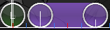
- 00:28:660 (1,2) - I would also have these slightly directed upwards https://puu.sh/vP3IK/7ff12133b9.png
- 00:34:307 (1,2) - You could consider mapping these similarly as before to maintain style, example, keeping the level of curvature on the sliders consistent
- 00:53:895 (3,1,2) - I think a better rhythm would be slider + circle + circle, or slider + slider, as the emphasis from vocals are on the red ticks
- 00:56:895 (1) - This should be a 1/2 slider, and I would fill in the gaps here 00:57:777 - , maybe a circle + 1/2 slider starting from that timestamp
- 01:05:366 (1,3) - You should really make these sliders the same as 01:05:719 (2,4) -
- 01:12:424 (1,2,3,4,5) - The overlap on 4 looks kinda weird. Maybe like this, with 5 stacked on 3 (notice in this example I change the direction of 2 as well, it makes the structure a little more interesting
- 01:25:130 (1) - just so you know, this is a bezier curve and not a standard 3-point circular slider. It happens when you add a fourth sliderpoint and then remove it. You should delete and remake this slider to make it a standard circular slider


