forum

GFX Bimonthy #2 - Video Games [Finished]

posted
Total Posts
28
show more
juesus
Yumemi Planetarian


[img]https://puu.sh/v2LMf.png[/img]


Comments: I love much this visual novel.


VNDB link: https://vndb.org/v34


I use this render
nihapy
D.Va online!


[img]https://imgur-archive.ppy.sh/5nILCGm.png[/img]
Winky-face ; )
lyrics are from S3RL - Candy

Topic Starter
Reunilu

nihapy wrote:

~snip~
Yo, the OP says that the project file needs to be PMed to me. Nothing's totally wrong (atm) and I've already retrieved the PSD, but remove the link.
Kurochiie
Project Fiora - League of Legends

[img]https://puu.sh/v2j1k/fca8146735.png[/img]
Comments: When I was editing this one, I was listening to this.
I don't really play LoL but this champion caught my eye. She's lovely!
Render
MyAngeLNahuel

Chara-UNDERTALE


[img]https://imgur-archive.ppy.sh/KpHOim7.gif[/img]
Comments: A good game.
A good character.


- K a t h -
Midnight Ahri - League of Legends


[img]https://imgur-archive.ppy.sh/Df0QVq5.png[/img]
Comments: Like the others, I don't play LoL. But Midnight Ahri looks pretty badass, and she's now my fave ♥ lmao
- K e n -
A2 - Nier:Automata

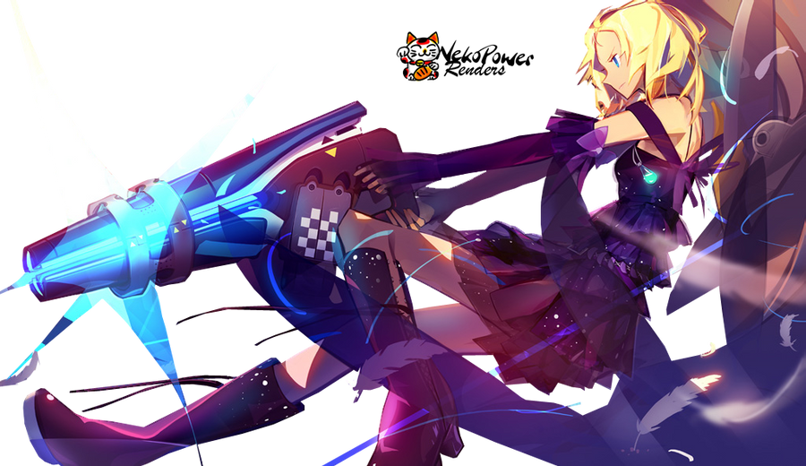
[img]https://puu.sh/v3Gyv/5515e9a7d0.png[/img]

Comments: One of the best games I played.
2B is life but I wanted to go with 2A because
I liked that render a lot.


Render used : http://xeratius.deviantart.com/art/Yorha-Render-1-667282296
JayM3_
S4 League


[img]https://imgur-archive.ppy.sh/I96xnWM.png[/img]
Comment: I just want to have something with action ^.^#
Render: http://img12.deviantart.net/a0a4/i/2011/117/8/6/render_s4_league_by_miaupowah-d3f1427.png
Luisina
Ying - Paladins


[img]https://puu.sh/v5JXS/aa8400bc7c.png[/img]
Comments:
I use this & this render.
Topic Starter
Reunilu
Submissions: Closed!


Gonna try a new thing? I don't know how well this will work out, but next week's theme is colorful! The GFX type is vertical signature with max sizes at 600 x 800. Same rules for voting apply for this competition.

  1. Everyone is able to vote. However, the participants will not be able to vote for themselves, as votes towards themselves will not count.
  2. Remember that this is not a popularity contest. It's a competition of skill.
  3. Votes will be counted by post, not poll.
  4. All votes must have a reason for their vote. You don't have to be a GFX artist to list technical reasons, of course. That said, constructive critcism is highly encouraged.
  5. One vote per person.
  6. This isn't a required part of voting, but if you would like to suggest themes for future GFX Bimonthies, go ahead. : >
A quote from my friend Spitty:

  1. Does the signature fit the theme?
  2. Does it look pleasing?
  3. Do you think proper techniques were used?


Zyra from League of Legends


Yumemi Planetarian


D.Va online!


Project Fiora - League of Legends


Chara-UNDERTALE


Midnight Ahri - League of Legends


A2 - Nier:Automata


S4 League


Ying - Paladins


Voting ends April 8th

OP will be updated shortly.
- K e n -
My vote goes for Kuro.
I really like the red/black combo.
It looks very clean and it's not
to colorful which I think is perfect
for the designe of this champion skin c;

I also know how the actually art of this looks
and i have to say that red suits her more than
the pink/purple they gave her.So yeah Kuro did
an amazing job.


ps. Fiora is bae :>
NatsukoHonda
My vote goes for nihapy.
I love the writing and the gradient is beautiful.
The text matches very good to the picture.
For finish, d.va is love.
juesus
My vote is for XxCrystal.

I like the particles and texture what have the image and she use two images. The effect 3d is good in the image.
Encore
I vote for Luisina
really liked the effects
fonts, colors and the images used matches really well, ying waifu
Tenyante
Luisina. I liked the red lights, they give off a more "magical" aura to ying.

She is also the best support.
[ LemonAdd ]
Hm, I have to choose between Kath and Kamikazy...
I think my vote goes for Kamikazy. I really like the dark effect on the character and the font fits very good with the subject and the colors.
HootOwlStar
My votes goes for Kurochiie. Personally love the overall colour scheme and emphasis on the character, which makes the artwork to stand out from the other entries.
JayM3_
My vote goes for Kamikazy For the fact that it really focuses on the main character on such a difficult pose :3.
nihapy
like people did last time i'll talk about all the entries and then choose who i vote for! also this is just my opinion and fair criticism, take it or leave it there its lying on the floor look at it ahh so cute (灬╹ω╹灬)
[Kamikazy]
really good palette and choice of font. the textures are on point! i love zyra so i was really pleased to see this piece. only problem is the size, its not at all sized for a signature! other than that, one of my favourites.
juesus
i saw the first one you did and i have to say i prefer this one, you did good on revisiting your piece. theres a lot of good things like the background, its beautiful! i like the effect on the render too. one bad thing is the text, it doesnt really go well with the rest, and its quite hard to read. its also a bit too big to fit in as a signature
Kurochiie
i hate fiora she so cancer this one is really similar to kamikazy's, one tone palette and harsh textures but its more perfected in a sense. theres so much details! i like the font a lot. really good job, you're talented hoyl
XxCrystal
a lot of effects used! seems like your style and its great, having your own style is really important in art (in general, this applies to graphics as well). the two images used goes really well together, pls teach me how to do the bokeh effect haha, i like the "chara" but it hard to read whats beneath it! overall a really good one too. AND ITS THE GOOD SIZE!! yay
those entries are so much more complex than mine D':
- K a t h -
not a big fan of that one, maybe because of the ahri art ? imo the choice of artwork is really important. technically its really good piece though; i really like the effects, creates an eery atmosphere 8)
-Haise
theres some really good ideas here, i think its really a shame we dont see the background image more, its kinda blurred and masked by the textures. they are a little bit too strong here imo. the image doesnt really go well with the rest too. however, i really like the colors and the rough effect! my last point would be the text, i think theres room for creativity and improvement here too :3c
JayM3_
i gotta say i love this one. like a lot. too much maybe :'D the effects are so cool! so much action and dynamismmmm BUT i think the s4 logo is really ruinning (<strong word but not in the sense that its garbagefddsg far from it actually) the piece :'c your logo too is a little too big. but omg i really think its super good, keep it up!
Luisina
its way too big for a signature D': wow this one is stunning, the bokeh, the blur and the text! i dont have a lot to say on this one, i really like the colorful but well chosen palette of colors. its maybe a little too big so theres a lot of space wasted but its just a detail.

theres a lot of really talented people here! my vote goes for XxCrystal, i'm really inspired by this one and it fits my style/tastes! good job everyone~
Meive
My vote is for Luisina, because i liked the render, the blur and the text. nice~
JayM3_
JayM3_
i gotta say i love this one. like a lot. too much maybe :'D the effects are so cool! so much action and dynamismmmm BUT i think the s4 logo is really ruinning (<strong word but not in the sense that its garbagefddsg far from it actually) the piece :'c your logo too is a little too big. but omg i really think its super good, keep it up!
nihapy
yaay i like it! its really cool~ thank you for taking my criticism!
Topic Starter
Reunilu
I had a hard time choosing between Kath and Kamikazy, but as much as I like the lighting for Kath's entry, I think I'll go for Kamikazy's entry. In my opinion, the lighting is just as cool as Kath's entry, but what made me choose Kamikazy is that the text was much less subtle.

This time, I think I'll critique Luisina. Personally, I really like this entry! The bokehs are well placed and the enlargement + blur of the render was really nice and I HATE IT when people enlarge the render. I did not think there was an exception to that until now. Unfortunately, it suffers from a whole lot of nothing-ness and for me, it's one of those like =/= good GFX pieces (disclaimer: I'm not saying it's bad). Because it has so much space, it comes off feeling like it should be a wallpaper more than a signature. That and it has a lot of little tumblr-like aesthetic touch ups (I don't know what to call them besides that, I just know that it's vastly different from anything else I've seen on forums) which I have mixed feelings for on a technical level simply because it could be so much more than what it is now if there were more... stuff. Resources. Whatever a GFX artist like me is supposed to call the collective stuff of using C4Ds, vectors, and/or textures to compliment a focal.

(and maybe I'll edit this later and critique one more person.)
Luisina

Reunilu wrote:

I had a hard time choosing between Kath and Kamikazy, but as much as I like the lighting for Kath's entry, I think I'll go for Kamikazy's entry. In my opinion, the lighting is just as cool as Kath's entry, but what made me choose Kamikazy is that the text was much less subtle.

This time, I think I'll critique Luisina. Personally, I really like this entry! The bokehs are well placed and the enlargement + blur of the render was really nice and I HATE IT when people enlarge the render. I did not think there was an exception to that until now. Unfortunately, it suffers from a whole lot of nothing-ness and for me, it's one of those like =/= good GFX pieces (disclaimer: I'm not saying it's bad). Because it has so much space, it comes off feeling like it should be a wallpaper more than a signature. That and it has a lot of little tumblr-like aesthetic touch ups (I don't know what to call them besides that, I just know that it's vastly different from anything else I've seen on forums) which I have mixed feelings for on a technical level simply because it could be so much more than what it is now if there were more... stuff. Resources. Whatever a GFX artist like me is supposed to call the collective stuff of using C4Ds, vectors, and/or textures to compliment a focal.

(and maybe I'll edit this later and critique one more person.)
when i realized it was for a signature it was already too late since i had already posted it ;_;
Senritsu
Because it's not closed yet, i want to put my vote on Kath.

I love the vibrant color they used on the pict. Indeed it's simple, not like the others. That simplicity on effect and stuff are which make the originality stay still. Appreciating the artist, and also the gfx edits, which makes it more.. calming. Good job on the contrast and evertyhing.

also, just my advice. Isn't it better to keep the submission anonymous? So there won't be any bias on the voting. Although you said this is not about popularity, people will still be biased. Just my two cents though.
Topic Starter
Reunilu
This is REALLY late and I'm sorry for that, I went to a convention yesterday and I fell asleep as soon as I got home. Hopefully I didn't miscount from my drowsiness, I just woke up an hour ago.

1st Place

[Kamikazy]


Luisina

2nd Place

Kurochiie


XxCrystal

3rd Place

- K a t h -


nihapy
Please sign in to reply.

New reply