forum

Art General Discussion

posted
Total Posts
73
show more
Pawsu
GFX General Discussion*? since all your questions are GFX based.
Here's some extra links you might wanna add: [•] --- GFX Development Center & Good fonts for making Profile Pictures/Banners/Signatures
-Spec_old

AllRiseSilver wrote:

it depends on the image
i usually use JI chubby caps, bubblegum, rixlovefool, harry P, fingbanger, and ave fedan

you can found a suitable font here tho : http://www.dafont.com/
Hohoho thank's
Flanster
Do have a word with me on this next time before taking such decisions. If this gets used properly, I don't see why not.
But only if these threads' information and resources provided in the OP get merged into this one (ofcourse with the permission of the other threads' creators), since thats what centralizing is all about. If you are thinking of making this a hub for general GFX help, this should be done first.
mina-
Some fonts I usually use for editing:
  • Orator STD
    Dead Island
    Birdman
    mf I love glitter
    Tiger Rag LET Plain 1.0
    Over the rainbow
    Imagination Station
u can download the fonts at dafont.com or search it on google o3o
LigerZero
Recommend for noob for request or asking about edit GFX

sekalian di up :p
Topic Starter
ALTKID
i have asked for the owner of those thread a permission

but they don't reply it
and seems like they're a little inactive

so yeah, i will wait until i get the permisson

anyway updated, thx mina- :D
mina-

AllRiseSilver wrote:

i have asked for the owner of those thread a permission

but they don't reply it
and seems like they're a little inactive

so yeah, i will wait until i get the permisson

anyway updated, thx mina- :D
urwell,ars :>
butuh font juga makanya mampir
R-unknown
Nice thread :oops:
let me ask one of example question
'can you give me a few tips for editing?' :D
mina-

R-unknown wrote:

Nice thread :oops:
let me ask one of example question
'can you give me a few tips for editing?' :D
  1. Decide what theme u want to use,example : cute,cool,scary,etc. Maybe can make ur edit not abstract.
  2. Search for some reference or inspiration . artblock
  3. Try some new things that can make you improve on editing.
  4. And,practice more! pratice makes perfect.
sorry,for my bad english ;w;
R-unknown

mina- wrote:

  1. Decide what theme u want to use,example : cute,cool,scary,etc. Maybe can make ur edit not abstract.
  2. Search for some reference or inspiration . artblock
  3. Try some new things that can make you improve on editing.
  4. And,practice more! pratice makes perfect.
sorry,for my bad english ;w;
great, thanks for the advice :oops:

no, your english is good~
ane juga masih belajar ;~;
Wall-ed
hmmm,maybe i bump this thread because it's very usefull :3
Little Zhang
Sooo I just recently decided to try and make an icon with round and pointed borders, and it went fine, but the edges seem very bad and rough... Any way I can smooth it out? I use gimp so...

Reunilu
Because I think this thread is rather important.

So I was going through my old tumblr the other day for some drawing refs and I stumbled upon a really important typography thing that I forgot I even had: http://reunilu.tumblr.com/post/102486789452/pumpkinstileslatte For some reason, I thought it was for like, one font stuff, but this works just as well, especially the last part.

Also kinda needed to post this as a note to self, I really need to finish my typography stylization tutorial for all you GFX aspirers.
-aster
Excuse me, but does anyone know the name of the text used for this certain section-passed?

http://imgur.com/a/oaxSC ; Here's the link to what I'm talking about.
Yukisa_old_1
excuse me, what this font that text "SHIORI GFX'' ?

Reunilu
It saddens me a little that people put constructive criticism for skinning, but there's very little of it when it comes to GFX. Frankly, I think the GFX here needs a little bit of work, but I don't know where to start. Anyway.

Yukisa wrote:

excuse me, what this font that text "SHIORI GFX'' ?


If I recall correctly, this is the Visitor font. Or at least something similar to it.
-[Jess]-

SSShaymin wrote:

It saddens me a little that people put constructive criticism for skinning, but there's very little of it when it comes to GFX. Frankly, I think the GFX here needs a little bit of work, but I don't know where to start. Anyway.
.
It is hard in here while people care skinning more than GFX.
Reunilu

-[Jess]- wrote:

It is hard in here while people care skinning more than GFX.
Yeah I imagine skinning is more important to people than GFX. People probably care more about how osu! looks rather than how they look on the forum.

That said, I sort of expect constructive criticism between experienced GFX artists, which means the shop owners in this case.
Tae

SSShaymin wrote:

It saddens me a little that people put constructive criticism for skinning, but there's very little of it when it comes to GFX. Frankly, I think the GFX here needs a little bit of work, but I don't know where to start.
In all honesty, I agree. I personally think my GFX needs a lot of work, but I have no clue where/how to do so.
Reunilu

Almaz wrote:

In all honesty, I agree. I personally think my GFX needs a lot of work, but I have no clue where/how to do so.
The simple answer to that would be "there are a lot of good tutorials on deviantart that help out" and "test things out and experiment", but those things just don't seem to apply to this GFX community. I would love to make tutorials just for this community, but I have stuff inbetween that I don't know if I'll ever finish one tutorial.

I don't know, this is just my opinion of how this GFX community currently stands
I hate to be negative, but this GFX community seems to have a bad habit of recoloring images and putting fancy text on it and calling it GFX. I mean, the recoloring part isn't that bad, I have to admit it takes skill just so the recolored image looks really pretty, but it seems really lazy and while I'm incredibly glad that there's people who look at GFX and are inspired to make their own, that habit spreads to the noobie GFX artist and it makes me sad to know that's not what hard work in GFX looks like.
-[Jess]-

SSShaymin wrote:

I don't know, this is just my opinion of how this GFX community currently stands
I hate to be negative, but this GFX community seems to have a bad habit of recoloring images and putting fancy text on it and calling it GFX. I mean, the recoloring part isn't that bad, I have to admit it takes skill just so the recolored image looks really pretty, but it seems really lazy and while I'm incredibly glad that there's people who look at GFX and are inspired to make their own, that habit spreads to the noobie GFX artist and it makes me sad to know that's not what hard work in GFX looks like.
I find that many GFX artist are doing the same GFX gif and somehow I find it is not original to make this type of GFX .people in this have always copy the same style of someone 's GFX .There are many noobie GFX who just think recoloring =GFX or more worse adding text =GFX
Wall-ed

-[Jess]- wrote:

I find that many GFX artist are doing the same GFX gif and somehow I find it is not original to make this type of GFX .people in this have always copy the same style of someone 's GFX .There are many noobie GFX who just think recoloring =GFX or more worse adding text =GFX
idk how to saying it,but i dont't know if what i am make it still gfx or not ? , if not ,maybe i need to make it look better for now
-[Jess]-
Just learn,one day you will find your own style like me
Reunilu

Wall-ed wrote:

idk how to saying it,but i dont't know if what i am make it still gfx or not ? , if not ,maybe i need to make it look better for now
By most GFX standards, what you do isn't GFX, however based on observations from other forums that do things similar to what you've been doing, what you're doing right now is an incredibly useful skill for finishing touches on GFX.
KatouMegumi
Guys, I am looking for a font that Kath or Kuro used. It had "o" as a heart, and "i"'s dot as heart too. Not handwritten.
Reunilu
Bump because important thread. I'm sort of busy right now, but I still wanna be useful.

I dug up some old GFX I made a long time ago and I've decided to release them, free of charge. Neither are in my current style, which is better because there are some habits of mine that I have now that the noobie GFX Artist shouldn't get into (like relying on brushes).


PSD: http://www.mediafire.com/file/01da4llnewsukau/cirno.psd


PSD: http://www.mediafire.com/file/nqgh0amro9j1fow/kaga+prototype.psd


I recommend start studying the Cirno sig first before trying to study the Kaga one. The second one is a little bit messy, but at least the first one gives an insight on using C4Ds.
Reunilu
Re: this thread, because I was asleep and I'm a little disappointed in myself that I couldn't be a part of the discussion. Plus this sort of thing goes here anyways.

A tangent: I have similar feelings as the op and I think "ah well good luck person, but it doesn't look like they have experience with handling resources :/" every time I see a new thread open. Well every new thread I've seen open up to this point in time anyway. Sometimes this train of thought gets so toxic that I think to myself "gosh, this place is like a little bubble of inexperience, can't we get some more experienced people here to show that GFX is more than using cute girls and resizing/cropping images?" and I have to slap myself in the face for that because I can't really judge.

About three years ago (maybe four years ago now, holy gods the time goes by), I was in a similar position as a lot of people here, albeit the the subforum was much smaller and we talked about learning GFX more frequently, I was pretty eager to learn GFX and opened up a shop. Two shops actually, but those two forums were closely associated with each other.

What I've learned from the first two years of GFX and people requesting from me is that a shop, even though a GFX shop is about making digital goods, one gets valuable experience on what works and what doesn't, what one style is good and what is kind of meh to make. That's how it was for me, anyway. I was extremely dedicated to this art form and I wanted to learn all I can. I even got my own art style from just learning and experimenting in requests and outside requests.

...Again, that's how it was for me. I definitely don't expect everyone on this subforum to do the same thing, but it's something that I want to see on this subforum.

Just so everyone understands, tl;dr the point I'm trying to make is that I'd like to see more experienced people open shops, but I can't complain about the current way.

(If part of my post seems kind of weird and I'm repeating myself, the lights in my house went out due to a thunderstorm.)

Edit: Even though I might come across as patronizing about the approach to GFX (and I'm deeply sorry if I really do), I express similar sentiments as Tae with wanting to help people. Actually that's why I try to revive this thread. In my off time, I also try to make tutorials. Emphasis on "try" because I have no idea where my previous versions are and the one I was working on yesterday got wiped by the blackout. :/

----

On a different note--and this is more directed at the mods of this subforum--are we allowed to make critiques in individual GFX shops or is it just restricted to the Post your GFX thread? Just curious.
Tae
My opinion and ideas:

While there were some valid points raised, I honestly don't agree with the approach that was taken by Fizzn.

In my view, his tone came across as rather patronising to potential newcomers. Personally, I would prefer to help guide those who would take an interest in creating things for others but may not have the skills to do so, as opposed to telling them that they shouldn't until they are sure that their work is great.

I may have stopped working on my thread for the time being due to having to study for my exams, but I'd be happy to guide anyone in order to improve their skills (even though my work isn't the best haha).

Personally, I had no idea what I was doing when I opened my own thread, but wanted to help others who didn't know what they were doing either. After practicing, doing requests, and taking inspiration from other people's work, it was clear that I had learnt new things and that I had developed some skills (as you can see below). I still hold this idea of helping others, and anyone is welcome to contact me if they need some help.

Development

(From when I first opened my thread, roughly June/July 2016.)


(From December 2016.)
Topic Starter
ALTKID

Fizzn wrote:

Guys, I am looking for a font that Kath or Kuro used. It had "o" as a heart, and "i"'s dot as heart too. Not handwritten.
sorry for late respond but it think that's rixlovefool i guess, this one right?
Reunilu
Okay screw doing a formal tutorial over PS, I'm doing this on a post.


Partially adapted from a dead forum guide I made/was making, ver 1.01

So you wanna be a GFX artist, huh? You really like the art that the people on this subforum make, yeah? You've already got your version of Photoshop not gonna ask how, your business is your own and ready to download pictures of cute girls?

Alright hang on hang on hang on hang on hang on that's jumping the gun a little bit on the GFX. It might look easy to get Photoshop and start arting (and it sort of is to a certain extent), but like any other art form, it takes some time to make some half-decent GFX. I'mma say this once in this entire guide/tutorial thing: GFX is not centered around making cute girls look cuter or to-die-for guys look hotter with some random effects that you liked. That's only part of the goal. GFX is about making a coherent, aesthetically pleasing picture that compliments your subject without drawing much away from said subject using the basics and skills you've learned and honed. I know that's not exactly a completely different thing from what I just said, but the point is the question of making GFX goes from "is what I did cute/cool" to "is what I did good?".

Let's make an important distinction before we move on to the real point of making this post: "personal likes" do not necessarily equal "good". The difference in "personal likes" versus "good" is something like art style versus the anatomy of a human. For example, you might not like photo realistic art, but the art itself has top-notch coloring or shading or composition, whatever it may be. Conversely, you might like cell shading, but the art itself might have super unrealistic proportions or the artist themselves just aren't experienced enough to pull off dynamic compositions or literally whatever else. This is also the important difference between opinion and criticism, though I admit there's a slight gray area between the two.

What I've said here are things that you might want to keep in mind before reading the rest of the tutorial, as my ideas of GFX may be vastly different from the ones here (and they likely are, since I've "studied" GFX from various forums, not just this one), but I'm sharing them because I want to. A bit of a disclaimer before I start: my word on GFX is not absolute and I don't believe it to be absolute, neither should you believe it to be an end-all-be-all guide to GFX. If you want to learn more, there are a bunch of other guides on deviantart.

...Okay that was way longer than I anticipated. NOW let's get started.

Basic Terms


Some of these words are jargon I'm going to be using in this post, but all of them are common jargon used in all sorts of GFX communities. You might be familiar with it and if you are, great! If not, you might wanna read some of this. Some of these words are concepts that I'll be exploring in depth, which I'll bold.

  1. Signature - An image made from a stock or render to create something new. Often used interchangeably with the word "tag".
  2. CnC - Constructive criticism. Incredibly vital towards the improvement of your GFX. Never ignore CnC unless the person giving it is a huge douchebag and only lists what they don't like about it.
  3. C4D - This is actually an abbreviated term for the program "Cinema 4D", but colloquially means a 3D model that was created in said program. Very useful resources to start with.
  4. Render - A cut out image of a character, person, animal, or object. They look something like this.
  5. Stock - An image left alone. Most images that haven't be rendered are in this category, but if you need a reference, they look like this or this.
  6. Focal - Or focal point, whatever. Subject of your GFX, or the thing your eyes are drawn to. Probably one of the most important parts of the GFX process.
  7. Lighting - Interaction of light with any other object in GFX.
  8. Flow - Direction of your GFX.
  9. Color - Color scheme of your GFX. There's already sort of a guide for this in this thread, I don't think I need to go over it.
  10. Depth - How 3D your GFX is.
  11. Text/Typography - the text in your GFX. Arguably one of the hardest aspects of GFX (and the original tutorial I was going to make instead of this one).

Lighting


Lighting is the same thing as it is in making digital/traditional art except slightly backwards. What I mean by that is instead of putting down where your shadows and highlights are based on your light source, you're establishing a light source based on the art's or photo's shadows and highlights. (Note: there is a way to do both in GFX, but I absolutely commend the artists that can do that) It's actually pretty straightforward, you just have to look at your render/stock and put a light source. There are a couple ways of going about lighting:

All of which can make full use of blend modes. If you haven't caught on, all three examples use the third lighting option, the C4D effect and fractals. If you haven't been resource hunting and you're a proper GFX artist then WHAT ARE YOU DOING *shakes your monitor*, fractals are special lighting effects that go with pretty much everything. The most popular ones out there are the ones by greentunic. Like any GFX resource, these can be very easily spammed, so use them wisely.
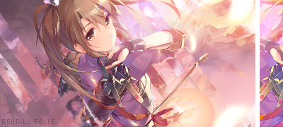
Flow


Flow doesn't really get more complicated than the general direction of the GFX. Your eyes naturally follow the direction of a line and anything in nature that resembles lines. General direction doesn't just mean things like "everything in the photo is heading to the right" or something similar, it can be used to draw attention to your focal. Take this tag for example.


There's no visible flow that goes from the left side of the tag to the right side, but all of the lines are going from the focal to the edges of the tag. For the most part, this method of flow was to compensate for the lack of flow the render offers. Honestly, I don't prefer this way very much. It's got a feel that makes it sort of easy to distract the viewer's eyes, which is sort of bad unless you absolutely know what you're doing. Tags like this are more my speed. (The lines are already drawn on it because I was still actively using my dev twitter.)


The lines closer to the focal represent the flow of focal and how the artist drew the girl, while the lines farther away from the focal represent the flow I made with my vectors. Overall, the goal of the vectors was supposed to compliment the render and while I realize now that this is not one of my best works, the goal of a good flow was still met.

Depth


This is probably one of my favorite aspects of GFX. Like flow, it doesn't get much more complicated than its definition in Basic Terms, but unlike flow, there aren't exceptions to the definition.

So to create depth, you go one or two ways: you use the blur tool (grouped with the Smudge and Sharpen tools) or you use Gaussian Blur. You can do both, but I typically like using Gaussian Blur because I like separating stuff by layers and groups and it doesn't get as messy and laggy as Blur tool. Likely just my computer.

Now your standard GFX tag consists of a couple things at the beginning: the rule of thirds, a focal, and a background. Your focal and your background are almost always two separate layers, and you'll find when you look up tags on deviantart that a lot of tags tend to use photos as backgrounds. Using photos is an easy way to get your depth, but what makes depth my favorite is what you can do to artificially create depth. This tag for example.


Normally all the bubbles in this tag would be like the bubbles to the closest of the left side of the render. However, I've duplicated the bubble layers and blurred the ones that aren't as close to the render. Thus, this creates a sort of artificial space between the bubbles and render and makes it feel like there's more substance to the tag. On the other hand, you could also blur a layer that's directly in front of your focal (I don't have an example of my own to show off, unfortunately), and it'd create the same effect.

Focal/Focal Point


As I said before, the focal point is the subject of your GFX and one of the more important parts of the GFX process. Normally if this were any other place, I'd place this very first before the last three topics I typed up, but this is directly relevant to what I'm about to type next/last. So I said at some point that the focal is the thing your eyes are drawn to first, no? Stay with the focal until you feel like you're finished. The focal is the most important thing in the GFX piece.

I admit that I don't entirely know the reason why you should stay with the focal, but I can say why you shouldn't stray from the focal: it makes the entire GFX piece messy. It creates a feeling of "what is this person trying to do?" and a state of confusion. For a lot of people, this state of confusion is more a lack of understanding and filling in the lack of understanding with "wow this looks cool". It's been a while since I've had this experience, but I remember my first few months of learning GFX and over time the GFX tags that I liked went from "wow this is cool" to "oh, this is how you make this, is it really so simple?" because after looking at the same resources over and over, you learn to understand what people are using and how they're using those resources. Or that's how it was for me.

But enough about me, here's something useful that'll help with your focal placement. It's called the rule of thirds. In Photoshop, this is done with Edit > Preferences > Guides, Grids and Slices > Gridline Every: 33.33, then View > Show > Grid. You'll get something that looks like this:


All the lines that connect are points that you should be putting your focal on or near, but which connecting point depends on what focal you're using. Here I'm using a human in an upright sitting position, which means I should use the upper left or the upper right points of intersection (I'm going to call them points from now on). This is what I get when I move the focal more to the right.


Sure this might look normal if it were any other GFX artist on this subforum, but there's a lot of unnecessary space that I'm definitely not going to be using for text, which I'll discuss later. What I have now is very unbalanced compared to my rule of thirds example, and thus should be placed near the upper left point.

Text/Typography


Oh boy, this one. I might just stop trying to condense stuff.

I'm going to be frank, my typography skills aren't the best, but that's totally okay because that's the case for a lot of GFX artists. There's a reason why text is arguably one of the hardest aspects of GFX. Recall that I said the focal is the most important thing in the GFX piece. The reason why text is so hard is because text naturally grabs attention away from your focal, which is something you don't want. Which means absolutely avoid things like this unless you know what you're doing.


Let's break this down by number.

  • 1) All of the resources used in GFX piece are supposed to be in some way subtle to compliment your focal. Placing the text in the corner ruins the subtlety.
    2) Doesn't go with the color scheme of the tag and pops out way too much.
    3) In the original version of this tag, there's a bit of space that's occupied only by a vector. Text is not meant to fill space!
As I said before, GFX compliments your focal, and the above examples do none of that. They all detract from the focal in some way and they all emcompass most of the problems that an aspiring GFX artist will face. No matter how much you try to make things pretty or cute, if the basic purpose of text was to occupy space without meaning or detracts from the focal when it's not supposed to, there's definitely a problem with the GFX. Here are some tips that I've learned about text.


  1. Don't underestimate the fonts that come with your computer. They're more helpful than you think and help to keep subtlety in your GFX.
  2. Experiment with different combinations of fonts.
  3. Think simple. Some of the best typography out there don't have much editing on their layers and stick to things like drop shadow, stroke, and gradients.
  4. Avoid fonts like these. They detract too much attention from the focal regardless of size or position and you'd probably be better off stacking effects on regular ol' fonts when you're almost done anyway.
Here are some examples of mine that I've been told by other GFX artists that have good text.


Notice how they're both very subtle and fit in with the tag. The one labeled ninfia goes with the basic flow of the tag thanks to the white drop shadow and the one with Zoroark follows the viewer's eye movement. There's not much I can say beyond that, but again, simple is best.

Closing Thoughts


Initially I wasn't planning on writing so much, but it seems to have turned out that way. In the end, I can't dictate what any of you do, but what I've typed is something I hope could build a strong foundation for future GFX, as it seemed like there lacked one after observing the subforum for some time. I wrote this specifically for this forum, but if it helps someone outside of the forum, then all the better. Of course if you have any questions, the thread is absolutely free discussion.

All GFX used in this guide are made by me, not as a sign of arrogance, but as a way of showing courtesy to the GFX artists that don't want their own GFX used for this sort of purpose.

Changelog
1/18/2017: Added new definitions to Basic Terms, rewording some of the stuff in there as well.
Rilene
I was gonna ask something then it turns out to be "GFX" more than "Art", OP can you rename this please? It's very misleading.
Adorn
I think that this thread can be about art. It is a general discussion, and GFX is a very prominent topic and skill in this subforum.
You just need to present the art topic. What's up?
Topic Starter
ALTKID
@Reunilu : wow, that's great, i will add it to the first page later! :D
Rilene

Flannel wrote:

I think that this thread can be about art. It is a general discussion, and GFX is a very prominent topic and skill in this subforum.
You just need to present the art topic. What's up?
Not really sure, this thread really looks like it is emphasized on GFX.
Tae

Rilene wrote:

Yeah 'art', all stuff in this thread is about GFX but not general art that includes GFX.
Well, I suppose the "Art" in the thread title refers more to the Art subforum as a whole. Seeing as the majority of this area does revolve around GFX, it does mean that the main topic is likely to relate to GFX.

As Flannel said:
I think that this thread can be about art. It is a general discussion, and GFX is a very prominent topic and skill in this subforum.
You just need to present the art topic.
Although GFX is the main topic, if you present an alternative topic related to the art subforum, even artwork and photography (just taking examples from the "Post your ----") could be discussed.
Rilene
Oh then, even if title and topic is correct in this case as you said, it seems that the content like tutorials and some tips is related to GFX which somehow misleads me and possibly other.

Wow, you quoted my old post when I haven't thinked properly, now I'm portrayed as a dick.
Nissanwarrior69
http://e-shuushuu.net/ a good site for images
Tae

Nissanwarrior69 wrote:

http://e-shuushuu.net/ a good site for images
hmm, I haven't heard of this site. Looks a little messy in all honesty

http://www.zerochan.net
http://safebooru.org
http://pixiv.net

Here are some more. Even deviantart can be decent if you filter through the dodgy stuff.
Nissanwarrior69

Tae wrote:

Nissanwarrior69 wrote:

http://e-shuushuu.net/ a good site for images
hmm, I haven't heard of this site. Looks a little messy in all honesty

http://www.zerochan.net
http://safebooru.org
http://pixiv.net

Here are some more. Even deviantart can be decent if you filter through the dodgy stuff.
yeah and thx defently gonna check those out
-[Jess]-
http://www.pixivision.net/en/a/2156
15 Hand Poses Sheets
http://www.pixivision.net/en/a/2122
Reference for Composition in Art. Poses
http://www.pixivision.net/en/a/1636
Basic Drawing Lessons for Beginners ~Let’s Practice with Human Figures~

Let have some skill of drawing,not just GFX related
show more
Please sign in to reply.

New reply