Welcome. Many people can't wait for the implementation of osu!next. Me too, so I decided to try to reproduce a skin. I had only what was shown on the http://next.ppy.sh and my creativity.
This skin includes ALL game modes
Preferred format image: 16:9
!! If you play on stable(fallback) version you must change valufe in skin.ini HitCircleOverlayAboveNumer: 0 on 1
This skin includes ALL game modes
Preferred format image: 16:9
!! If you play on stable(fallback) version you must change valufe in skin.ini HitCircleOverlayAboveNumer: 0 on 1
Changelog
19-02-2016
Start
20-02-2016
Start
20-02-2016
- Changed: HitCircleOverlayAboveNumer: 0 (because numbers disappears)
- Edited: buttlon-left.png, button-middle.png and button-right.png
- Edited: spinner-warning.png (and the same file with @2x)
- Added: ranking-maxcombo.png, ranking-accuracy.png and ranking-title.png (and the same files with @2x)
- Added: Folder "bonus" with hitcircle.png, hitcircleoverlay.png (and the same files with @2x) and readme.txt (All information in this file)
- Added: selection-tab.png.
- Fixed: Updated screenshots.
- Added: Animation circles (hitcircleoverlay-*.png).
- Edited: scorebar-bg.png (and the same files with @2x) (view)
If you want I can add your nick in this grey area under hp-bar - Added: "ctb" folder with Yuzu catcher if you want change default Ryuuta
Interface
Song Select and Modes

Mods - Std, CtB, Taiko

Mods - Mania

Skip button

Pause Screen

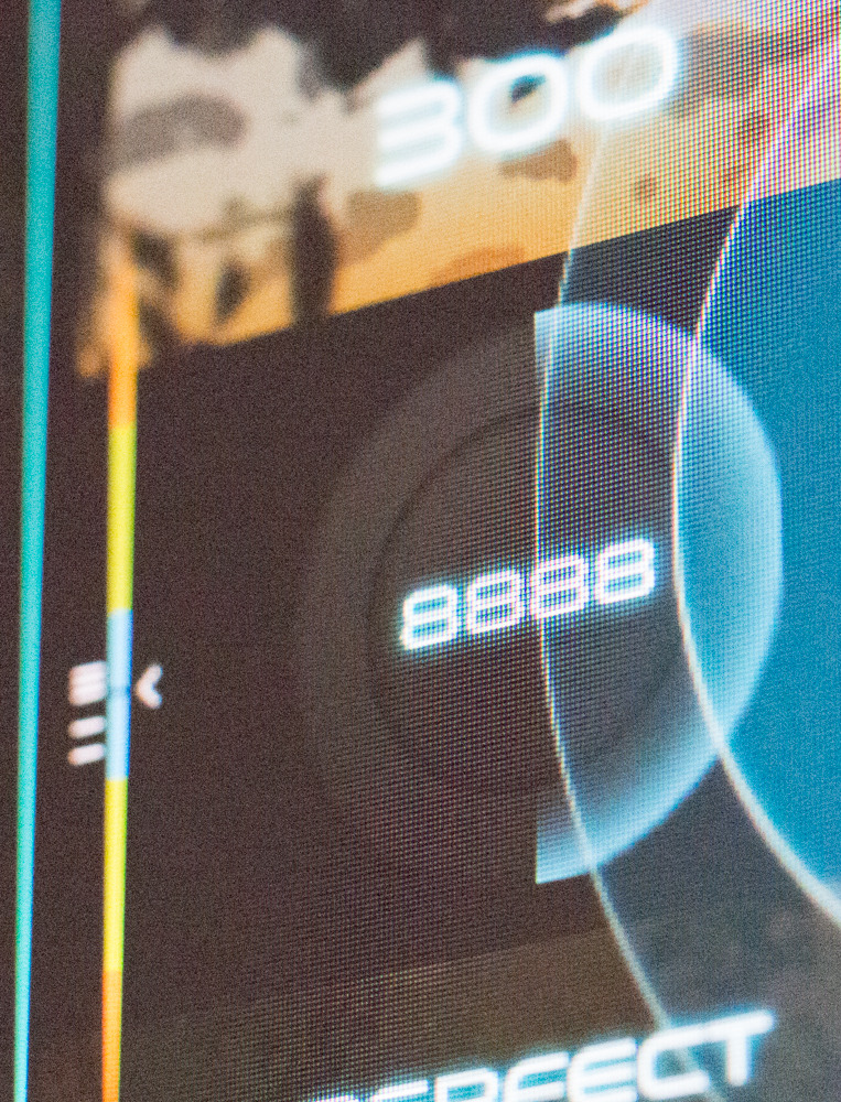
Ranking Screen

Mods - Std, CtB, Taiko
Mods - Mania
Skip button
Pause Screen
Ranking Screen
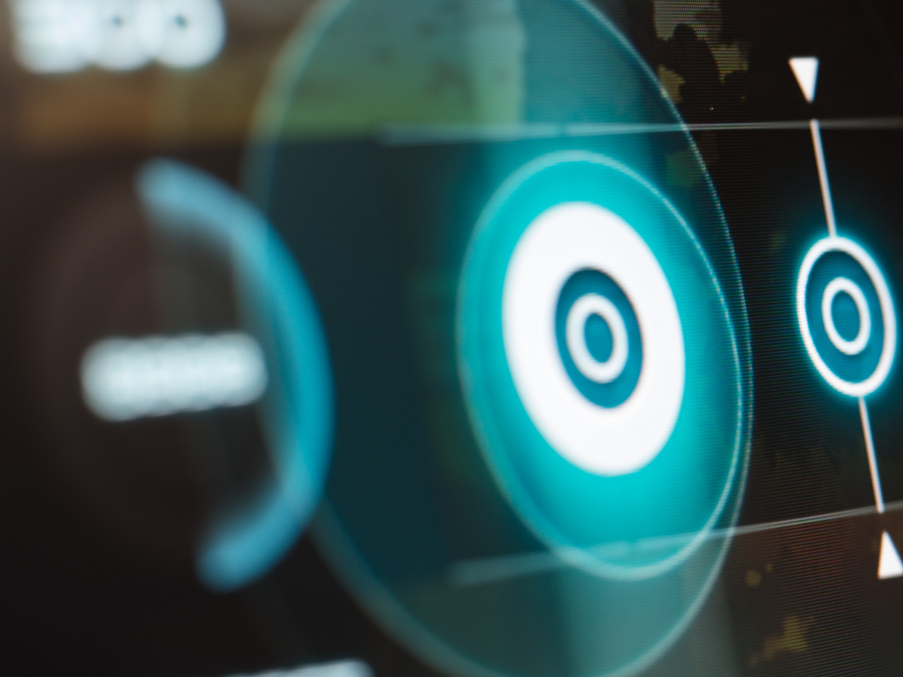
Standard
Spinner

Gameplay


Gameplay
Taiko
Gameplay


CatchTheBeat
Gameplay


osu!mania
4k Gameplay


7k Gameplay


7k Gameplay
Huge thanks to PerhapsSomeone, SitekX, streeteelf, Tidek and -Kamikaze- for the replays used in the preview skin.
Thanks to XyloDG for recording Spinner preview.
Thanks to XyloDG for recording Spinner preview.
I will be grateful for any feedback/suggestions.


