▿ (large 2K images!)
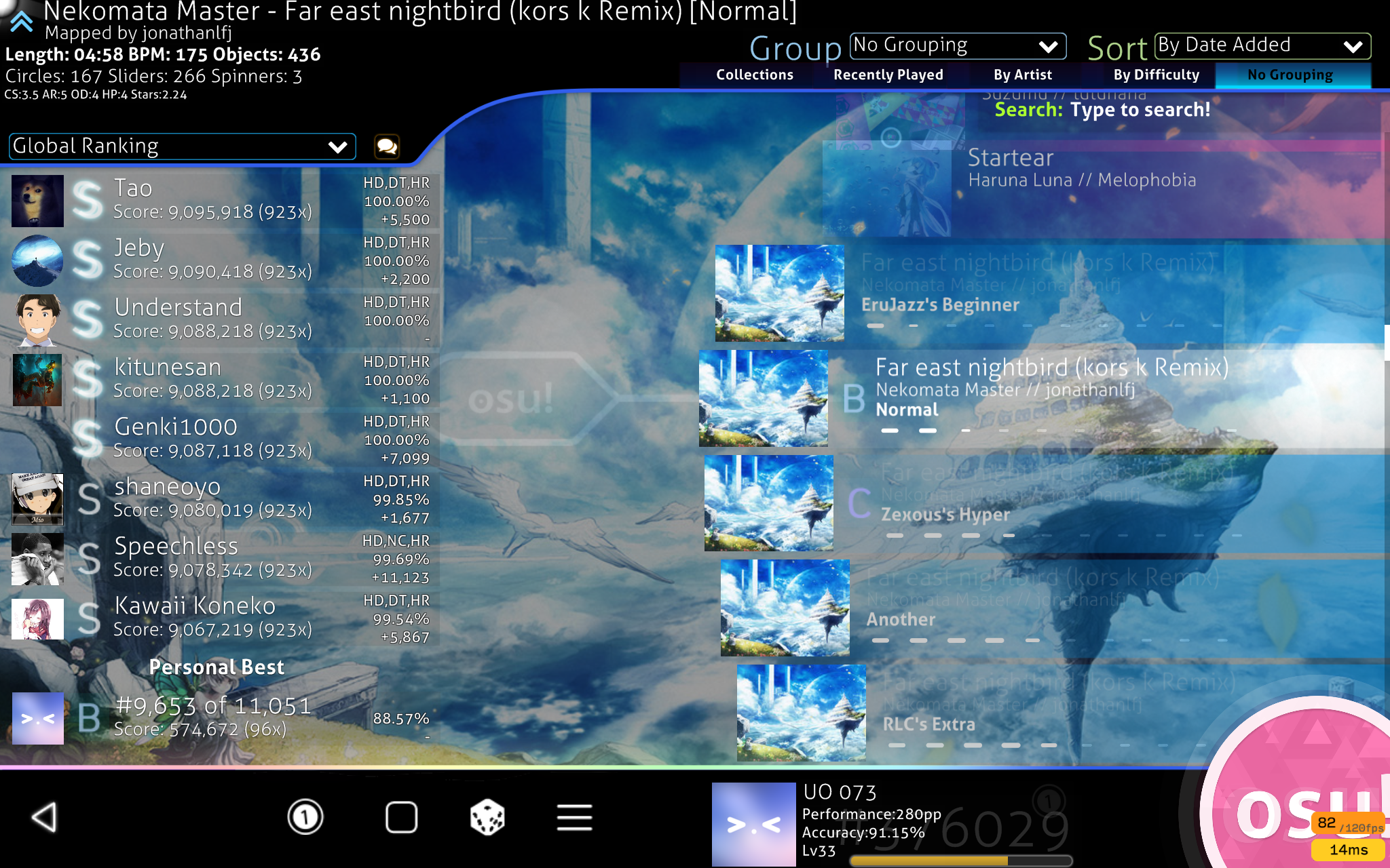
Song Select
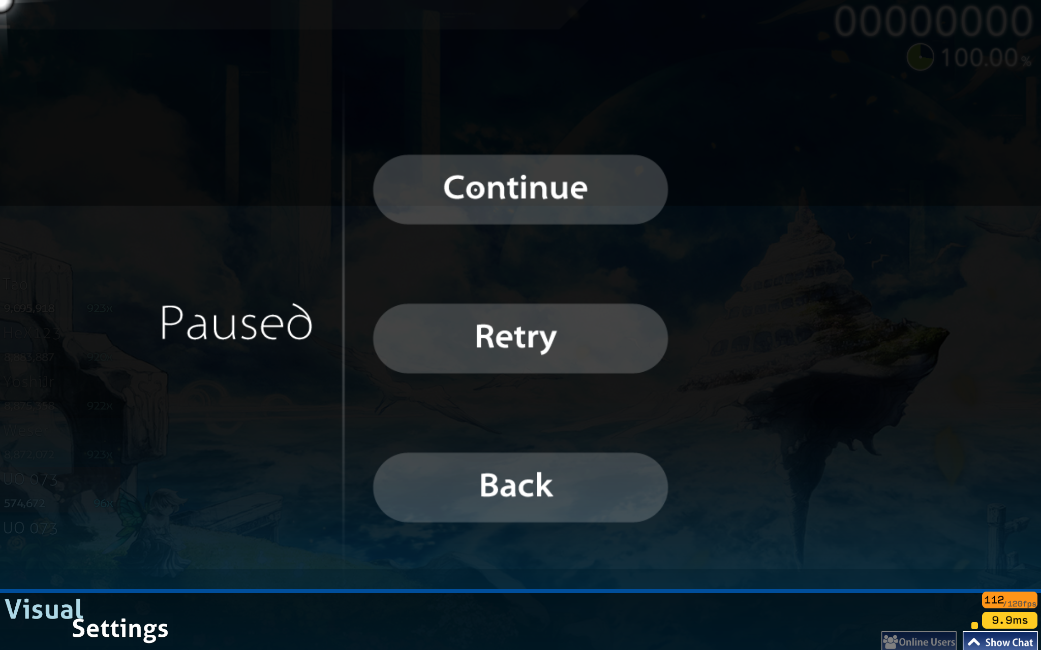
Pause
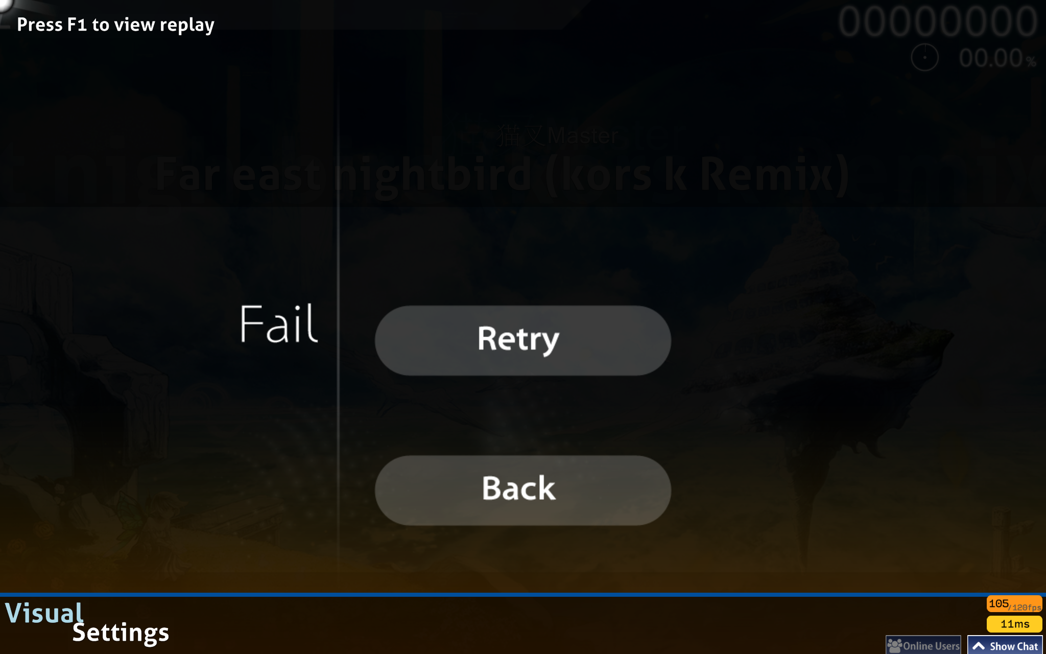
Fail
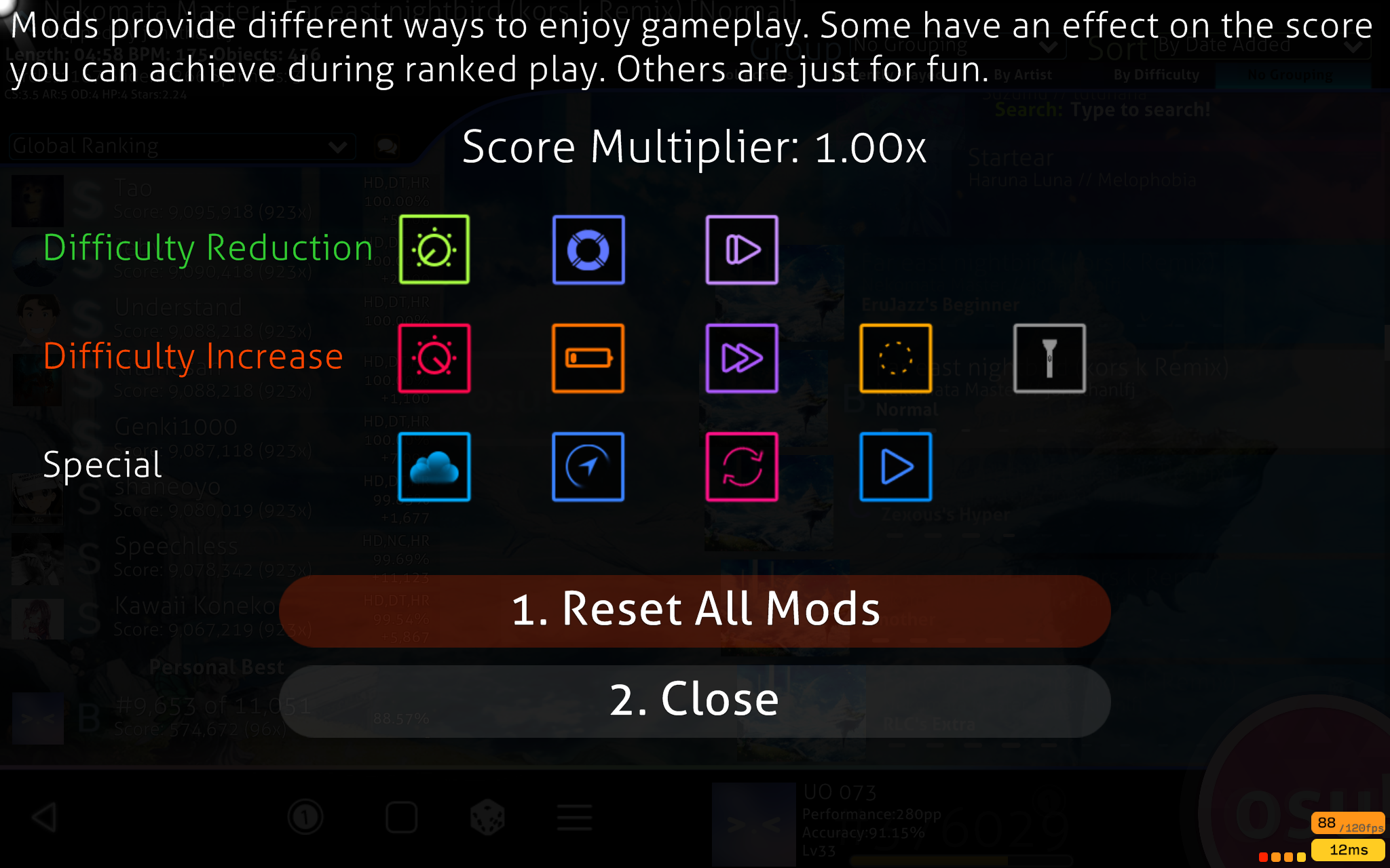
Mods
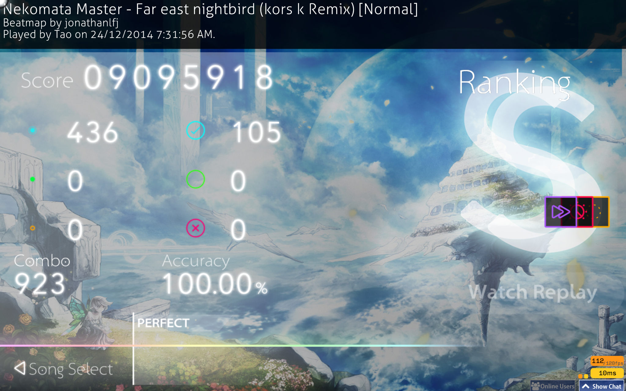
Ranking
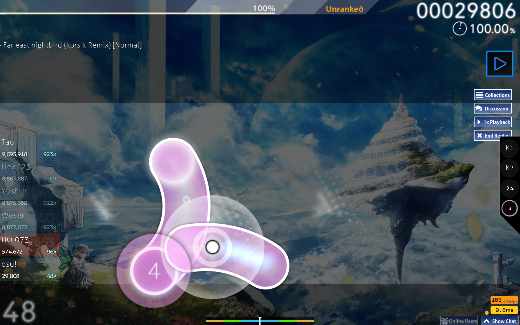
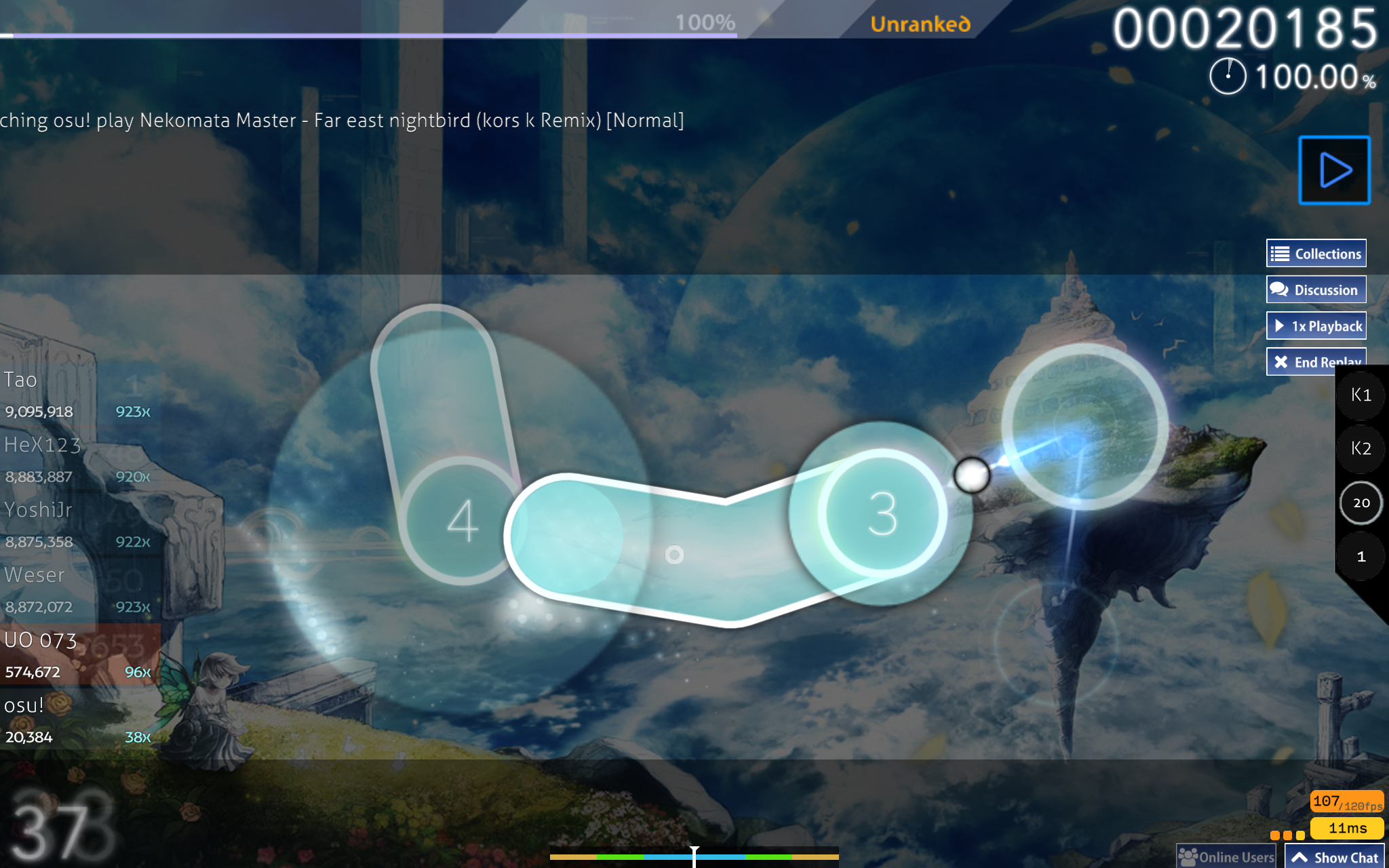
Osu!
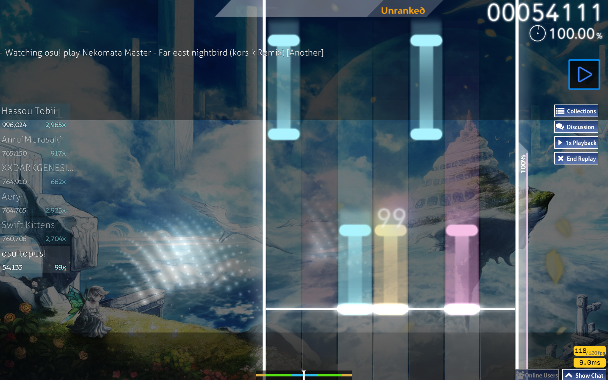
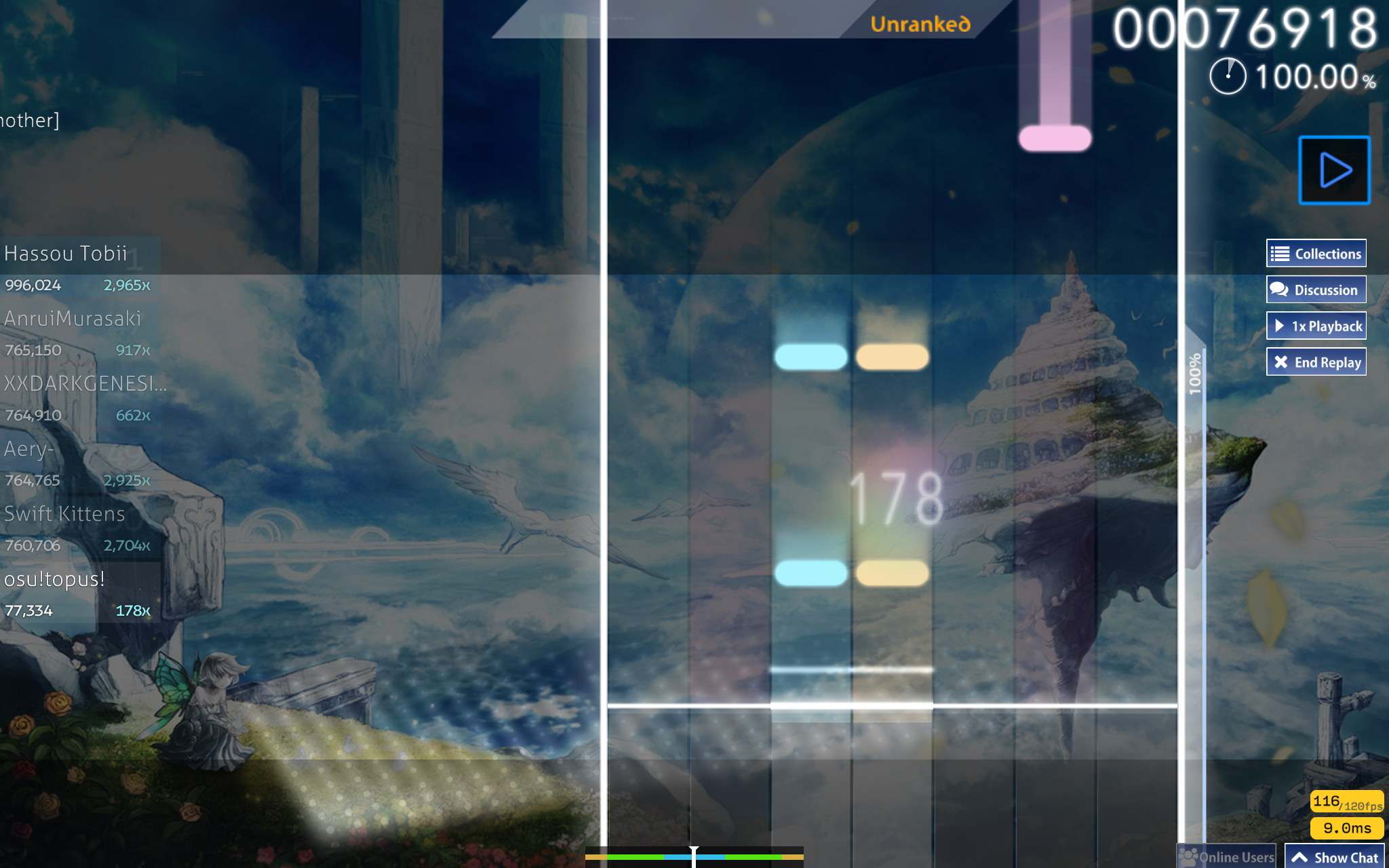
Mania!
Pause
Fail
Mods
Ranking
Osu!
Mania!

▿
HELLO!
Welcome to my very first skin - Sky!
This skin is made to be clean and innovative. Something beautiful, but not flashy. It's also home to many new concepts that enhance gameplay, (well, for 3.0 anyway. in 4.0 i scratched that and made things more aesthetic than easy.... ). Of course, If you prefer some other design options, there's always the options folder! Here you can change a lot of the elements, not just turn them on or off, but actually change them. You can even customise the scorebar! If you don't have the software, no problem. follow the instructions included to request for one, I'll try make it as soon as possible.
Welcome to my very first skin - Sky!
This skin is made to be clean and innovative. Something beautiful, but not flashy. It's also home to many new concepts that enhance gameplay, (well, for 3.0 anyway. in 4.0 i scratched that and made things more aesthetic than easy....
). Of course, If you prefer some other design options, there's always the options folder! Here you can change a lot of the elements, not just turn them on or off, but actually change them. You can even customise the scorebar! If you don't have the software, no problem. follow the instructions included to request for one, I'll try make it as soon as possible.
▿
--v4.2--
Added Score v2 mod
Fixed up options folder to support the new update
--v4.1--
Added more colour in the form of animations
New hitbursts
--v4.0--
INTRODUCING COLOUR!
Enhancements to readability (in my opinion)
Mania skinned! Sorry not centred... i have a slow osu build so thats very hard to do
New sounds!
--OPTIONS v3.0.1--
Fixes:
There seemed to be a problem that otakupingu, LERUfic, and Mozu found... Thanks so much for letting me know!
I attempted to fix this, hopefully it works on windows now. I tested it and it works fine for me, but let me know if it doesn't work.
--v3.0.1--
Fixes:
When this was 3.0, I uploaded the one that I was working on. oops. It's been fixed now, so it's the "latest latest" version.
Minor changes from there were made, mainly debugging.
--v3.0--
Improved:
Cursor
Spinner - Better
Target Practie Mod Icon (but not sure how to skin target practice gameplay)
Follow point improved animation
Combo is transparent - less distracting
Buttons - rounded now, more clear to new players.
New:
Target Practice Mod (but not sure how to skin target practice gameplay)
With the new items made in version 3.0, I added more options with the things I changed. So you can still revert back to the old versions of things if you like them better.
Fixes:
Approach Circle is fixed (results vary from person to person) - added a black shadow so the edges are more distinguishable
Cursor - made more visible, and looks cooler
--v2.1--
New:
Mod Label ON/OFF option added in options folder.
Drums ON/OFF for ranking
a few more...
Fixes:
Mods fixed. They are now more beautiful.. nah just kidding
Menu Back fixed
New Menu Click sound
Installation bug should be fixed...
skin.ini error fixed
Pause-fail works for widescreen now.
--v2.0--
Heaps of options added! (in the seperate options folder download)
Fail-screen is still the same, still using the 16:10 ratio. (could anyone screenshot the fixed fail screen found in the comments? i need to calibrate the 'failed' text on it.)
--v1.0--
First Release
ACKNOWLEDGEMENTS
The skin is a greatly modified version of the '2014-08-06+(For+Sharing)' skin, which was sent by a friend. It seems it's lost in the internet though...
The details in it's skin.ini:
Name: 2014-08-06 (For Sharing)
Author: Startrick (Modified by ril)
Some elements from it remain the same, like the ranking letters, menu back and most hit sounds.
Elements from YUGEN by Garin were used as a base for some items
ummm... Some more sounds got taken from even more skins. I've asked all I could, but I don't remember which is from where... sorry if I used yours!


