m4m from your queue
Easy
00:37:082 (1,2) - how about aligning the sliders with each other, would look better imo http://i.imgur.com/5Ql8pas.jpg
00:39:691 (1,2,3,4,5,6) - flow here could be a bit better, rough suggestion: http://i.imgur.com/FZvqowA.jpg + http://i.imgur.com/BRylVvD.jpg
00:55:343 (1) - how about changing this shape a bit and put it somewhere aroung 250/280?
00:57:952 (1) - pls move sliderend ~2px down,
01:04:474 (3) - the sliderhead poiting down here seems to disrupt the flow a bit, I think a modified version of 01:03:821 (2) - might play better
01:11:307 (2) - this seems slightly off-screen http://i.imgur.com/nKKQWQI.jpg
01:14:894 (3,4,5,6) - would flow better if it was a little bit more down-left imo
01:17:503 (3,4) - and 01:22:720 (3,4) - => It might be nice if you used the same angle for both, or at least a more similar one
Milan-'s Normal
Why is this diff the only one not using the uninherited timing point on 01:10:982 ? The song is the same after all and so should be the timing?
00:12:952 (5) - would flow better if 5 pointed more downwards http://i.imgur.com/Cu5coih.jpg
00:18:169 (5,1) - this looks just a little off cause they aren't aligned perfectly http://i.imgur.com/FBbWVjZ.jpg
00:57:952 (1,2,3) - I think this would look and play better if it was a bit symmetrical http://i.imgur.com/lvG0z4T.jpg
Hard
00:21:104 (4,1) - flow could be better here mayve curve 4 (but then it' wont fit with 3) or move 1 and following a bit down+left
00:24:691 (3,4,1) - make it like this instead? http://i.imgur.com/iuWCBBT.jpg
00:37:082 (1,2,3,4) - pattern looks nice, but 1->2 seems to play a little awkward compared to the rest
00:40:669 (5,1,2) - this might be a bit weird to read and could flow better
00:59:745 (2,3,4) - 00:59:745 (2,3,4) - 4 looks a bit weirdly placed, how about making 2 a wave slider and blanketing 4 with it?
01:05:452 (5,1) - looks really easy to sliderbreak on since slider leniency has to be abused near perfectly to not have to do a small 1/8 jump
move the sldierend more on 1 to make better to read and play
01:15:873 (4,1) - ^
01:35:764 (1,2,3) - ^
I just testplayed the diff and it seemed fine to read (even for me who struggles at AR<8 but I don't normally play Hards so I can't really judge how it will play for someone who does...)
In case you want to see the testplay, here's the osr: http://lasse.s-ul.eu/ssYKi9a0
Insane
00:14:582 (3,5) - would look better if symmetric
00:31:865 (1,2,3) - flows a bit weird if slider leniency doesn't get fully abused
00:41:321 (3,4) - idk about putting this anti-jump here
00:51:919 (3,4,5,6,7,8,9) - putting the stream at this place makes if awkward to aim I think maybe put it in the upper left quarter and /or cuve a bit?
those stright, longish and slow downward motions at the bottom of the screen just don't feel nice to play, at least for me
=> this one is much better to play for example: 01:05:289 (3,4,5,6,7,8) -
00:58:604 (4,5,6,7) - might feel better if you kept the flow for the whole combo by swapping 6 and 7
01:02:680 (6,7) - you are going close-far-close etc for the combo buut suddenly far-far-far, might feel better if 01:02:843 (7) - was stacked on 01:02:028 (2) -
Prismatic
00:15:724 (6,7,8) - - - seems to flow a bit awkward since 4-5-6 leads to some kind of circular motion and 78 break it, i'd put 8 somewhere right of 7/above of 5
00:21:267 (11) - feels a bit out of place with the rest of the "ctrl-g double square pattern", stack on 1 ?
00:51:919 (4,5,6,7,8,9,10) - curve the stream a bit upwards to make it play better
can't seem to find more issues with that diff. Blankets are nice and a majoritsy of the jumps flows really nicely, rhythm seems okay too.
Can't really comment on hitsounds cause I suck at that, but I didn't hear any hitsound that seemed misplaced...
00:37:082 (1,2) - how about aligning the sliders with each other, would look better imo http://i.imgur.com/5Ql8pas.jpg
00:39:691 (1,2,3,4,5,6) - flow here could be a bit better, rough suggestion: http://i.imgur.com/FZvqowA.jpg + http://i.imgur.com/BRylVvD.jpg
00:55:343 (1) - how about changing this shape a bit and put it somewhere aroung 250/280?
00:57:952 (1) - pls move sliderend ~2px down,
01:04:474 (3) - the sliderhead poiting down here seems to disrupt the flow a bit, I think a modified version of 01:03:821 (2) - might play better
01:11:307 (2) -
01:14:894 (3,4,5,6) - would flow better if it was a little bit more down-left imo
01:17:503 (3,4) - and 01:22:720 (3,4) - => It might be nice if you used the same angle for both, or at least a more similar one
Milan-'s Normal
Why is this diff the only one not using the uninherited timing point on 01:10:982 ? The song is the same after all and so should be the timing?
00:12:952 (5) - would flow better if 5 pointed more downwards http://i.imgur.com/Cu5coih.jpg
00:18:169 (5,1) - this looks just a little off cause they aren't aligned perfectly http://i.imgur.com/FBbWVjZ.jpg
00:57:952 (1,2,3) - I think this would look and play better if it was a bit symmetrical http://i.imgur.com/lvG0z4T.jpg
Hard
00:21:104 (4,1) - flow could be better here mayve curve 4 (but then it' wont fit with 3) or move 1 and following a bit down+left
00:24:691 (3,4,1) - make it like this instead? http://i.imgur.com/iuWCBBT.jpg
00:37:082 (1,2,3,4) - pattern looks nice, but 1->2 seems to play a little awkward compared to the rest
00:40:669 (5,1,2) - this might be a bit weird to read and could flow better
00:59:745 (2,3,4) - 00:59:745 (2,3,4) - 4 looks a bit weirdly placed, how about making 2 a wave slider and blanketing 4 with it?
01:05:452 (5,1) - looks really easy to sliderbreak on since slider leniency has to be abused near perfectly to not have to do a small 1/8 jump
move the sldierend more on 1 to make better to read and play
01:15:873 (4,1) - ^
01:35:764 (1,2,3) - ^
I just testplayed the diff and it seemed fine to read (even for me who struggles at AR<8 but I don't normally play Hards so I can't really judge how it will play for someone who does...)
In case you want to see the testplay, here's the osr: http://lasse.s-ul.eu/ssYKi9a0
Insane
00:14:582 (3,5) - would look better if symmetric
00:31:865 (1,2,3) - flows a bit weird if slider leniency doesn't get fully abused
00:41:321 (3,4) - idk about putting this anti-jump here
00:51:919 (3,4,5,6,7,8,9) - putting the stream at this place makes if awkward to aim I think maybe put it in the upper left quarter and /or cuve a bit?
those stright, longish and slow downward motions at the bottom of the screen just don't feel nice to play, at least for me
=> this one is much better to play for example: 01:05:289 (3,4,5,6,7,8) -
00:58:604 (4,5,6,7) - might feel better if you kept the flow for the whole combo by swapping 6 and 7
01:02:680 (6,7) - you are going close-far-close etc for the combo buut suddenly far-far-far, might feel better if 01:02:843 (7) - was stacked on 01:02:028 (2) -
Prismatic
00:15:724 (6,7,8) - - - seems to flow a bit awkward since 4-5-6 leads to some kind of circular motion and 78 break it, i'd put 8 somewhere right of 7/above of 5
SPOILER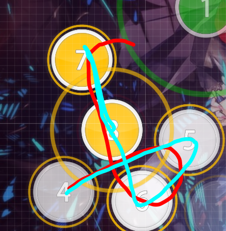
red seems to flow way better than blue here
this pattern for example 00:19:800 (1,2,3,4,5,6,7) - feels so much better to play even if it is actually harder with the higher spacingred seems to flow way better than blue here
00:21:267 (11) - feels a bit out of place with the rest of the "ctrl-g double square pattern", stack on 1 ?
00:51:919 (4,5,6,7,8,9,10) - curve the stream a bit upwards to make it play better
can't seem to find more issues with that diff. Blankets are nice and a majoritsy of the jumps flows really nicely, rhythm seems okay too.
Can't really comment on hitsounds cause I suck at that, but I didn't hear any hitsound that seemed misplaced...
 . Your's includes a 120 degree change from 2>3>4 which is a lot sharper than my 60 degree angle changes.

