design suggestion to make the notification on our profiles more visible for the less 'eyesight inclined' members of the community:
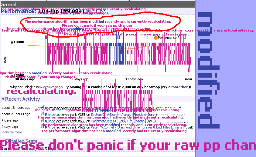
this is just an artists depiction, the real web page one will be crisper and have less aliasing of course.
this is just an artists depiction, the real web page one will be crisper and have less aliasing of course.