Version 1.3.1
Last updated on June 11th, 2014
Aesthetic aims to combine a minimalist approach of few distractions
with a clean yet colorful and visually appealing design.
When I started playing osu! a few months ago and decided to look around for some skins, I was both surprised and disappointed that a vast majority of those advertised as simple or minimalist didn't meet my idea of such a skin at all. Even now, I can count the number of really clean skins I've seen on one hand. When I started working on this, I knew none.
My goal was to create a skin for myself and those who are interested in using it. A tight skin optimized for playing that still manages to look pretty. No shadows, reflections or other effects that make the circles look fancier, just a plain and flat theme.
I've been working on this skin off and on during the last few months, adding on and improving step by step. Right now, it's pretty much complete for osu! standard mode, although there are a few things here and there that may need tweaking. I plan to expand this skin for all modes in the future, but I'd like to take my time to familiarize myself with the gameplay and come up with some ideas first.
All feedback is welcome, I'm happy to find new ways to improve this skin.
Additional Information
Hitcircles
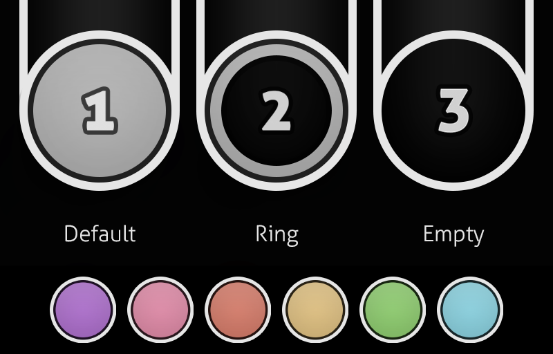
The Aesthetic skin provides three different hitcircles that users can choose from, depending on preference.
All hitcircles are designed to blend in seamlessly with slider borders.
Hit bursts
The hit bursts adapt the new default colour scheme to a flat look. When playing for scores and optimal performance, I see 300 hits as an unnecessary distraction, so they are disabled by default. If you prefer to play with these hit bursts, they are still included in the Extra folder.

osu!mania
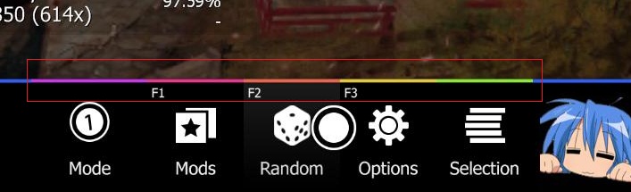
Mod icons
For this skin, I attempted to create a new set of icons in simple shapes that remain recognizable even when viewed at a small size. In addition, the mod icons are divided into colour categories that allow them to be quickly recognized by their nature. Roughly speaking, red mods increase difficulty, green mods make a beatmap easier. Silver mods make reading a map harder and are required for silver S ranks, special mods are purple.

Combo bursts
This skin doesn't contain any combo bursts. The idea is to keep the design as neutral as possible, and I can't think of any way of putting combo bursts as they are to good use with that in mind. Feel free to add your favourite combo bursts from other skins, or create your own!
To do
The Aesthetic skin provides three different hitcircles that users can choose from, depending on preference.
All hitcircles are designed to blend in seamlessly with slider borders.
Hit bursts
The hit bursts adapt the new default colour scheme to a flat look. When playing for scores and optimal performance, I see 300 hits as an unnecessary distraction, so they are disabled by default. If you prefer to play with these hit bursts, they are still included in the Extra folder.
osu!mania
Mod icons
For this skin, I attempted to create a new set of icons in simple shapes that remain recognizable even when viewed at a small size. In addition, the mod icons are divided into colour categories that allow them to be quickly recognized by their nature. Roughly speaking, red mods increase difficulty, green mods make a beatmap easier. Silver mods make reading a map harder and are required for silver S ranks, special mods are purple.
Combo bursts
This skin doesn't contain any combo bursts. The idea is to keep the design as neutral as possible, and I can't think of any way of putting combo bursts as they are to good use with that in mind. Feel free to add your favourite combo bursts from other skins, or create your own!
To do
- Taiko skin
osu!mania skin✓- CTB skin
- Replace section fail/pass sounds
Replacement for Pause/Fail screen✓Increase hitsound volume, possibly rework some sounds✓Add bigger cursor alternative✓Improved followpoints✓Add transparent hitcircles✓Add cinema mod icon✓Ranking graph✓
File size: 17.4 MB
Status: osu! standard and osu!mania complete
Installation
.osk - Quite simple, just download the .osk file and open it in osu!. If you already have an earlier version of the skin and want to update, make sure you delete the old version first. You can also rename the old skin folder instead.
.zip - Extract the Aesthetic folder using your file manager of choice and put it in the Skins folder at your osu! installation directory, typically at C:\Program Files\osu!\Skins
Changelog
Version 1.3
- Added mania skin, including keys and notes in 6 different colors and white.
- Various changes to support skin version 2.2 and the new beatmap panels:
- Adjusted menu-button-background and stars
- Fixed alignment of ranking letters on the new beatmap panel layout
- Added cursor smoke
- New hitcircleselect in the editor
- Small adjustment to the normal-hitnormal hitsound
- Added the updated menu buttons that should have been there last time
- Added a Target Practice mod icon
- Changed the mania Fade In mod icon
- Slight adjustment of the colour scheme of all hitbursts, mod icons and menu options
- Added a little glow to the approach circle to make it appear smoother
- Adjusted the hitlighting
- Probably more that I forgot about because it's been a while.
Update 1 - New Pause/Fail screen
- Fixed typo on osu!mania hitbursts
- Cursor-smoke redone to fix the nasty edges in SD, and reduced in size
- Added osu! and osu!mania mode icons
- Moved default and score fonts to a separate folder, and added a black score font set
- Small adjustments to default and score fonts, scorebar, small ranking letters and key overlay
- New small ranking icons
- Adjusted shading of default and ring hitcircles from being too bright and flat to a pastel look.
- New color palette
- New font choices to fit the recent osu! redesign: Updated mod icons, hitbursts, score and default numbers and more.
- Changed "Spun Out" mod icon
- Adjusted pause and fail screen
- Added menu snow
- New and improved hitsounds for normal and soft set
- Added alternative big cursor, slight change to default cursor
- Improved followpoints - quicker fade
- Added missing spinner-rpm.png
- Added purple to default combo color palette
- Added icon for Cinema mod
- Added two alternative transparent hitcircles
- Added ranking graph (An amazing rectangle!)
- Adjusted transparency of reverse arrow
- Centered pause and fail screen options
- Added HD preview video
Old Downloads
Aesthetic 1.3.zip (v1.3, 5. June 2014)
Aesthetic 1.2.zip (v1.2.1, 27. March 2014)
Aesthetic 1.1.zip
Aesthetic_1.0.osk (v1.0, 7. March 2014)
Aesthetic.osk (v0.9, 28. February 2014)
Aesthetic 1.2.zip (v1.2.1, 27. March 2014)
Aesthetic 1.1.zip
Aesthetic_1.0.osk (v1.0, 7. March 2014)
Aesthetic.osk (v0.9, 28. February 2014)

