Suggestions On what you have:
-Make the "0" taller. All the other numbers are full height, while the 0 is kinda like an o in the center of it. Just strech it a little and it should look a little better (I know it's prolly the font, but it looks funny in the middle of a pile of numbers like it will be for scores and whatnot).
-Make sure the glows and whatnot you have on the letters don't get cutoff on the pixel limit. Looks kinda like the "0" on the left-hand side hit that problem, same side for the 9 as well.
-For the section pass, make something around it (make a frame of some sort, maybe like in the OP) because it being cut off due to the original image looks kinda bad. Same with Section fail, though you can maybe get away with just making it fade at the bottom.
-The Rank image is rather grainy. There's two ways to fix this, Easy way: Fiddle with filters and make it look better (Doesn't always work, but more often than not takes less time), or the Harder Way: Revector it (Looks better, but takes more time)
-Make the little white dots around the edges go away.
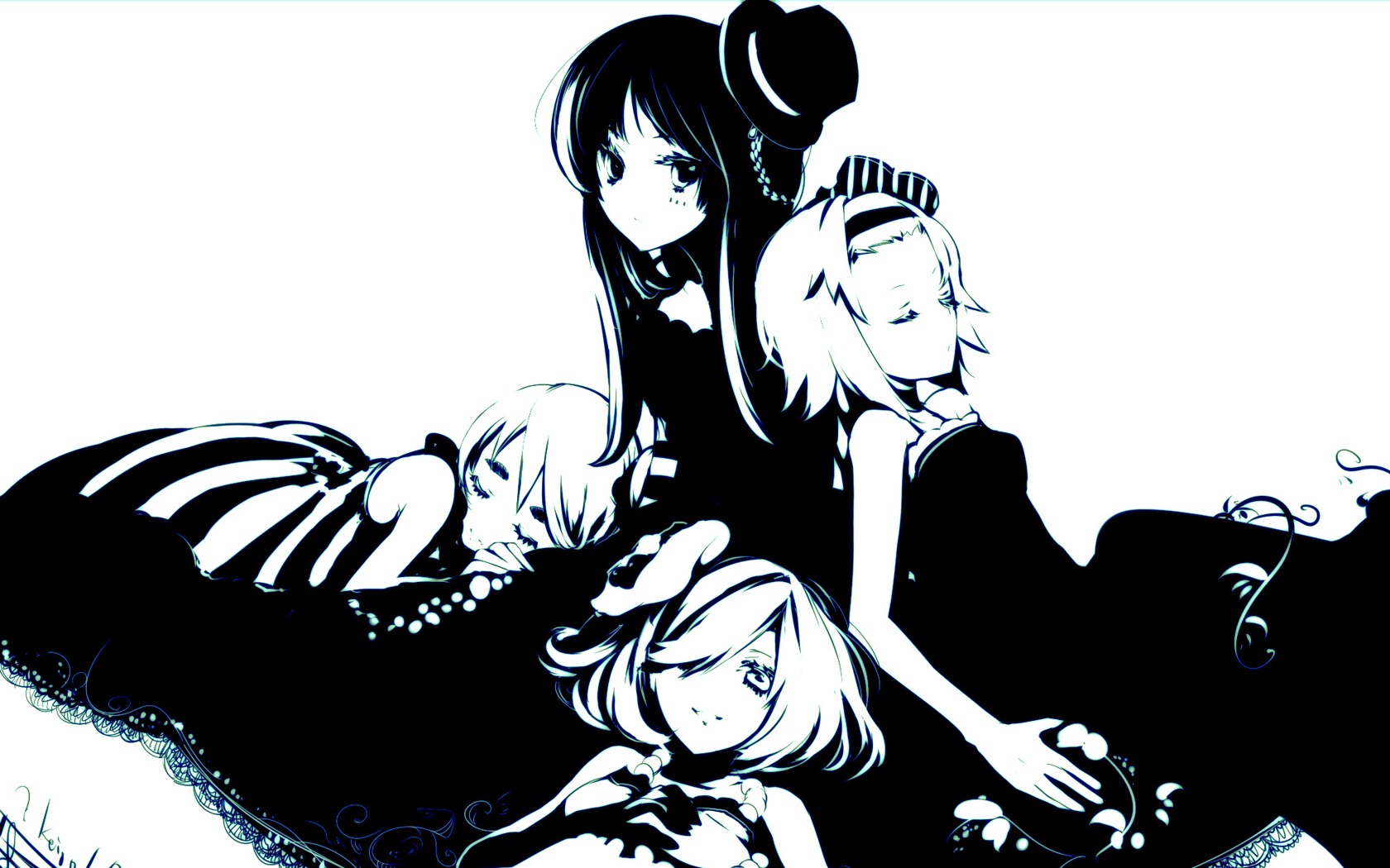
-Maybe make the K-ON! group image in the back be in the middle or on the left side? *shrugs* I usually like seeing the characters on the rankings part, and most of the time the right side is covered in the song-select anyways (with the song's ranking thing).
-The eight looks rather thick. Is that is the font, or can you fiddle with it?
Suggestions for other stuff:
-I agree on the Crazy/Lazy thing. Might wanna make it similar to the way it shows in the ED towards the end, all the letters turned differently and stuff.
-Maybe make the cursor the bass drum on a drum set with the K-ON logo on it (lightly)?
-Red/White will be your best bet for color scheme. Do the girls have characters colors (I've only seen the OP and ED, so I don't know)? If they do, then you should use those as well as accent colors.
-Stars --> Guitars, Of course. :3
Questions:
-What program are you using? I can give some pointers if it's Photoshop (7.0 or Higher).
-Does the font you're using for the numbers have letters as well?
-What font IS that? (xD I want it~!)
I can't wait to see this theme completed~!
-Make the "0" taller. All the other numbers are full height, while the 0 is kinda like an o in the center of it. Just strech it a little and it should look a little better (I know it's prolly the font, but it looks funny in the middle of a pile of numbers like it will be for scores and whatnot).
-Make sure the glows and whatnot you have on the letters don't get cutoff on the pixel limit. Looks kinda like the "0" on the left-hand side hit that problem, same side for the 9 as well.
-For the section pass, make something around it (make a frame of some sort, maybe like in the OP) because it being cut off due to the original image looks kinda bad. Same with Section fail, though you can maybe get away with just making it fade at the bottom.
-The Rank image is rather grainy. There's two ways to fix this, Easy way: Fiddle with filters and make it look better (Doesn't always work, but more often than not takes less time), or the Harder Way: Revector it (Looks better, but takes more time)
-Make the little white dots around the edges go away.
-Maybe make the K-ON! group image in the back be in the middle or on the left side? *shrugs* I usually like seeing the characters on the rankings part, and most of the time the right side is covered in the song-select anyways (with the song's ranking thing).
-The eight looks rather thick. Is that is the font, or can you fiddle with it?
Suggestions for other stuff:
-I agree on the Crazy/Lazy thing. Might wanna make it similar to the way it shows in the ED towards the end, all the letters turned differently and stuff.
-Maybe make the cursor the bass drum on a drum set with the K-ON logo on it (lightly)?
-Red/White will be your best bet for color scheme. Do the girls have characters colors (I've only seen the OP and ED, so I don't know)? If they do, then you should use those as well as accent colors.
-Stars --> Guitars, Of course. :3
Questions:
-What program are you using? I can give some pointers if it's Photoshop (7.0 or Higher).
-Does the font you're using for the numbers have letters as well?
-What font IS that? (xD I want it~!)
I can't wait to see this theme completed~!
 But there are obvious ones, like the rankings and the pass/fail.
 Keep it!

