Hello!~ Easy:
Easy:00:02:265 (2) - : I think you should change the slider art here so you can introduce the player on how music can differentiate slider's art.Alternatively,you can change the slider art of this 00:01:181 (1) - since the shape of 00:02:265 (2) - is more capable to the rhythm.
00:06:602 (2) - : Same as above
00:13:108 (2,3) - : I don't see any reason to have a clickable note since there is no any characteristic sound to be clickable at this part.Better map it as a slider like 00:12:024 (1) - so you can keep a calm cohesion.
 Normal:
00:03:349 (1,2) - : This rhythm is inconsistent with that 1/4 slider,listen how the musics goes.It should be mapped rhythmically like this

00:05:518 (1,2) - : Same thing.
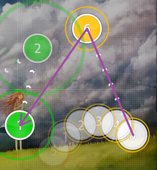
00:20:699 (1) - : The blanket is a little bit off on the top and on the bottom.Maybe space it out a bit
 Hard:
Hard:00:29:373 (1,2) - : I dont understand the SV change here plus that clickable note make no sense.It is just high toned,the rhythm does not change rapidly in order to speed up the velocity.Better delete that 0,60 SV change and let the slider end on the white tick.
00:31:542 (1) - : 0,80 SV?
LOL,rly?Did you place the fastest SV change than all the other ones,just for this specific high tone?The rhythm here is
held and
calm,its not getting faster or something,so you should avoid doing those SV changes.I see that you are changing the SV later again,so i will just skip them,i hope that you got my point.
00:55:217 (5) - : Why did you emphasize the spacing here only on this note and these 00:54:674 (2,3,4) - have the same spacing?You should emphasize them too cause the beat is getting louder and more louder on each one of them.
01:11:662 (3,4) - : They should be like these 01:10:939 (1,2) - .
01:15:638 (3) - : Same thing.
 Mell:
Mell:00:13:831 (1,2) - : I dont see any reason behind of this huge jump.There is no any strong or characteristic sound to emphasize them like this.In this case its the exact opposite,the tempo here is getting more silent.You should emphasize this 00:13:470 (3) - instead.
00:31:542 (1,2,3,1,1,2,1,2,1,2,1,1,2,1) - : Same thing from the Hards mod about the SV changes.You should avoid spamming these SV changes in a
calm part,the rhythm is the
same.
00:55:759 (2) - : Rotate that clockwisely by 25 degrees?
01:08:048 (3) - : Ugly overlap i guess.
01:23:951 (1) - : This pause is akward cause you are in the most intense part of the song,called
kiai.You should map two 1/2 sliders to keep a cohesion.
01:29:554 (3,4,1,2,3,4,5,1) - : I think this is better rhythmically .

01:49:072 (4,1,2) - : These should be mapped like 01:49:614 (3,4) - .
Very chilling song,wish you luck.
 - Mir
- Mir  - Pentori


