forum

Charlotte ✩ skin [L.Update:06/12/2015]

posted
Total Posts
65
Topic Starter
Hatsue

Thanks for over 6k downloads!! :D

Hello !
Here is my first skin I post.
It's about the nice anime 'Charlotte'. Hope you like it!


NOTE: I uploaded some BONUS-stuff. But that Bonus-stuff isn't in the skin-folder (due the large file size). If you want the Bonus-folder, please download it seperately! You can download the folder under ''download''.
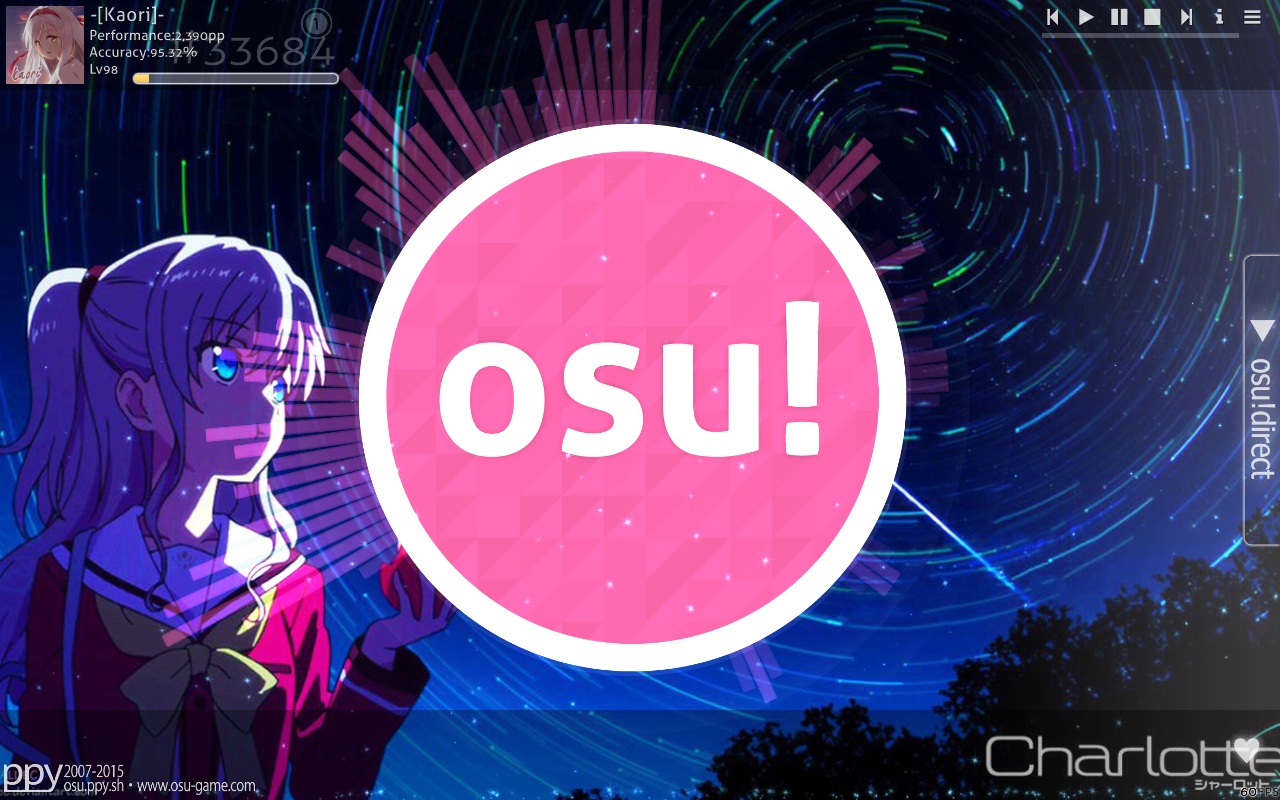
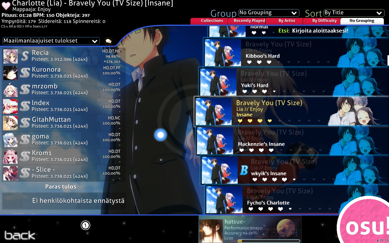
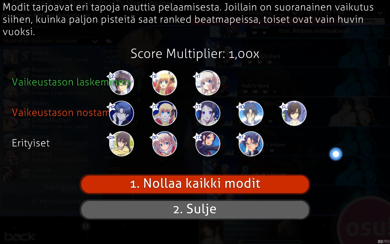
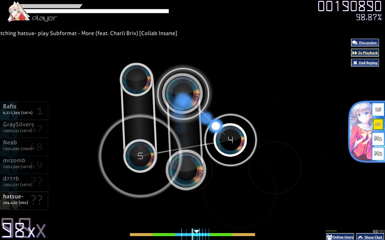
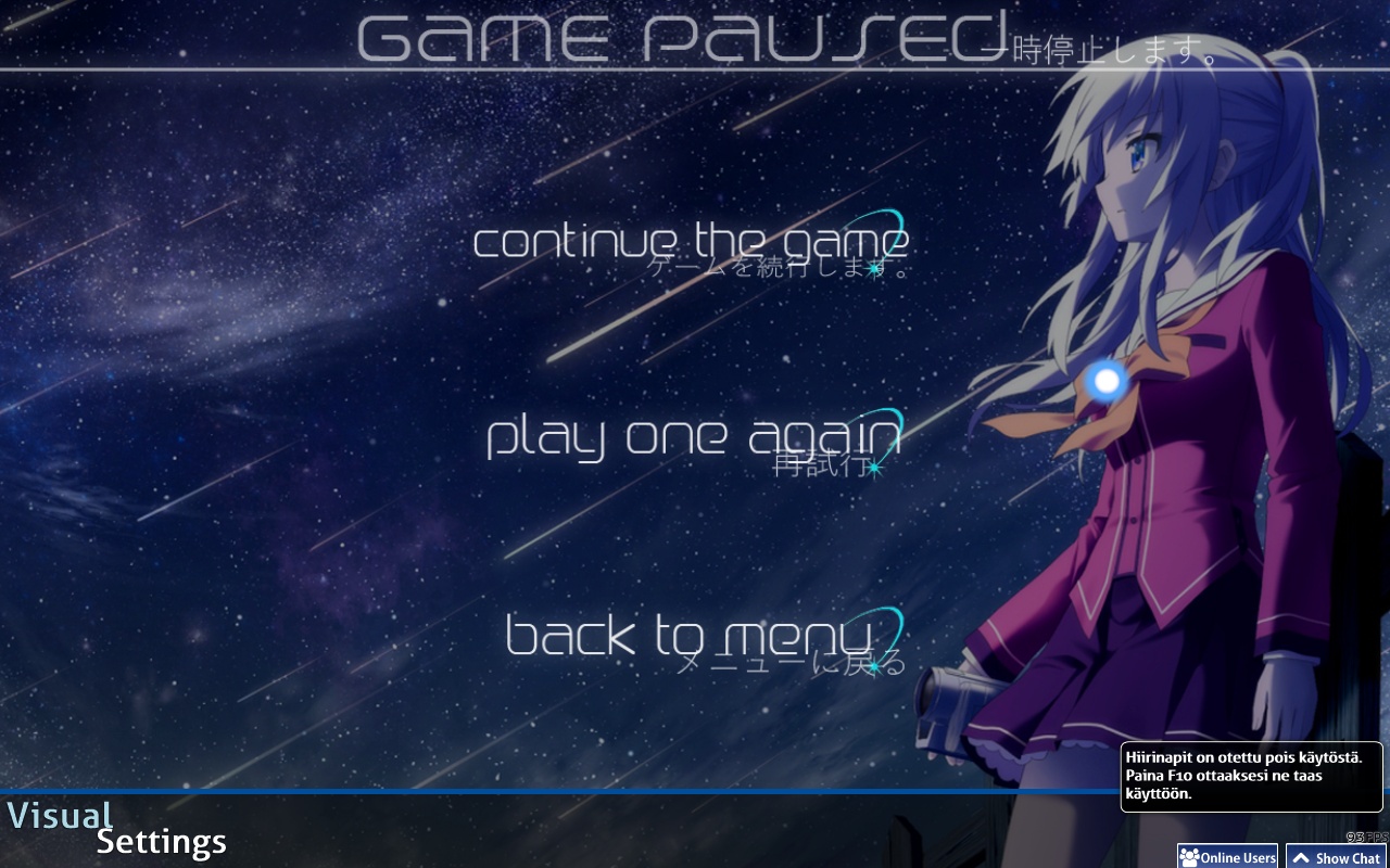
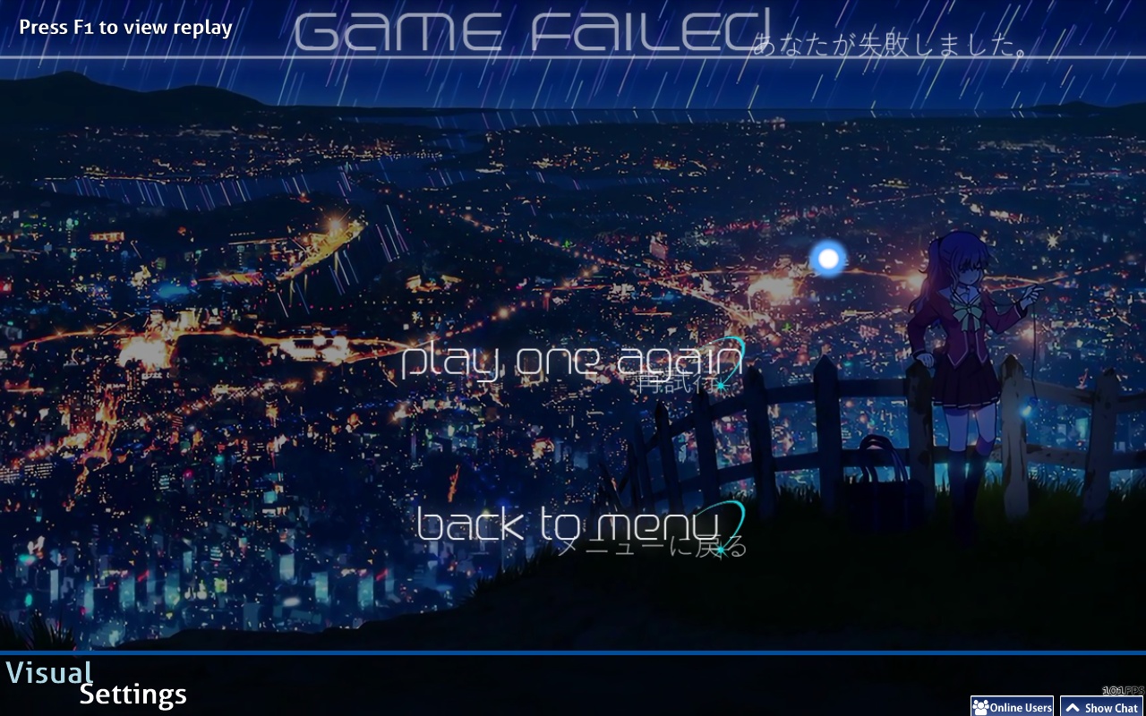
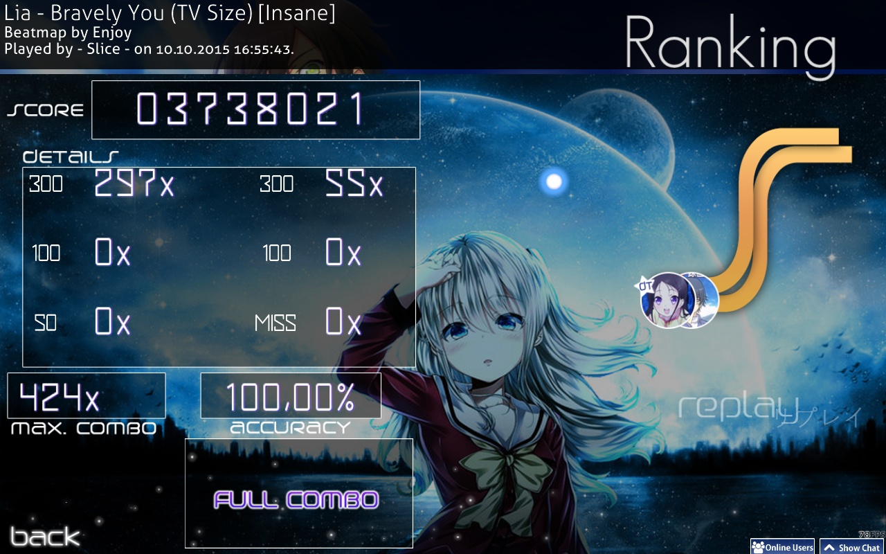
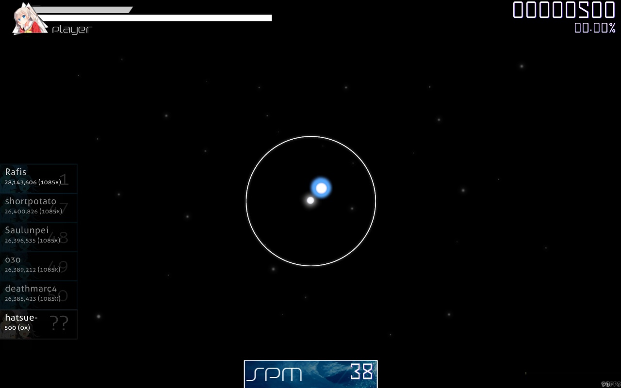
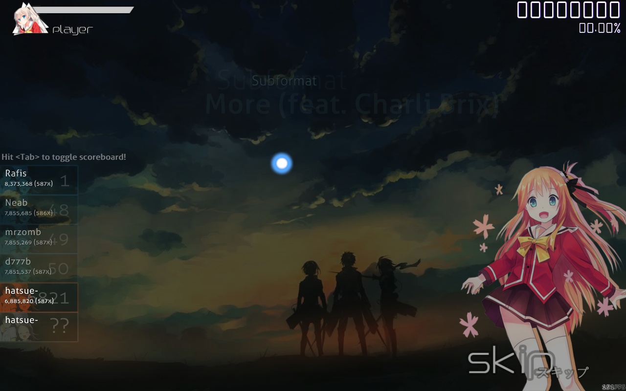
Screenshots
Thanks to -[Kaori]- for the screenshot of the menu!


Scorebar.psd is in the skin-folder! Just look under 'scorebar-bg.png', (I'm also taking requests..)


Video
Video made by Regasi, Thanks !


Video made by -Hakurei-, Thanks! :3


MIRROR 1 (puush)

Skin-Download: click here!
Bonus-folder: click here!


MIRROR 2 (mediafire)

Skin-Download: click here!
Bonus-folder: click here!


Updates
06/12/2015: -added thing to the bonus-folder
-inputoverlay
-ranking-sh/ranking-xh
-menu-back
-mod-icons
-spinner
-new hitsounds


CREDITS
hitsounds, bubble: -u- (https://osu.ppy.sh/forum/p/3741895)
hitsounds, nrt0768: ragenik
hitsounds, nrt04762 (and other sounds): -Miyano Kotone- (https://osu.ppy.sh/forum/t/314362)
video: Regasi
HappyRocket88
Wao! What a awesome skin you have made there! Congratulations!
Topic Starter
Hatsue

HappyRocket88 wrote:

Wao! What a awesome skin you have made there! Congratulations!
Thank you!
Underforest
Awesome skin! :) Congratulations for that great edition

Heart!
Topic Starter
Hatsue

AlejandroMedia wrote:

Awesome skin! :) Congratulations for that great edition

Heart!
Glad you like it! :)
Amane
Wow, looks awesome :3
Originality
This is gorgeous. I think I'm in love. Well done!!!!

Edit -- things I changed because I'm picky --
- combo colors (looks really good with red, green, and blue)
- spinner
- hitsounds
-the finish screen with ayumi is the best one (;
Endaris
The skinnermiddle wobbles xO
If I was you I'd think about doing something different for the menuback.png and the Input-Overlay as the skin has mostly a dark color scheme which makes these two stand out in a rather negative way.
The 50/100/miss are a bit too distracting for me due to their nonsymmetric design.
For the followpoints I'd recommend you to blank followpoint-1 and followpoint-2 in favor of 3-7 as right now most of the followpoints start so close to the circle center that they ruin the looks with the opacity a bit and rarely a followpoint didn't quite reach the next circle for some reason, for example this jump 01:07:299 (4,5) - in https://osu.ppy.sh/b/373657 :

Some of the mod-icons seem to be of poor quality(especially NF and SD) and the modname is often hard to read, you should try to get a stronger contrast between the star and the font color there and if you want to use a dark-color for the font you also have to watch out that the it doesn't go over the outside of the icon as it lowers readibility due to the dark background in the modselection menu. There's also a typo for the HalfTime-mod(HF instead of HT).
Ranking-S and ranking-SH are a bit hard to distinguish in my opinion.
Overall nice designchoices though, this skin has a lot of potential to be great.
syloid
love this, nice work man
Trizept
Sick skin m8
Topic Starter
Hatsue

-Nasuhara- wrote:

Wow, looks awesome :3
Thank you (:

Originality wrote:

This is gorgeous. I think I'm in love. Well done!!!!

Edit -- things I changed because I'm picky --
- combo colors (looks really good with red, green, and blue)
- spinner
- hitsounds
-the finish screen with ayumi is the best one (;
Thanks! I'm working on a new spinner and thinking about changing the hitsounds now.


Endaris wrote:

The skinnermiddle wobbles xO
If I was you I'd think about doing something different for the menuback.png and the Input-Overlay as the skin has mostly a dark color scheme which makes these two stand out in a rather negative way.
The 50/100/miss are a bit too distracting for me due to their nonsymmetric design.
For the followpoints I'd recommend you to blank followpoint-1 and followpoint-2 in favor of 3-7 as right now most of the followpoints start so close to the circle center that they ruin the looks with the opacity a bit and rarely a followpoint didn't quite reach the next circle for some reason, for example this jump 01:07:299 (4,5) - in https://osu.ppy.sh/b/373657 :

Some of the mod-icons seem to be of poor quality(especially NF and SD) and the modname is often hard to read, you should try to get a stronger contrast between the star and the font color there and if you want to use a dark-color for the font you also have to watch out that the it doesn't go over the outside of the icon as it lowers readibility due to the dark background in the modselection menu. There's also a typo for the HalfTime-mod(HF instead of HT).
Ranking-S and ranking-SH are a bit hard to distinguish in my opinion.
Overall nice designchoices though, this skin has a lot of potential to be great.
woa, thanks for all that suggestions! I will edit it! x)

subnormales wrote:

love this, nice work man
Thank ya' c:

Xbox wrote:

Sick skin m8
Yep, thanks x)*
Ulquiorra
OMFG
<3
DeletedUser_2213373
Really well done
Nice and neat =w=
Frostmourne
Finally I have been longing for the Charlotte skin, thank you for making it !!! T_T
Topic Starter
Hatsue

Ulquiorra wrote:

OMFG
<3
<3

Riantra wrote:

Really well done
Nice and neat =w=
Thank you ((:

FrostxE wrote:

Finally I have been longing for the Charlotte skin, thank you for making it !!! T_T
Yee, no problem x)

CURRENTLY WORKING ON A NEW UPDATE. PROBABLY PUBLISH IT TODAY.
Topic Starter
Hatsue
UPDATED!
Please redownload, if you downloaded it before 06/12/2015 for a better play-experience.
(Look under 'Updates' in the main-post to see what's new.
Asakura Yuuto
Good skin!!
But I seen some "sound elements" from my Kantoku skin ver3.0 !!^__^
Rivals_7
Any planning to made for other gamemode as well?

This is cool, tho. Great job man :D
- O r d P -
nice skin :D
Haynoru
woaw nice skin you made there!! keep up the good work :D
show more
Please sign in to reply.

New reply