ricochet890 wrote:
https://imgur-archive.ppy.sh/kdIZo42.png
How about designing icons for song selection buttons like above? I feel the current ones are a little bit bland.
Overall your skin is solid, I love it.
I may have tried out something like that before, not sure what happened that made me abandon the idea. I'll try out a few things later, thanks for the suggestion.
johnmedina999 wrote:
I noticed that both mania-hit300-0.png and mania-hit300g-0.png are transparent and aren't visible. Is this intentional?
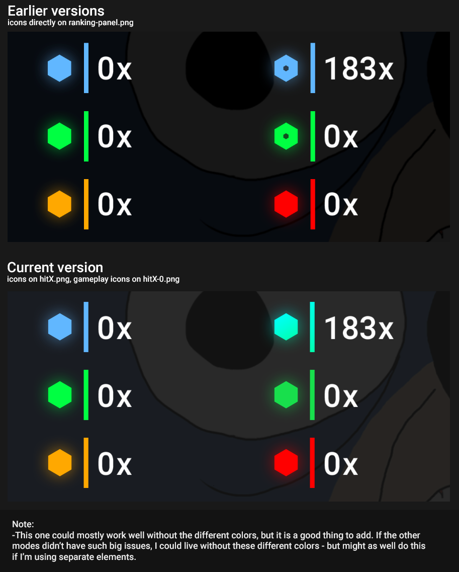
Yes, I did something similar with osu!standard which I thought would also have worked with osu!mania. The thought process is that there's no need to display anything if you're doing just fine (getting 300s). I only have doubts if pro mania players would find it necessary to display 300 while still keeping 300g invisible, or the other way around. Considering that getting either one still keeps you at 100% accuracy, I decided to keep both invisible until I got feedback that told me it's better to do otherwise. I rarely get anyone talking about modes that aren't osu!standard though.
Philosofikal wrote:
Man, have you seen this review that was written about your skin on this big skinning channel?
https://www.youtube.com/watch?v=rdyNoZlVceA
What the hell? In context to the ratings that many other skins receive on this channel I felt that this was brutally unfair and borderline ridiculous. Disregarding my own opinion on your skin, the fact that they would give you a 1 (a rating which I have only seen on one other skin which was an absolute wreck in every area) despite not being able to point out any substantial/objective flaws was, in my opinion, very thoughtless and disrespectful. If they want to trash your skin like that they should at least be able to support that ranking with some kind of comprehensive objection.
As a fellow skinner who shares a similar style to you, I kind of felt like this sort of blatant bias against minimal skins was by proxy an attack on me, and therefore irritating enough to write a pretty scathing comment on their channel. I understand that all the same their review is still beneficial to you as it it's free advertising to a relatively large audience, but damn it got under my "skin".
Asses on blastThis review's scoring methodology is so utterly preposterous it borders on insulting. One star/two stars for something that you can't even illustrate a single strong objective flaw about is absurd, and completely devalues what the impact of getting one star is supposed to represent in the scale - a complete failure. This is supposed to be comparable to something that is totally broken? I feel as though you really just decided to compromise the system and sandbag all the other element points just so you could give the gameplay a 5 and the skin overall a 3 so you wouldn't have to endorse something you subjectively dislike. The fact that you had to cop out that scores of the same value aren't comparable to each other just exemplifies how arbitrary and meaningless your numbers are. If the numbers aren't comparable then why are you putting them into numbers in the first place? Isn't the whole point of numerical ratings to simplify and objectify the complex and subjective for easy comparison to other things?
I usually like your reviews and I am a subscriber but you 100% dropped the ball here. This is not about your opinion on the skin, which is irrelevant. It is about your total failure to justify the numbers you provide through your words in the review. If all you can offer in the place of damning criticism is a flaccid meh, how have you justified giving your lowest score?
I have seen it. I do remember talking to the reviewer but I didn't really get his point, I'm not sure what I thought but I ended up deciding to just deal with it and move on.
I do agree with you and I think that the review is quite an insult, considering that this skin gets called "low effort" while other skins with clear misalignments and poor font/color choices don't even get called out on it and get high ratings. After that I just chose to stop taking the channel seriously, as if the previous reviews from other skins weren't enough.
They either fail to notice problems that are usually glaringly obvious to a graphic designer or fail to praise the skins when it does things correctly - they seem to rely mostly on a "this is just my opinion" rather than also having a good amount of objective explanations as to why something looks good or bad.
johnmedina999 wrote:
^I also like how this is an all-modes skin but failed to review any other mode. The skin is nice and clean in all its aspects, really.
I found that weird as well. Instead of waiting for reviewers that played the other modes, they only talked about standard. Apparently someone else submited the skin to be reviewed in their website, they keep a list with the submited skins in there and I saw that the person did ask to have all the 4 modes be reviewed. I also find it weird that they would review the skin without asking the creator or waiting for the final version of the skin.


