Submissions: closed! This time, I'll put the submissions in a spoiler since this week called for vertical signatures. Same rules for voting apply for this competition.
- Everyone is able to vote. However, the participants will not be able to vote for themselves, as votes towards themselves will not count.
- Voting is about who has the most skill.
- Votes will be counted by post, not poll.
- All votes must have a reason for their vote. You don't have to be a GFX artist to list technical reasons, of course. That said, constructive critcism is highly encouraged.
- One vote per person.
- This isn't a required part of voting, but if you would like to suggest themes for future GFX Bimonthies, go ahead. : >
- Does the signature fit the theme?
- Does it look pleasing?
- Do you think proper techniques were used?
Entries
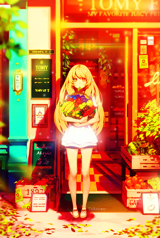
Fruits Basket
Life is Full of Colours

Removed due to plagiarism
Kirigiri

Konpaku Youmu

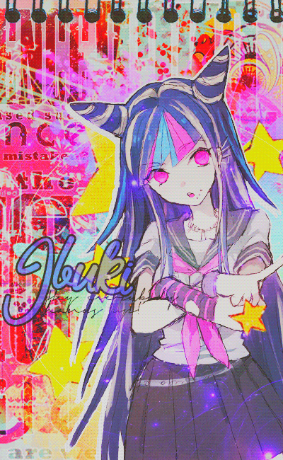
Ibuki
S U N S H I N E

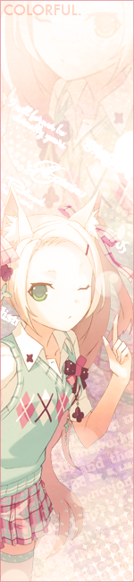
Colorful
Voting ends April 22nd!
 and that paint splats behind the text but further it really is a beautiful art!