that sliderborder color is so painful on 100% dim lol
just a suggestion, but maybe try something like "SliderBorder : 70,200,245" ?
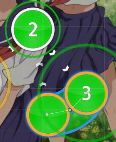
looks like
http://lasse.s-ul.eu/zybgQbCD ingame
I know you like to map a bit center heavy usually, but the intro just feels bit too clumped in the middle of the screen until around 00:23:502 - :c
00:11:978 - would put the 30% timing line here and add a 20% one for the start since there is a noticeable change in song volume and before that it seems bit loud
00:06:124 - maybe also 25% here for better progression
00:23:685 - now here 30% seems bit low with how much louder the song gets, probably like 40%-45% ?
00:28:990 (3,1,2,3) - this is really broken ingame cause of stacking
http://lasse.s-ul.eu/yIofuR5v01:19:295 (1,2,3,4) - how about setting the sampleset for sliderbodies to normal here? the slide sound would go really well with the sounds in the song // 02:24:783 (5,1,2,3,4) - this too
01:21:856 (7,8,9,10) - movement on this feels so weird to play for me coming from the star before, how about something like
http://lasse.s-ul.eu/SiYkcu9J (ignore ugly shape)
02:27:710 (7,8,9,10) - similar to the other one I think having this curve in the other direction is way nicer movement wise
http://lasse.s-ul.eu/gzbpX0RC03:54:051 (2) - pretty sure you will deny this cause I know how you usually nc things, but I think nc here would be great to have the long vocal slider in its own combo
04:00:270 - adding break instead of so much empty drain might be neat and would still give you above 5min drain
05:16:460 (1) - sounds like it should end a bit earlier to me, 05:18:563 - maybe?
let me know when I can qualify